Final Project Documentation 2 (Reflection)-Laura Huang

Link: http://imanas.shanghai.nyu.edu/~ys3041/final/index.html

Design:
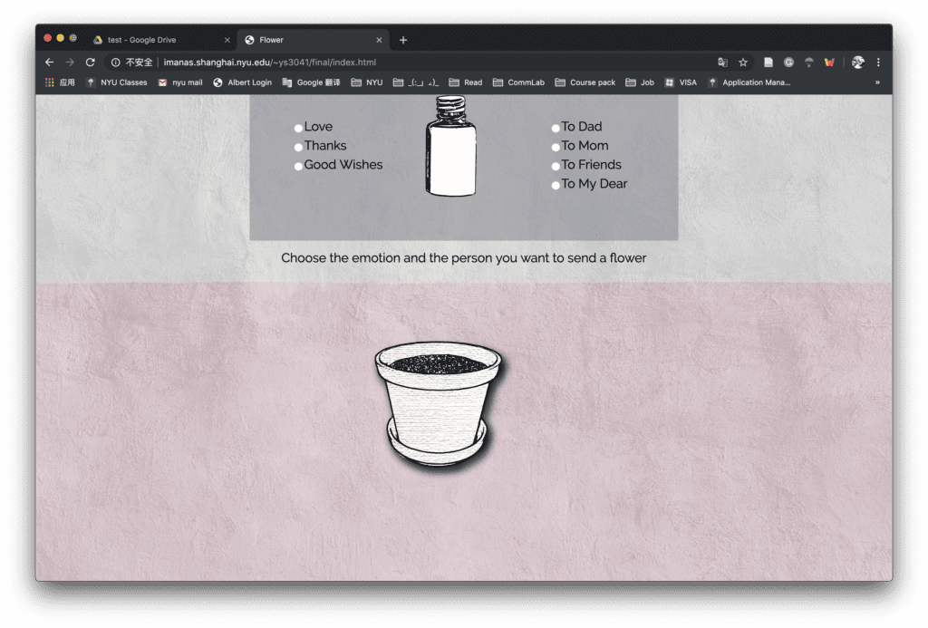
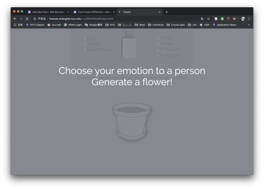
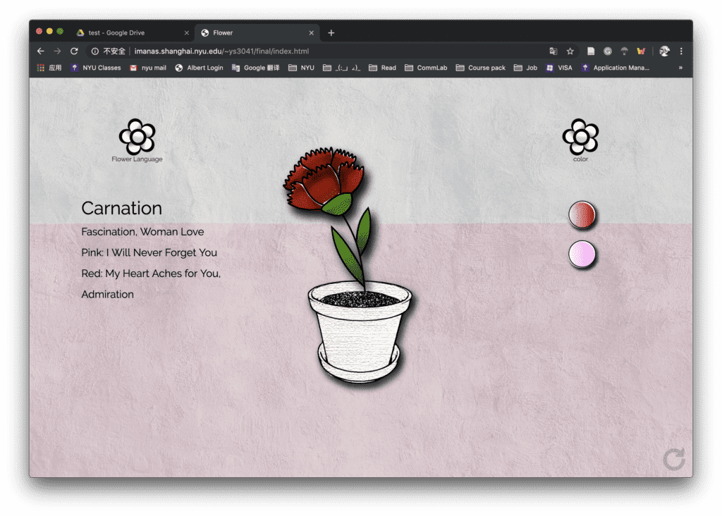
  Our project is a website that enables the user to generate a unique flower by choosing the emotion and the specific person they want to send to. The first step is to generate a flower based on distinct selections and the second step is to fill the color and read the flower meaning. In the first step, the basic layout is a checkbox at the top of the webpage, involves three emotions: love, thanks, and best wishes; four people: mother, father, friends and my love; and an empty bottle between the two columns. The user can click and select one in each column. The bottle will shake as they click, and by following the instruction, the user can “pour” the ingredients in the flower pot underneath. In the second process, a specific kind of no fill flower will generate in the flowerpot based on the user’s selection. Two buttons will show up on both sides of the website. The user can click on one to choose the color patterns for the flower or click the other to read the flower language and meaning. In the end, users can refresh the page and create a different flower again.

Screenshots for the project:


Process :
    The final version of our project has several adjustments to our initial thoughts. But in the process of finding alternative ways and methods, we learned a lot of new methods and a new way of thinking.

    For the first step of selecting emotion and people, we solved the problem of the limited selection and sending the value to match each type of flower by using the radio checkbox instead of normal checkbox and using the array to get the value. The result of the selection part went well after many times of testing and calculation. I wish we can expand to more choices in future development.

    Also, for the instruction page, we may want to improve more according to the feedbacks. Instead of adding a whole instruction page for 2 to 3 seconds, we can use other ways like the blinking of the instruction text, which will be more simple and clear. This is really inspired by a lot of my classmates’ project design, in which the blinking text is a straightforward way to emphasize the text.

    For the color filling part, after we failed to draw the flower using the p5 curveVertex and Bézier Curves function, we altered the method to draw the whole image in the Illustrator which is the most efficient way at that time considering our time and work limitation. The original versions of the flowers are mostly plain and boring, after some suggestions from the professor and peers, I changed the brushes and intentionally stylize the flowers to make them more vivid. I also added the shadow to the flower and flower pot, which turns out to be a good choice especially when we changed our background to the texture patterns.

    However, since we paint the whole image and change the color thoroughly, we didn’t achieve our initial goal of filling the color on each petal one by one. If we have more time, I think I will explore more functions in p5 drawing and try to draw the pieces to test if we can change the color separately. I also want to explore the more advanced function on the color palette referring to the inspiration website that I found in my proposal. For example, I can add the spot that picks the color and change the mouse feature to present the color filling process.

Future : 

    Overall, we are glad that we present a complete project and we also find many ways to improve our website design and layout. Although we avoid the distracting background in our project, which may mislead the users on the focus and finally choose a more simple texture that can highlight the main object, there is still some inconsistency in the whole webpage, for example, the style of the button can be more simplified instead of repeating the style of flower. The texture could be better designed and align with the entire page style

   We may also want to think about different layout for the webpage so that the whole project could be more creative, unique and interactive. All the peers and professors give great feedbacks which not only provide suggestions on the present project but also point out a lot of directions for us to improve in the future. We appreciate all the help during our work and all the feedback and suggestions. We will definitely do more research, especially on the flower topic, to apply the advice to our website.

Final Project Documentation 1-Laura & Susie

Link: http://imanas.shanghai.nyu.edu/~ys3041/final/index.html

Partner: Susie

Description:

Our project is a website which the user can generate a unique flower by choosing the emotion and the specific person they want to send to. They will choose by clicking the checkbox and follow the instructions of clicking the bottle. After the flower is generated, they can open the color choices or check the meaning of the flower, or refresh to create the flower again.

Process:

We came with this idea because we want to create something related to flower and color and customizing your own flower by adding the emotions and filling the colors seems feasible. I was responsible for all the visual parts and helped Susie with the code. At first, we want to make the color filling on every petal and small parts so that each flower can be different and unique. I first did some research on the p5 drawing and found some functions like curvevertex. I tried to load the original image first and draw the stroke based on those images. However, since we related flowers with their specific meanings, the flowers have to be more distinct and based on some real-world models. In this case, the curvevertex may not achieve this goal as it requires a lot of work on recording the points on each petal if we want to make it more natural and delicate. I also tried Bézier Curves but it can only draw ellipse-based curve which might not imitate the flower naturally and successfully.

Therefore, we choose to draw the flowers in the illustrator which is also easier to make adjustment in the later stages. I added different layout and exported all the combination of colors and flower petals for preparation.

While I was painting in the Illustrator, I explored some different brushes and ways to stylize the images. Inspired by the professor, I also found ways to make the picture less stiff and bored, we can totally add some artistic effects and details intentionally to make it more vivid. So the final design of the flower is more hand-painting and comic style. I also add the shadow effect to all the elements to make them more solid after we change the original background-selecting idea and use textures as the background. 

When we come to the coding part, we met some problems deciding the way of filling the color. One problem is that we can’t confirm the position of each petal to constitute a complete flower. Although we tried different positions and divs, they didn’t work very well. Due to time limitation, we decided to change the whole color of the flower instead which will be more stable for the project.

As for the layouts, at first, we want to place the flower pot on the window sill and change the outside view through mouse scrolling right and left. After I draw the images of the flowerpot and put all the design into the webpage, we found the background is a little bit distracting to the whole visual experience, which is also suggested by the professor that it’s better to eliminate the elements and only emphasize one point at a time. Since we already two functions of choosing the color and flower language, changing the background is indeed difficult to match the whole style and design. So we move the background selecting part and only focus on the main object of flower and two functions.

When writing our code to realize the function of select one emotion and one person to generate the corresponding flower, we spent a lot of time struggle with the value that we get from the checkbox, which later turns to be more efficient using the array and the radio checkbox.  The rotation of the bottle is realized by the keyframe function in CSS and I also added the hover effect to the selection button to signal the user to click them.

The  final version of the project is shown below:

Reflections:

We make many adjustments in our process of this project but we also explore much on different ideas, layout designs, and coding.

We also received a lot of feedback for future improvements. For the design of the website,  a good and important suggestion is the choices of texture. Although we explore different styles and backgrounds for several times, there is still some inconsistency in the texture, which is a direct effect on the user’s visual experience.  We may want to change the style of the two buttons related to color and flower language to make them more coherent.

Other improvements may be a further development on the interaction. The choosing color part, as we wrote in the proposal, can be further developed into the palette and enable the user to select more patterns. We may also want to add the share choice at the end or just add the screenshot hint.

Overall, Susie and I made a lot of effort on the project and we’re happy to finish it within a limited time. We’ll still work on the suggestions and explore more approaches and possibilities of this project.

Credits: 

Background image and bottle references:

https://unsplash.com/photos/P8XV99FyzCk

https://pixabay.com/vectors/bottle-jar-pills-medicine-954645/

Week 12: Final Project Proposal-Laura & Susie

1. Project Concept

a) The subject and/or topic:

   Create your own flower with different elements, choose the color and background and send it to others.

b) Why important?

   We select flower as our main elements because we find many young people nowadays rarely express their love and feelings directly to others. They may be more willing to convey love through small gifts like flowers. For example, as the Mother’s Day is approaching, the users can create and customize their own flower and send it to mothers. The flowers will be based on the real flowers, but it will grow and bloom depending on the choices from the users. They can also send the flower not only to their Mom but also to anyone they care about. We want to make a net art that is more flexible and customized, which can encourage people to express their love and thankfulness to whom we love and those who love us.

2. Inspiration and Sources

http://wildflower.resn.co.nz/

https://colormandala.com/

   The first source we found is a website called wildflower, we were inspired by this because the flower it generates is so vivid and beautiful, it also contains a part to send this flower to someone we love, which is also an idea we want to express. However, many people are not familiar with the flower language and in this project, the flower type is limited and generates randomly without any intentions. Therefore, we want to add more emotions to the unique flower and give it some explanations so that the users can choose what type of flower they want and who would like to send.

   The second sources we refer to is mainly related to our technical issue of coloring the flower. This website is mainly a game of filling the blank pictures but we think the single and plain color may be too dull for a flower, so we decide to make our own templates and substitute them based on the color choices.

3. Production

   In our project, the user will first choose to add different emotions and elements to the flower, such as love, friendship, tears, grateful, happiness, etc. Then the flower will be generated depending on what the user chose and the meaning of the flower (flower language) will be shown beside the flower. After that, he can choose the color of the flower and we will switch the color template for each color choice. He can also change the background environment of the flower to better fit the meaning of the flower. At last, he can click the share button and send the flower to others.

   In the production process, we will first do the researches on what kind of emotions that can be added to the flower and how it related to different types of flower category. Then we decide to draw flower templates using p5 and based on the shape of real flowers. The user may select the elements they want for their flowers and click “grow” to generate the flower and the corresponding flower language. There will also be some sound effects when the flower is created. We will prepare the color templates for petals, pistils or leaves that could better merge with each other.

   After the flower has been made, we plan to use the scroll function to let the users change the background environment that best matches the flower language or their feelings. This also requires a lot of research on the flower and their meanings. We also want to play different background music according to the background so that the entire piece will be integrated with each other.

   For the last part, after the user selects all the alternatives, they can click the “finish and share” button, the screenshot will automatically be generated and the pop-up window will show the ways they can share, for example, email, facebook or other social media, or save it to the desktop.

Week 11: Response to A History of Internet Art – Laura Huang

   The article mainly discussed the invention of the net and the art generated from it. As the art merges into the form of internet, it is more related to our daily lives that combine texts, images and becomes a new method of communication. However, the establishment of internet art requires certain rules and principles. Originally, the internet should provide an equitable community for all kinds of art and artists. The open platform should be independent of any bureaucracy or discriminations and should create a civil society that involves media openness and pluralistic politics.

  As more people, organizations even authorities participate in this process of production and distribution. The delivering channel is attached with some outside meanings and objectives from political or economic aspects. In this case, with more social forces influencing the internet and net art, they are likely to be colonized by mainstream media and corporate magnate.

  In my opinion, it is very interesting to see how mainstream opinions and art forms change along with the development of the internet. For example, the cyberfeminism and the artworks that come together with this idea. The subdivisions in the net community allow more creative ideas and concentrated inspirations among people. And in fact, the net art is so closely merged with our lives that we may don’t even notice them. They also have so many forms but the premises to promote net art is the freedom on the internet. The net community should be the pioneer in developing and disseminating new ideas rather than a tool to control the ideology and abuse of power. Being totally anonymous on the internet should also be cautious as this feature may cause irrational and vicious in the conversation of net art and break some fundamental rules. Overall, the Internet is still on the track of fast development and it needs new strategies to lead the way.

Week 10: Internet Art Project-Laura Huang

I searched on the monoskop website and looked through the artists. I found an artist names Burak Arikan, who is a media artist and focuses on the social economic issues in society. (https://burak-arikan.com/works/) The core element in his artwork is the relationship. He creates a lot of software, prints, installations to illustrate different relationships and networks between different industries, groups of people, political ideas and social topics. He also used different art forms to show the network, for example, the darkness of colors, the size of the circle, the moving pace of the elements or the distance in a 3D space. He even built a website which the users can create their own network graph and share with each other.

One net art he created is called “my pocket”, in which he records all the receipt and transaction in his daily life and accumulate them into transaction graphs and animations. He uses the thickness of the connecting lines to show the total spending amount and the relationship between the two purchases. I think it’s a very unique way to turn the small things and actions in our daily routines into arts and visual works. Here is the link: http://turbulence.org/Works/mypocket/graph/