https://imanas.shanghai.nyu.edu/~ycc525/externaljs/
Week 3: CSS Portfolio (Selina Chang)
My portfolio

SO this is how it looks like.
Throughout the whole process, I have tried looking up at the w3school, and this site is really helpful that I literally learn everything.
For the heading, I use a liner-gradient image as my background. Initially, I found that the picture couldn’t appear even though I saved my documents and refreshed it for times. It turned out that if you want to insert an image in css, that image must be in the css forlder.
For the navigation part, I used display:block and hover to make it look that this.

For the content, I made it somewhat looks like the layout of instagram. However, I encountered a problem which is the text-align, I couldn’t make my words next to the little heart, which remains a great trouble.

Generally, my portfolio page seems to be merely good, I would like to improve it somehow when those problems are answered. I will try to learn from the w3school more to learn some advanced skills.
Week 3: CSS Layout(Selina Chang)
https://imanas.shanghai.nyu.edu/~ycc525/first_project/
This is what I have figured out so far. And I found changing the designs such as colors and layout both hard and interesting.
Week 2: Understanding Comics (Selina Chang)
The book Understanding Comics literally changes my perception of comics. McCloud unraveled the concept of comics by tracing back to thousands of years ago. In fact, most of the instances he took, I have never thought of them as “comics”. I initially thought of comics as simple lines and thought bubbles without too many details, and thought of them as some art works that is much easier than those hung on the museums’ wall to be appreciated. It turned out that it is not the case.
This book really impresses me for it tells me the truth which I have taken for granted throughout my time reading comics. Before reading this, I have never thought of the reason why comics are more widespread than those realistic sketches. McCloud explains that the universality of cartoon imagery the more cartoony a face is, for instance, the more people it could be said to describe, making people feel empathy while reading. The combination of cartoony characters and realistic backgrounds, especially in those adventure comics, let us identify ourselves with the characters. The most magical factors among all, is the scene beyond gutters. I have never thought of the reason why we can have scenario in mind by merely looking at two pictures. This is generated by closure, which is based on our former experiences of the world, so as our perception of those panels.
In my opinion, these are the reasons why comics painters are deliberate authors. We should appreciate beyond the surface to see what those talented authors actually aspire to convey through seemly-childish artpieces.
Week 2: Photoshop Collage-Selina Chang
FINAL VERSION

PICTURES USED


DESCRIPTION
The idea of my collage originates from the photo taken by tourists under Merlion, which is one of the most popular destinations in Singapore. Some drinks from Merlion’s mouth, others use the water to take a bath. That’s where my idea came from.
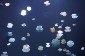
I use a sculpture that I accidentally took a picture of and make it a man showering under Merlion, relaxing, with a dog accompanying him. And I used those jellyfishes as some power from the outer world, trying to invade their city. From this collage I want to convey that we are under some threats that seems vulnerable without seeing them.
To accomplish this, I first use the quick selection tool to select the sculpture and create a new layer of it and put it onto the Merlion picture. To make it seems more realistic, I sharpen the sculpture and adjust some parameters such as hue and saturation. Then I select few jellyfishes using quick selection tool as well and put them onto the collage. I duplicate three layers and adjust the color balance, making them have some vulnerable candy colors.