Week 3: Comic Idea Proposal- Ying

INSPIRATION

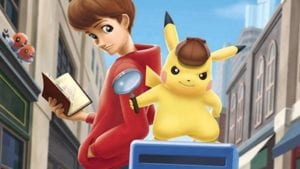
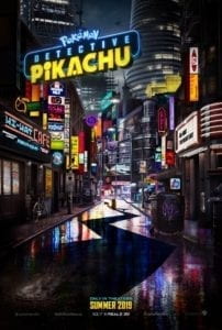
While we are brainstorming for ideas, we talked about our favorite comic, movie and anime to take inspiration from. We thought that we should adopt elements such as characters that will make our story fun and interesting for everyone. I have proposed to use Pikachu and the adventurous plot from Detective Pikachu


Detective Pikachu is a game and movie series about a young man who joins forces with Detective Pikachu to unravel the mystery behind his father’s disappearance. Chasing clues through the streets of Ryme City, the dynamic duo soon discover a devious plot that poses a threat to the PokĂ©mon universe.

STORYLINE

We suppose the reader, you(the reader) plays the role of the companion of the Detective Pikachu.  You and Pikachu are good partners that have solved a lot of tough cases. And one day, the new challenge appears——investigate the abandoned and shabby apartment building, which is said to be haunted.

This task comes from a client who’s working for removing the abandoned buildings in an old district. Unfortunately, they are stuck by several weird accidents: something unknown is disturbing their work. Though many people believe it’s probably because of the ghost, you and your lovely companion Pikachu don’t really trust it. Therefore, you come to the place at night to seek for the truth… After a series of events, you finally get the answer——it’s because of another pokemon, whose master has been dead for years. He tries to protect the place where used to be his family… (Milly).

ILLUSTRATION

We came up with several ways to unfold the story. Some of them are:

  1. Drawing in cartoon/anime style.
  2. Draw out everything in pieces and print them. Later assemble them together and present it in the form of pictures. 

Since we want to keep the style the same throughout the comic, we wanted to stay with the same method. Also, we thought of adding visual effects such as overlay to set a mood for the audience and sound effects such as the cry of Pikachu to make it more engaging.  

As for the interaction part, we first plan to set conversation by clicking or scrolling. Since we want the audience to explore along with Pikachu, we want to set different clickable items. We try to let the characters interact with the plot with some change of gestures or facial expressions. If we had time, we can consider the different possibility for an alternate plot and ending. 

Week 3: Basic HTML/CSS Website- Ying

Link to the about page: http://imanas.shanghai.nyu.edu/~yc3359/week03/index.html

Or you can take a sneak peek to my new welcome page proposal.

http://imanas.shanghai.nyu.edu/~yc3359/week03/welcome.html

 This is where I got the effect from (https://css-tricks.com/snippets/css/typewriter-effect/) and I thought it was really cool. 

I started out my assignment with the construction of a horizontal navigation bar on the top. I decided to make that first since it will be used multiple times throughout my other pages. This way I can just copy and paste the code to finish that step before stylizing my other pages. For the navigation bar, I created a white background on the top. I added my title for the assignment “Ying@IMA” as my logo. Then I added tabs that are already existed like the portfolio page. I will be updating more tabs in the future. The HTML code for that is shown below. 

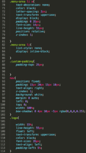
As you can see I’ve assigned it in a class called custom-padding so I can easily adjust the over padding and I wrote the rest of the code within nav. Below is the CSS code.

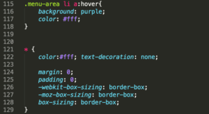
So what I did is that I’ve set the tabs on the right and the logo on the left. I also did the hover function where tabs will be enclosed in a purple box. This code is shown from 115-117. Moreover, I added a shadow to the bottom corner to add more contrast and the code is in 182 by using box-shadow. There are several difficulties while making this navigation bar but most of it is about the position of the text and the bar. I eventually got the result that I wanted by testing numerous values for almost 2 hours but it was worth it. On the about page, I’ve added a background for header one. This was quite easy just by adding a background from the local file. I then adjust the background by using background-position and background-size. The rest of the content was pretty straightforward where I put the text in either center or to start on the left. For the involvement section, I’ve added two logos and decided not to add any texts for it so I can keep the website simple and minimalistic. The user can click in to check more information. When you move the mouse cursor onto the image it will have a little message box appearing that says the title of the website. This was done by using the title code. Lastly, I insert link to the tabs that I already created.

For the portfolio page, I’ve fixed the footer problem where it does not stay on the bottom of the page by changing the position to fixed. One useful thing that I learned is how to put special symbols onto HTML by using converter online. I tried to make a footer section but failed and I gave up because it messed up my previous section all the time.         

Blog Post: Color Studies – Ying

In this blog post, I will be documenting and comparing both of my physical color studies and digital studies. 

Assignment 1

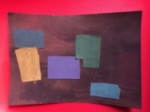
To be honest, I had no idea about my color choice and it was totally random. I choose brownish-red as my background. I created this color by mixing red and grey. For the rest of the color, I just mix them with the primary color along with grey or any darker color except black. Also, I used a lot of purples as well because it worked quite well with brighter colors. There is absolutely no meaning and symbolism behind this painting. 

Assignment 2

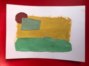
In this painting, I was trying to make a landscape. As you can see the green represents the grassland. The yellow represents the landscape and the mountains. The cyan color is the cloud. Lastly, the red represents the sun. I tried to mix them with white to make it brighter but it didn’t turn out as I would expect. I remain the border as white to give the overall painting a contrast element to the whole. 

Assignment 3

The first exercise is changing the brightness and I picked black for the center. The red in the first example will make black more stand out and make it seem more bright. While the second example, I picked brown which is a darker color to make it seem dull and dark. 

In exercise two, I will be changing the hue while maintaining saturation and brightness. I choose a light purple for both. In the first example, I picked light blue to maintain its neutral look. While the second example, I picked the purple which darker and more saturation. This will make the second example a slightly different color.  

In the third exercise, I will be changing the saturation of the color. For the center, I picked orange. In the first example, I picked a dark blue to make the orange more intensive. While the second example, I picked grey to make as little change as possible to the orange.  

In the fourth exercise, I will be changing all of the elements that I’ve done before. In this exercise, I picked orange again. The first example, I picked a reddish-orange to make the orange more intensive in darkness and more saturation. The second example, I picked yellow to make the orange more intensive in brightness and less saturation. Since both appear to be a slightly different color, the hue appears different. 

The last exercise can be challenging because it required the different colors in the middle but changing the border to make the same color. For the center, I tried not to pick colors that are different drastically. The first color in the left is slightly more greenish and the right is a more orange look. At first, I had no idea what color to pick for the surroundings. I can only figure it out by testing different colors on the color grid. I don’t think this is the best option that I can do because the center color can appear the same without looking at it closely. I guess in the second example the orange-red color will make the yellow-green darker and so closer to the first example. 

Assignment 4

In the first sequence, I used colors from green to blue. When the color approach the middle it turned cyan. 


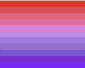
In the second sequence, I used colors from red to purple. The color turned slightly pink in the middle. 

These two color sequences are complementary but instead of combining them as complementary colors, I match red with green and blue with purple. I think it will make the final sequence more standout and more contrasting look. The red and green reminded me of Christmas color which I really liked. 

Assignment 5

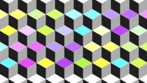
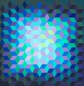
For the final assignment, I made a three-dimensional platform with duplicated squares. These individual squares are created with three panels and they are in the sequence of yellow, green, blue, purple and pink. Also, they are from lighter to a darker scheme. I purposely left the top and bottom corner white so there is this illusion that the cube is facing both up and down depending where you start. This is inspired by Victor Vasarely’s artwork called “Ion-11”. In his artwork, he makes the square in many different directions which confuses the audience of its direction. Also, it used brighter colors such as green, yellow, and cyan in the center. The outer corner, he used darker colors to make the center the focal point of the artwork.   

Week 2: CSS Exercise- Ying Chen

Link: http://imanas.shanghai.nyu.edu/~yc3359/css-float-n-flex/index.html

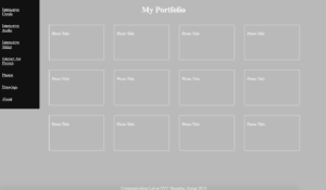
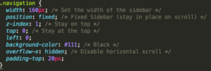
In this exercise, I practiced how to add style to my HTML page with CSS. The goal of this exercise is to arrange these content boxes in an orderly fashion and to customize it like inserting color or changing font. I like to keep my page simple so I used grey for my background and kept the text white. I also added a navigation bar to the left and make it black. Below is the CSS code for the navigation bar. 

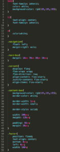
While adding the navigation bar, I faced an issue where the boxes came under the navigation bar. I solved this issue by adding the following code to avoid overriding.


The following is the rest of the CSS code.

Week 2: “Understanding Comics” Reading Reflection- Ying Chen

In Scott McCloud’s comic book “Understanding Comics”,  he explains how comics are created through simplification of shapes and symbols. This is a comic book about comics. It very interesting how the author adopted this form to allow readers to not only know about the concept but also visualize it as we read. After reading this, I’ve become more appreciative about comics and understand the meaningful purpose it can have on transmitting information.  

Although the creation of comics can be controversial and unliked by many people for its dull and simple form. The history of comics can be traced back to the first creation of language and to a large degree, the language itself is a human creation of symbols for us to interpret. Ancient languages such as Egyptian and Chinese take on the form of simplified images of a real object. For example, the character äşş meaning people has characteristics of two legs. Comics are merely a progression of language. Icons and emojis are very similar in a way in that we are creating a new type of “language” in the same method in the way we create a language based on the real object. Anyone can actually create their own on their computer, some of these can be: “:3” for cuteness, “:)” smile, “:/” unhappy, or even more complicated one:       “( ͡° ͜ʖ ͡°)” which symbolizes for kappa face. These are very often used on the internet and popular among teenagers. It is the fastest way to express their feelings. It’s interesting how the author mentions us as the self-centered creature in which we see and mimic ourselves everywhere. For example, we can found human characteristic in cars where it has two lights on the side and an air vent in the center. It really reminds us of a human face. These characters really appeal to us and we can even see that in outlets. Since we tend to mimic ourselves, icon and emoji can interpret differently.

At last, McCloud allows us to explore the secret world between the panels, through the lines, and within the hidden symbols of a powerful but misunderstood art form.