Sound Visualization_Musicverse
Project Description
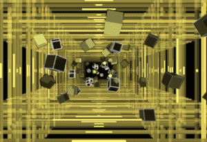
This is a project that generates sound visual through processing. What I want the visual to be is a 3-dimensional world that travels through space and there will be objects flying towards the screen. There will be volume frequency bars that surround the outside edge. The frequency bar and the flying objects will change colors depending on the values of the frequency. It is a fascination to me how music can be a way in creating content such as cinematic video that forms synchronization between visual and sound. This concept is behind the creation of a very popular mobile app among teenagers called TikTok or 抖音 (DouYin) in Chinese. It takes value from a piece of music like frequency to apply velocity and fx to any kind of recorded materials. Music can also inspire pro-gamers to make their own cinematic video and in the process, it makes them think how they’re editing the video to make their gameplay more enjoyable to watch. I was part this a while ago and every time I edit a video, I have to mark the different range of pitch so I can think of what visual effect to add and what velocity should this part be. See examples here: Example 1 Example 2
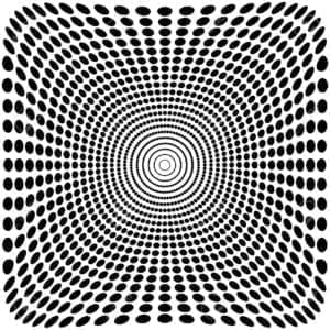
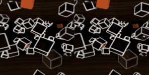
The intention behind this project is to make a user experience a world of music through both sound and visualization. Also, it gives them a “zoom-in” illusion at the end when they look away from the screen into their surrounding. That’s why I titled my project Musicverse (music + universe). One of the inspirations behind this is a music video of space traveling https://www.youtube.com/watch?v=XfSuIZgky6M. In addition, I want to add optical illusion whenever the user looks away and so they felt like everything is zooming in towards them which is inspired by optical illusion art like the one below.
Perspective and Context
Maurice Merleau-Ponty once wrote “The real world is not this world of light and colour; it is not the fleshy spectacle which passes before my eyes. It consists, rather, of the waves and particles which science tells us lie behind these sensory illusions”. What he is saying is that our perception of the world around us is not the same as we perceive it to be. It signals that sent to our brain for interpretation. That’s why optical illusion art can create this motion for our brain to interpret even though it is flat and stationary. The project mimics a similar effect that is created based on the frequency of the music. It controls the velocity of all visualizations in the z-axis to give the user a sense of speed and a “zoom-in” illusion of traveling through space. The frequency also controls colors of the visualization and certain instrument will represent different colors. For example, red for bass, green for medium sounds and blue for high. Merleau-Ponty said, “it may be said that each colour is the equivalent of a particular sound or temperature”. What I mentioned before about the creation of visual effects in cinematic videos does apply to his ideas. He said that “What matters is the selection of episodes to be represented and, in each one, the choice of shots that will be featured in the film…” The type and the form of music that the producer decides to use do indeed determine what the content is going to be such as visual effects, velocity, or the color correction etc.
Development & Technical Implementation
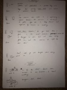
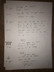
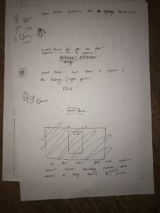
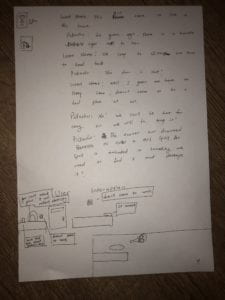
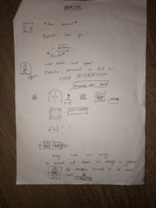
Since I had experience with processing from before while taking Interaction Lab and I want to make visuals, I decided to use processing for this project. First, I sketch out what the visual is going to be like and the necessary components that are needed.
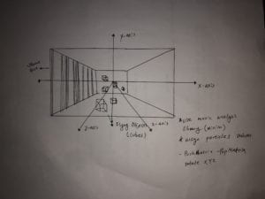
To start the processing, I added a library named minim that can analyze the mp3 file. There is a sample that I found attached in the library folder that generates random cubes and when you put in a music file it will analyze the data of the music and so changes the velocity of the cubes. 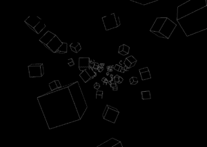
The last thing is the frequency box that I will create that give the illusion of traveling through space. This is the source code and there will be comments that explain the function of the code: CLICK HERE
Presentation
The presentation was not the best I can do. I was overwhelmed because I couldn’t think of any idea that can make the user more close to the experience created by the project. My initial intention is to create this “zoom in “optical illusion” when the user looks away from the screen. But it would be better if the user can immerse themselves into this visual world. I thought of making glasses where I can put my phone but it is too risky since it can fall down easily. In the end, I realized I could of use VR goggles which I never thought of at the beginning instead of making the user stand and stick their head into a cover. I actually did try to implement it into VR-mode but I couldn’t get my hand on VR goggles. The participants were really interested in the visual effects and were a little shocked when it started because the visual was really strong.
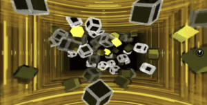
Video: https://veer.tv/videos/project01-289373?start=20.314511189
Conclusion
Although the visual is there, the presentation of the project was not enough. Part of the reason is that I was not clear about the focus of this project in the user experience rather than the technical component. In this project, I learned how to use a new library called minim and how to adopt 3D animations in processing to work with sound. During the development, I tried to manipulate the z-axis by giving it directions. I failed due to lack of skills and opt-out from using it. One thing I can improve is to focus more on user experience by asking more people to try out my project and having them to give constructive criticism. I can use a VR-goggles or some sort to make the experience more immersive and pleasant. Moreover, I could guide the user and show the goal of this project by following a prompt which will require rehearsal beforehand. I could ask how the user feels at the end and whether they feel that everything around them is pulling in when they finish. Lastly, an experiment could be adapted to show the full effect of this visualization. For example, I can show a picture and ask them how their vision differ before and after seeing the visualization.
