Final Project Documentation – Ying

<NATURE IN MOTION>

<Link>

<Description>

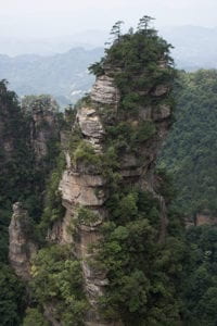
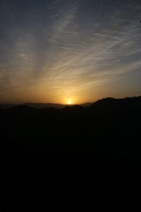
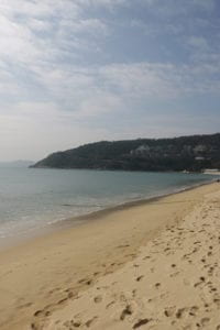
For the final project, I will be working with Murray to create an interactive image gallery. We wanted to utilize our resources and my partner had a lot of pictures on nature. Our idea is focussing on a topic like nature and to showcase and to bring expression through images. After looking through all the images that Murray had taken. We decided to settle on five different categories: forest, mountain, beaches, sunrise, and temple.

<Process>

The aesthetic and the layout of our project was inspired by azab.es which I found during the research for the net-art assignment. I loved how the web creator utilizes the texts perfectly with animations and color change. The web layout is simple with black and white color. Users can move around the image as they move around the mouse cursor. When you click into the picture you will get more details about that image with texts and more images.

To start the process, I made the main page that began with an animated video. We found this cool short clip of blowing tree leaves from motion-places, a free online video stock that we can use for free. For convenient, I found this jQuery library called vide which allows you to plugin video as a background.

Then I wanted to introduce our five different categories. To introduce our categories, I wanted to follow the same style as my comic project with parallax. For convenient I used a jQuery library called Rellax. This allows me to control different elements at a different speed. The clickable images that will link to its own page will be fixed. The parallax effect will be assigned to the big white text, NATURE-MX throughout the page. To blend the text into the page more as a background, I added the no-select style that disables text highlight.
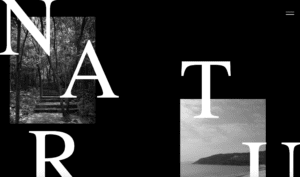
For the individual pages, we added the pictures which are featured on the main page at the center. On the right bottom corner, we added the location of where the picture is taken and the name of that specific picture. We added a water ripple effect to the picture whenever you click on it and move around the picture with the mouse cursor. To distribute the work equally, I suggest several tasks for my partner to complete on his part. We came up with the idea to make the individual pages like a canvas that allows us to mix-match different images of the same category. We thought that it can have an influence on emotions. These images match well because they have a similar tone in color. But the different shots of the image allows us to create a completely new image. To make the image appear we created an on click background on both sides of the main image. This allows the user to add and erase images.

<Reflection>

At the end, I wasn’t so satisfied with our result. Although the website looks nice overall, it lacks in content. To avoid this problem in the future, I should have made a thoughtful plan and having a purpose while creating a project. In regard to this project, we should have made the interaction more obvious such as adding a mouse indicator whenever it hovers to the invisible buttons. Last but not least, there is some work to improve in partnership. I felt that there is a lack of communication and collaboration. Sometimes, I felt that I took the task on my own.       


<Credits>
Vide Plugin

Parallax Plugin


Project Proposal – Ying

Concept

For the final project, I will be working with Murray to create an interactive photo gallery along with some stories about the place. We’re doing this because we thought that photo shouldn’t just be visualized by the audience but also it should expose the audience to different senses such as hearing. Moreover, we planned to add more features on each photo such as temperature, time, and specific location. This allows us to show our picture and convey a message that we want our audiences to interpret. We simply want to bring the photo back to life.

Inspiration

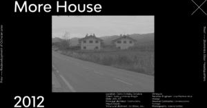
I found this creative website which I think some of the content could be suitable for our project. It listed several detailed information about the picture like the material that the structure is made out of, the location and the designer of the building, etc.

https://www.azab.es/projects/more-house

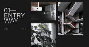
But we wanted our main interface to be a scrollable one with content that we can click on to see the details. 

https://moves.basicagency.com/01

Production

We want to add as many interactive as possible but also make it visible for the user to interact with. We plan on to utilize the mouse cursor and tell the user what to do by showing a small text over it. We will add sound effects to several texts that users can ho-over and we will make it visible by making it bold or making it stand out. The overall aesthetic of the page will be modern and clean will minimal color mixing, so we might just use a background that’s mostly black or white. We also planned to add a video by showing a zoom-in clip to the specific location by using Google Earth Studio. 

Week 11: “Web Work – A History of Net Art” Blogpost – Ying

After reading the “Web Work” by Rachel Greene, it helped clarify what net art really is. Before that, I don’t really know what it was and I was fascinated by the fact that it was created by accident during the development of computer technology. People never thought of using the internet as a material to create artwork that contains so many meanings and ideas. It is distinctive too, in its style and the way it is created. These artwork are powerful, being transmitted all around the internet. They spread like “virus” which I can make a reference to modern era memes. Prior to all of that, people only use the internet to create a personal web page that contains only information. 

Today, net art has developed at an unprecedented level. Besides from the old way of creating net art with code, many artists are dependent on technology such as Sketch and Apple Pen to create artwork. Not only it creates a different style of art, but it helped human to express their ideas easily.

Net Art is visible everywhere in our lives from app interface to the funny memes on your social media. I believed it will the old traditional way of hand drawing with physical materials. 

Week 11: Net Art Project Blogpost – Ying

https://wimdelvoye.be

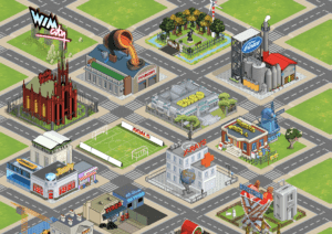
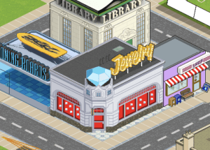
I found this website called Wim Delvoye that display artworks on the website. Its main page has this sim-city like background which I found interesting. It is interactive too and you can click on these building which will redirect you to an artwork that is related to the building. For example, if you click on the jewelry building, it will show you an artwork about jewelry.

This reminded me of the game that I played when I was very young its called sim-city. I love this game a lot so that’s why I love this background because it is so relatable to me. 

Final Project Proposal- Ying

Perspective and Context

One thing that stood out to me while reading The Century of Kinesthesia by Guy Brett is that the sensation of movement from an artwork does not come with motion but rather the technique that it uses to carry space, time and energy. Just like the author states “there may be an object which literally moves but is stultified and stale in its formal concep-tion; similarly there are works still done in art’s most ancient modes – such as drawing – which are more radical and dynamic in their formal structures” (5). Also, humans are constantly exploring the space around and the universe. Such curiosity is often satisfied by the work of art that offers the sensation of movement and space. For this project, I will be offering that sensation of movement and space through light composition along with the motion from the motor. 

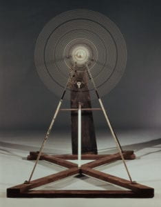
The first artist that I look up to for constructing this project is Marcel Duchamp and specifically his work on the “Rotary Glass Plate”. Although this work embodied a simple motion in rotation, it really magnifies the sense of optical illusion from the drawing on the plate. It affects our brain magically that we sometimes forget about time because we are so deeply intrigued by it, which Ponty talks about in his perception writing. It could relate to many things in our lives too such as air current, plane turbine, etc. It is also these things that are related to time and space which is why it has the power to satisfy human curiosity in exploring space and the universe.

Another artist is Bridget Riley and his work “Blaze”. This is a classic optical illusion art. This artwork is best described by Brett that the technique which is the pattern in “Blaze” can carry a force of power in movement and space without actual motion. This artwork has been made into a real moving device that follows the same zig-zag pattern in two pieces but rotates in a different direction. This magnifies the optical illusion even further. 

In my project, I will keep my composition and the structure simple since all of these artworks that I looked up is minimalistic yet powerful enough to give that sense of movement and space. I planned on doing the rotational style motion for my project which I thought is more suitable for an optical illusion. 

Project Description

I’m not totally sure what my project is going to look exactly. One reference or inspiration is this video: https://www.youtube.com/watch?v=9SyrUV7sJ8Q. All of the motion is rotational and the shape is often the same may be a different size. However, the opposite direction of the rotation allows us to sense that movement because it gives that contrast of the same exact shape. The s-shape in the video reminds me of real-life objects and animals like the seagull flying in the sky. 

I will most likely use el wire because I felt that I’m most comfortable using it and hope to continue on its usage with the motor. I will use at least two motors that rotate in the opposite direction. The overall size of the presentable project or the final product will be no more than around a meter. 

Production Schedule

  • 04/24 (wed) – Project Proposal Due
  • 04/25 (thu) – Project Approval
  • 04/30 (tue) – Designing 
  • 05/02 (thu) –Gathering Materials 
  • 05/07 (tue) – Prototyping
  • 05/09 (thu) – User-testing, decorating and finalizing
  • 05/14 (tue) – Pre-Final Critique
  • 05/16 (thu) – Project 3 Presentation
  • 05/23 (thu) – Project 3 Blog Post Due