Week3-Javascript Exercise – Milly Cai

the link

https://imanas.shanghai.nyu.edu/~yc2966/week03_js_exercise/index.html

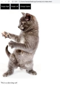
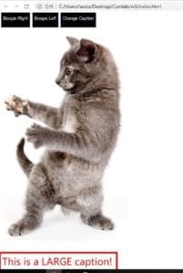
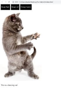
The screenshot for the result


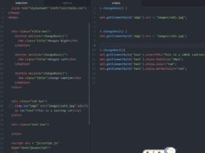
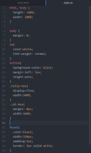
The code

html&js

CSS part

The problem met in the process

In the beginning, I’ve got in the problem with the border of the bottom sentence” it’s a dancing cat!”. The border didn’t show whatever I did with the getElemetById,  getElementsByClassName or even change the setting of the border… With the google developer tool, I notice what’s strange is that the area of the bottom text box which I set to contain the paragraph almost cover the whole html page. I’ve been troubled in this for a long time and cannot figure out the reason. Luckily, with the help of Cindy, I delete some useless properties such as display: flex and float for each box, and set the style of the border before I change the color of it in js. It finally works! As I don’t have much experience with coding before, this exercise does help me to learn more about the syntax and ways that the codes follow.

Week 3 – Comic Idea – Milly & Ying

Inspiration

As for our interactive comics, the inspiration comes from the Pokemon Go’s movie: Detective Pikachu. It’s a really quite character, thus, we would like to design an adventure with Pikachu.

Storyline

We suppose the reader, you(the reader) plays the role of the companion of the detective Pikachu.  You and Pikachu are good partners that have solved a lot of tough cases. And one day, the new challenge appears——investigate the abandoned and shabby apartment building, which is said to be haunted.

This task comes from a client who’s working for removing the abandoned buildings in an old district. Unfortunately, they are stuck by several weird accidents: something unknown is disturbing their work. Though many people believe it’s probably because of the ghost, you and your lovely companion Pikachu don’t really trust it. Therefore, you come to the place at night to seek for the truth… After a series of events, you finally get the answer——it’s because of another pokemon, whose master has been dead for years. He tries to protect the place where used to be his family…

Illustration

Though we plan to match the style of background scenes with the characters to make the scene look better, it probably wouldn’t work due to the time limitation. Thus, it’s probably better for us to transform the picture with ps or other picture-dealing apps do keep a similar style.

As for the interaction part, we first plan to continue the conversation by clicking or scrolling; besides, as for the investigation part, the readers could go and examine the surrounding by themselves. And we also try to let the characters interact with the plot with some change of gestures or facial expressions.

Week 3 – Basic HTML/CSS website – Milly Cai

Link to my website:

http://imanas.shanghai.nyu.edu/~yc2966/week03/intro.html

As I add some little interactions to the pages, I take a short video to show them clearly.

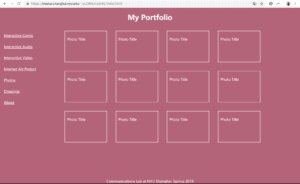
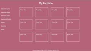
As for this  assignment, I mainly improved the previous one made on Monday, which looks like this, because I quite like the background color and don’t want to abolish it:
Besides, I also refer to the structure of the first portfolio website I’ve made in the first week, which includes the thing that I mainly would like to show on my website.
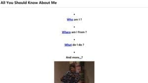
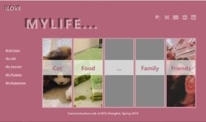
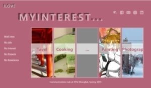
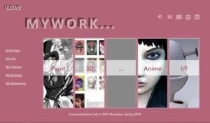
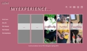
As I searched on the internet to see some good examples as inspirations for my assignment, I found it would be best for the visitors to get to know you immediately when the designers put the straight look picture gallery at the cover page of the portfolio or personal websites. Thus, I rearrange my about page into the current version, which begins with four pictures that lead to four categories: my personal life, my working process/projects, my interest, and my experience.

And there are also links to the specific project of the pictures in the subpages. The gray pictures are set for taking up the blank spaces that I have not come up with an idea.

Here are the pages:
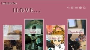
    

As I want to add some interactive element in these pages, I search online for some tutorials and learn how to make the texts or pictures zoom out or change it’s color when the mouse is above it. I play with the flex boxes with or without the borders to show my pictures.

In the beginning, I really got some problem with the big title in the corner. Which I found the margins and paddles do not fit my expectation no matter what I do. Thus, I check it’s detailed information with Google’s developer’s tool and finally get it solved. However,  another existing problem is that it never shows the blank spaces between the letters that I typed in. As a result,  all the letters come out with no intervals and make it not easy to read. I hope I could solve this problem later in class.

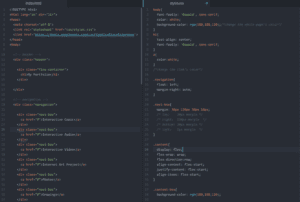
Here’s the code I used for the title and its shadow, I create two boxes of text with “after”. This function lets the following words locates according to the existing one.
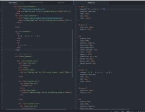
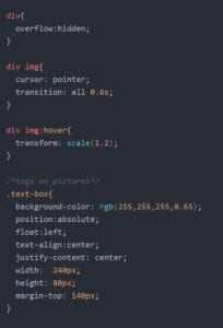
This is the code I used for enlarging the pictures I put in the borders but also hidden the exceeding part.
  

This part is for the links to change the size and shape with the mouse is above it. In addition, I found transition quite useful as it slows down the speed to change and make the movement more natural.
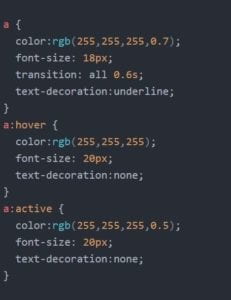
Conclusion:

I think what I still need to improve is that the arrangement of the page is not smart and clear enough. Besides, I also notice that some of our classmates use the gradient effect to deal with the background. It looks so beautiful and I might try next time. 
Week 2 – CSS Exercise – Milly Cai

Here is the link to my portfolio page:

https://imanas.shanghai.nyu.edu/~yc2966/week02/index.html

The final version of the portfolio page:

The coding process:

I add some comments to the style that I’ve added to this page. (especially the things I just learned and felt necessary to remember.)


Conclusion

In this work, I tried to change the whole page’s color as well as the words. At first, I found that neither did I change the color of the font in the body nor in the class of navigation/navi-box, which are the classes including the links, would change the color of the links. Thus, after searching on the internet, I found the easiest way is to redefine the text color of “a<>”. This just likes what we do to the h (heading) function. Besides, I’ve also got confused with the usage of some properties, such as the difference between float and text-align; the difference between align-content and align-items… With some practice and online tutorials, I think I could understand them better.

Week 2 – Response to “Understanding Comics” by McCloud- Milly Cai

In “Understanding Comics”, Scott McCloud offers us a very taking analysis of the comics, which is the art form that is usually ignored by mainstream art. Though being a comic lover, I have not really considered this art form with that much. Thus, McCloud’s work does let me understand both from the side that how this medium conveys the information and also how do we readers receive it.

Take the definition that McCloud gives to the comics, for example, he defines it as “juxtaposed sequential art” (9). I just found this concept is quite interesting that comics have a special way to explain the idea of spacial as well as the time. Not like film or other art forms such as photography and sketch, comics tries to express the timeline of a story in the same panel, the same space (on the same paper). Time-passing is expressed by the sequential pictures that might describe the process of a movement (the blood bleeds, the change of facial expression…). Besides, another interesting concept that he has mentioned is the idea of”gutter”. This is a typical way of information indication in comics. Just like McCloud says, though there seems to be blank, you just know that something must be happening. It’s actually a smart way to deal with the change of time and space. Something is omitted, however, even better expressed. This is a way for the readers to involve themselves in the work——to fill this blank with their own imagination and emotion. Or in other words, “closure”, as McCloud says. This method is also common in other forms of painting and drawing. For instance, in the traditional Chinese paintings, the artists love to apply this skill to create a touching atmosphere and invite others to fill in this blank with their own thoughts. I think probably this also accords with what McCloud explains further in the later part——the core purpose that the comics to convey the information is to get people themselves in the story.

Like he discriminates pictures from the writing as the former one is “received” information, while the latter one is “perceived” (49). What makes comics distinctive is that it combines both of the above. It applies the iconic items to let people put themselves into the characters and their experience. This also reminds me of the reading in last week “The Medium is the Message”. As McLuhan believes that the medium itself also has a great effect on the conveying and understanding of the information it takes. The objects just extend our self-consciousness, they also indicates the information. The icons in comics exactly prove this idea. That’s the reason why the characters would be simplified—— it’s because the more general they are, the more people could be represented by them. To this extent, the way they dress, the words they speak could all be a symbol/icon to understand the general identity of them.