The interactive comic we created is heavily inspired by the Japanese visual novel Zero Time Dilemma. We really thought that this visual novel was something we could really take inspiration from and develop a cool take on that same type of storyline. We ended up opting for a style that ended up resembling more of a visual novel than that of a comic as we thought that that way we could better convey the storyline the way we wanted to, as well as it being easier for us to implement the characters and background within the code.
Plot Summary:
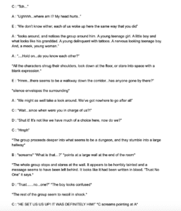
The plot for the story starts out with you being the protagonist waking up in an abandoned parking lot with no prior knowledge of how you got there or what led you to wake up in this parking lot in the first place. Suddenly a figure appears in the distance and the screens cuts to darkness, next thing you know you wake up again and you are in a dungeon. In the dungeon, you are surrounded by other people which seem to be just as confused as you are about where you are and how you got there. There are several people there including a little boy, an older man, a criminal looking man, a young woman, and a teenage boy. Once this is established you and your new found group of friends decided to explore your surroundings, however, there remains a lot of distrust within the group which causes tensions later on. Exploring the dungeon you then come on to other sites, such as an infirmary, a laboratory and a kitchen. As the user, you will then be given the option to choose which one to explore, each one with a different outcome. However, only after choosing to explore the right one will you be lead to the final ending, if you choose to explore the wrong one you will be prompted back to the page where you choose which place to explore.
Layout:
In order to make the process of implementation easier, we decided to use a visual comic style which then made it so that it was easier to make the code for the backgrounds and the characters. The background stayed consistent within the frame while the characters switched around as the different characters spoke different lines. The dialogue for the comic was under the frame for the background and would continue as you pressed the continue button. Like stated above the protagonist is presented with a choice of three different places to explore, however, only one of the options ends up leading to the correct and final good outcome. This was the interactive aspect of our comic as you had to play along with the storyline and kinda just go through the story to see if you had made the right choice or not.
The Innerworkings
The comic was built on an HTML page and a CSS page, this was possible because of the relatively easy structure of the comic using the same backgrounds and just changing out the characters. Some of the elements used were divs, p tags, and percentages. For the visual aspect, I used a Wacom tablet to draw out the backgrounds as well as the characters for the comic. Since we were going for more of a visual novel type, I did want to incorporate some comic type imagery to keep the idea of this “interactive comic” because of that I didn’t want to make the images too realistic so I decided to keep them pretty simple, mostly working with shading to add depth to the visuals and then adding a black outline to most of the drawings to further add on to that comic-y feel I was going for. For the characters, I wanted to go for something that kind of encapsulated the whole post-apocalyptic narrative of the story. For this, I decided to draw out each of the characters faces and then leave their body as more as a blank blob shape because I felt that that was something that kind of left you wondering like “what is going on?” and added to the feel of the post-apocalypse. To further this I also ended up deciding to keep the characters in black in white and also just mostly relied on outlines of their faces and made simple gestures to symbolize the different characteristics of their faces. One of the biggest aspects that I thought was the most striking was the fact that I decided to leave their eyes blank so that it really added to that eerie feel. I think that keeping the characters simple also made it so that the user would focus more on the color scheme of the background and what the writings on the walls of the backgrounds were saying which I think was more important.
Final Thoughts
Ultimately this project ended up being much harder than I expected it to be. Using the Wacom tablet was really hard for me at first because I had never used one before and it was really different from drawing with a pencil on paper. The perspective aspects of some of the backgrounds were also really hard to do and took a lot of time and designing for it to actually look like a well-made perspective piece. I had actually started out trying to make the graphics in photoshop but I ended up finding that that was kinda hard to do so then I switched over to using the Wacom tablet, this ended up taking a lot of time because I had already started the process on photoshop and then I had to switch over to a new software (I ended up using Sketchbook) after that I did end up transferring the images back to photoshop and using some of the tools we learned in class such as the blur and crop to give the images a better look. This process also took a lot of time because since I don’t have photoshop on my computer whenever I had to use the program I had to make sure to be in the academic building. In the end I think there were creative differences between me and my partner because my characters didn’t end up being the ones used in the final version of the comic, instead, he opted for the characters which had already been created for the original comic. However, I do think that our comic ended up being pretty good and it was an interesting learning experience.
The Comic can be viewed at http://imanas.shanghai.nyu.edu/~arz268/communications-lab/Comic/