For this documentation, I will document and analyze my previous works for color studies.
Assignment 1 Chromatic gray saturation
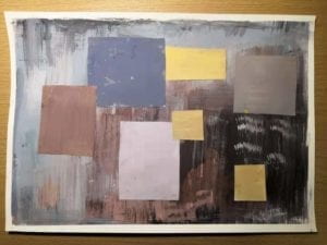
To make a chromatic gray color pattern, I mainly mixed white, brown and dark blue to create prayed colored. While besides the grayness, I also paid attention to the composition of my painting. As you can see in the painting, the left upper part is mainly blue which I attached dark blue and brown patterns to make a contrast. And the right button part are dark brown and back, which I put the yellow and pink patterns to make the background obvious.
Assignment 2 Chromatic brightness
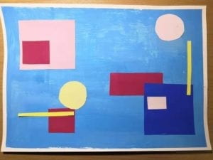
Fo the brightness practice, I used a sky blue as the background. And same as the previous painting, I used color of different hues to create a sense of arrangement for the canvas. As I placed light yellow and pink over patterns of read and ultramarine (some places theater way), I make the painting not flat but balanced not only for brightness but also for composition.
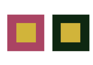
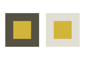
Assignment 3
For assignment 3, I exam the color effect by altering the surrounding of a single center color. The center color I picked is khaki yellow.
Assignment 3-1 Brightness
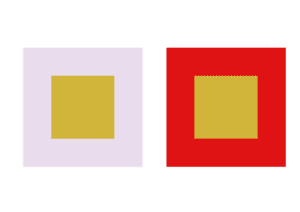
For first experience , I tried to present different brightness of the center color. I used gray pink to lessen the brightness of center color and made it dull, while used bright red and make a contrast with the center color thus to it stand out.
Assignment 3-2 Hue
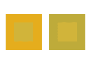
In exercise 2, I used colors which are both very similar to the center color to present different hues of the center color. As shown in the image above, the left surrounding color is more yellow than the center color, which to some extent makes the center color look like green. While on the other hand, the right surrounding color is more like green, which keeps the center color as yellow.
Assignment 3-3 Saturation
For exercise 3, I got a little confused at the first place about how to change the saturation (in comparison with brightness). When I was observing the color effect, I thought that maybe I can make the change by alerting the saturation of the surrounding colors. Thus I used a less secreted red and a dark but very saturated green. The interesting thing here is, though I though the more saturated the surrounding color is , the less saturated the center color will be, for this exercise, it turned out to be the opposite. However, I am not sure about this conclusion because it was only my perception.
Assignment 3-4 All elements
For exercise 4, I tried make the same center color look different with hue, saturation and brightness. I took experience from precious work to change the hue, saturation, and brightness of surrounding colors to alter the corresponding elements of the center color. Thus, I used a dull, less saturated moss green, to make the center color look brighter, more saturated and yellow. While on the other hand, I used a bright, more saturated, warm gray to make the center color dull, less saturated and more like clay yellow. (Here the saturation of center color changed oppositely to that of surrounding colors, which is contradictory from exercise 3).
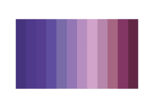
Assignment 4 Color sequence
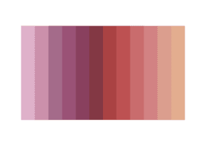
For the first sequence, I changed the hue and brightness of the color.
For the second sequence, I also change the hue and bright, but with a different order (darker at the two sides and brighter at the middle).
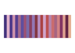
When I combined the two sequence together, since the elements of color sequences (especially brightness) changed in a different order, the combination makes an extra effect that the saturation of first sequence also seem to changed. The contrast of color hue also creates a moving effect.
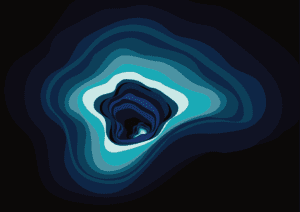
Assignment 5 Kinetic Painting
Before I started painting, I looked through those artists’ works mentioned in our class. I found one common feature of their works is that most of then have used geometric shapes to create kinetic effects. While observing their works, I was thinking that since movements are usually dynamic, what if I use arbitrary lines and shapes to compose the painting? Will this arbitrary shapes more powerful than geometric ones to express movements? Or it will be the similar, or even the opposite? Bearing these I started my painting by first looking up examples online.
I got inspiration from some graffiti portals on Pinterest.com. This kind of wall paintings use arbitrary waves as their main shapes. By composing with different sizes and color elements of the shapes, these paintings are able to create a three-dimensional gateway effect upon a first glance. These are some examples:


My painting especially got inspiration from one work of German street artist 1010.
I took the core color from his work and added in colors of differen
t hues, saturation and brightness. With my own creation, I made an immersive whirlpool by adding the gradation and making contrast of colors in the painting, which seems that there are more space and light than we see from the surface.
I named this painting Endless.