Communication Lab Final project (Fall 2018)——Skye Gao (Chen)

Final project: “A friend of my friend died yesterday”

Partner: Alex Zhang

Professor: Ann Chen

Date: 12/11/2018

Link:http://imanas.shanghai.nyu.edu/~xg679/Commlab/CommlabFinal/desktop/

  1. Concept and design

Our project dives into the topic of digital death and its presence on various social media platform. With media communication permeating our everyday lives, fundamental topics of humanity such as death, loss, grief, and mourning are increasingly transferred to and negotiated in media environments. Social media platforms with their strong focus on emotions and interactions are especially prone to expressions of grief and mourning, and provide an expansion to traditional mourning spaces in society. Holding the questions whether social media is facilitating or missing certain norms in comparison to traditional mourning rituals, our project aims to approach this controversial topic by visually displaying pieces from various social media sites which represent the incident, subsequences of and social reactions to one’s death online.

With the pre-context “A friend of my friend died yesterday”, the project is settled in an intermediate space between artistic fiction and real-life commentary. It consists of mock-ups of the interface of macOS desktop, Facebook, YouTube and wechat, which are connected by imitating the user experience of the macOS notification system. By re-creating such experience, we aim to emphasize the digital nature of our project, and thus immerse the audience into the context we designed.

The whole project starts off with a preface of our project which is settled in a window on the “desktop”. The introduction includes the fictional context “A friend of my friend died yesterday”, and several question related to this information which we expect the audience to take away while going through the following content. We also place three notification boxes on the corner of the page which will navigate the user to the next stage.

The following part of our project is the mock-up pages of three social medias: weChat, YouTube, and Facebook. We created gif pieces which represent the incident, subsequences of and social reactions to one’s death online, and arrange them according to the layout of these interface. Users can click into the hover boxes on the interface page to see the detailed content of that pieces.

The project is not set with an ending because we want it to be an open discourse and we expect the audience to think deep on this topic of death and digital age basing on the fundamental questions in the preface.

Sources:

Do not Click ‘Like When Somebody has Died: The Role of Norms for Mourning Practices in Social Media” by Anna J. M. Wagner.

User Experience of a Heartbreak” by Sarah Hallacher.

2.  Process

I researched and chose the project idea at the very beginning because this is a topic I had been interested in for a long. While in the class when we shared our ideas, Alex showed great interests in my proposal so we decide to work on it together.

In my proposal, I planned to designed a storyline to present the concept. However, after professor showed us another project by Sarah Hallacher “User Experience of a Heartbreak”, which is also a social media related topic, we were inspirited by its display of the information and decide to take this idea as our project’s form. Based on that, we first discussed what kind of information we would include in our project and sketched them. At the first place, we have pieces from more social medias like Instagram and google chat, however, consider the content and workload, we narrowed the scope down of the presented three social medias.

I first started working on the Facebook page to ensure the feasibility of our plan. I used Canca.comand Marvel.comto edit images and used this online gif generator to make the gif pieces. Then I mocked up the Facebook page in the same way and used the hover-to-show texts examplefrom W3school to indicate the entrance for display.

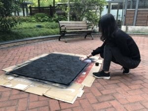
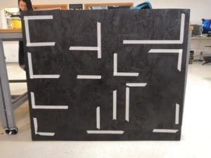
Then I imitated the desktop interface of Mac while at the same time Alex worked on the YouTube page by creating the two videos: One is about the memories of the deceased in which we used edited photos to make up the video, and the second one is a pieces of funeral.

In our first round of user-test, we presented the parts of mac interface and Facebook page, and we got the following main comments about both of our content and visual layout, and made changes accordingly.

  • As the first version of our desktop is like below, it did not look like a desktop but a slide, so we alter changed it to the current version.
  • The Facebook interface as well as the description we added were confusing, but we did not change much at last considering the time limitation. Also, we expected that when the remaining parts pf project is finished, itwill make more sense for the user.
  • Our idea was fully expressed by going through these parts, so we later added an introduction part at the beginning.

After the user test, we continued to finishing the remaining parts of wechat and YouTube and made modification according to the feedbacks we already got. While Alex was continuing to build the YouTube page, I changed the background of the desk top and added a preface to the mac interface with a typing effect which I learnt from this online example.

3. Feedback and future improvement.

From both user tests and presentation, people really appreciated our concept of death and digital life and the editing work we have made for creating the gifs and interface of social medias. However, we also got the following critiques which are mostly related to the conveying of our idea:

  • There are too much is too open space that people get confused whether this is a real narrative or just a general commentary, which makes them unable to follow the flow at the first place.
  • The setting “a friend of my friend” is too ambiguous.
  • Despite the heavy content, it doesn’t really have an emotional draw because it’s too generic.
  • It might not have enough visual cues to make sense.
  • There seems to be a disconnect as to whether it’s offering insight as to how one should react to death in the modern age or is offering a commentary of how people do react in the modern age, which is similar to the first one.
  • The description besides the images are not consistent and some of them is not complementary.

So in relation to these critiques, people also provided corresponding solutions:

  • The general flow seems to be through questions, however, it might make more sense if it flowed through a specific narrative or developed questions more relevant to a specific narrative.
  • It can be better to create a more linear storyline rather than just a demonstration along with possibly a guide towards how to function.
  • Add text or names can possibly make better personal connection
  • It would have more of an impact if it was more exploratory of a specific narrative which would, in its execution, develop a deeper concept and message.
  • The level of message and emotion of each message should be more consistent.

Drawing together all these comments, we think the main problem of our project is about the conveying of messages and ideas. The audience’s thinking flow should be clearly guided and progressed by our project. Thus for future improvement, we think we should focus on improving the flow of our project in a more organized. Like the audience suggested, we can arrange our information based on a storyline or place them in a specific scenario which can better help users to make personal connection. Also, we need to rephrase the description/interpretation for each images so that the user can understand. Moreover, we think implement more complementary messages into the display can make the content of our project more rich and propounding.

UX Design Project Portfolio (Fall 2018)—— Skye Gao

Project: NYU Shanghai bus capacity service

Partner: Lach Mundair

Professor: Azure Qian.

Date: 12/16/2018

Motivation

The motivation of our project comes from the direct experience of NYU Shanghai shuttle bus system. All NYU Shanghai students and faculty who live in the dorms face a similar problem. The NYUSH shuttle buses designed to transport between the dorms and the Academic Building often fill up and leave before their scheduled departure time. Being aware of our peers’ wish to have an affirmation on bus capacity and a more reason bus schedule, we wanted to develop a system that can place our school’s bus system into a virtuous circle. 

In this sense, our product aims to give people a convenient way to check bus capacity to know when they should be heading down to the bus, and also gives them the ability to update the system for others. 

Based on these basic ideas, we started to design the user journey and identifying our core tasks:

The first version of our core tasks have two parts:

  • Check availability

Users will check the availability of seats before heading for bus, so that they will decide when and whether to leave.

  • Scan card to update

Each user will scan their card when getting on the bus to update the availability, so that following users will be able check again.

Considering the time span, we decided to focus on the check availability part, which is about app design on smartphones.

From our brainstorm, we identified our target users into two groups: bus riders (students) and bus drives, and our initial plan was to design two different app services on the smartphone for each group to which extent the bus is full. The goal for the project will be minimizing the time wasted on catching bus/missing bus, and saving students time to the most. We also expect this project being beneficial for the school bus system and widely applied to other bus services (company, public service etc.).

User Research, Personas, and Scenarios

Based on our identification of target users, we started our user research. Considering the population and variety of our target users are quite small, we decided to only use the method of interview rather than survey to find our user’s pain points and interests.

Lach interviewed the group of students and I group-interviewed three bus drivers, and we built out user persona based on the results from our interviews:

  • For the students, they all show great interests in our design idea but holds the concern of how we would implement it with physical devices.
  • While for the drivers, though thinking it is a good idea for students, they did not find it necessary to include them as users. They did not see the exceeding advantages of this system for them than their old experience (which are counting numbers and leave based on experience). As they said, most of them are more or less nor techonoligical-inesitive, some of them even seldom use WeChat scanning. Rather than online channels, they preferred physical approaches which should be as explicit as possible. Such feedback really set us rethink about our targeted groups and our implement approaches.

Story Board

Based on the feedback we had from our interviews, we decided on focus in the students users. Thus we draw the storyboard about a students who is studying in the library and hesitates to leave for bus. The app we design however gives him the message he needs to know about the bus capacity and finally he happily gets on the bus without wasting time. 

Wireframe

Considering this is a service based in NYU Shanghai community, we did not use our own logo but design our product as a part of the NYU Shanghai WeChat official account. Thus, our style is very much WeChat based.

Prototype

Based on wireframe, we used Marvel to make our first prototype. (Below is the user flow of bus from AB to Pusan).

Since we are designing a NYU Shanghai service, the color template we used is that of the official color template NYU has provided. And the color we actually used are HEX 57068c with different opacities.

Usability Test

With our prototype, we has run several round of user tests and made the following changes according to the feedbacks.

First round suggestions and changes:

  • The color used for the circle is too bright which was not very user-friendly, so we changed it to the  circle below:
  • The parallel scrolling bar of the bus schedule was a little bit confusing because the user had to think about which one to scroll and what will happen with the other one. So we separate the scrolling bar adding a destination option interface before this interface:


Second round suggestions and changes:

For the second round, our users were more clear about what to do and what should be expecting, however, their comments were still mainly about the design of the last interface. Feedbacks we got were that the circle made a strong indication that this is a button and should be click into. So considering that, we removed the circle and replace it with a simple icon of bus and a notification of the left seats.

Third round (in-class presentation) feedback:

After we gave the final presentation, we got further feedback from our professor that we could actually utilize the “button indication”of the circle and make it more entertaining. We think this thought is very interesting and will think about it for the future improvement.

Below is the prototype demo of our product:

Mock Up & User experience demo:

Since the application service we designed in this class is only one part of the whole design plan, so we shot this user experience video to help demonstrate the whole experience of our product.

Special thanks to:

Professor Azure Qian

Kinetic Light Final Project: Re-shaping —— Skye Gao

Project name: Re-shaping

Professor: Eric Parren

Documented by: Skye Gao

Date: May. 23rd, 2019

Project Description:

Re-shaping is a kinetic collocation of lighting components  which creates generative motions with mechanical devices.  Contours of geometrical shapes  are sketched out on a black canvas by illuminated led neon tubes, and will revolve in space with certain degrees by servo motors. The project is designed to shape people visual perception of patterns by constantly modifying the collocation of grids. With motions from 2D dimension to 3d dimension, the project intends to extend of boundary of shapes and explores the perception of space. 

The project idea is largely inspired by artworks of two contemporary artists, Esther Stocker and Sebastian Hempel. 

Esther Stocker – Pictify

Esther Stocker  creates spatial installations that manipulate people’s perception of space. Her ideas about space actually emerges from 2D paintings: in many of her words, the space are constantly reformed generated by perceiving lines or patched from different perspectives. In a reduced language of form consisting of black and white lines and grids, her works explore formal boundaries and spatial structures by creating a space where he viewer no longer can tell where the floor ends and the wall begins. Though her works are not kinetic, they demonstrate very well that the visual perception is a main factor for spatial experience, and is the main visual reference for my project.

The works of Sebastian Hempel are as full of movement as the spaces presented. In terms of works that concentrate on the motions with only installation.  Those mechanical process have implications in terms of content, as all the aesthetic effects really on the motions of either installations or human movements. With a similar concept  as Stocker’s work but demonstrate in a kinetic way, his kinetic light sculpture, Leuchtstabbild (Lightbarimage), is a representative way of how space can be reformed with motions. 

Perspective & Context

Guy Brett approaches the concept of eye and body in his book by addressing that “the concentration on optic, the visual sense, as a vehicle for the exploration of movement and space/time, can be exploded, even from within visual are itself, by another tendency” (52). Such tendency, according to him, can be understood by and large as the separation of the visual form the other senses, or namely, the eye from the body. Through devices that “disturb, or manipulate, the body’s sense of space through a play the optic nerve”, kinetic art, allows for a “much more radical reorientation” of both out bodily experience and our thinking (52). In this sense, artworks by two contemporary artists, Esther Stocker and Sebastian Hempel, can be seen as various demonstrations of such concept of perceptual reorientation. Hence my project, drawn from the concepts presented by these artists, intends to be  a experiment of both lighting and spatial motions. 

Development & Technical Implementation

Materials: 
  • 1 * wooden background board
  • 1 * painting easel
  • 1 * Breadboard 144
  • 1 * Arduino Uno
  • 1 * USB A to B Cable
  • 1 * 12V power adapter (350W)
  • 1 * 5V power adapter 
  • 7 * flexible led neon tube (m)
  • 8 * servo moto
  • 8 * servo mount (small *large sizes)
  • 8 * laser-cut acrylic grid
  • N * Jumper Cables (Hook-up Wires)
Pre-construction tests & material preparation

According to my project plan, my project mainly includes two parts: lighting components and mechanical devices (servo motors & holders). The lighting will be attached to the laser-cut holders according to the shape, and the holders will be attached to servo motors by servo mounts, which will be stabilized to a background board. 

8mm flexible led neon tube

Since the lights only serve the purpose of illuminating shapes, I chose flexible led neon tubes as my lighting components. From my research, this kind of led lights can be easily formed into shapes and re-connected, and the lighting effect is suitable for display as it has a wrapper to diffuse the lights. I chose the thickness of 6mm considering the scale and effect of my project.

At the same time, I tested the servo motors that will carry and move the lights. There are two considerations for servos: the strength to hold and revolve the lighting units, and the components to connect  attaching stuffs. 

The servo motors I applied are 180 degrees Futaba S3003 and MG 996R since they have better strength and stability.

Futaba S3003 servo motor
MG 996R servo motor

As for the attachment,  I first build a servo mount prototype to test the strength and stability using robotic modules. The result turned out that the prototype was not very stable since it had too many attachment which could be loosen easily. Therefore, I took the suggestions from professor and fellows to ordered some servo motor as well as servo mounts online.  

Servo mounts prototype
Metal servo mounts
Latout design 

While waiting for lights and servo motors, I proceeded to design the layout of my project. Drawn inspiration from Esther Stocker’s works, the idea was to using grids to divide the canvas and thus to reform people’s perception of space. Therefore, I only set some of the grids to be moving while others will keep still. It was a long process to settle down the positions for both moving and still parts with considerations that they will effectively change the formation of canvas and won’t interfere with each other at the same time.

Layout design (physical sketch)

The design process goes from physical to digital as I firstly use paper-cut lines to roughly sketch the layout on table, and then proceeded to settle the specific positions within Illustrator.


The scale of the installation was originally 1.8 * 1.2 m. However, considering the time duration of this project as well as the availability of materials and space, I scaled down my project to the size of 1.2 * 1 m and changed the layout design accordingly.

Design of layout change in Illustrator (1.8*1.2m version)
Design of layout change in Illustrator (1.2*1 m version)
Construciton preparation 

After settled on the design, I started to prepare layout materials (including background board and acrylic holders). I found a dumped wooden board in wood workshop which can fit the size. With the help of Andy, I got to clean and prepare the board and proceeded to spray it black (as a backdrop for lights). After the background was prepared, I used tapes to mark the position of lights and servo motors according to the design. 

Original wood board
Sprays
Spraying the board
Background board with taped position
Piece of the girds

I then laster cut out the gird holders with acrylic. I set some of them to be only outlines of the shapes, while others a plan in consideration of the movement with servo motor. To better connect the holders with servo mounts, I also cut out the screw holes according to the hole sizes on servo mounts/motors to stabilize the whole assemble.

Also, as the led tubes had arrived, I cut out the tubes according to the full length of the each of grids 

CONSTRUCTION of installation,  programming & final result
Circuit for servo motors and lights

With all the materials prepared, I get to install all the components together to the background board. Firstly, I attached all the holders to the servo mounts, and attached them  to the background board with hot glue. I also drilled some hole on the board the let the wires through.

Placement of servos and holders on background board

Then I attached all the lights to the corresponding girds with hot glue. However, the hot glue dried easily, so I further use super glue to attach them. The whole installation was placed on an easel for display.

With installation completed, I got to programmed the movement of servo motors. The movements were all 90 degrees based on their originally positions, and the order was designed to be perceived as random. 

1-4 types of servo mounts connection
2-4 types of servo mounts connection
3-4 types of servo mounts connection
4-4 types of servo mounts connection

The final result was presented and documented within a totally dark space in Room 821. (Video shown as below)

Presentation

Display during IMA show

The final presentation took place in Room 823 during IMA show. Audiences were viewing the project from certain as expected. From my observation, audiences were very attracted to the lighting effects a as well as the periodic movements. They found the lightings very “beautiful” and the motions “unexpected”. Due to the dark environment and the strong lighting effect, the mechanism behind the lightings was hard to be noticed, which helped to  concentrate on lighting effect and motions. Some audiences would approached to the installation to observe the mechanical movement, and would be surprised by some sudden moment as it was programmed to be random. Overall, audience could well perceive the changes of patterns, and the general idea was better delivered if with a little bit explanation. 

Conclusion

The whole process of building this project went through a long time duration and was an integration of research, test, construction and modification. Overall I am satisfied with the outcome. Though it was not the scale as I expected in project proposal, I got my concept expressed to the most through this concentrated piece. In terms of the idea of motional space, there is much room for exploration based on this project. From feedbacks given by audience,  it can be drawn that the perception of motion and space is not only influenced by shapes and lights, but can also be affected by speed and actions. For instance, with different moving speed of the grids, audiences had totally different feelings of space. Also, some different kinds of motions (e.g. smooth movement vs. shaking movement) add on different feelings of progress. Therefore, I feel like besides this project, there are many other perspectives  for me to experiment in terms of motion and space. 

NOC week 9: ripples —— Skye Gao

Link: https://editor.p5js.org/Skye/sketches/u0QRQ2n1m

For this week’s assignment, I utilized the concept of particle systems and created a simulation of ripples. According to one falling drop, there would be generated with constant  ellipse which shows the effect of ripples. I met much difficulties when trying to create peploses with a certain time period. As the for loop for particles is constantly generating objects, if I just simple set the color of ellipse to change, it would either create a disk by ellipse with gradually changed opacity, or it would disappear really quickly. After several trial and failure, I figured out that one way to show the regular pattern of ripple is to only display the ellipse with a certain interval. And the outcome looks like this:

There is still much room for me to explore with this sketch, as for this assignment I did not figure out how to let the ripple die out after some time while it is constantly generated. Also, I would like to further explore the particle system concept by creating multiple ripples and having a scene of rain dropping on the water.

NOC: Final Project —— Skye Gao

Project: Wings

Date: May 18th, 2019

Processor: JH Moon

Introduction:

My final project is about object simulation. I intend to simulate the motion of bird wing and to make some visual effect based on the anatomical movement with p5.js . The project has two versions: one shows the physical structure of bird wings, the other visualizes the appearance of wings by applying particles systems. 

Inspiration:

The inspiration of my project comes from some street arts that paints wings of human size with various art styles. One common feature for these kinds of wings art works are that, the audience are invited to become part of art pieces by posing with the wings. Also,  from my other class about 3D modeling, I learnt that wings is a common organic feature in many 3D modeling scenes and game design, which leaves the concept with much room for exploration and utilization. With p5.js, I would like explore this form of art by creating visuals of moving wings, and by utilizing tools like projection in the future, I would like to let the art piece to be immersive or even interactive. 

Related image

Ive Freya

Development:

Since my project really focuses on the object of wings, I started off with researching for and analyzing the anatomical movement of wings. 

how-to-draw-wings-ventral-dorsal-bird-2-1

how-to-draw-wings-ventral-dorsal-bird-2-2

With reference to the research findings, I divided the structure into several parts: joints, bones, and feathers; and based on that, I proceed to plan my project by breaking them down into different gradations: sketch, movement, and appearance. 

As shown in the sketch, I first planed to build the bone structure and joints with the basic movement, then I would attach feather structure to the bones by using the concept of springs, and finally I would visualize the appearance of wings by applying particles to the kinetic structure. My project were basically implemented according to this plan.  

Bone structure: 

To build the bone structure, I created the movement of joints (points) first and connected them with lines (bones). However, the way to design movement was tricky. I firstly tried to change the joints position with spring concept, but the wan points moving with springs is was not very regular and they would tangle with each other. So I proceeded to manually change the positions of the joints. I used the sin() and cos() first, but in this way, the movement was too stiff and the bones were stretching.


To solve the problem, I looked up more animated movement of wings online to study the organic principles, and I realized that the problem was each joint was not moving based on the previous one. The way joints are moving should be revolving around an axis. Therefore, I changed the code to achieve the effect. 

how-to-draw-wings-flight-animation-promo

Feather structure: 

After completing the bone structure, I then proceeded to attached the feather mainly using the concept of springs. I used lerp() function to divide the distance between each two joints into ten and placed one end of the spring over there. I then positioned the other end of spring based on the first one by using sin() and noise() to build the basic curve shape of wings and connected the points with springs. 

Two wings:

After having the basic structure of one wing, I used class systems to duplicate and flip the wing to make a pair of them. The final result for the wing structure looked very organic and really met my exception. 

Link for p5 demonstration: https://editor.p5js.org/Skye/sketches/4ycJm0eZg

Particles:

With the anatomical structure of wings, I then tried present the appearance of wings by attaching particles to the structure. The outcome looked like this:

Link for p5 demonstration: https://editor.p5js.org/Skye/sketches/ZVm2FPYOo

Presentation & Future improvement:

For presentation, I showed the two versions of my wings, and got feedbacks that I should as I have two version of the wings: one is realistic simulation, the other is more about artistic representation, I may be should choose one direction to focus on and push it to the limit. 

Due to my intensive schedule during the final, I did not fully achieve the result of my project as expected, which left much room for me to further develop it. Based on the feedbacks and my reflection, I think I should have these future improvements:

  • Make the wings structure & movement more realistic and organic by experiencing with the variables;
  • Explore with the particles to create different kind of visual effects of wings (e.g.. color, shapes, lights);
  • Create some scenarios by adding some background or decorations in the canvas;

In all, it was an challenge for me at some stage but I really learnt a lot from those theories and concepts in class. I am especially thankful for all the help and support professor Moon had offered us. It was a real pleasure to be in the class!