I had actually seen the picture of Molotov Man before I read this blog post, and it was nice to understand the context of the issue because I didn’t understand any of it when I was in middle school. I read the short like it was a story, and I’m not sure why, but I felt a sort of nostalgia for this feeling, because it was like a run back in history. It is also one of my fears, that I would accidentally copy someone without knowing so, accidental copyrighting. I guess I’m happy that I read this story because it gave me some background as to what would happen, and that it could be solved, but overall the story was interesting and I enjoyed the perspective and views Garnett had.
Week 7: Response to Ecstasy of Influence Vincent – Moon
One of the things that I have always thought about was the difference between plagiarism and inspiration, and reading Lethem’s “Ecstasy of Influence” kind of gave me a understanding of what is considered as influential rather than plagiarism. From what I got, under the right contexts, doing something similar as someone else shouldn’t be looked down upon, rather its a phase for the creator, to understand someone else’s art form is the first step to understanding your own. Lethem says that by accusing others of copyright, “you attack the next generation of creators for the crime of being influenced.”
Week 06: Podcast Blog Vincent – Moon
For this podcast blog, I listened to the “Homecoming – Seasons One: Episode One”. I chose this podcast because I expected the story to be something similar to the high-school “homecoming” dance, but I was wrong. Nevertheless, I still listened to it, and it was very enjoyable.
The story’s main character is Heidi, and takes place in two timelines, the past when Heidi worked the “Homecoming” program, and the present where she is working at a restaurant as a server.
What made the podcast enjoyable?
The podcast was enjoyable because of how the characters’ voices work with the background noises, giving you a feel of being in the story as well. The mumbled chatting in the background, clattering of cutlery, it all fits in well with entering the listener into the story’s rhythm.
Another aspect was the way the characters spoke about the events happening, one instance being the animal in the background shrieking, and the way the characters spoke about it made it seem even more real.
The story itself was also very good, and the transitions between past and present are done wonderfully. There are a lot of questions that I have, and I will actually listen to the podcast more if possible.
Week 06: Comic Project Vincent – Moon
For this project, I worked with Tenielle and Susie, a three person team.
The first step was to brainstorm an idea, and we were inspired by the idea of a timeline, and the idea of houses was our interest, and so that became our thesis: a timeline of different era/country houses.
Tenielle first did research to make sure the information was accessible. The research portion wasn’t hard, as all we needed were to get pictures and read up a little bit on what materials were required for the houses, and flags and descriptions for each of them.
After research, the only thing left was to do the coding, which wasn’t especially hard but was time-consuming. Susie drew a couple of stick figures to use for the project, but only a few were used because of time-constraints.
We ended up with two css files, two html files, and two javascript files, one of each for two sections of the project.
Part 1:
The first part mainly consists of HTML and CSS, only a wee bit of Javascript to create a smoother transition into the next page. We wanted a cool title screen, so we made a nice fade-in title with a button to transition into the next page.
I started off writing the code for the fading in:
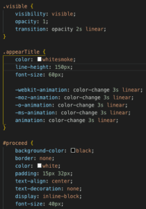
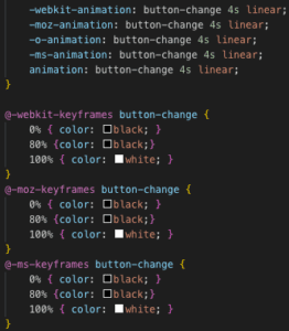
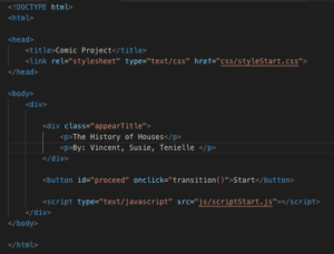
And then some quick javascript for the transitioning to be smoother:
Part 2:
The actual part of the project was split into three parts: flex-box, picture hover, and image follow mouse.
Flex-box:
This was the most frustrating of all the code, as flexbox isn’t easy and having to figure out how to layer pictures on top of each other also took a couple of fellows to help out, but in the end we got it to work.
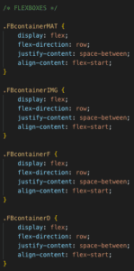
Picture hover:
This was the part where I am pretty proud of myself, especially understanding the logic and writing the functions myself. I didn’t look anything up or ask for any help, just a couple tries and I got the coding down.
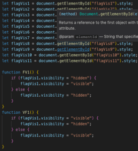


The basic logic is using the style “visibility” and if else statements. If hover, then visibility hidden/visible. Now that I think about it, it actually isn’t hard to do, but I feel pretty proud because I figured it out on my own.
Image Follow Mouse:
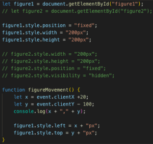
I had trouble on this part mainly, and it was a dumb problem because all it was was me using firefox instead of chrome. I had wanted to use something similar to visibility for the cursor so that the image would change on a hover, but I ended up running out of time because of other projects and wasn’t able to implement that part.

![]()
Results:
Conclusion:
After the presentations, I realized how different our project was from others, and I had completely missed the “comic” part of the project, and I feel sad because I actually had other ideas for the project but ended up not doing them because I was working with a different perspective in mind. Although the coding isn’t much, I felt that I really learned a lot throughout the process of the project, and I am happy with what came out of it.
Another thing I learned was to look more openly, not to stay tunnel-visioned on doing a timeline, because I think that was what made our project not comical.
Overall, I had a great time working on the project, though it was tiring, I learned a lot and it was great to be able to work so freely on a project.
Week 5: Vincent’s (if/else) Javascript exercise – Moon
For this javascript exercise, in order to finish it, you had to understand the logic of the if/else statement.
The first step I took was to create the actual HTML file, which is just standard “head” “body” stuff.
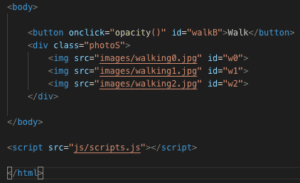
I gave each of the images their own ID, which would be useful later in the javascript and CSS.
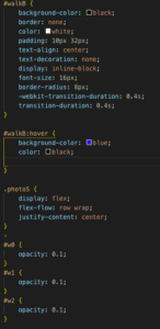
The second step I took was to do some CSS, specifically giving the images a opacity and also the images a flex box.
The last step is the javascript, which I was stuck on a simple mistake. I understood the logic of the function, and felt like there shouldn’t have been any problem with the coding.
Problem coding:
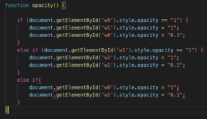
This coding didn’t work and I was utterly confused by it, until the next day when I was playing around and saw the red squiggly under the last “else if” statement. I removed the if, and then it instantly worked.
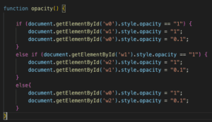
Overall, the exercise wasn’t very hard because all it took was just to understand the logic of the “if/else” statement. I had made it hard by not seeing one of the easy mistakes.