Project 2 – Documentation Post Guidelines (Tina)

Title

Butterfly love story

Project Abstract

Our project tells a story of the butterfly love story, we use shadows to present the whole story, and then add max effects on the screenshot.

Project Description

our project is about two young people who fall in love with each other, but because their families do not allow them to be in the relationship, they are forced to apart. They choose to die together as a way of revolting, and finally, they become two butterflies and can be together forever. Because we want to simplify the story so that the audience can understand more easily, we choose to use the process of a flower’s blossom to represent the love between two people. At the very beginning, we use the flute to lead in the story, and then the music is played by the piano. Here we used the wavy lines to create a soft shadow shape, then the flower appears, we use three layers of the petal to present the process of blossoming. With the blossoming of the flower, the love between two people grows, and when the flower encounters the lightning and thunder, the couple is bearing the scold and fury from their family. finally, the flower turns into two butterflies, and the music approaches peace.

We are inspired by the Chinese traditional music piece Liangzhu, this music piece was written according to this butterflies love legend. We use it as the background of our project, my partner and I played and recorded it.

Perspective and Context

We design our music to be played by both piano and flute, and the flute just appears at the very beginning and the most intense part. And there is a part of staccato notes, it makes people have the synaesthesia that something is jumping, so we connect it with birds, we add the sound of birds here, and we laser cut a bird, control it to fly around the flower here. What I like the most is the use of board pierced with different shapes in our project. This is inspired by the demo, an artist projects the shadow on the screen just using a board with strikes, and by rotating, curving, and moving forward and back. This creates an amazing change between light and shadow.

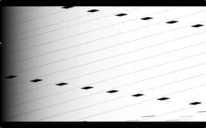
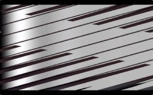
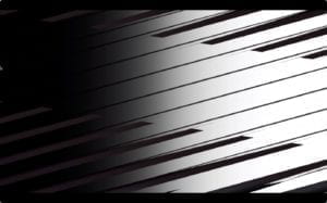
(the photos of boards)

And during different stages of the flower’s growth, we used different shapes of shadow to present different scenes. We use wavy lines to present soft and gentle stream in the spring, spots to present the sparkle and jumping lights in the summer, and broken lines to present the drastic lightening. 

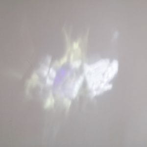
The use of holographic paper and mirror paper is inspired by the reading and video about Lumia. We thought about how to create the change in the light using the easiest way, without the help of technology. And it turns out that the effect is great.
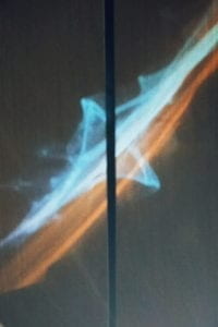
We use easemappr to cover the scene with changing the filter, and at the most drastic part, we add the effect of rotating and zooming to show the conflict.

Development & Technical Implementation

We use the laser to cut the box to hold the whole project, and we also cut different layers of the petal, birds, and butterflies.
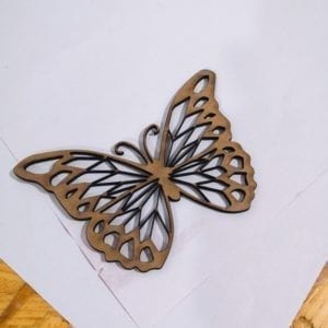
we designed three layers of petals to present the process of blossoming.
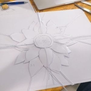
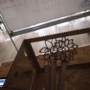
 

we designed a groove through which we can push the flowers into the box, but then we discovered that it is hard to make the flowers stand because the board is too thin. So we finally need someone to hold the board in case it would fall down.
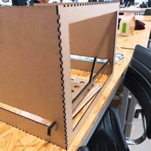
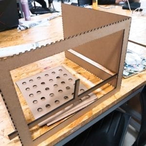
I found the upper line of the front board will cover a part of the shadow, so then we decided to cut it off.
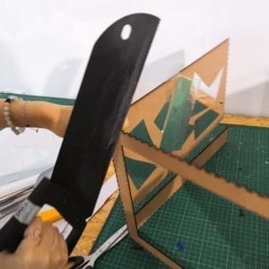
As for the light source, firstly we bought ten small led lights online, but then we found out that they are not strong enough to create any shadow. So then we borrowed supplementary lightning from the equipment room, but then we found it did not work because it is not a spotlight, it doesn’t generate a clear shadow. Multiple lights will be bright enough, but it will decrease the shadow. Finally, we choose to use a torch as the light source. From this, I learn that to create a clear shadow, I need to use a strong spotlight.
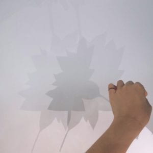
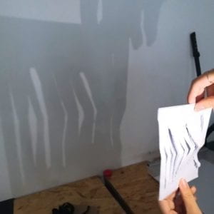
(first time of testing the phone’s flashlight)

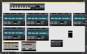
One issue we met when adding the max effects was the samplr could not make the sound correctly. It was because I did not know I need to connect the “gate” between the keyboard and samplr. Also, when I wanted to mute samplr for a while and then restart it to play a piece of music at a certain period of time, I met the issue that I have to press the keyboard again, but the keyboard can not be linked to mixmid. Therefore, I chose to adjust the volume in the sound mixer instead.
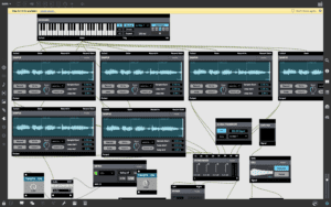
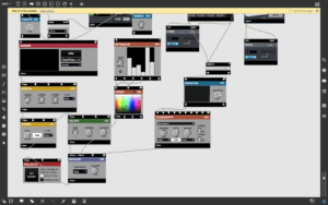
(the capture of the present mode)

Performance

Because we are a group of two, it is a little hard for us to control the physical part, the light, and the mixmid at the same time, so when we gave the presentation, we invited Ellen to help us move the boards and objects. But I also think it would be better if we can figure out a way of fixing the light. During the presentation, Joyce controls the physical movement of the boards while I control the mixmid to control the max. We have rehearsed before presenting, which helps us to perform fluently. But because we are in a very dark environment, so I can’t see the knobs clearly, so it is important to remember the position and rehearse before performing.
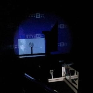
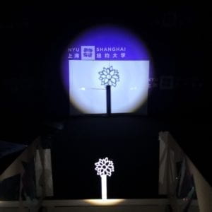
 

One thing we didn’t expect is that the effect of holographic was not clear during the performance, maybe it was is because that the environment of the classroom and auditorium is different, but in all, this didn’t bring a big influence to our performance. Another thing was that in the auditorium we couldn’t find a white wall for us to project the shadow, so we temporarily pasted a brown paper to the wall. But the paper wasn’t large enough to cover all the areas we were going to project, and if I move the camera closer, it could not focus. I have already adjusted the focus of the web camera to the smallest, it still could not focus on such a short distance. So during the performance, the audience could always see the purple background on the screen, which was not pleasing.
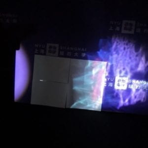
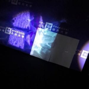
 

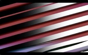
(directly see the Lumia created by holographic paper and mirror paper)

Conclusion

As for the good part, I love the holography appeared in our project very much, also I am proud of the design of the pierced board. In the demo video, we see the artist just use strikes, but I made more boards with spots, wavy lines and jaggies to create different shadow shapes. I do think we have good ideas, like using laser-cut boards to create different shapes of shadows and using holographic paper to create a colorful and variegated scene. But we did not apply these ideas into our project fully and perfectly, they just appear here, but we did not let it generate the effect it could generate. When we present, because of the influence of the web camera, we cannot see the holographic Lumia clearly on the screen. In the future, the first thing to consider is applying max more to my project. One thing l learn from the first project named “eyeball” is that do not limit the scene to the object we shoot or focus on, but we can move forward using the max. They start from the water drops with different colors in the water, but later the shape changes into a more abstract shape and leave the audience more space to imagine. So in the next project, I’m thinking about how to use the function in max more to create a more diverse project. Another thing is to think carefully about the connection between music and the way of creating things. Since Liangzhu is a traditional Chinese music piece, maybe we can consider using Chinese instruments instead to improve the sound effect.
Reading Response 6 – Graphic Scores (Tina)

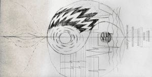
graphicscore

As for our group’s graphic score, we are inspired by the traditional Chinese theory of Yin and Yang, since our music piece is Liang Zhu, a Chinese traditional piece. Yin and Yang show the balance between the two sides of everything, it helps to show the beauty of symmetry. The graphic score should be read from right to left, we use black and white rectangular to represent the flute sound at the beginning of the piece, then there are two curves, which represents the end of the beginning part of our piece. The sound moves to a flat and broad stage with the piano, we use wavy lines to show the stream sound in the audio, and then the music moves to the jumping part, so we use broken lines. Two circles inside the biggest circle represent two strongest points in the piece, one is the bright notes in the jumping part, the other is .we add the sound of thunder and rain to the background layer to show the resistance in the music piece. We use the zigzag shapes to show the, and finally, the music approaches peace and quietness.

RAPS Reading Response 5: Cosmic Consciousness – Tina Zhang

As for the similarities, both of them moved visual music from the screen out into three-dimensional space, and they interested in the transformative power of abstraction in motion and its correlation to music. Both of them found eastern metaphysics essential to their art because they believe that the “meditational practices provide a pure and untainted alternative to the ego-driven materialist ideologies of the West”. They wanted to eliminate the real world in their work, instead, focusing on the art generated in the mind.

Whitneys use new technology to create cosmic film experience. They say that “in sum, no visual motion worked the way musical motion works”. And they were convinced that it was because of the technology limitation, the solution lays in the technology. They used the motions of a pendulum to create a synchronized sound and images, and the images and sound are closely connected. They got to be the pioneer in the field of Cosmic-oriented visual music of early analog and digital effects, and following influence Jordan Belson. But different from what Whitneys had done and thought, Belson seems do not want to use machine-made in his work, rather spring from some kind of natural phenomena(148). Comparing to the Whitneys who use atomic energy to create visual music, Belson focuses on using natural resources. He “creates a kind of ideal world, a universe of linked senses in which all elements—sound, shape, color, motion—are no longer merely related but are absorbed into one another.”

The Vortex Concert series was one of the first tours which had over 100 performances. It changed the traditional way of combining music with realistic and concrete images into more abstract images, which involved the audience into performance themselves. It provided the audience a new way of thinking and relating music and images, convincing that elegant art can also be connected to electronic music, can also be appreciated by the normal audience without a very high artistic background. The light show phenomenon spread fast through the whole European and America, influencing the entire audiovisual performances.

Project 1 Documentation–Wave (Tina)

Title

Waves

Project Description

I was inspired by the Studie made by Oscar Fischinger, I love how the lines flying on the screen and different geometric shapes moving and changing according to the symphony. But these series of work were limited to black and white, also the symphony was relatively tedious. Therefore, I want to create a piece that combines classical symphony and beats, combines black-white and color, combines the sense of floating and sparkling together.

Demo


Perspective and Context

As we have read, a blind man who can’t see still will associate the color scarlet red with the sound of a trumpet” (Locke, 8-9). I connect more peaceful and quiet symphony with a black and white scene, at the same time, I use different colors to present the beats on the second layer. In this way, I can increase the diversity of the video. Since the symphony gives me a sense of floating and peace, I decided to use black and white flowing lines, the black part starts from the left side, and with the developing of the music, it moves to the right side, and then the window sparkles and turns back to white. This is a soft, flowing frame which reflects the symphonic music. On the other hand, the continuously moving lines and shapes which connect to the beats present dynamic and vivifying frames.

From my perspective, there is no need to present complicated or protean videos, what the most important is the harmony between the visual part and the audio part. Although everyone develops synesthesia according to their own life experience, which diverse from person to person, they still share some similar feelings. And I’m trying to figure out what these similarities are, using them in the project. In this way, the project can arouse the audience’s sympathy.

Development & Technical Implementation

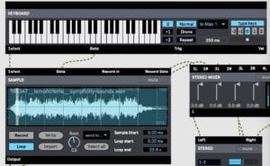
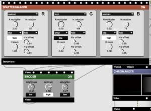
I downloaded a period of Symphony Sounds made by Lemoncreme from freesound.org. I loaded the music into the SAMPLR, and I added groove beats using the Piano roll sequencer. And I use a 3PATTERNMAPPR to generate colorful and continuously changing lines and shapes as the second layer.

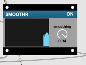
As for the technical part, I originally used CELL-MIDI to play the symphony track, but then I found that the playing time was limited, so I changed to use SAMPLR. In this way, I can play the whole music piece, and adjust the speed easily. And when working on the piano roll sequencer, I met the issue that the signals change so fast that it is hard for eyes to catch up with. To slow down, I added two SMOOTHRs before inputting the signals into 3PATTERNMAPPR. Also, if directly using the original RGB parameters, it is too dazzling for us to see, so I add a BRCOSR to change the brightness, contrast, and saturation of the shapes.

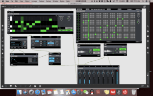
This is the snapshot of my project:

https://gist.github.com/tz1201/9ffc40f89bbfb5825b7999962f86babc


the objects i used to create beats


the smoothr to slow down the speed of the video


i use samplr to present music piece, and one interesting is the lasting end, when i set the higher limitation to 60 seconds, i can not play the whole piece. but when i set it to 20 seconds, i can play the whole 17s track.

i use brcosr to adjust the color of the short video.

Presentation

When I did the presentation, the first problem is that I did not set the parameter of the time limitation of the SAMPLR. Moreover, even though I used a stereo mixer in the project, I still did not combine two tracks of music correctly. To solve the problem, Eric helped me to do the live improvement, connecting both the left and right track into MIXER. Thus, two sounds are not separately playing.

Conclusion

One of the biggest issues of my project is that it lacks diversity, my video only consists of arranged lines, and the changes are limited to the color changing and translational motion. Another thing is that the connection between these movements and the music is not very strong, it is kind of hard for the audience to enjoy them as a whole. I also learned a lot from my classmates, like I can consider the keyboard as an input to create more interactive and diverse effects of the project. But I still very like the black and white variation I used, and I want to apply it to my future project and make it more meaningful.

Resource 

Audio

Emrich, Hinderk M., Janina Neufeld, and Christopher Sinke. “Synesthesia, a Neurological Phenomenon.” In See This Sound: Audiovisuology a Reader, 414–23. Köln: Verlag der Buchhandlung Walthar Köning, 2015.

Reading Response 4 — midterm preparation (Tina)

Lumia is a way of presenting the colorful and fancy floating light, it makes me feel the summer breeze and the starry sky. There is no way of denying the significance of Wilfred and his artwork, not only because he leads the start of a new form of art using light, but also, he is the very first to combine art and science, using the form of art to show the scientific theory behind it. He started a new form of light art through the concept that “Lumia, therefore, did not belong under the umbrella of “color music’” because there is no scientific proof. The core of Wilfred’s art piece is to present that “the true nature of light – a force of energy that travels constantly through space.” But when he presents to the audience, he catches the deep desire of light inside people’s hearts. This is one reason for his success. As stated in the article, “humanity’s dependency on the warmth of the sun to sustain life had led to the development of a rare and beautiful sensitivity toward the light”. 

Despite the light, Wilfred also stressed the significance of the darkness. Darkness to Lumia is like silence to music, it is “the point of departure, support, and return” for all compositions. When there is a blank, the rest then will stand out. This provides with us a new way of thinking, if you can not reach the goal directly through the front, try considering from the back. 

What impresses me a lot in the video is the way of making machine, presenting the art in the real world. They put a lot of effort to capture the insubstantial light and find ways to present. The design is ingenious like when the instrument is turned off, the Clavilux Junior unit functions simply as furniture. And also like what mentioned in the ending of the video, there is a small dent on one machine, through this dent, the light passes out and presents the luminous light on the screen. Creating art is a, but you need to develop the physical part to realize your thought. This is very hard because, through my own learning experience, I learned that it is always impossible to perfectly realize what you think. The artists must experience thousands of times failure, adjusting and improving, finally reached the ideal effect.

Reference

LUMIA