Recitation 7—-Tao Wen

Question 1:

When the for loop is only in setup(), the graphic will only repeat 100 times. However, if there’s another loop under void draw(), than the action of “repeating 100 times” itself would be repeated 100 times, so the number of graphics is HUGE.

Question 2:

The benefit of using arrays is enabling us to store a number of data that satisfy certain requirements, so that we can pick data to fulfill a function in our own way. 

I would probably set a number of quizes in my project. When the user-controlled robot bumps into something, a question would jump out and the user has to answer it correctly in order to make the next move. Arrays can help me store a certain number of questions, so that they can pop out in a certain order or randomly, according to the way I want it.

Step 1
float x;
float y;
float r;

void setup(){
size(800,800);
background(255);
  colorMode(HSB);
}

void draw() {  
  display(200, width*0.25,  color(145,207,250),width*0.75);
  display(100, width*0.75,  color(250,106,166), width*0.75);
  display(400,height/5,  color(250,106,166),width*0.25);
}

void display(float x, float y, color c,float r) {
  fill(c);
  stroke(0);
  strokeWeight(5);
  rect(x,y,r,r);
  arc(x, y, r*0.6, r*0.6, 0, PI-QUARTER_PI);
  stroke (0);
  strokeWeight(5);
  rect(x+r*0.1,y-r*0.2,r*0.1, r*0.2);
  rect(x-r*0.1,y-r*0.2,r*0.1, r*0.2);
  ellipse(x-r*0.05,y-r*0.1,r*0.01, r*0.02);
  ellipse(x+r*0.15,y-r*0.1,r*0.01, r*0.02);
  delay(1);
}

Step 2

float x;
float y;
float r;

void setup(){
size(800,800);
background(255);

for(int i = 0; i < 100; i = i+1) {
    display((random(width)),(random(height)),color(round(random(255)),175,255),random(255));
} 
  colorMode(HSB);
}

void display(float x, float y, color c,float r) {
  fill(c);
  stroke(0);
  strokeWeight(5);
  rect(x,y,r,r);
  arc(x, y, r*0.6, r*0.6, 0, PI-QUARTER_PI);
  stroke (0);
  strokeWeight(5);
  rect(x+r*0.1,y-r*0.2,r*0.1, r*0.2);
  rect(x-r*0.1,y-r*0.2,r*0.1, r*0.2);
  ellipse(x-r*0.05,y-r*0.1,r*0.01, r*0.02);
  ellipse(x+r*0.15,y-r*0.1,r*0.01, r*0.02);
  delay(1);//Use these parameters to create your graphics
}

Step 3

float[] x=new float [100];
float[] y=new float [100];
float[] r=new float [100];

void setup(){
size(800,800);
background(255);

for(int i = 0; i < 100; i = i+1) {
 x[i]=random(width);
 y[i]=random(height);
 r[i]=random(255);
  colorMode(HSB);
}
}

void draw() {
  for(int i = 0; i < 100; i++) {
    display(x[i],y[i],color(round(random(255)),175,255),r[i]);
} 
}

void display(float x, float y, color c,float r) {
  fill(c);
  stroke(0);
  strokeWeight(5);
  rect(x,y,r,r);
  arc(x, y, r*0.6, r*0.6, 0, PI-QUARTER_PI);
  stroke (0);
  strokeWeight(5);
  rect(x+r*0.1,y-r*0.2,r*0.1, r*0.2);
  rect(x-r*0.1,y-r*0.2,r*0.1, r*0.2);
  ellipse(x-r*0.05,y-r*0.1,r*0.01, r*0.02);
  ellipse(x+r*0.15,y-r*0.1,r*0.01, r*0.02);//Use these parameters to create your graphics
}

step 4

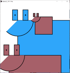
Based on step3, I added these two lines under “void dispay(){”

  x=x+random(-2,2);
  y=y+random(-2,2);
Final Project Ideas—Tao Wen

Project 1: Cooking Simulator

Basic idea: It walks the user through the whole process of cooking a dish

Research: I’ve found a video game that is detailed enough to meet my expectation of cooking. However, it is purely online and does not involve much physical interaction, which decreases sense of immersion. There’s also a cooking simulator that involves actual kitchen wares, but it only helps practice skills such as controlling the pan.

Statement: When one begins to learn cooking, especially dishes that require certain procedure and certain amount of ingredients, it is very likely that he does one step wrong and wastes all the ingredients. By walking the user through the whole cooking process without using actual ingredients and showing the result on screen, the user can learn cooking quickly and efficiently.

Project 2: Pet

Basic idea: Simulate raising a pet

Research: Currently I’ve only found toy pets, and net pets, and no design that connect actual toys and electronic interface yet.

Statement: This is a cute little game that helps children experience pet-raising. By simulating feeding, washing and soft touching the pets, children can learn what responsibility means regarding a life.

Project 3: Ready Player 2

Basic idea: A combination of online quiz and offline maze

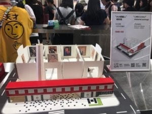
Research: This idea comes from the Picasso exhibition I saw in Beijing, where a miniature was sold in the souvenir store. I think it could very interesting to make it interactive. Also, in the film Ready Player One, every VR player has to go through a maze and answer the questions correctly to get the key, which provides me the basic structure of my design. The project interactive garden gives me the idea of how to sensor the robot all along the way in the maze.

Statement: The project, combining quiz on the screen and an actual maze model, serves to educate people in a fun way. Only when all the answers are correct can the robot (controlled with the keyboard by the player) get to the end, when the treasure box (model) will open and the user get the prize inside.

I am also thinking about installing a camera onto the robot, and make it a museum miniature. The user can change the setting of the exhibition, and by controlling the robot around, see if the exhibitionis planned well from the viewpoint of the visitor.

Recitation6–Tao Wen–Rudi

In terms of learning process, the most important part I took away from the recitation is to be patient. In recitation exercise, I was unsatisfied with my original work, thinking that it’s too simple and ugly. However, I realized that a successful project has to be done little by little. As for the assignment, it took me a whole week to figure the code out, but I am so glad that I didn’t ask anyone else for help!And I realized that one has to be really good at math for coding.

Interesting functions include:

colorMode(HSB)—can create rainbow-like image, so pretty

mouseClick, pmouseX/pmouseY—I just love interactions

Homework

int r=20;
int t=0;
int n=0;
int min=0;
int c=0;
void setup(){
size(600,600);}

void draw(){ 
t=t+1;
if ((t>=(300*(n)+min)) & (t<(300*(n+1)+min))){ //0<=t<300
r=r+1;
} 
colorMode(HSB);
background(255);
stroke(t,t+1,255);
strokeWeight(30);
ellipse(width/2, height/2,r,r);

if((t>=(300*(n+1)+min)) & (t<=(300*(n+2)+min))){//300<=t<600
r=r-1;
}
frameRate(800);

println ("time",t,"r",r,"n",n);
if(t%600==0){
n=0;
t=0;
}
}

Recitation Exercise

void setup() {
size(600, 600);
background(255,255,255);
}

void draw(){
float c;
float x=pmouseX;
float y=pmouseY;
ellipse(x,y,30,30);
noStroke();
c = 244;
fill(c,c, random(255),100); 
if(mousePressed){
background(random(255));
}
}

Preparatory Research and Analysis—Tao Wen–Rudi

PREPARATORY RESEARCH AND ANALYSIS

Chronus Exhibition Experience

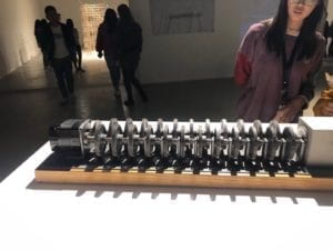
The experience visiting Chronus exhibition was definitely eye-opening and different from other exhibitions I have seen before. There was one exhibit that really intrigued me, using wheel gears and strict calculation to demonstrate the concept of time. As is written in the introduction, despite the high speed of the first gear, the time it would take to make the last gear rotate one full circle would be as long as the history of the universe. I was deeply impressed by how an abstract and huge concept (the existence time of the universe) can be embodied so precisely and concretely by a piece of art design, in which technology is the main contributor. If I am to pick a static, classical art piece elaborating on the same idea, it would be Dali’s surrealist piece named The Persistence of Memory. However, they are so different in terms of aesthetic experience. Dali’s painting is static and more tacit. It communicates the main idea by showing how objects are rotten with time passing. One has to stare at the piece for a while, switching his attention to different spots on the painting to gain a comprehensive understanding of it. In comparison, the artwork employing technology is more linear and straight-forward, almost like a metaphor and is easy to grasp. Also, it is dynamic, creating a different kind of expeirence compared with an oil painting.

In terms of inspiration of final project, this particular exhibit teaches me one important lesson: a design has to be straight-forward. However fantastic the embodied idea is, it has to be clear to the audience/user about its function, delivering the designer’s thinking precisely and noticeably. I’m not saying that art should be understandable to all audience; I’m saying that an understandable artwork has a greater opportunity to have its idea remembered and spread, if an artist’s goal is to let more people know about his thinking. With regard to interactive design, it is a necessity to stand in the shoes of audience/user.

Two other interactive projects I searched

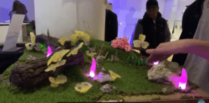
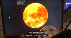
I found two projects by browsing randomly through the NYU ITP students’ end-of-semester show. One is a miniature garden. By pressing buttons or waving at the plants, different kinds of responses are triggered. The other is an interactive space explorer. With one planet model in hand, which functions as a steering wheel, you can rotate it and the planet animation on the screen would rotate correspondingly. Both are really interesting, but if I am to choose a better one, I would probably go with the interactive garden. For, in terms of experience, the miniature garden simulates a real landscape, the details of which are carefully designed and therefore look very tempting to the audience to interact with it. The possible outcomes are also versatile, which raises the users’ expectation as well. The interactive space explorer, on the other hand, does not provide as many possible outcomes (at least according to the video), which makes it, say, more boring. However, I still consider it a good project, for it delivers its idea very clearly. One’s first repsonse when holding the model planet would be to rotate it, and therefore no further explanation is needed.

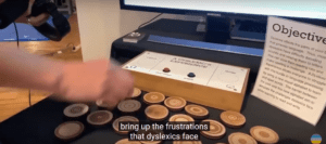
However, there’s one thing that I think should be avoided when thinking about communication efficiency, which is overloaded information. In the same video, I noticed a project with a LONG instruction. It was not until I watched the part twice that I understood how the project was supposed to work. What’s more, after taking all the trouble to figure it out, I didn’t find it interesting at all.

Therefore, other than the basic “input-process-output” logic of interactive design, there are so many more things to be considered. One important aspect is the usability. As discussed in class, it means “a measure of the ease with which people can use something”. To maximize usability, a design should be easily understood by the user without much instruction. An online article expresses the same idea. In “Bad Design vs. Good Design: 5 Examples We can Learn From”, the first characteristic of a bad design is “information overload”, the problem of which is that “what sounds like a simple question takes a lot of mental processing to answer”. Therefore, simplifying the logic of a design is crucial to improve usability, and eventually, the level of the design. Both of the first two projects I mentioned were user-friendly, in that the user can go straight ahead to try the project out without much “training”.

Reference

1.Interactive garden(2:57); Interactive solar system (8:39); Project about dyslexia (5:22)  https://www.youtube.com/watch?v=02z_yyHAm-U

2. Definition of “usability”-class slide https://docs.google.com/presentation/d/1-EnH9SQ38CsvkCpDZsZA59jau7_GMBkfrPy_k6UCSKw/edit#slide=id.g42ef75b7c2_0_82

3.Bad Design vs. Good Design: 5 Examples We can Learn From https://www.interaction-design.org/literature/article/bad-design-vs-good-design-5-examples-we-can-learn-frombad-design-vs-good-design-5-examples-we-can-learn-from-130706

Recitation 6: Processing Animation–Tao Wen–Rudi

Step 1: Choose an image to be your motif

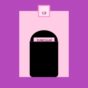
The image I have chosen is a screenshot from one of my favourite films “The Grand Budapest”. The use of color in this film is so beautiful and dreamlike that I thought of it immediately as my motif. I’d be so happy if I could make it come true.


Step 2: Draw your image in Processing

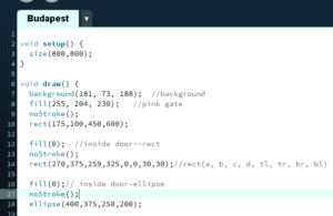
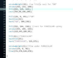
It would take an incredible amount of work to copy an exact same image. However, if I am to give a general idea of it, all it needs is a few features easy to notice, which would be the color, some basic shapes, and the English words. To achieve all these, I just needed to search in the reference list of Processing website. For colors, I found a color selecting website, where I could get all the codes needed. I improved my searching skills during the process!

Of course, I ran into some trouble. It took me a while to learn the order of stroke, fill, and shape. Also, the coordinate of each shape was decided completely by my calculation, and I believe one shouldn’t have to be a math genius to be able to draw on Processing. Therefore, my approach to the coordinate definitely had room for improvement.

The final product, I would say, was so much different from (and uglier than) the original motif. It’s flat, and its color lacks the sense of depth. I think in drawing this kind of detailed image, Processing wouldn’t be a good choice, for it is better to be used in making animation.