Final Project Reflection [Ta-Ruedee Pholpipattanaphong (Ploy)]

link to the project: http://imanas.shanghai.nyu.edu/~zy1193/project4/project4.html

A. Process

Our project is based upon the idea of the different foods in various places within China. Since both me and my partner, Angel, love to travel, we find that one of the big considerations is the food. We feel like food is a big decision factor in where we would like to travel. Furthermore, since I am a foreigner, I am very fascinated by the food China has. For instance, Shanghai food is pretty sweet whilst Sichuan food is very spicy. I am very excited to explore the various flavors and the unique types of food around China. Therefore we decide to explore the foods within China and the interesting facts behind that food. We chose 5 destination which corresponds to their well-known food.

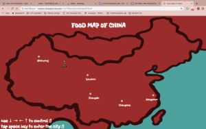
This is our main page: The users are intended to navigate the map to the different places labeled by using the arrow keys on the computer keyboard. 
 

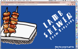
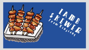
After entering the page, a well-known dish would show up. All the images are hand-drawn by us using Ipad. I drew 4 pictures each for the food so that the images can move around just like an animation. So for instance, the images below changes from 4 sticks to 2 sticks and from a text that slanted to the right to being slanted to the left. Within this page, there would also be the sound of the cooking method. We recorded all the sounds in the dorm. For instance, for this lamb skewer, we used oil and garlic to make that kind of barbeque sound. 


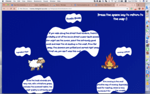
Later on, the audience is to press the mouse to enter to the information page. In this page, we first give the basic information about the food and then we went into detail and explores more specifics such as the raw material, cooking method, environment, culture, myths, and etc., with relevance to the food and place. 
B. Process 

What worked especially well is that our initial plans were clear. We are on the same page and therefore we work well with the images of the outcome and the goals in our minds. We also divided the work out pretty well. Since the coding requires a lot of work, Angel quickly took charge of the codings. Then I did all the drawings. After that, we came together and did all the audios together. Then we divide the research parts up. After Angel created the first main page and one of the model sample page, then based on her codings, I create the last 4 pages. We communicate throughout the process and try to solve all the obstacles together. We also decide everything together. I believe that our teamwork is the strongest benefits of this project. 

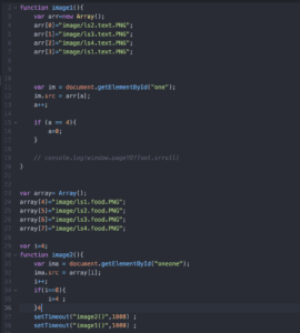
There is nothing that didn’t work. However, something that we would like to change might be using more of the codes. For instance, we wanted to change them into the next page with a transition of cutting the image into half and then it enters a new page, however, we couldn’t find the code that the computer could manually do. Therefore, we decided to create this process by ourselves, by cutting the image into half and then applying the animations with the code. Since we have 4 images for each of the 5 foods, we ended up spending a lot of time editing the images itself. Throughout the process, we used a lot of trials and errors. Even by cutting the images was hard itself as it needs to be perfect between the two split images so that they fit perfectly together. Therefore, we spent a lot of time creating something that the computer should be able to do easily. This is how we did it: 
C. Future 

Given more time, I would like to spend more time on the code. Try to incorporate more codes and functions in our pages. I would also like to think deeper behind the ideas that are portrayed (critiques from project presentation). For instance, from the feedback we received in the project presentation, the map is a controversial issue. Therefore, I would want to step away from the political standpoints and change the map into something else. In addition, we received critiques such that maybe we should explore more on the purpose of the color, place, and food. From the background colors that are randomly used, I can think into the purpose behind those colors and use a meaningful color that conveys something. Next, I would want to make the project more appealing and visible by attracting the audience to the text as well. What we could definitely change is that increase the size of the font and the color of the font that are not easy to read. Lastly, I should think about where to put the man because, from the first page, it is not clear that the audience is controlling the man.

I am very proud of this project because we achieved our expectations. However, there are a lot of different aspects where we can implement in the future. 
Final Project Documentation: [Ta-Ruedee Pholpipattanaphong (Ploy)]

Link: http://imanas.shanghai.nyu.edu/~zy1193/project4/project4.html

Description: In the project “Food Map of China”, Angel and I decided to create a map of China with 5 different well-known foods from 5 different provinces. Our goal is for the audience to be able to move around on the map of China freely and then learn more about the food and the cultures of each place. Since we both love traveling, we see that food is a huge aspect when choosing where to go.  

Process: We decide that we want to draw everything by ourselves so I worked on the drawings whilst Angel started the coding page of the map and then the page for the food. We then recorded the sounds of that food together. For instance, with the hotpot, we recorded the sound of the water boiling and for the lamb skewer, we recorded the sound of the oil on high heat. We find that a little bit challenging because the sounds were not loud enough through the microphone. Therefore, we also use other techniques. For instance, the sound of the oil was not loud enough so we added water to the oil and that increases the sound a lot. Later on, I went into audacity and edit those sounds. One of the most significant edits was on the amplifier so that the sound can be at its maximum level. After having all the images and the sounds, Angel sent me the codes that were used on the page. Then basing on her codes, I created the other 4 pages. 

Challenges: The codes were challenging. We have an image in our minds since the beginning of the project and we want to stick to it. For instance, creating a map that the user can navigate themselves was something that needed a lot of research. Other challenging codes were the curtain function when we transitioned from one page to the other. A lot of those codes were trial and errors. We really went beyond what was taught in class in order to get our ideal project.

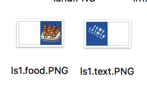
However, there are a lot of things that we could improve on. For instance, we couldn’t find a code that would divide the image into half and then the curtain effect would apply. So what we did was cropping the image manually and then naming the 2 parts differently. Then we set one side to be the text whilst the other to be the image of the food. This was really confusing at first since the order was not what I expected. For instance, we have to leave white spaces on the left of the food and the leave white spaces on the right of the text (images below). It wasn’t the position I expected. From manually creating it, the positioning contains imperfections as the image does not fit perfectly next to each other. I tried really hard to minimize the faults, however, it is really hard to position it, especially when the food overlaps into the textual part. If we have more time, I would spend more time searching for better codes so that it can be done by the computer instead of manually.

Post Mortem: This project turned out somewhat similar to our plan. However, there were changes along the way, especially after user testing. I feel like user testing was really useful because we see a lot more from the audience perspectives and not from the creator perspectives. For instance, they tell us what is not clear in our project and that we could make the text more readable. The project ended up with a lot more research than what we expected. We went in search of the backgrounds and the cultures behind this food. I am really proud of how the project turned out because we are able to incorporate many aspects into one. Even though the time for this project was considerably short, I really like working with Angel and believe that we are of great teamwork. 

Week 13: Final Project Proposal

Project Proposal: Angel and Ploy

A. Concept

We would like to explore the relationships between different foods and the different cultures in various parts of China. Even though China is one country, different provinces have their own unique cultures and distinctive foods. For instance, some parts of China rely on rice as their stables whilst others rely on noodles. The types of food that are consumed also reflect the cultures of the places. For example, people from northern China rely on rice because the weather is favorable for plantation. This portrays the cultures of the plantation. The flavors of the food from different parts are also significantly different. For example, Sichuan food is very spicy, whilst Shanghai food is quite sweet. The reason why Sichuan food is spicy is that those spices keep them warm in the cold weather. We believe that food and culture in China are very unique as it shares a special relationship, however, many foreigners might not know about it. From this project, we hope that the viewers will be able to learn more about China’s unique cultures and also delicious food.

When we are looking for places to travel around China, food and culture is very important. Food is an important aspect to consider just like the attractions and the hotels. Every time we would like to be traveling, we often look at food and see what is there to eat. We often search on the internet to see which places have the best food so we can try it out. Thus those food portrays the cultures of these places.

We would like to create a web page of a map of China. The audience can move around China to see the food in each place. This would help the audience to decide where might they travel to given the different foods and cultures.

B. Sources

http://www.playmapscube.com/

Playmapscube.com is a game about Google maps. The game is for the audience to navigate the ball to the destination that was indicated in the mission card. The player would navigate it by moving the mouse and then the plane of the map would move according to our navigations. Since it is the real map, there are many buildings that serve as the obstacles to the game. The routes on the map and the freedom given to audience interaction inspire us to create a web page based upon the decision of the player. In our project, the player would be in control of where they want to go and from that decision, the project continues.

https://www.tasteatlas.com/search

Tasteatlas.com is a page that incorporates much different food on the map of the world. When we clicked on each food, it opens up a new page and there’s the detail of the dish. Every time you want to travel, you want to find the most famous food. From the display of the website, the audience can instantly and directly know information about the food of various areas without searching individual places on the browser. Therefore, we are inspired to create a website with the design that assists the audience with the maximum level of simplicity.

Starving Time Channel

We really like to see reviews of food at different places. I subscribed to a specific food channel – Starving Time – as they travel around in Thailand to try different food. It makes me feel that there are so many foods out there that I really like to try. Sometimes food is the reason where you are traveling. Since there are so many people who are interested in trying all kind of foods, this artist inspires us to work on a project that would interest the current society

C. Production

On the first page of our website, it would be a map of China with a character. The audience would be able to navigate the character around the map of China by using the arrows on the keyboard to different places. After arriving at the destination there would be well-known food at each place. We would like to draw the food on our iPad, so it would be easier to use various colors and are easier to edit. Corresponding to the drawings, there would be the sound of the food. For instance, the sound of the water boiling for hot pot or the grizzling sounds of the barbeque for the street food. In addition to that food, we would have information such as culture and the environment. Another audience interaction is that they would be able to like or dislike the place/food. The audiences can go around China to see the food and culture of each place.   

Week 12: Response to “History of Net Art” [Ta-Ruedee Pholpipattanaphong (Ploy)]

Written by Racheal Greene, “Web Work: History of Net Art” explores the meaning behind internet art. It starts with how it become to be. At first, I don’t understand why Greene mentions that “The term ‘net.art’ is less a coinage than an accident” (162). However, when I continued reading it further explain this statement. Net art wasn’t made purposefully as an artistic behavior. It did not start from artists wanting to create net art. But rather, people see what was created and thus give those online arts and communication a term such as ‘net art’.   

Net art has distinct characteristics that make it differ from traditional art. First of all, it is in completely new media, the internet. Secondly, net art is not like traditional art because it does require interactions among artists and viewers. Why net art is so successful is because it is meant for interactions, “it was artists, enthusiasts, and technoculture critiques trading ideas, sustaining one another’s interest through ongoing dialogue” (126). Without interactions between the web and the audience, net art could barely exist. Some examples of net arts are videos, games, comics, and etc that are posed through the webpage. 

From the article, I realized that the internet does play a huge role in the advancement of the net arts. Without the development of the internet, the net art movement would not be this rapid. In addition, the advancement of technologies will also provide net arts with more opportunity to expand their type of arts. For instance, I could picture that before it might be constrained to only comics that are posted on the internet but when the technologies develop something else evolve such as videos games. Since we are strictly putting ourselves in the era of the internet, as the internet progresses, net art would definitely progress as well. 

Before Professor Chen introduce us to the idea of ‘net art’, I have no idea what it is and what is considered as ‘net art’. From reading this writing and also doing my own research on net art, I found that I have been interacting with net art a lot but it is only that I don’t know that it is defined as net art. Therefore, I am looking forward to the new kinds of net art that will evolve. 

Week 11: Net Art Project Reflection [Ta-Ruedee Pholpipattanaphong (Ploy)]

Link to the webpage: http://www.paperrad.org/newindex.html

I found this website when I was browsing through Rhizome Net Art Anthology. What struck me about this webpage is the vibrant color. Then I clicked in to explore more.

PaperRad was established by DIY artists in the 2000s. Those artists found a common thread in their interests as they want to explore unique medias such as comics, videos, and DVDs. PaperRad was extremely active during 2000s-2008s, composing of various internet works, while some are archives and some are artworks. The shared theme and idea between all the artists is the “riot of brightly colored compositions featuring graphics and mazelike complications of characters from otherwise overlooked aspects of ’70s and ’80s pop culture.” (anthology.rhizome.org)

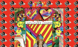
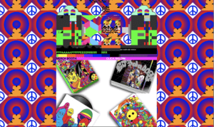
This is how the main Paperrad page looks. 

However, I cannot screenshot the blinking of the screen. I feel like the blinking of the different colors,  texts, and images really catch my attention. Those blinking aspects of the webpage really give movement to a static web. It lures our eyes around the page from one text to the other. 

I could see that images are placed one over the other. Instead of seeing them as mistakes, it gives me the feeling that artworks don’t have to be all perfect without imperfections. It can be messy and it is still a wonderful art.  

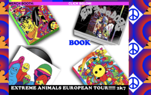
As I played around, I found out that there are many instructions on the page to “click below”, “click the animal”, “get the info”, and etc to get more connected to what Paperrad has to offer. When I hover over some images, texts also come up. For instance in the image below. 

Here I hovered over the book image and the word “book” appears. When I clicked on the image of the book, a new webpage opens and reveals the sample of PaperRad book. Again, on this page, they are also using vibrant colors and the blinking of different things. Below is how the web looks like. Similarly to before, I cannot capture all the artistic aspects. For instance the animation behind in the backgrounds of all the books turning pages. 

Since it is an archive page, it embeds a lot of broken links. It is interesting to see those broken lists and how it posts challenges to net art.

Within the website, there are many things to explore. And those things also leads to other parts as well. I really like the page in the artistic aesthetics and the uses of vibrant colors to capture the audience’s attention. What I like most is how it portrays the feelings that art could be anything we want, and it doesn’t have to be perfect.