Interactive Comic Progression Post 1 – Taylah Bland and Laila

Progression Blog Post – Taylah and Laila 

Laila and I met on Tuesday, March 5th to work through a plan of how best to handle this assignment. Laila had already begun to experiment with Adobe Illustrator whilst also drawing out a story board to document the key points of our story. 

Upon discussion with Laila, I really liked her drawings and suggested we keep what she has and start with simple graphics like line drawings. As the story progresses and our protagonists becomes enlightened with this new found ability to appreciate nature, we begin to see an increase in the resolution, quality and complexity of the illustrations. 

I have taken responsibility for the photoshop images of nature. I wanted to combine a few pictures of three nature spots (Mt Everest, The Great Barrier Reef, Pyramids of Giza) to showcase not only the beauty of nature but the potential it has for personal transformation. 

During this time, Laila will continue to work on the beginning illustrations utilizing the Adobe Illustrator Program. 

We plan to meet with Professor Eckert on both Thursday this week (7th and 14th of March) and next week in order to talk over our idea and to consolidate the best possible way to utilize the knowledge we have to create a strong interactive comic. 

We also plan to meet up on Sunday with all completed graphics and this will give us just over a week to put them into the browser and create the interactive component of our comic. 

I have also done additional research on youtube to look at ways in which we can create simple but effective transitions for our comic. We are trying to use Digital media in its simplest form to convey a very deep and meaningful message in our comic. We are hoping that through utilizing digital media as a platform to present this, we will be creating greater accessibility for a larger demographic.

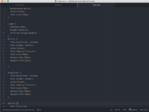
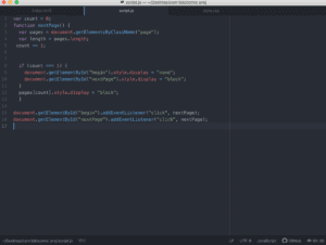
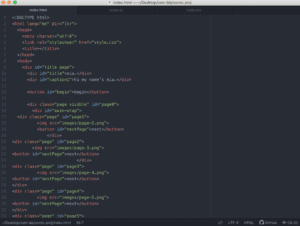
Attached is a video and some pictures of some of the coding that Laila has started to play around with! 
Progression ImageProgression ImageProgression ImageProgression Image

Project-Progress-1

Week 3: JavaScript Exercise – Taylah Bland

http://imanas.shanghai.nyu.edu/~tlb394/week3-2/

This exercise was really fun! It was really interesting to see the difference that applying JavaScript can make in terms of the interaction capabilities in the website. I really need to pay attention to simple formatting errors that I make. I seem to get a little carried away in the code and sometimes this creates an oversight however, I am learning to really watch everything I am doing.

 I am so excited for the rest of the projects and to develop my skills! 

Basic HTML/CSS Website – Taylah Bland

Taylah’s First Website Blog Reflection

http://imanas.shanghai.nyu.edu/~tlb394/website-1/

I had so much fun with the HTML and CSS Website Creation. This was my first time ever using code to create my own site. Admittedly it was difficult at first because I had to miss the basics classes due to a Student Government trip to Abu Dhabi. However, Professor Eckert was kind enough to assist me by giving me a crash course the day before I left so I was able to complete the first HTML component. 

During the recitation in which we created the CSS Portfolio I was a little stressed because I wasn’t following everything 100%. However, I relooked at the slides and did some additional research and realized that a lot of my errors were simple punctuation error marks. 

The Process

I wanted to keep my website relatively simple but effective. I really do like websites that engage you with a lot of animations and colors but on this instance I wished for a more professional look. 

My favorite color is blue and I decided to create a background in a light blue with text in a dark blue. I also made my text centered to distinguish it from the rest of the writing. I kept the text in Helvetica font and quite large so it was readable by any demographic. I also placed borders around the headings to add dimension to the website. 

I integrated a couple of photos in to my website as well. I really like the effects that borders have and so I utilized a “double border” (including the use of padding) n order to create an effect in which I got to have two different colors overlay to create my border. The yellow served as a pop of color to take away from the blue. I also added a full page border to create a sense that all the information was enclosed in a simple, scroll down page without the need to click for additional links. 

I also linked my social media handles at the bottom on the page for further reference to anyone who might be interested in exploring more of my professional or traveling side that wasn’t showcased on the website. This was a relatively simple process to link and one that I really enjoyed. 

I wanted to add an animation element to my website and so I researched how to make text move across the screen. Therefore, I utilized the “Marquee” tag to create a moving banner across the top of my website. I think by adding this effect it gave my website a little more character. 

I did run into a couple of problems. The first was my inability to adjust the height and width to an appropriate dimension to see the image clearly. I played around with the heights and widths but couldn’t get the images to refrain from looking slightly off. The images look proportionate when the webpage is condensed but in full screen they look slightly distorted. Though, I guess you could see it as a positive and as a purposefully selected stylistic element (kidding of course).  The Second was playing around with adding images into the background for a gradient effect but I couldn’t quite get the code to work properly so I settled for a simple, classy design. 

Reflection

I was honestly really proud of my website. Although its not perfect and may not be anything special it represents the beginning of my communications lab journey. Having no previous experience of coding, I am really content with my ability to produce something that I am proud of in such a short amount of time. I will definitely be using it as the building block for the next projects and I would love to revisit it at a later date and spruce it up even more. 

Interactive Comic Outline – Taylah Bland

Partnered with Laila 

Overarching Theme: Competing perspectives that there is a trade off between the digital world and the natural environment. 

Realization: That the two can actually harmoniously coexist when balance is examined and realized it can be implemented into ones life. 

Our interactive webcomic shares the story of a girl born and raised in the city who feels lost in the rapidly expanding digital world attributed to her position as a social media influencer. Where her daily life is to look through the lens of a screen to present a utopian society. Whilst watching “Planet Earth”, she has the sudden realization that she isn’t really “living” in the real world. On a quest to soul search, achieve self fulfillment, and reconnect with the natural world, she decides to disconnect from any form of social media, travel and see some of the world’s most beautiful natural places. Through our website, the reader will be able to navigate through panels showing her journey and interact with the website, making some choices for the character that will progress the story line. At the end, she realizes that she cannot take nature for granted and she cannot always be dependent on technology, she learns that these two things can actually coexist within her day to day life.

The places we are considering for inclusion in our interactive comic include:

  1. Grand Canyon
  2. Amazon Rainforest
  3. Great Barrier Reef
  4. Morocco Merzouga
  5. Mt Everest

CSS Exercise – Taylah Bland

http://imanas.shanghai.nyu.edu/~tlb394/exercise-css/

I had some difficult in moving some of the items that I will address in office hours. However, after spending a considerable amount of time in attempting to fix it up I submitted what I could do.