Recitation 8: Serial Communication- Theresa Lin

Exercise 1: Etch a Sketch

Materials

  • 2 Potentiometer
  • 1 Arduino
  • 1 Breadboard
  • Wires

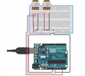
Schematic

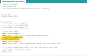
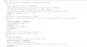
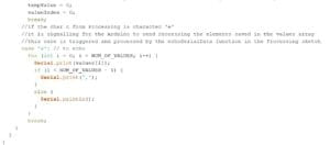
After I built the circuit, I first checked to see if the potentiometers were working properly by using the read serial code in Arduino for multiple values. Because I only had two values that needed to be read, I commented out the third value that was already in the example code.

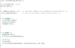
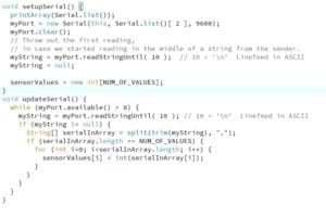
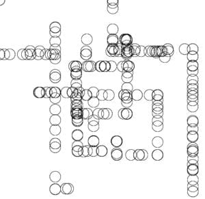
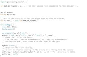
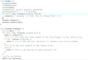
Next I changed the port number in Processing and tested to see if it would print out the values from the two potentiometer. When that worked fine, I changed the code so there would be two sensorValues and then drew an ellipse. For the x position of ellipse I set it to sensorValues[0] and for the y, sensorValues[1].

Processing Code

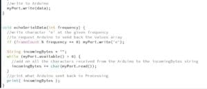
Arduino Code

Exercise 2: Musical Instrument with Arduino

Materials

  • 1 Buzzer
  • 1 Arduino
  • 1 Breadboard
  • Wires

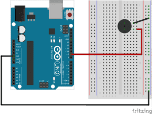
Schematic

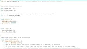
For this circuit, at first I didn’t connect the buzzer correctly so for the longest time there was no sound when I ran the code. Later on I realized I plugged the positive into ground and vice versa. I then added code to the draw() function in processing so that when the mouse hovers over the screen, it’ll draw a white line. I also changed the NUM_OF_VALUES to 2. The coding was more difficult for this exercise. At first it was a bit overwhelming, but with some help from the fellows I realized I didn’t need the if statement in Arduino in loop(). So I removed that and only set one value for tone. I was also confused about what value[i] was supposed to be in processing. Again with some help, I realized it was the value that should be set equal to the mouseX position.

Arduino Code

Processing Code

Recitation 7: Processing Animation- Theresa Lin

Useful Functions:

colorMode() – changes the mode of the color from RGB to HSB

pushMatrix()- saves current coordinate system

popMatrix()- restores the prior coordinate system

if()- if a statement inside the () equates to true, then the statements within the if() will run

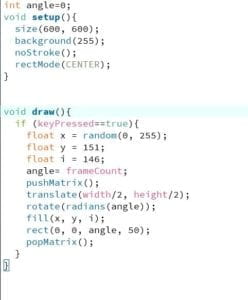
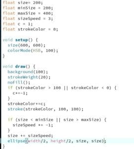
Hw 1:

Additional Hw:

Preparatory Research and Analysis- Theresa Lin

My previous definition of interactivity was “a process of input, processing, and output or listening, thinking, and speaking between either human and human or human and computer.” Through the process of the group project and as well as the midterm, I have noticed an important aspect of interactivity that I failed to notice when I wrote my first definition of interaction. Projects, or anything that qualifies as ‘interactive,’ in my opinion must evoke a strong emotional feeling from the users/participants during the interactive experience. Some especially strong feelings of emotion based on people during the interaction to name a few included surprise, laughter, enjoyment, and curiosity. I would like to build on my previous definition of interactivity that interactivity is not only a process of input, processing, output, thinking, and feedback but simultaneously a process that evokes strong emotional feeling from the participants.

In regards to “The Art of Interactive Design” emotion explains why the same simple act of opening the fridge door is less stimulating than a game where all the user has to do is press a button. Both involves a simple task. However, for example, the speed game that we learned in class drew out competitive emotions from the participants thus it greatly contrasts the feelings of one opening a fridge door and seeing the light turn on.

This difference was clear to me after my midterm project, Schrodinger’s Cat decision maker. Seeing participants’ expressions when they interacted with the decision maker was when it came to me that a big part of interaction was about emotions. Although the project was meant to be a decision maker, some people misunderstood the concept a bit and used it more as a fortune teller which actually turned out to be just as interactive, if not, more interesting. It was amusing to see how excited some people were when they got a desirable answer such as ‘yes’ to their question of whether or not they would do well on their exam. It was equally amusing to see the disappointment on other participants’ face when they received an answer they didn’t want to hear.

Upon doing some research for other interactive projects I discovered SUN by Philip Schütte aligns with what I consider as interactive. SUN is an interactive installation in which the participants can control the movement of the sun against the horizon on a digital screen with a physical bouncy ball. In the video, people who used the ball to control the sun’s movement were extremely intrigued by the installation and would test out the limits of the movement of the sun.

SUN – Sun’s cycle as an interactive (playful) experience

Another project I found was a product that projects out a natural lighting experience indoors. The product is created by Leslie Nooteboom and is called Komorebi which is sunlight filtering through leaves. The artist created Komorebi for the purpose of people who live in places where indoor natural light is scarce, especially in urban areas. This project doesn’t align with my definition of interactivity although the user can program it to change shape and location. Personally I really like this product and its purpose but I feel like it is more of a decorative art.

https://komorebi.studio/product-designer

Recitation 6: Processing Basics- Theresa Lin

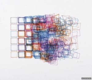
I chose this piece by Vera Molnar because I really like how the squares are neat and gradually get extremely messy towards the right and even change shape. I also like the colors used and how they clash. To me, there’s a certain aesthetic appeal to this piece because I like artworks that are have messy lines.

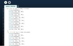
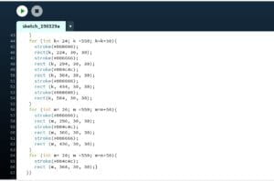
I wanted to draw layers of overlapping squares in rows and columns. I used the color palette from https://www.color-hex.com/color-palette/4666. I used rect() to draw the squares. I drew them in a for loop for the squares so I wouldn’t have to input each and every one of them. I used additional for loops for every row that overlaps.

My final creation is similar in that there are squares and they overlap. However, mine isn’t messy towards the center. The squares in each row have the same color, and also the same colored squares overlap unlike the ones in Vera Molnar’s piece. I think that drawing in Processing was a good means of realizing my design because it allowed the squares to be precise and accurate in size and distance from one another.

Schrödinger’s Cat- Theresa Lin- Marcela

Project Name: Schrödinger’s Cat (Decision Maker)

Name: Theresa Lin

Partner: Frances Yuan

Instructor: Marcela

Motivation

Both Frances and I are really indecisive and always have a hard time deciding on things such as what to eat. We also noticed that our friends are all also really indecisive when it comes to planning on what to do together. We wanted to make a decision maker that was more fun and engaging than your typical decision maker website.

Inspiration

We stumbled upon this video of a Schrödinger’s cat decision maker and thought it was really intriguing and has that level of engagement we were looking for so we wanted to re-create it. https://www.youtube.com/watch?v=B7sKqlM4LZg&t=1s  In their project they reveal the cat by shining a light on it, we decided to put the cats on a surface on a servo and make it rotate randomly.

This video provides a clear explanation of Schrödinger’s Cat. https://www.youtube.com/watch?v=OkVpMAbNOAo

Concept Story 
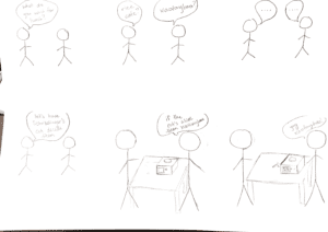
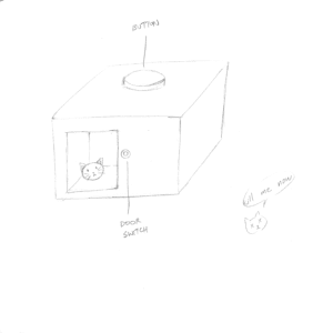
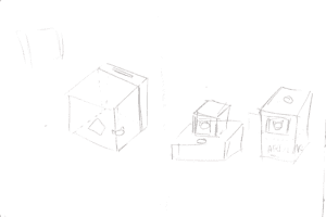
Project Sketch
Tools Used

Illustrator
makercase

Materials Used

2 Breadboard
1 Arduino
1 Servo
Gears
Straws
1 Motor
Wires
1 H-bridge
10k resistor    

Prototype

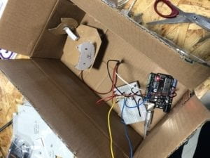
Servo for the two cats to rotate on 
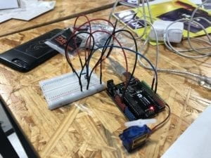
User Testing Feedback

During the user testing, one thing we noticed was that people were a little confused as to what to do first. They didn’t know they had to ask it a yes or no question. I think it might be because we didn’t specify that it was a decision maker. People said the window of the cat wasn’t the first thing that they were looking at so they didn’t know where to look after pressing the button. Some users also said that they weren’t sure when to open the door to look at the cat. A lot of people liked how the box had cat ears so the entire box resembled a cat head.  One thing I thought was interesting was that some people would ask questions like “Will I pass my midterm?” instead of questions that required decision making. Before the user testing we didn’t think it could also function as a sort of ‘future predictor.’

Final Product Process

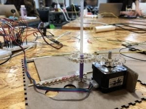
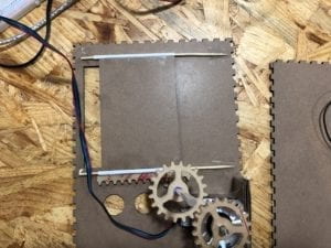
Based on the user testing feedback we received, we thought it was be best to have a door that would automatically open when the user presses the button. For the automatic door, we had to laser cut gears. At first we tried to use Gear generator for our gears but we had to pay to download the gears so we tried to find other alternatives. We ended up downloading a picture of gears and then tracing the image in Illustrator to change it into vectors.

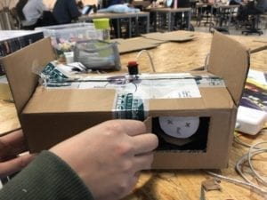
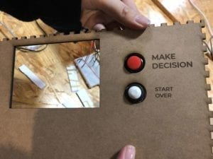
We tried to think of the best way to design the box so that the user’s attention will be on the door and the button at the same time. We also thought to include some instructions such as a step one and two so it will be more clear as to what to do. We decided to put the red button right beside the door so when users press it, their attention is already by the door and will immediately anticipate on the door opening. We decided to make the box taller than our prototype so it’s easier to see by placing the door towards the top. Although many people liked the cat ears on our prototype we decided to leave it out on the final version because we felt like people kind of expected the box to have a cat face and suggested that we change it to a cat’s face with expressions expressing ‘yes’ or ‘no.’ However, we wanted to stick to the Schrödinger concept and left the ears out.
We also decided to put the words “Yes” and “No” with the corresponding cats because some people couldn’t tell whether or not the cat they were looking at was dead or alive. We used this picture of the cats from Shutterstock and added the words on Illustrator.

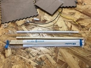
For the automatic door to slide, we used a straw and wires at first. However, the wires were too small compared to the straw so when the door slides up and down, the door would sway from side to side and the gears wouldn’t line up.
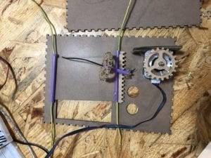
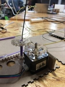
We ended up going to Family Mart to see if they had a narrower straw or something sturdier and thicker that the wires. Fortunately, they had both a smaller straw and these wooden picks. It fit perfectly and prevented the doors from swaying.
Challenges/Obstacles

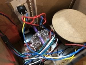
One of the most challenging things was making sure both of the gears would line up. At first the position of the motor was a bit off, so the gear wouldn’t match up after they turned. We had already glued the motor onto the box, so we had to cut off the hot glue and re-glue it. We also noticed that the hole we made for the buttons were too big, although we were sure we measured it correctly. We ended up putting the buttons through a piece of cardboard so it would hold the buttons up.
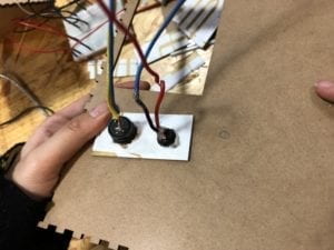
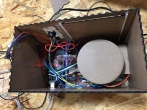
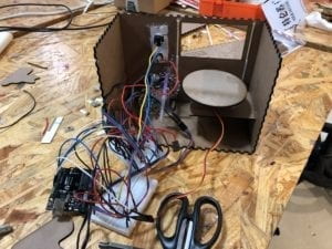
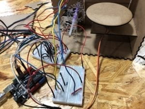
After we were done building the circuit and and gluing most of the box, we noticed that the box was potentially too small for all the circuits. We ended up replacing a lot of the wires with shorter ones for the breadboards and Arduino to all fit into the box.
Conclusion: Reflection 

I think the automatic door was definitely a positive addition that we added in response to the feedback we received during user testing. Making the box taller and placing the button right next to the door were also positive changes. Our users definitely were not confused as to where to look because their attention are drawn to the red button first and then immediately onto the door that’s opening right after they press the button. I learned that it’s best not to assume that everything will work smoothly and then start working on the project at the last minute.

Demo

We also had our friends try it.