Masked Breath – Theresa Lin – Marcela

PROJECT TITLE – YOUR NAME – YOUR INSTRUCTOR’S NAME

Masked Breath – Theresa Lin – Marcela

CONCEPTION AND DESIGN:

For the concept of my project I wanted to bring awareness to one of the many environmental issues we have and are still actively contributing to which is air pollution. I wanted the users to wear a physical face mask while they look at a screen of pollution. When they put on the mask, the pollution will clear away.
Through this I want to show that sometimes when the air isn’t as visibly polluted as others, people might think the pollutants are not there but in reality it is; they just can’t see it. I feel like a lot of people are either used to air pollution and don’t think much about the consequences on health and the environment because they aren’t immediate. Maybe one day they are coughing because the air quality is so bad but the next day they’re not, that then results in what seems like a short-term effect for some people. However there should be a constant reminder that something does need to be done about the pollution and that air pollution is there whether or not we see it. That’s why a basic act such as putting on a mask is important. It acts as a visual reminder of the air pollution problem especially on days when the air particles aren’t particularly visible.
This is the meaning behind my project that I want to convey, however I do believe there are many different ways my project can be interpreted and I want to encourage people to freely interpret the meaning and think more actively about this issue.

FABRICATION AND PRODUCTION:

For the image I wanted to show in Processing, I first used a video of a timelapse of the blue sky. In front of that I had a class of a fog-like png image. I used a temperature sensor to put in the masks. The idea was to add at least two masks so two people can wear it. When two people wear the mask, the pollution (images) will fade away faster. However since I had too many layers of images processing would not run fast enough. I tried decreasing the amount of layers and also changing the background video to an image but it still could not run fast enough even for the user to tell that the images are moving. Despite that, I still user tested with what I had with a few people. Some of the feedback I received were that the images I used didn’t really seem like air pollution. They seemed more like clouds. Also the images were moving too slowly so they were confused at first as to what was supposed to happen when they put on the mask.
After I received lots of help and feedback from Marcela, we changed the images to small ellipses that looks like air particles. That worked so much better, and even though there were around 20000 small particles, processing still ran so much better. Another change I made was instead of making the particles clear away faster when two people wear the mask, I changed it so that all the particles would only fade away if there were two people wearing the masks. If only one person wears the mask, only one group of air particles would disappear. I had two groups of air particles. One problem that I realized during the feedback given after final presentation was that people couldn’t tell only some of the particles cleared when one person wore the mask. It just looked like the particles were moving around on the screen. From the feedback I received, I agree that it would have been a better idea to use image tints and change that based on the number of users wearing the face masks.
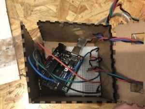
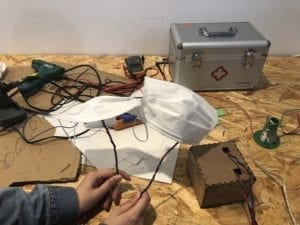
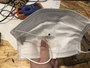
I hid the temperature sensors underneath another smaller layer of a piece of mask.
CONCLUSIONS:

The goal of my project is to bring awareness of air pollution through the means of interactive art. I think my project results align with my definition of interaction in that it has (hopefully) evoked strong feelings on this particular subject matter. If I had more time I would improve the feedback on Processing, possibly change the image tint or change the image to a clearer blue sky when two users put on masks. I would add more different feedback and increase the number of masks, so that every distinct number of people wearing it would results in something different on the screen changing. Like Rudi mentioned, I can see this project on a bigger scale involving more users. Rather than have people read about the consequences of pollution, I think something visual and interactive leaves a better and longer impression.
Week 9: Final Project Process by Theresa Lin

Lilyzone

This project is an interactive art installation. They intend to create water lilies out of plastic for users to interact with. The interaction is mainly through sticking something inside the water lilies to play sounds of a “bianzhong” and other traditional Chinese music/sounds for users to experience a traditional Chinese cultural atmosphere. Some of the feedback we gave was that maybe instead of a sticking something into the water lilies, there could be other ways to trigger the sounds. It would be more intuitive if the sounds played when the user places the water lilies on water. We also suggested the possibility of incorporating a pressure or distance sensor instead.

Your Pet Plant

This project aims to create a realization and emphasis that plants are also living creatures and the relationship between humans and plants need to be improved especially in consideration of the detrimental environmental issues the world is facing today. The idea is to have a plant in Processing that corresponds with a physical model of the plant. Whenever the user touches certain parts of the physical plant, there will be some kind of feedback, for example a laughter, from the plant in Processing to show that the plant has a personality. Some of the feedback we gave was that maybe instead of showing a plant in Processing, there could be something else since there is already a physical model of the plant that the user is interacting with.

E-Maze

This project is a game that’s a maze on Processing in which the user controls a ball on Processing through a game-like controller with Arduino. The path that the ball passes through will be painted with colors and once the user colors all the path in the maze, they will pass the level. Some suggestions we gave was that instead of just colors on the maze trail, maybe it would be more intriguing for the users if an image was revealed instead. So instead of just colors, the users would be moving the ball throughout the maze path to reveal the image. This way, it creates more of an incentive for the users to want to play and pass the game.

I found it intriguing how most of these projects were not just focused on interaction between people but more of creating an experience or drawing attention to a world issue. All of these projects definitely align with my definition of interaction because they all intend to create strong emotional feelings from the user through the experience. After hearing about all these project ideas just makes me realize that there are so many ways to utilize technology not just through practical use but also to create meaningful or sometimes even just simple, fun experience that connects a person to the world or other people around them.

Feedback I received

  • Better to have just either single player, or two player
  • if Two player was an option in addition to one player why would the user want to play with someone else, what is the motivation behind it
  • if it’s just one player then it’s also a bit boring if all the user is doing is pressing the same colored button to match the one on the screen
  • if the physical keys are bigger in size then when two players play the notes will become chords so then one person can’t play that many chords at once, so then there has to be more than one person playing

I do think that it makes more sense to just focus on one or multiplayer aspect. I think my incentive for having it as an option was not strong enough. I’m also thinking of integrating the idea to make the physical keys larger so that one person won’t be able to hit all the keys at once if more than two appear on the screen.

Week 10: Media Controller by Theresa Lin

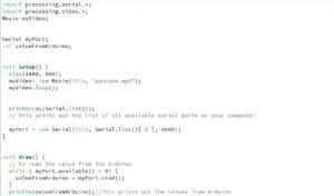
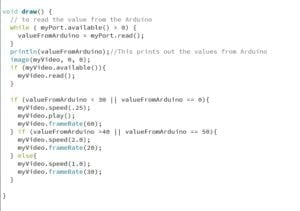
For the exercise, I used a potentiometer to try to control the speed of this video. The idea was to make it so that the users can make the video go in slow motion whenever they wanted and speed it up whenever. After I edited the code for one variable, I spent a while playing around with the speed() function to see how the video would react. In the code, I set it so that if the values from Arduino was over 40 the video would play twice as fast, and if the value is under 30 it would play at a fourth of the original speed. I also increased the frame rate to 60fps so when it’s in slow motion, the video quality wouldn’t be too blurry. I think because my computer lagged so much, it was really hard to tell if the video was actually slow or fast when I turned the potentiometer. The values that Processing was receiving kept jumping from 10-13 to 48 or the other way around so sometimes the video would end up speeding up or slowing down when it’s not supposed to. I’m not sure if there was something wrong with the potentiometer or it could be that my computer made it lag. It’s a bit hard to tell in this video.

As mentioned in “Computer Vision for Artists and Designers” because of how computer algorithms are so widely available for anyone to learn, computer vision is being incorporated more and more into not just ‘practical’ designs but also interactive art. It broadens the scope of ways people can experience art. I think using Arduino and Processing is a really good way of interaction that tunes into humans’ physical senses while people experiencing computer-based artworks. It creates a bridge between the physical and digital world.

Final Project Essay- Theresa Lin

A. Project Title

Musical Colors

B. Project Statement of Purpose

Upon reflecting on my midterm project, I have found that interaction between multiple people creates a different reaction and experience compared to interacting with a project alone. I thought of many activities that involves two people but at the same time can also be done alone and came to the conclusion of playing music. I used to play piano, which is something that can be played alone, but I also remembered the times I’ve played duets. From those memories, I remember how much different the experience was playing the piano with someone else together compared to playing a piece alone. Because you have to make sure you’re playing at the right speed as the other person, it creates a interactive experience between you and the other player. In a way, it can be thought of as an cooperative game. From that, I thought about creating a project that could imitate this experience, allowing the user to play alone or with someone else and experience two different feelings.

C. Project Plan

For my project, I plan to have possibly a preset song that will play when the user(s) press the correct keys. On the screen, there will be two rows of different colored blocks in order from left to right. The user just has to press the correct key (button) of the corresponding color shown on the screen for the note to play (the physical key/buttons will also be colored). When the correct key is pressed, the note will play and the block on the screen will rotate once as a visual feedback that the user pressed the correct key. Two players can also play. I want to have an option before the game starts for the user to choose whether there’s one or two players. When two players play, however, the blocks on the screen will only give the rotation feedback and play the note when both players hit the key at the exact same time.

I plan to first code music block notes on the screen during the first week and have it done by May 4th. Then start to work on the second half, connecting the buttons from Arduino to Processing from May 4th until the presentation.

Project Plan

Week 1: Visual coding

Week 2: Start working on connecting the buttons from Arduino to Processing

D. Context and Significance

In my preparatory research and analysis, I refined my definition of interaction from the previous research project to “interactivity is not only a process of input, processing, output, thinking, and feedback but simultaneously a process that evokes strong emotional feeling from the participants.” Then after this, I received feedback on my midterm project. Upon further reflection, I would like to finalize my definition of interaction as “an experience between a person and computer or two or more people that involves a process of input, output, thinking and feedback which evokes strong emotional feeling from the participants.” Because there are many different levels of interactivity, I would say the most engaging form of interaction is usually between two or more people. In the case that a computer is involved, it acts as a tool or form of interaction for the users to be engaged in. So for my final project, I wanted to create something that emphasizes the different level of interaction depending on the number of participants. I also wanted to focus on a fun aspect for the project so participants will experience a positive feeling when interacting with my project.

Ainu Website Progress Report

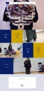
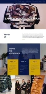
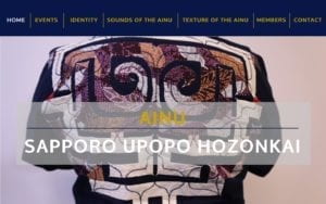
So far, we created four different mockups of the website homepage using Inviison Studio. We chose a navy blue (#081748) as the primary color and a darker yellow color (#CCA300) as the secondary. The navy blue reflects most of the Ainu’s apparel. The layout of the website are based on actual Wix themes that we were considering.

From the feedback we received in class, most preferred the second layout where an events section is shown on the homepage. This way, the events and workshops section is emphasized as a bigger part of the Ainu group’s focus. Some people were unsure about the color combination, mainly the yellow color. There was also suggestions for more image transition so there would be more interaction.

Next, we would like to focus on actually making the website on Wix and add transitions to the images. We are also planning to start going through the content and start the editing process.