http://imanas.shanghai.nyu.edu/~tke217/week01/aboutme.html
Hey guys! This is my link ^ to my first project, linking the css exercise we learned and my About Me page. I thought it would be cool to combine these two, because I was really proud of my first version “About Me” page and took a while working on that (especially since I’ve never built my own website before). However, the css exercise was a whole other process that also took me a while to get used to.
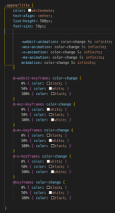
I used the style.css program aside my index.html to help personalize my website. I used a lot of the: justify-content, align-items, align-content, and text-align to basically center all of my photos and content, because personally I believe centering is aesthetically pleasing!
I also played around a lot with the width and height of the images, because I wasn’t too sure what would be appropriate values, so I just experimented and came out with exactly what i wanted (same height and width on most of the images).
One thing that was difficult for me, was connecting what I was trying to style to the actual style.css program on Atom! I would cross my fingers whenever making adjustments there and then refresh my page to see if there was any actual difference. Something that I did enjoy was the outcome of my page, because I feel I definitely incorporated what we learned in css — like centering the images, title, and body, changing the font, font-size, and color of the texts, and using the flex-box to make the website how it is now!
