Week 7: Audio Project Documentation – Tenielle Ellis

Link:  http://imanas.shanghai.nyu.edu/~yy2552/audio/

Description:

Anica and I agreed on basing our website around the popular idea of relaxing on a nice riverboat in Italy, and enjoying the sights as well as sounds of what one might be passing by.  We also thought using our own comic person to help guide the user would be a cute and contrasting idea. I say contrasting because we knew that we were going to use images from the internet, yet we also wanted to embed the topic of the last project into ours, and create a cute imaginary, yet realistic experience for our viewers. Lastly, we included two buttons underneath our tour guide so that the user can have fun choosing which side of the river to be on. 

Process: 

Anica was in charge of the coding and visuals of the website, and I was in charge of drawing the cartoon character, finding the audios online, & editing them on Audacity. Throughout the process, we would often find times to meet to work on the project and make sure we were on track. We would then be our own “teachers” and assign individual work for what needs to be completed before the next time we meet. From previous experience, this way strongly encourages us to make time for the project and use the time given wisely.

I came up with the idea of using a comic person in this realistic-set theme, because I thought it would be fun not only trying to incorporate the theme of our comic project, but to make a contrasting setting. So, I drew a comic person sitting and relaxing on the Riverboat in Italy. Map in hand, and hat on head, this tour guide will happily help our users navigate through our website. 

I also was in charge of finding the audios for each sound, and wanted it to be as realistic as possible. My inspiration to know which image and sound I wanted to incorporate stemmed from Youtube videos showing me the perspective of being on a riverboat in Italy. I looked at different videos and perspectives to give me a more accurate picture of what to look for. I then took each audio and turned it into my own mix. I edited all the audio and combined certain parts of different audio together, as well as amplifying the sound to make it more clear. I also made sure that the amplifying levels on each audio were the same or very similar. 

In terms of teamwork, that was definitely a bit challenging for me. Teamwork is really an acquired skill, and I found myself frustrated at times because of the language barrier which led to continuous miscommunication between my partner and I. 

I personally didn’t think some of our goals were met, like for example Anica and I kept running into this problem of not having similar visuals for the webpage, so we had to constantly go back and forth between fixing it and trying to clarify what the united vision is here. However, with both our hard work we eventually came to a similar goal with how the website is supposed to look like!

Audio Citation:

The source for the audios were found on https://www.zapsplat.com
Week 6: Response to “On the Rights of Molotov Man” – Tenielle Ellis

I learned a lot from these two readings, but I love how they go hand in hand. They both share a common theme of the usage of previous works and if that is really counted as plagiarism or stealing of ideas when really it is just a source of inspiration to create. From this article specifically, there was apparently copyrighting of a photograph, however the new works was painted and in the original picture the man was holding a rifle, but in the painting that was changed to a cocktail on fire.

The artist saw the picture and decided to specifically focus on the man and emphasize the raw emotions he was portraying. He made this new creation that sparked so much creativity and creation from other artists like church ads because they noticed the man was wearing a crucifix, to being on shirts, billboards, etc. This new artist that was accused of using someones original works couldn’t do anything about the creativity this painting evoked from others. This is why I mentioned in my previous post that you can’t label or own creativity. Creativity stems from inspiration, and in this case I don’t believe it was plagiarism. 

The author mentions that yes, the image may be the same but the idea that it evokes is different. Molotov man was used in so many different ads, in campaign speeches, talked about in classrooms, used on merchandise, etc., but stood for all different kinds of messages. This is why the power of creativity is so amazing, because you can literally draw inspiration from almost anywhere, put a unique personal touch on it, and create something new and amazing. 

Week 6: Response to “The Ecstasy of Influence: A Plagarism” – Tenielle Ellis

This reading was more like a story to me. It offered so much structure and for the reader, it gave us diverse examples to understand the beauty of art: paintings, animations, the free market, etc. To me, the reading simply focuses on the influence of art and the  inspiration it draws out from creators, thinkers, dreamers, artists. However, there is a catch: plagiarism or “stealing” of someone else’s original ideas. A common thought is that in order for one to be creative, everything needs to be “original” and the ideas can stem from previous works however the outcome cannot. Although what I got from this reading (as well as the Molotov Man reading) is that even the most profound and globally acknowledged artists and companies make their work based on previous popular art. 

As I stated previously, the author offers examples to help the reader better understand what the article is trying to portray. In the beginning of the article, he mentions how jazz and blues musicians actually integrate pre-existing melodies into their own songs, as well as how animation is literally built on the inspiration of characters and scenes used before. He was basically trying to say that without that type of influence to inspire and influence, there would be no grand mastery art that we see now. 

He also later then explains how “Copyright is an ongoing social negotiation; a necessary evil”, the words plagiarism and copyright were made up from society and commonly holds a negative connotation, when it actually is an important part of inspiration for artists to produce works and let their own creativity flow. It may be similar content, but the ideas about it may be totally different from the original artist (however, by the end of this reading I am convinced that there is no original artist because other people can take that content and turn it into something totally different that holds a totally different meaning). He acknowledges this fact by explaining that attacking artists creativity because the inspiration is based off of previous works will eventually hurt artists of future generations because it suppresses their creativity when creativity isn’t something to be categorized or labeled. It’s a free flow that is unique to each and one’s their own. However, he does mention the notion of imperial plagiarism, however to my opinion that is still looked at negatively and gaining inspiration should never be labeled or categorized or put in a Good or Bad corner. 

Later on throughout the article he does talk about how art can be a gift and commodity exchange. Meaning that although it can be bought and sold in the market, it still gives the buyer a personal touch or feeling. For example, when someone buys cheese, most likely there is no personal connection to it other than it being the topping of your baked potato. With art, you can still purchase it, but the most interesting thing is that it holds a more personable effect and meaning that is different for everyone. Lastly, he mentions public commons or public commonalities. “The world of art and culture is a vast commons”, meaning that no one is in charge of it, or owns it, but it is a shared experience that brings people together, that creates a language people can use to communicate, to understand, to make relationships and connections. 

Basically, creativity is not necessarily all original…it does stem from somewhere, in some time period, from someone else. Without this influence & inspiration, what would the foundation of creativity be? Without this vital platform and foundation, it’s hard to plant the seed to grow ideas and create amazing works that we see nowadays. 

Week 6: Podcast “Mandatory ~ Homecoming” Response – Tenielle Ellis

I listened to the second podcast: Homecoming, Season One: Episode 1

This narrative was a bit confusing to follow, but with the guidance of sound effects I was able to somewhat understand. I was really impressed by how much audio the podcast was able to pick up, and basically bring this narrative to life. The background noise and music, and the sounds all help give the listener a visual of what’s happening and evokes the emotion of a certain situation, as well as the character’s feelings. The audio also brings the senses to life, for example if someone is sniffling or coughing, or if someone is in the middle of chewing, or the light chatter between people in the background, or the noise of many cars passing by. This definitely shows the location and time of day by using these background noises.

 Specifically, I really liked the whoosh sound of when the narrative was going from the present to the flashbacks. This sound effect really made it easy for the listeners to know that these situations were happening at different times, but they are still interconnected. Another specific situation I wanted to point out, was the sound of being on a call — the ringing and the distortion of voices from one line to the other, and also the sound of being recorded and possibly in an enclosed space.  

I really liked this podcast because of how much sound effects it used. It really gave me as a listener a visual when listening to this narrative, and I could picture the situation at hand. Personally, I am a visual learner so I have a hard time with podcasts or pure audio to really follow what the storyline is, but with the help of sound effects I was able to understand the storyline a little better. 

Week 6: Comic Project Documentation (w/ Vincent and Susie) – Tenielle Ellis

Link:  http://imanas.shanghai.nyu.edu/~vsw227/comicProject/start.html

Idea: In the beginning, making up ideas for the project was fun but eventually we had to come to a mutual agreement about what to focus on. I suggested we focus on something specific so that the idea of our project wouldn’t get lost. We eventually came to the conclusion that we would focus on houses, because it wasn’t too common and we thought it would be interesting to compare houses from different time periods and different continents. To mainly see the stark contrast. 

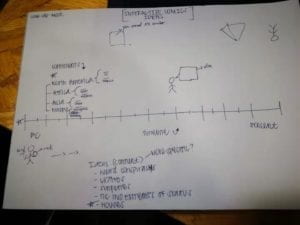
Aside from a typical timeline, we wanted to make it fun for the users, so Susie came up with the idea of having a comic person as the “cursor” that would kind’ve lead the viewer through the timeline.  We then had to split up the work, so I volunteered to do the research aspect, Susie with the visuals and drawings, and Vincent would lead the coding process of the website. 

Description: When the user accesses the website, they will be led to a start screen of the history of houses. It will then lead to a simplistic horizontal time periods dating from 20,000BC to 2019. However, when the user puts their cursor on each time period, there will be a vertical description, flag of origin, and materials of each house. We thought this would be an interesting concept to focus on, especially because of the horizontal swiping and not having to click on anything, but just a simple hover over of the cursor. 

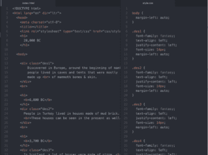
My part: My part of the project was conducting the research for the houses. This part was a bit time consuming for me, because although it seems that researching houses from different time zones could be easy, I was also trying to make sure that the pictures I found accurately represent each time zone and continent/country. I looked for the time periods as well and made up the descriptions for each house. I was really shooting for information accuracy and houses that could be fun to contrast. I also looked up the pictures for the materials that the houses were made up of. Lastly, I wanted to challenge myself and try to pitch in with coding — descriptions on the website. I used our class examples and some of the demos on the PPT to guide me. It was a bit difficult at first because the  html index and css styles weren’t linking. However, afterwards it was easier because all I had to do was copy and paste the same coding, but just change the description, time period, and class name.  I was happy to help out Vincent with his coding process. 

Process: Overall, I think we did a great job. We were all open to meeting after class and working on our project. I also think that our website was different because we went based off original ideas that we wanted in the beginning and  stuck with it the whole way. I also give a lot of credit to Vincent, because Susie and I gave him the foundation and tools to work on the whole website and put together everything to complete the project. I also do believe we achieved our goal because as I said previously, we stuck to our original idea of the timeline and although certain ideas were left out in the end, I can say that we did achieve part of what we wanted and definitely saw our vision come to life! There is always room for improvement, and I would definitely work on the design of the website more to make it more fun and interactive! I would also add more inclusivity with the comic person and the timeline. Although this wasn’t a story, it was definitely fun to put together and this just simply shows another side of a comic website 🙂