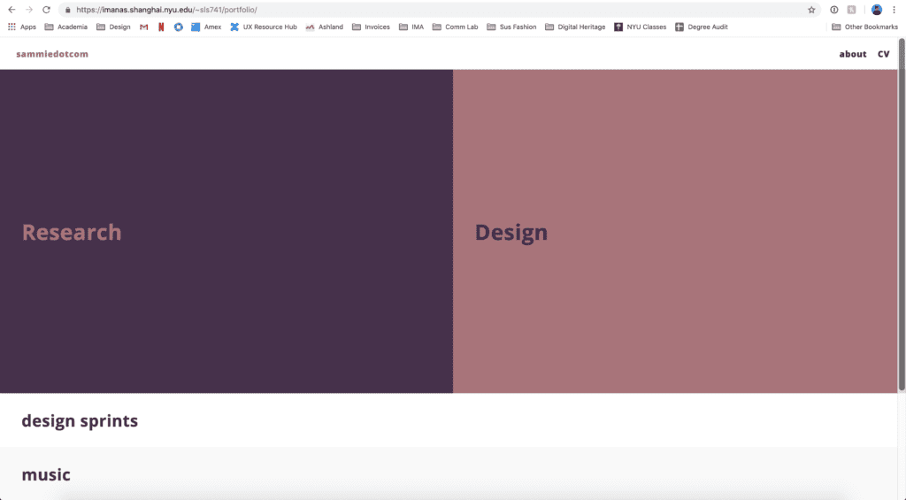
Here is a link to my portfolio: https://imanas.shanghai.nyu.edu/~sls741/portfolio/index.html.

I noticed a couple of times that I had to do a hard reload (Cmd + Shift + R) in order for my updated styles to show. So try that in case the styles do not seem updated!
Since I am in the somewhat weird position of being a senior taking comm lab, I did not run into any issues with styling my portfolio. If anything, I hit more of a creative block. So, this blogpost will focus on my idea behind my layout choice and my process. (Also, please don’t worry if this post intimidates you! I have been writing CSS since 2015…)
Layout:
I wanted to provide a simple and easy to navigate layout that clearly takes the user down two separate paths: 1) My research-related work vs. 2) My design-related work. The reason I want to make this distinction is because I have come to a point in my career where I have shifted my focus from design to research.
Process:
- First, as per the HTML exercise, I built the skeleton of my site — thinking about each page and how the user might navigate between the pages
- When structuring my HTML, I made sure to use containers for each independent section so that the styling would be easier to manage
- Diving in to the CSS, I started with defining the basic elements such as
display and position
- When using
design:flex; it is also important to define elements, such as flex-direction, justify-content, align-items, width and height
- This is important because the
<div> needs to know how big it is and where it exists in relation to other divs in order for you to easily manipulate it
- Then I moved on to things like
margin, padding, background-color, color, font-family, and font-weight
- After that, I started to incorporate some
:hover interactions such as manipulating opacity
Let’s dig into one of the hover styles that I implemented. For the line that animates under “Research” and “Design”, I used the following code:
.hero .design a::before,
.hero .research a::before {
content: "";
position: absolute;
width: 100%;
height: 3px;
bottom: -5px;
left: 0;
visibility: hidden;
-webkit-transform: scaleX(0);
transform: scaleX(0);
-webkit-transition: all 0.3s ease-in-out 0s;
transition: all 0.3s ease-in-out 0s;
}

.hero .design a::before {
background-color: rgb(74, 48, 77);
}

.hero .research a::before {
background-color: rgb(177, 113, 121);
}

.hero .research a:hover::before,
.hero .design a:hover::before {
visibility: visible;
-webkit-transform: scaleX(1);
transform: scaleX(1);
}
There are multiple things going on here. First of all, I am using the pseudo element ::before in order to create the line (read more about pseudo elements here). Since I did not want any content, I defined it as empty "". As I mentioned before, the element needs to know its position and size, so I defined position, width, height, how far from the left and bottom it should appear in relation to the text.
I also define visibility:hidden; as I did not want the line to show to begin with, and I will manipulate the visibility in the hover styles. In addition to visibility, because I want the line to appear as if it’s growing, I then must transform the element by scaling it up. So, first, we must define the initial state as transform:scaleX(0);, and then, we simply change this to transform:scaleX(1); in the hover styles. Lastly, the transition property makes the animation smooth by defining the transition-timing-function as ease-in-out.
Next steps:
- Create the /design page (by revamping my old portfolio site and adding new work).
- Flesh out my methodology documentation on the /research page.
- Make homepage more engaging by further developing my brand and adding some more interesting animation.
