Week 6: Response to Christine Sun Kim “The enchanting music of sign language” – Samanta Shi

I really enjoyed Christine Sun Kim’s presentation. I was intrigued by her last example, where she shows the signs for falling in love, colonization, and enlightenment. The signs were somewhat similar, but mean such different things. To me, sing language feels like a very creative and immersive language. I was also drawn in by Kim’s facial expressions and body language.

Kim made me think about other scenarios where communication goes beyond speech. As a UX researcher, it is important to pay attention to facial expressions and body language because there is a distinct difference between what people say, what people do, and what people say they do. Understanding someone goes beyond listening to what they say. Facial expressions and body language reveal a surprising amount of information about a person: how they feel about what they are saying, if what they are saying is drawn from memory or fabricated, how they feel about you and/or your response. How someone places themselves in a room is also revealing, showing their level of comfort with the space, with you, and with the interaction. I imagine that people who are hard of hearing might pay closer attention to these factors than a hearing person might. As Kim pointed out, she was hyper aware of the reactions that sounds elicit (i.e. slamming a door). 

Additionally, I think that Kim brought up a really good point about softness (p) in music with her p tree. You can never really accomplish complete softness, and there is no such thing as pure silence. There is always some kind of noise or vibration. We do not exist in a vacuum and you cannot escape your own thoughts. While “silence” can be uncomfortable, it is sometimes necessary. (We are also mindful of this during user interviews or usability testing. The researcher should never jump to fill the silence.)

Kim’s presentation also reminded me of the TV show Switched at Birth, where some of the characters are hard of hearing and where some of the hearing characters learn ASL. The show addresses some of the concerns around societal barriers and inclusivity. The hard of hearing community has to find ways to “fit in” to the hearing world. Society should be more empathetic than that… This show made me think about the world we live in and how it makes a lot of assumptions about the humans functioning in it. Anyway, sign language is a beautiful language, and it does indeed have a music of its own by using space, movement, and emotion.
Week 5: Final Project Update – Sam and Tiger

Group members: Sam and Tiger

Idea evolution:

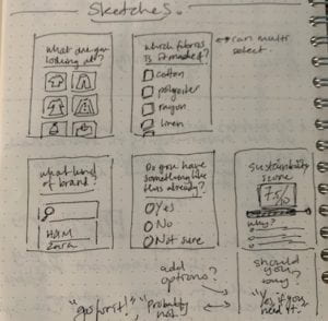
The problem that we identified for the design challenge is: How might we provide a “sustainability score” of clothing for consumers to help them make more sustainable fashion choices? Because there are few ways for consumers to learn about the production process of clothes, and also because of most consumers’ lack of knowledge on textiles, it is hard for them to make sustainable decisions when buying them. Therefore, we would like to help with that by designing a WeChat mini program that allows users to scan a tag on a piece of clothing, and then displays a “sustainability score” indicating its level of sustainability. The score would be determined by these factors: the type of clothing, the brand, the textile, and the price. Besides, it could  We do realize that as time is limited, we might not be able to build a program that’s fully functional, but the basic feature that it would have is that on receiving input, it gives a roughly calculated score based on that.

Research update:

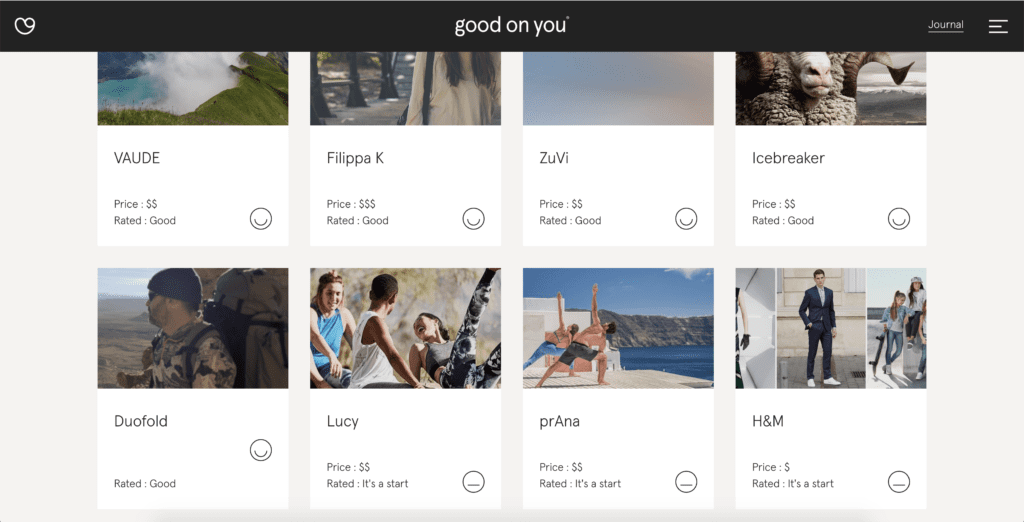
As part of developing our sustainability score definition, we’ve started looking into some already existing sites that accomplish the same, or very similar thing. For example, Good on You has a directory of brands where they rate how sustainable a brand is. Here is a screenshot of their directory:

If you click into a brand, they provide a rating overview for “planet”, “people”, and “animals”,  with a more detailed explanation below. Good on You also provides a page where they describe how they rate: https://goodonyou.eco/how-we-rate/. We will use their guidelines to inform our sustainability score.

We are also exploring The Kering Group’s page on sustainability: https://www.kering.com/en/sustainability/. We are also looking into their environmental P&L tool found here: https://www.kering.com/en/sustainability/environmental-profit-loss/.

Design and development update:

Since we were not so familiar with building a WeChat mini program, we attended the popcorn session that Konrad led on Friday. We learned that its syntax is a bit different from HTML + CSS + JS, but similar enough to understand the basics. On the official WeChat mini program website we found some informative instructions on how to develop a mini program. 

We have some initial ideas for the design of the app, but have yet to create mockups and turn it into a prototype. However, since we want to keep the app simple so that it’s easy to use when shopping / on the go, hopefully that won’t take too long(!).

For the prototype,  we will likely hard code the scores based on user input. However, the vision is that a user can simply scan a piece of clothing without having to do any manual input and then the program returns a score. (We definitely won’t get around to this version this time around though!)

Next steps:

Our next steps include conducting some more research and then putting together our definition of our own sustainability score. We will also have to design the screens for the MVP mini program. We are aiming to have a prototype ready by next weekend so that we can guerrilla test it at a mall to get some user feedback.

Week 5: Interactive Comic Project – Sam and Bonnie

Link to our interactive comic: “How will you spend your day at school?”

Reflection by: Sam

Description:

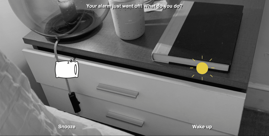
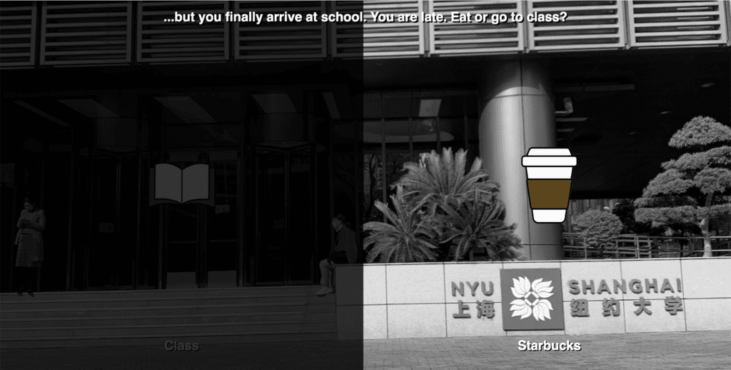
Our interactive comic takes the user through a few different variations of what a regular day at NYU Shanghai might look like. We utilized black and white background photographs with animated characters to juxtapose the seriousness of school with the playfulness of this project.

User is faced with a decision to make:

As the user hovers on one decision, it goes into focus:

Process:

As Bonnie and I worked on our interactive comic, we decided to divide and conquer. As a first step, I took photos of relevant scenes at school, at home, during my commute for background images and Bonnie created characters. After that, I set up our project folder, started on some basic HTML and CSS and created the structure for our JS file. As part of our process, and to manage our contributions to the code, we decided to create a git repo, which you can view here. This helped us manage our code as we were working on separate paths of the user flow, since every interaction requires a decision.

As Bonnie and I worked on building out the flow, we realized that we wanted our comic to look a bit more exciting, so as I was cleaning up the code, Bonnie created animated gifs of the characters. I really love the gifs as they add more energy to our comic!

Issues:

Since our user flow includes so many options, we ran into some issues with maintaining state and keeping track of what class should be active vs. inactive.

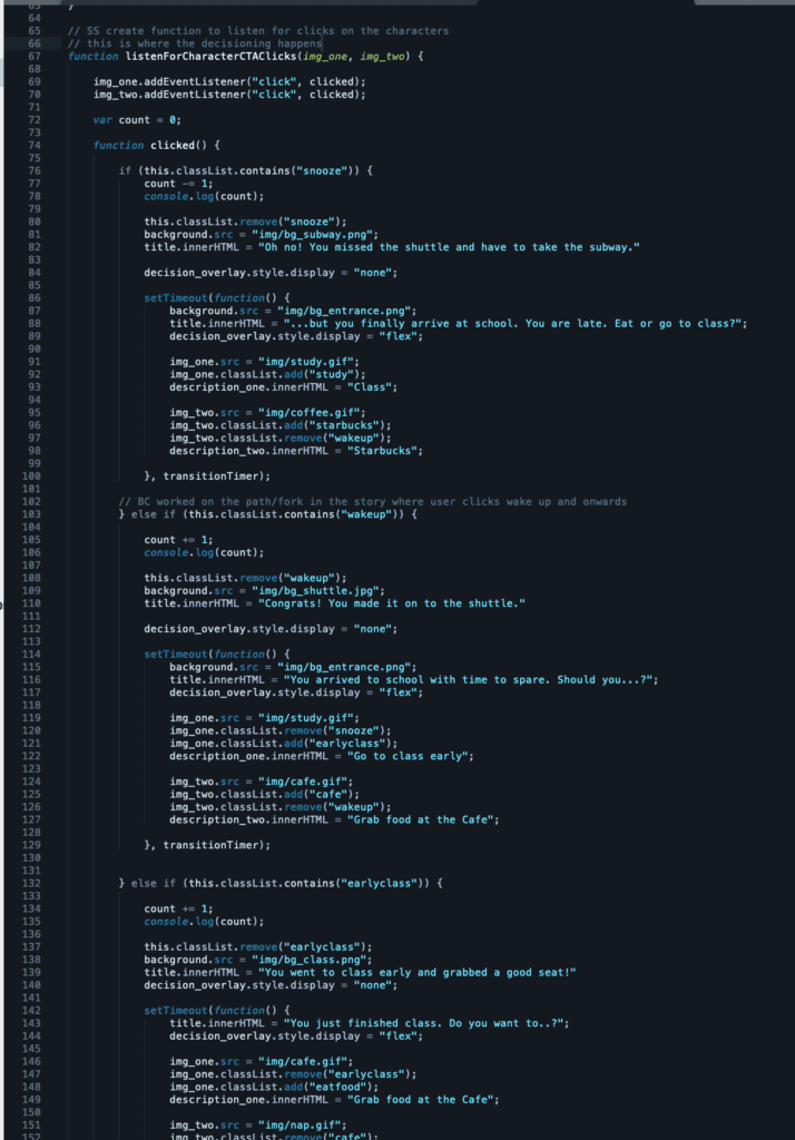
I found myself falling into a deep JS hole when trying to debug the decision tree. For example, our counter seemed off at times, and as I was QA-ing / user testing the demo, some of the decisions that I made seemed good, but then at the end I would end up with a negative score, which didn’t make any sense. So, I used console.log to see how the counter was impacted by each decision, and used the browser dev tools to help dig myself out of this JS hole.

As you can see, our if/else if statements go on and on, ranging from line 67 to 566 đź¤Ż

The adding and removal of classes actually makes this project pretty hard to debug, and there’s no way to go back in the experience, so if I were to create something similar in the future, then I would think about how to structure my if/else if statement better. Perhaps extract the data to make it more manageable.

Also, one thing that I just realized, instead of adding and removing classes using classList, we should have simply reset the class. So for example, instead of doing:

img_one.classList.remove("earlyclass");
img_one.classList.add("eatfood");

We should have simply reset it using className:

img_one.className = "character cta eatfood";

Post mortem: 

I believe we reached almost all of our goals for this project. The one big thing that we didn’t get around to was implementing fun puns and jokes into the verbiage. We spent more time on testing the website to make sure all the user flows were working correctly and making sense. If we had more time, I think we would have incorporated some more characters in some of the scenes, some puns, and perhaps some sound effects.

Week 4: Cradle to Cradle Response – Samanta Shi

I really enjoyed reading about the design principles in the Cradle to Cradle approach. Reframing the problem statement and reworking the goal makes a lot of sense to me. The goal isn’t to produce less, as they mentioned, because that would mean that the ideal goal is to produce zero, which is completely unrealistic. Rather, the goal is to produce more in a way that contributes to “nature’s bounty”. I believe that this optimistic view is what drives innovation and encourages designers and engineers to embrace creativity in creation.

I was particularly struck by this: “Imagine an economy where a designer designs not just for single use, but for a legacy of products with a storyline that has no end” (300).  What an exciting and challenging task!  Suddenly, designers have to think more deeply about their creations: what will it look like, how will it feel, what will it be made out of, what should it be made out of, how will it contribute to society, how will it feed into the next cycle?  It is simply not enough to think about design as merely a visual task because it is so much more than that. Designers determine the “storyline” of the product, whether it’s a piece of clothing, bag, shoes, necklace, phone, laptop, or TV.  Hardware designers, software designers, digital designers — all kinds of designers must take ownership of the product’s storyline in order to support change in production, manufacturing, buying and selling.

The social fairness design aspiration (“honor all natural systems and the people involved in creating products”) also left an imprint on me. Respecting workers, ensuring good conditions, committing to fair wages, and promoting safety really just boils down to empathy.  And, this is something that all designers should be familiar with already, especially if they practice design thinking. I really do think that designers can push companies to make better choices. UX designers already take ownership of building empathy for the end-user within the organization.  Fashion designers can do this too. And, they should not just focus on empathy for the end-user (consumer), but also for the workers.