Week 4: Comic Update (Shirley & Selina)

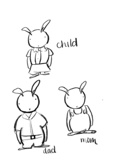
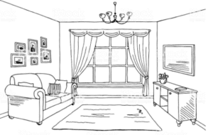
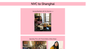
There are different versions of the characters. Right now we are deciding between bunnies or something more human-like/realistic. We are still thinking about whether we want to use the pictures below in our project or draw skylines of each place. Something that is still puzzling us is how will we translate the idea of reality vs. dream into our comic without confusing the reader. For interactivity, we are thinking about using arrows to go from each page of the comic. We may keep a black and white theme but we are not for sure yet.

Sydney

Shanghai

NYC

Living Room

Week 4: Javascript Exercise (Shirley Liu)

Link to exercise

Figuring out the layout of each character and the button was not as challenging as figuring out how to make it look like the character walked.  I was thinking about how to write the if statements but later I realized I needed to define variables in order to succeed in making the picture move. Thinking about what to set true and false was difficult but it made sense in the end. I also ran into an issue with opacity because I thought it was set from 0 to 100% but later realized we used decimals to change the opaqueness. 

Week 3: JS Exercise

Click here

At first, I did not know how to start the assignment but then as I was making buttons and styling them, I thought about how to write the functions for each button. Then, I realized the cat would move when the picture changes. Additionally, I had a little bit of trouble figuring out how to get the cat image under the buttons but I played around with it and ended up using flex-direction: column and it worked out. 

Week 3: CSS Portfolio (Shirley Liu)

Check out my portfolio here!

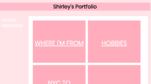
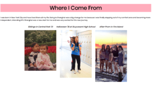
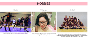
I ran into some problems figuring out how to do the layout for the other pages. However, the exercise that we completed before with the use of flex helped tremendously. It was nice to think of an idea of the layout and then actually put it together like how it appeared in my head. I had some trouble trying to make the pictures centered along with the header but in the end, it worked out. Additionally, I had to figure out how to link a page that I made myself. It was very fun putting together my portfolio and overall I enjoyed the experience. When I used the link Cyberduck provided, not all the pictures showed up. I am not sure what the problem is because I wrote the correct file names and uploaded them all to Cyberduck.

Week 2: Response to Scott McCloud (Shirley Liu)

Scott McCloud’s decision to inform us of what comics are through a whole comic strip is very interesting as it allows us to see what he says about comics as we read the book. McCloud defines what a comic is and what qualities a comic has. McCloud brings up many examples that I never thought could be considered comics such as the airplane safety instructions and pictures taken at a photo booth. Another interesting idea that McCloud delves into is the existence of two worlds that we experience and how simplistic comics have more personality. He claims that comics that are too detailed are too close to what the real world is so in actuality, realism acts as a negative factor in the narrative.

I believe the most interesting part of the reading was chapter 4 because it covered the topic of time in comics. McCloud explains how usually one frame depicts what happens in a moment however, he talks about how that is not always the case and can be altered into what happens over a few seconds. Additionally, he explains how big or small or the number of panels can mimic this feeling of time that is passing. More emotion is depicted through more or larger panels. Through the use of motion lines, we are allowed to influence how someone perceives how an object is moving and the speed of which it is. When not directly told, the reader has to figure out how much time has passed which I think is important to note when making your own comic. Remember to take away that time plays such an important role in storytelling and can affect the overall storyline. Overall, the way McCloud’s thoughts and humor flow together makes the read more clear, interesting, and easy to understand.