Week 3: Basic HTML/CSS Website – Ruby Kim (Moon)

http://imanas.shanghai.nyu.edu/~sk7383/week03/index.html

The task was to create my own website by utilizing HTML and CSS.

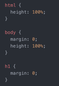
As recommended by the professor, I started by setting the height of html and body as 100% and removed default margins by using inspector and changing the background colors of each divison/attribute temporarily. 
Next, I adjusted the height and width of the larger divisions. In order to avoid the .footer to be collapsed, I made the height of the box–100px– longer than that of the previous assignment. Then since I wanted to locate three different sizes of squares beside the .navigation, I created two containers–.container-1 and .container-2–the former containing two content-boxes and the latter composed of only one long box. 

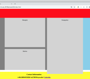
Also, as shown in the screenshot below, the .content box flooded out of the .container-2 when I put my cursor at the top of the webpage. Even though I tried almost everything(including flex and position) that I learned so far. it did not work. But in the end, while searching up for the ‘CSS alignment’ on w3schools website, I found that ‘overflow: auto;’ function helps me solve this problem. 
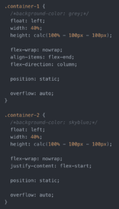
Before applying ‘overflow: auto’

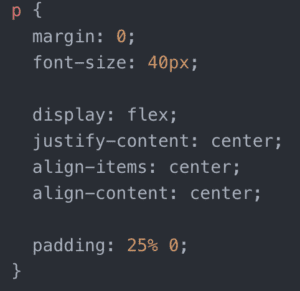
Furthermore, regarding the adjustment of the text within the content boxes, I thought that flex, such as ‘justify-content: center’ or ‘align-items’, could locate my text in the center, vertically. But, it was totally different from my expectation, and I, at last, solved the problem by utilizing ‘padding’. 
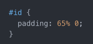
After overcoming the biggest struggles, other things were mostly focused on design, such as font-size, font-family. I chose my font of the paragraph as ‘Merienda One’ and that of the .footer, .navigation, .header as ‘Lobster’. Then, in order to make a link for each category(‘where am I from?’, ‘education’, ‘my favorite artist’ and etc), I created separate html page and css. For those, I aligned both texts and photos to the center, change the color–#9f30b4–for the headers. In addition, I tried to add images from the folder I downloaded, (e.g. img/picture.jpg), but although I typed the order correctly, they did not show up. This was because I did not realize that images should also be in the same folder(in week03, instead of week01).
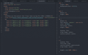
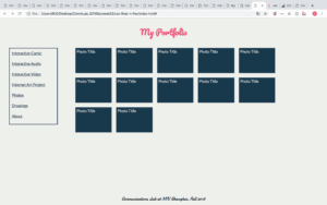
Screen of one of the separate HTML/CSS pages

Week 2: CSS exercise – Ruby Kim (Moon)

http://imanas.shanghai.nyu.edu/~sk7383/week02/css-float-n-flex/index.html

Screenshot of the webpage

In this project, the task was to create a webpage with style by utilizing CSS.

The first problem that I encountered was setting the ‘footer’ to the center of the page, which I tried to manage it by altering the margin and width of the box. Even though it was possible to locate the footer in the right place, but the correct solution was using a ‘text-align: center;’. Also, I learned that the ‘margin’ is not independent, but rather it is referring to the margins between the elements. 

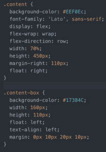
However, coding the ‘content’ and ‘content-box’ was the most challenging part of this project. While trying all the ‘flex’ codes, I still could not figure out the way to set an equal margin for the boxes. And also was not sure if I should employ ‘float: right;’, yet it was the final method that I could choose.  

In addition, by utilizing Google Fonts and Adobe websites, I changed the fonts and the overall color of the webpage. Especially regarding the colors, rather than merely inserting the name of the color (e.g. light gray, white, black) I searched up for the HEX code in order to provide a more detailed illustration.

Week 2: Response to “Understanding Comics” by Scott McCloud – Ruby Kim (Moon)

In “Understanding Comics”, the intent of McCloud is evident in which the comics are generally degraded compared to its true integrity. It is interesting how he tried to redefine or clarify the definition of comics to break the deep-rooted stereotype of society.

I personally agree that the word “comics” itself contains negative connotation nowadays. For example, we can easily encounter a situation when parents scolding at their children not to read comics. Also, at least the schools that I went did not highly encourage the students to comics but rather recommended reading novels or poetries. This incident already demonstrates that people think that comics are not educational and it is a waste of time reading it. 

However, we cannot generalize that all the comics are not worth reading. Even though some of them merely focus on amusement, I think that specific purpose itself is meaningful enough.  Furthermore, comics allow readers with infinite imagination. It is eventually up to the readers to interpret certain images or contents portrayed in comics. Therefore, that would give more room for the creator as well. Also, the part where McCloud mentions that we actually “become” the character in the comics was interesting in a sense that I can hear the voice of the characters in my head although it is a mere drawing inside the book. After reading this, I realized that comics should be recognized  as one of the significant mediums which is comprehensive and allows open  interpretation than others.

Week 2: Response to “The Medium is the Message” by Marshall McLuhan – Ruby Kim (Moon)

As demonstrated in the title, “The Medium is the Message”, McLuhan highlights the significance of the medium over the actual content of the information. In other words, the way how the knowledge or idea is delivered has a stronger effect on people’s perception than the information itself has. In fact, just as we receive differently depending on whether the information is conveyed through speaking or writing, it is not surprising to argue that the method of communication impacts people. For example, in a situation where we send a message to others, we may just type the words that we want to deliver. However, instead of written language, the words can be substituted by emoji, which alters the overall ambiance of the communication. One thing that shocked me the most was that McLuhan published the article in 1967, the time even before the Internet had existed. This might reemphasize the importance of the medium in nowadays where a myriad of data flows around us.

It is undeniable that technological development has offered diverse ways of delivering ideas; however, we have to be aware of the impacts of the medium and be cautious not to distort the essence of the information while taking advantage of it.

Week 2: Response to “Long Live the Web” by Tim Berners-Lee – Ruby Kim (Moon)

In “Long Live the Web”, Tim Berners-Lee highlighted several key aspects that the web should satisfy—universality, open standards, and separation from the Internet. As he mentioned, I also have taken the Web for granted. Without any particular reason, the Web just gave me an impression that it would not change nor disappear forever. Therefore, this article opened a whole new perspective. Especially regarding the openness of the Web, I was astonished that a lot of platforms that consumers use, Apple’s iTunes system, for example, are considered as “closed worlds.” Before reading this essay, I have never thought that iTunes blocks the transparency of the Web, but rather it provides us with myriad choices and information. Also, I have not considered that our freedom is being violated when we join certain applications like Facebook or Youtube to access services. As Berners-Lee emphasized, in order to bring everybody equal opportunities and benefits, webs should not deceive consumers and offer reasonable services so that it could result in the development of technology and preventing fragmentation at the end.