Week 3: Recitation Exercise – Sebastian Lau (Chen)

http://imanas.shanghai.nyu.edu/~shl620/week3/recitationexercise/

I had a bit of trouble using the ‘getElementById’ function because I forgot to add parentheses to the ids that I was trying to reference. Other than that I think the exercise was somewhat straightforward. I picked the theater representations for tragedy and comedy since we usually see them together and I wanted to do something other than the boogie cat. I had a bit of trouble changing the style in css for the buttons as I put the class in the <div> instead of the actually <button>. After fiddling with the button style, I hope to make the box transparent so the text is just there with an invisible box you can click because I think it would look a bit weird for a poem to have buttons. 
Week 3: Comic Idea – Sebastian Lau (Chen)

At first, we were looking at some of our interests to see if there were any topics we could write a comic about. We didn’t really have any so we took a look at some of the examples. We both agreed that whatever we did do should have a story. At first, we were thinking of doing something based on Japanese anime as I am somewhat familiar with them and there would be lots of source pictures we could use if we couldn’t really make the art ourselves. However, after looking at a poem we thought about doing a poem translation where we would both look at a poem (one of us would look at a poem in English and the other would look at the same poem but in Chinese). The interactivity would come in where the user could hover over lines and see our interpretations of the same line in the form of pictures. As we were looking for poems I came across a poem titled ‘Medusa’ that I had read in high school and thoroughly enjoyed. After a bit of discussion, we decided to do a story where the readers could go through ‘Medusa’ and see how the lines of the poem could be visualized (as it’s quite a visual poem). 

Week 2: Mapping – Sebastian Lau (Chen)

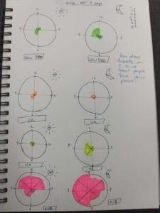
My map charts how frequently I think of people who are currently in certain places. The places I picked were New York, Hong Kong, the UK and Shanghai. I picked Hong Kong because that’s where my family and some of my friends are. I also have family and friends in New York. I know some people in the UK and Shanghai since I’m currently here.

Originally I wanted to use a world map and have bigger circles to represent how often I thought of people from different places. However, I thought it would be difficult to represent the times that I was thinking of people on the map so I decided to go with those world clocks that are quite common. I split it into AM and PM as normal clocks on show 12 hours on them. I think I could have been a bit more creative, perhaps using different colors to show different emotions perhaps when I thought of people from different places? 

Overall the map was quite simple and I think to improve it next time I could try seeing how much information I can really fit into these clocks without overcrowding it. 

Week 2: Photoshop Collage – Sebastian Lau (Chen)

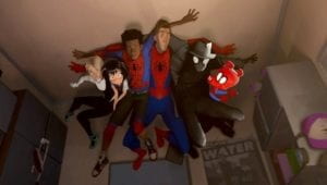
This is the original picture that I put into photoshop. It is a scene from Spider-Man: Into the Spiderverse that shows all of the different Spider people from the different dimensions. 

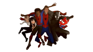
I split the picture into three parts, left, right and center. The center part is the most accurately cut out as if I didn’t cut the left and right perfectly then there would be parts of transparency on the image. As a result, I made sure to leave a bit on the outside so that the center image didn’t need to fit perfectly when I put it as a layer on top of the other two sides. 

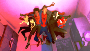
This is the final result. I just changed the colors of the three segments (more red on the left, greener in the middle, more blue on the right). I decided to go with something like this because the movie is styled very much like a comic book. I was hoping to achieve a more colorful comic book look where the scene looks less realistic and flooded with color. I think the red and blue were ideal as those are primary colors of his suit. I could’ve trimmed the different segments a bit more as you can see a bit of red where the scene is meant to be bluer.  

Week 2: Mock Portfolio Link – Sebastian Lau (Chen)

http://imanas.shanghai.nyu.edu/~shl620/week2/floatnflex/css-float-n-flex/

I found most of the coding to be quite straightforward. Aligning the text and choosing the fonts and colors were pretty easy. However, I had trouble with the flex box as I did not realize that I would have to use the “content” class rather than the “content-box” class.