Link: http://imanas.shanghai.nyu.edu/~shl620/poemfinal/main.html
Description:
My partner (Vivian) and I agreed to make an interactive poem based on Medusa by Carol Ann Duffy. We thought that the lines of the poem were quite descriptive and easy to visualize. We hope that people who visit our website can experience the poem in a deconstructed sort of way that is detached from the regular linear poem structure and can instead enjoy it while interacting with the website. On the website, you are meant to experience Medusa’s life as she did. In her mythology, she was cursed even though she was the victim of a crime. So, even though she’s typically seen as a monster, her actual story is much more nuanced and sympathetic. I believe this is somewhat reflected in Carol Ann Duffy’s poem. We tried to show that she was not just a monster with our visuals by showing her as she might have looked before being cursed. In the poem, it’s not very clear whether Medusa intentionally looks at animals to turn them into stone due to spite, but we decided to go with the idea that Medusa is unintentionally doing so since she’s meant to initially be innocent.
Our story/poem is meant to show the transition of Medusa from an innocent woman to an evil monster. In our first page, she’s just a regular woman. In the second page the background is the same image, but when you click on the animals they turn to stone. I kept the background the same image as the innocent woman while she turns animals to stone to try to show that she is doing this unintentionally as she had just been turned into a monster. After she realizes what she has done it twists her personality and causes her to turn into a monster where she is fine with taking someone’s life, which is why she turns the soldier into stone at the very end. We had the line change from “love gone bad” to “look at me now” to show that her love for nature had been taken away from her and has changed her to wanting to kill people.
Although this was very clear for me since I made the story, I think it might be a bit difficult for people to realize, especially since Medusa is typically just seen as a monster. I added an introduction to help explain that she was innocent beforehand, however, I don’t think I made it very clear that she was accidentally turning the animals to stone which I think would have made her seem more sympathetic.
Visuals/Style:
We chose to pull assets from the internet instead of drawing them. I’m not too sure how good Vivian is good at drawing, but my drawings are pretty bad. Also, we completely revamped our project after the feedback on Thursday meaning we only had a few days to finish the project and internet images were easy to find and just as easy to edit. I think the project would look nice hand drawn even if it didn’t look too realistic. I think the backgrounds are a bit interesting, but we weren’t really too sure what else to put there so we had her face to signal when she was a nice person and when she turned into a monster. We aimed to keep our images quite realistic as Ann pointed out that our first iteration of the project had some very jarring stylistic differences. I chose the font to look somewhat old and gray to look like stone. I didn’t really experiment with the font that much, but I added effects to it so that most of them had their own flair. The text are lines pulled from the poem as the project is meant to be a different way of reading the poem.
Code:
One of our most utilized functions was to have an effect happen over a certain amount of time. For me, this was the most important piece of code as I really wanted to have the animals slowly turn to stone because that’s probably how it was meant to happen, or at least that’s how it happens in most media interpretations that I have seen. Vivian found the code and I tweaked it to whatever I needed for the effects. Here’s a list of what I had used this one function for:
- Slowly turning animals to stone
- Having the animals move (instead of just teleporting)
- Having the pig “roll” (done by rotating it while moving it right)
- Having the cat fall (rotations)
- Making the text “crack” (rotations and moving them slightly apart)
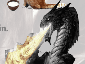
- Dragon and fire slowly turning to stone (made the fire turn to stone more slowly than the dragon so it looked like “Fire spewed from the breath of a mountain” before the flame got extinguished)
- Made the “fire spewed” text slowly turn red

A screenshot of the dragon turning to stone before the fire is extinguished.
Vivian did a bunch of other code like adding buttons to transition from scene to scene. I worked on the introduction as she was a bit unfamiliar with the story/poem.
Teamwork:
I feel like Vivian and I worked quite well together. We agreed on a concept for our project quite quickly. I think there were a few small conflicts in terms of stylistic differences or ideas, but they were very minor. I think the fact that we were able to finish our website despite a few setbacks is a testament to how well we worked together. While our website could definitely be improved, I am very satisfied with what we accomplished in two-three days. We worked efficiently and I feel like Vivian was pretty patient with me as I took breaks frequently. We both worked on separate things and were able to seamlessly integrate them at the end.
Reflections:
I would really have liked to see the website with a hand-drawn style. I think the visuals are serviceable, but most of our efforts went into the various effects and interactivity of the website. I think I underestimated how much work could go into making a simple website. This is the first time I’ve really used multiple files in terms of CSS, JavaScript, and HTML for one project. I’m glad we were able to organize it in a way that both of us were able to easily navigate the project folder. One qualm I have with the files was the naming. They were pretty general or didn’t really make sense in the context of a finished project (like “test.html”), however, by the time we finished I think both of us were a bit burnt out so we didn’t really want to risk changing the file names and messing everything up. Overall, I’m quite happy with our website given our situation.
