Final Project Documentation: Trashley’s Journey – Sebastian Lau

Our project was an interactive comic about trash and how it affects sea wildlife. We wanted the comic to appeal to younger ages because we believed that it would be more impactful if we nudged the next generation in the right direction since they are more impressionable. Furthermore, they have more time to implement these practices. The interactive comic featured a trash bag named Trashley who would explore the sea and encounter different pieces of trash or animals. We thought characters that users could identify with would help pass on the message we wanted to convey and make it more palatable. 

My role was primarily to storyboard and help with the script. I wrote out the general structure of the story first so that we could draft up characters so that Carlo could draw them. I also wrote some preliminary lines for the script so that they could get an idea of what each character was supposed to represent and how they contributed to our story and idea. The storyboards would help people who were unfamiliar with the project understand what we were trying to achieve and how we were going to achieve it. I included things like what each character was meant to say (in terms of the message) and the website’s functionalities. I feel like this in-depth understanding of the website and story was instrumental in creating the presentation. 

One of the challenges was to create the storyboard as I had a different perception of how it was meant to be. I think once I got the hang of it the storyboards were created quite quickly. Another challenge was a bit of miscoordination. Sometimes characters would be added to the website and then I would have to retroactively add them to the storyboard which I guess wouldn’t really matter for WCS, but made it difficult for me since I am still not very proficient in InDesign. 

I realized how early on we should start working and even more important how important a framework or outline is. I feel like a general framework could have helped our group as a whole. It did work in the first couple of weeks when we first made it, but I guess we forgot to make another one and as a result, I personally felt a bit confused on what could or should have been done during those weeks. While I don’t think we should have made an overarching outline for the whole semester, I do think that making another one after we finished the first one would have been helpful. 

I don’t think our project really changed from our initial proposal. The main ideas of what we wanted to do were there, Easter Eggs, interactive comics, and a trash bag as the main character. All in all our final product was more or less what I, and I believe the rest of the team, envisioned. 
Internet Art: The Perfect Human – Sebastian Lau (Chen)

http://imanas.shanghai.nyu.edu/~shl620/perfecthuman/

Description:

What is the perfect human? Who gets to decide what is perfect? Winny and I recreated the short film “The Perfect Human” by Jørgen Leth. We aimed to recreate it in the context of an NYU Shanghai student. By doing so we wanted to first show our own idea of a perfect human and then dispel the notion that there is a perfect human. We also wanted the user to see themselves as the perfect human. I tried to do this by having the website directly refer to the user as the perfect human. I hoped that by having the users think of themselves as the perfect human it would get the user to ponder what makes them perfect, and ultimately come to the conclusion that either they are indeed the perfect human or the perfect doesn’t exist (or is “flawed”). Our recreation highlights how the perfect human (or student in our case) can still be flawed. 

Visuals/Style:

The website is intentionally plain. “The Perfect Human” is quite bare, the room is empty, and only the objects that are needed are present. I wanted to emulate both the visual and narrative style of the film. The original film was black and white (most likely due to technological limitations at the time), but I still wanted to copy the color scheme. The text comes in very short phrases as I felt like it was the same as the narrative style of the film. Furthermore, after Ann gave feedback on what kind of text we should have, I felt like it might be best if our text felt more like an extension of the art piece rather than a continuously scrolling article. I had the background slowly change from black to white as you progress from Jørgen’s films to our work. I used this to signal to the user that they were switching to a different part of the website as well as have the tone shift to something more light. I added a down arrow to the first part of the website (which disappears when you scroll) as testers had mentioned the instructions were a bit obscure (they didn’t realize the text was meant to refer to them. 

In terms of video design, I think our videos were decently well shot. In addition, I feel like our style is very close to the original film. We incorporate the close-ups from both films as well as some quick cuts from “The Five Obstructions”.  While the humans in “The Perfect Human” and “The Five Obstructions” are relatively indistinct, our humans intentionally have more personality to better personify (in our eyes) a perfect human. 

Code:

I feel like the code isn’t very notable. I had a bit of difficulty with the scrolling to change the videos at a certain point because it kept flickering, but I was able to fix it. I also had a bit of trouble where the videos didn’t change when they were supposed to, but I realized it was because they were in the wrong place for if and else if statements. I added some other functionalities like hovering over buttons to change it (making it clearer that it was a button). I also made it so that clicking on the video would play or pause it rather than having to show controls or press something else. I did this to make the website as minimalistic as possible. In addition, I don’t think I needed any more functionalities other than the play/pause button (although for the longer videos a timeline would probably be very helpful, especially for people who have not seen the video yet). Other coding included changing the opacity of buttons when other buttons were pressed so that we could force the user to go through the videos in the order we wanted them to go through them. 

Teamwork:

Winny and I divided the work pretty evenly. She did most of the video stuff, like recording and editing. I worked on parts of the narration and the text for the website as well as the coding. We did come to some disagreements regarding how we wanted the website to be styled, but in the end, we were able to come to an agreement. Overall though I think the project went smoothly since we both wanted to recreate “The Perfect Human”.  

Reflections:

While this project wasn’t the most coding intensive, I feel like I had more control over the art style and direction in comparison to the previous projects. I feel like this project somehow had more “substance” to it compared to my past projects. I think this was because I paired up with Winny who wanted to do something similar to my idea. In comparison to all of the other projects where we would be given groups and then decide what we wanted to do. While I do enjoy working with Winny and think she is a great teammate, I think I’d like to try working on my own website by myself after this semester when there are no deadlines. 

The Life of Trash Comic Update

Storyboard:

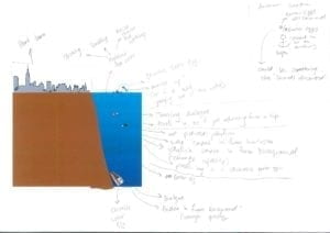
Our storyboard is still in the preliminary stages, but the next iterations will be more focused on singular scenes as well as the interactions and animations featured in that scene. The storyboard will also be cleaned up to make it easier to read. 

Research/Easter Eggs:

So far we have narrowed down our research to a few facts that we plan on implementing in Easter Eggs. These Easter Eggs will look like pieces of trash or animals and users will be able to click on them to receive information. Listed below are the facts that we plan on adding to the Easter Eggs. However, they haven’t been refined into the text we’re planning on adding to the website. 

  • Microbeads are forms of micro plastics that float around in the ocean. 
  • Gyres – permanent spirals of ocean currents
  • If we don’t do anything, seafood can be wiped out in 40 years —> in 100 years, jellyfish may be the only wild seafood left
  • In the stomach of whales: hosepipes, plastic pots and disposable bags
  • Plastic acts as a chemical sponge known as bioaccumulation

Graphics:

Listed below are some of the characters featured in the comic. 

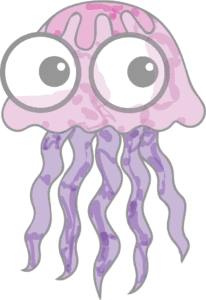
This is Jelly the Jellyfish. He’s scared of being eaten and will unfortunately witness a turtle eating a plastic bag (which it has mistaken for an actual jellyfish). 

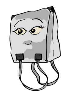
This is Trashley. She’s the main character whom you will be following throughout the comic. She’ll explore the ocean, coming across many different animals. 

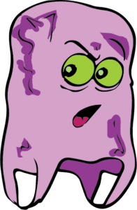
Meet Prince Louis, he’s a trash bag that just came back to the New York harbor due to the ocean currents. He has traveled the world and is much older than Trashley. He shows that trash in the ocean doesn’t just affect one place and it takes a long time for plastic waste to even disintegrate. 

Website:

Some of the graphics are placeholders, but they will be replaced with our own drawings. We are also looking at changing the text size to make it easier to read as well as more appealing to our target audience (6-10 year old children). 

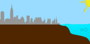
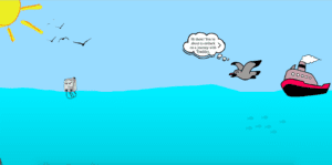
This is the beginning, clicking the start button will cause a gust of wind to blow Trashley into the harbor. 

As she lands in the water a seagull will fly past and give instructions on how to proceed through the comic. The user can then start scrolling to go deeper into the ocean. 

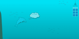
Trashley will be following the user’s mouse in the future. On the right you can see an anchor which will indicate how deep you are. There is also a placeholder image for how many Easter Eggs you have found to give the users an idea of how many left they need to find. Users will also be able to go through each animal’s story by clicking on the speech bubble. 

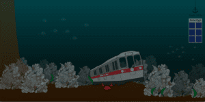
Here’s the end of the comic. The piles of trash is meant to show how polluted our waters actually are. The subway cart is an Easter Egg that will tell users about how they are acting as substitutes for coral as home for fish. 

Audio:

We have some audio to emulate what it would sound like if you were actually underwater. These include bubble sounds as if you just went underwater, as well as general underwater ambiance and background noises. 

Week 13: Final Project Proposal

Final Project Proposal (Winny & Sebastian)

For final project, we plan to present our recreation of Jorgen Leth’s short film “The Perfect Human” in an interactive webpage. Through this recreation, we aim to build an original dialogue with “The Perfect Human” adding our own understanding, and connect this old film with our present life. Our version of “The Perfect Human” will be based on NYU Shanghai and its students. We will re-record the narration and most likely tweak it to make it more relevant to our university. We are also going to have another version called “The Real Human” made up of bloopers (mistakes made during filming). The message we want to convey through our recreation is that humans are not perfect objects, they have feelings and emotions, they make mistakes; in a setting of our real life, our audience can better relate with this idea.

The two sources we are referencing are Jorgen Leth, the director of the original “The Perfect Human” and Lars von Trier, the director of “The Five Obstructions” version. In addition, we also drew inspiration from Chris Milk’s “The Wilderness Downtown”. We chose these artists as our sources of inspiration as we are intending to produce our own version of The Perfect Human. Moreover, we will construct our video in a different way, more akin to The Wilderness Downtown’s way of having multiple windows pop up. The pop-up windows will have the same scenes but will feature different parts of the school as well as different actors.

Within our final webpage, first, we will show the original versions of “The Perfect Human” and “The Five Obstructions” to give the audience an idea of what we are trying to emulate. We will also have text on the side to help explain the videos and as a result hopefully make it more obvious for our audience to see what the message of our version is. We chose to imitate the “The Perfect Human”, or more precisely “The Five Obstructions” as the editing of “The Five Obstructions” fascinated us. The ability to create something so varied and different, yet with clear roots to the original was intriguing. We felt like our project would be important to our audience (NYU Shanghai students and regular students in general) in dismissing the notion of a perfect human. We intend for our actors to represent all of us at NYU Shanghai (as they are NYU Shanghai students).

After receiving feedback from the class we fleshed out our scenes more. We decided on three different scenes, each with three actors doing different things. One scene is eating. However, we are changing the dialogue, and the scenes will be more relevant to the school. We will have a focus on the three different students eating different things (homecooked lunch, cafeteria lunch, wai mai) and then zoom out to show they are all at the same table. Another scene depicts students walking down the stairs. Lastly, our third scene shows students studying for different subjects. We plan on emulating “The Five Obstructions” style of zooming in and zooming out. We are still thinking about the dialogue/narration as well as the obstructions we want to give ourselves.

We will film around the school using the IMA equipment room issued cameras and tripods. We will also rent out shotgun mics and tascams to ensure a high level of audio quality whether it is for the voice overs or for the audio recording during filming.

Week 11: Response to Web Work: A History of Net Art – Sebastian Lau (Chen)

The political aspect of art has always interested me. Not all art is political, but I find it fascinating how often we see works of art comment on the current political climate. I am not sure what about art makes it a medium through which people express their political beliefs, but I do have some ideas. One of which is the saying “a picture is worth a thousand words”. Yes, you can express your opinions through writing or speech, but perhaps a picture can say all of that too. Also, art as a medium tends to be subjective. While different art pieces might be more overt than others regarding their message, I think one cannot truly see the message of said art piece without understanding the message at least somewhat. If the audience is unaware that such an opinion exists, how can they see it in a piece of art, which can be much more abstract than say a news article or social media post. Granted, I know very little about the world of art so what I am saying is just conjecture. 

Another thing that struck me was the anonymity of internet art. Again, not all internet artists are anonymous, but hard to trace web links and urls make it much easier than with physical pieces. Anonymity is very prevalent on the internet. Take for example, Twitter. On Twitter you don’t need to use your real name, address (physical or email), or picture. As a result, people can voice their opinions without fear of backlash. The very same is true with Reddit, an online forum. I believe that art and anonymity work well together. People can create what they want, expressing what they want, without fear of backlash. I think internet art does do this as the article gave examples of unpopular or anti-political opinions which could be dangerous in certain places where freedom of speech might not be as lenient.