PROJECT PROPOSAL-RODRIGO REYES

Title: Rola El Dado 

Statement of Purpose: Our previous midterm project consisted of having a person try his/her luck with our game of luck. We found that people thought they were very engaged with the interaction and that it was simply easier for them to understand the concept. We thought the concept of luck was very applicable to the final project. Although we want to make interactivity fairly simple so that the user may understand the project, we also want to make sure that we develop a project that is complex enough so that there are different elements to the “game” in order to avoid repetition. We found that people are drawn to interact with something that they understand, nevertheless something that does not lead to the same outcome over and over again. This way, the user of the project should be able to engage not just one time, but multiple times. This project hopes to encourage users to utilize it with others in social scenarios such as parties, family reunions, etc. In other words, it hopes to entertain groups in social settings. It draws its inspiration from the game “Truth and Dare”. The project will have six buttons, and six LED lights. The user will try to guess how many lights will turn on. There would be two different sounds, one for guessing right and one for wrong. This and the LED lights should allow the user to understand whether or not he got it right. If the user guesses how many lights turned on, he will get a randomized “truth” on the screen (setup through processing, and shown on the screen of the computer). If the user does not guess right he will get a randomized “dare” on the computer.  

The Storyline:

The Storyline draws its inspiration from stories like Netflix’s Bandersnatch. Considering that the game has multiple “routes” of playing, it should allow users to play the game more than once and still be engaged. There will be two players you can choose from on the screen; either a girl’s perspective or a guy’s perspective. To make it easier for the user to interact, we would film the real-life scenarios and export them to processing. Once you select your character, the user will follow the journey of whichever character he/she chooses. The player will select, with the mouse in the computer, whichever option he/ she chooses from the given ones on the screen. Depending on what one chooses, the storyline will develop differently. The Storylines will be centered around the topics of romantic relationships, and the lack of consent and respect in these. For each end, there will be something programmed on the Arduino to give a more realistic feel to the user. For instance, if the “guy” character chooses to be rude, he/she will end the storyline being slapped in real life (we would get a cardboard hand and servo motors to slap the user). Otherwise, if the “girl” character chooses to be very rude, he/she would be left alone. We would add a dramatic effect by having an electric fan connected to our Arduino throw air at the user. The game will be exaggerated and ironic, as it would only allow the user to choose options that are definitely not correct. Every path that can be taken should lead to the same outcome of being left alone. The project hopes to condemn the lack of respect in relationships and the lack of consent. It hopes that the user can interact with the processing storyline(s) and engaging. It also hopes to bring the virtual, what is going on in the screen, to the user (in real life through Arduino) so that he engages with the character even more.

The Better Reader:

The Better Reader will draw upon common exercises that are used to improve eyesight, as well as reading more quickly. The exercise has also been proven useful for people with dyslexia. A user will see on the computer (Processing will be used for the animation) three columns of three words each (nine words in total). One word is going to blink (disappear and appear) from the top left one by one and row by row until it reaches the last word and it goes back to the top to start again. This will allow for the user to direct his attention to that word that is blinking, facilitating the interaction. The program will randomly stop at any given word and it will ask the user to identify the last word that disappeared and appeared. It will give for options (four words), and if you select the correct word, the program will accelerate the word blinking pattern to make it harder for the user to follow along. You have three lives (opportunities to lose and keep playing) To make it more engaging we will use Arduino to connect to a console that has four buttons (each one to represent the four-word options that will be given on the computer). Furthermore, we would like to have a scoreboard with the ranking of the people that have “played” this game in hopes of incentivizing friendly competition. This exercise should be useful as it would allow users to develop their peripheral view, their concentration, and their short term memory. 
Final Preparatory Research- Rodrigo Reyes


Prior to going to the Chronus Exhibition, I have been to museums such as the MET,  and museums back home such as MARCO. I love interpreting paintings and sculptures, as well as interpreting their meaning. However, it was not until the Chronus Exhibition that I personally say art and modern technology being fused together in a way so that the art itself responds to humans. The Chronus Exhibition installments were very interesting to me because I saw dynamic art. It seemed like everything was moving in a way, and sometimes you could see how certain things you did made the art move or do something in particular.  It was interesting to see how the art installments would react to you, and it was interesting to try to figure out the purpose and the functionality of these installments.  Many of them I thought were too complicated for me to understand their purpose or what I was supposed to do to interact with them. A particular example in the exhibition that I not only enjoyed visually but found it engaging and relatively easy to figure out was  Zhang Hua’s “Artificial Intuition”. This installment would predict where people would go next and would attempt to block you. It kind of felt like a human vs machine intelligence kind of thing. 

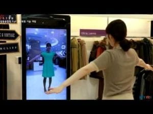
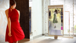
I recently came across interactive “mirrors”. They can be used to help costumers find clothes they like the most. The concept is you have something like a mirror (in reality the examples I have seen are more like a camera and an LED screen instead of actual reflective glass) and the mirror will change your clothes on screen. It could change color, length, and even change entire outfits in a matter of seconds.  The clothing brand CLO released a mirror  (Magic Mirror) in which people can stand in front of the mirror and through their movement select to change outfits. Instantly the mirror adapts to your movements and dresses you up with your selected outfit. One specific trait of this mirror is that you can grab the virtual outfit and it will react you grabbing it. The downside is that sometimes the mirror does not adapt to rapid movements and the virtual outfit is not properly accommodated to you.  Another example of an interactive mirror is Memory Mirror,  which was installed on a Neyman Marcus store in the US. Like CLO’s mirror, the Memory Mirror was designed to help customers choose whichever outfit they like the most. The difference is that the Memory Mirror just compares side to side recordings of what you have worn before and what you are wearing now. It does, however, change the color of the outfit you are wearing accurately. Because CLO’s mirror can automatically change your outfit without the person having to change it I would say CLO’s besides its downsides is the most successful at helping the customer. 

CLO Mirror: https://www.youtube.com/watch?v=rMUsVIB-anY

Memory Mirror (Meyman Marcus): https://www.youtube.com/watch?v=Xp7s_kCHJS0 

In my group project, I defined interaction as a conversation, it is a dialogue, a transmission and a tool that requires an input a process and an output. For it to be a more complex interaction, there must be an input a process and an output that can go back and forth. By the nature of it, you would need a relationship. To add to what I had said before I would like to stress in one key element: Understanding. In the communication that interaction facilitates there must be an understanding of how and what to communicate. In my midterm project, one struggle was making sure people knew, without us telling them,  what they had to do. The interaction was facilitated when we were able to design the project in order for them to understand or sort off expect what we are going to get back. In the CLO mirror for instance,  once you step close enough a “menu” will be shown on screen. Your hand gestures will be traced with a circle,  and once your arm goes forward, you will select an item. I think the design facilitates interaction between the machine and the human, especially considering there is an almost immediate response from the machine when the human does something. 

Recitation 6: Processing Animation (Rodrigo Reyes)

Inground (there is no particular reason why I chose this color). To make it evident that the user had to use the mouse to move the ellipse, I had the ellipse change its form every time the mouse was on top of it, and it would change once again the user started moving the ellipse. This way interaction would happen more this recitation, we worked on animation on Processing. I wanted to make a drawing that got dragged along as I clicked the mouse and moved the mouse. So naturally, there would be an interaction. What I ended up doing was a green ellipse with a pink back smoothly. I honestly think mouse interaction is the most obvious for any user to use, thus that is the one I wanted to explore in recitation. I follow this one coding website called funprogramming.org, the website allowed me to explore other aspects like activating the smooth function. I was also working with sz, and the cursor function to make it interactive. The Cursor function was pretty useful because it gives feedback to the user that they are supposed to click on the ellipse. 

Homework

The homework consisted in making an ellipse contrast and expand on a loop while it chages its color repeadateley as it shift inwards and outwards. Adding the function HSB was very new to me. Besides that working with else if and the bollean rules for this homework were complicated, nevertheless very entretaining and fun. 

Recitation 1 by Rodrigo Reyes

Question 1:

After reading The Art of Interactive Design, in what way do you think that the circuits you built today include interactivity? Please explain your answer.

After reading the art of interactive design I could argue that The three circuits we built were interactive. The first circuit made a sound after one clicked a button. The code helped the process of reaction. We click and we get a sound which is the response.  There was an input, a process, and an output. The second circuit, similarily, had an input, a process, and the output was the light turning on and off. The third circuit was also similar in the sense that the output was the dimming of the light. They all had input, process, and output. 

Question 2:

How can Interaction Design and Physical Computing be used to create Interactive Art? You can reference Zack Lieberman’s video or any other artist that you know.

During the summer I went to a futuristic art expo in NY. I remember being mesmerized by an automatic green screen. The point of it was to stand in the middle of a giant screen and a green screen on the other side. The result would be instant photoshop.  You would stand up in a position that the screen in front of you told you and the screen would tell you where you had to move or whether you were doing it right.   Once you got into the optimal position, the screen that had a camera that could track your movement. would inform you of it. Then, you would see yourself in the screen being photoshopped in crazy scenarios like riding an elephant in Tanzania or being at the top of a giant mountain. I would say that if you actually got into the optimal position that the screen instructed you to, the results looked pretty realistic.  This form of art is of course interactive. because its almost as if you were having a conversation with the screen.  

Recitation 5: Processing Basics Rodrigo

Document your work on the blog. Start by uploading the image you chose in Step 1, and add a description of why you chose this image. Then, discuss what you wanted to draw in Processing and your method of achieving that goal. Consider how your final creation is linked to the motif, and in what ways it is similar and different. Do you think that drawing in Processing was a good means of realizing your design? Please make sure to post your code and a screenshot of your final sketch in addition to the information above.

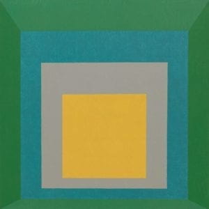
Josef Albers: Homage to the Square: Apparition

I chose this image because I like the contrast between the colors and the symmetry and visual effect that the squares create to make it seem infinite. I really like the visual effect to make it seem like as the squares get smaller, they are positioned further away. 

I wanted to draw something with really precise symmetry like squares, and I also wanted to play with colors while using Processing. In order to achieve that goal, I had to code the size of the canvas (I, and make smaller squares with a different filling to create visually pleasing symmetrical art.  

My code was the following: 

size(600,600);
fill(0,100,0);
rect(0,0,600,600);
fill(0,150,0);
rect(50,50,500,500);
fill(0,200,0);
rect(100,100,400,400);
fill(255,255,0);
rect(150,150,300,300);
strokeWeight(3);

Of course, my drawing was inspired by the motif of Josef Albers. The shapes that I used, the squares, the number of squares, the fact that that squares get smaller inwards and the green and yellow colors that were incorporated drew from Albers. Nevertheless, some of the colors do change and the position is different. For instance, my squares keep getting smaller on a ratio (a pattern), and that pattern is followed throughout. I played with a scale of greens as the squares got smaller, to later get to the yellow in the center. The color scheme differs from that of Albers. I find the symmetry and color scheme of my drawing much more representative of my expression. 

I had never used Processing as a means of drawing, however, from my first experience creating something with it, I did not enjoy it thoroughly and I did not think it was the most efficient way for me to draw.  Maybe I did not think it was an effective means of drawing because I barely have any practice and everything took too long, or also maybe because I am used to seeing the result of my action right away as I draw instead of having to wait until I run a code. I hope my opinion changes in the future.

PDF with the drawing attached bellow:

Untitled document