Spacetime Symphony – Robin Luo – Marcela

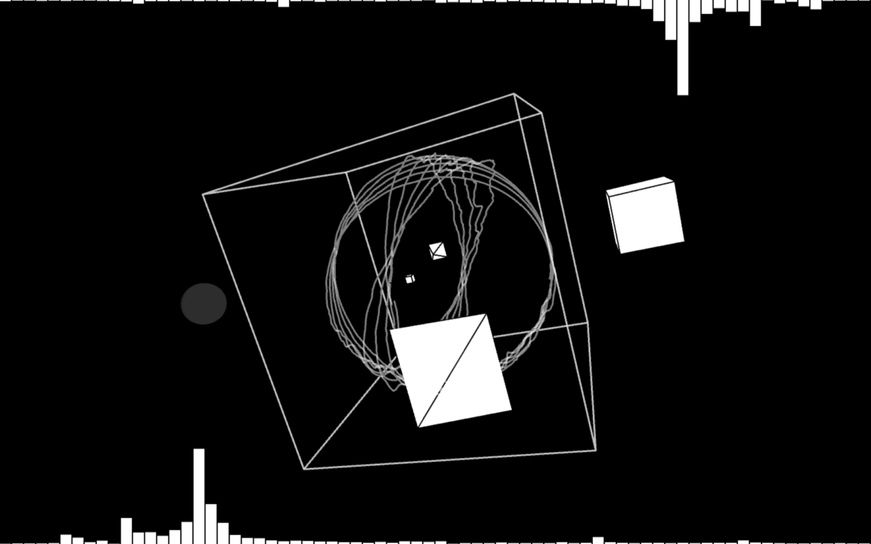
For my Interaction Lab final project, my partner Kyle and I created an interactive audiovisual called Spacetime Symphony. The project generated visuals and audio with Processing 3D which both changed through moving your hands from a distance sensor with an Arduino.

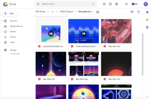
The conception and design of this project was pretty flexible and indecisive at first. We knew we wanted to have several components in our project: we wanted people to collaborate, we wanted people to create something together, and we wanted to include things we were interested in (art and music). We thought it would be interesting to make a collaborative soundscape. Because we can upload music and extract the different frequencies through the libraries and easily create visuals with Processing, we thought that using Arduino to Processing was the most feasible for our project.  We created a moodboard to figure out the visuals and my partner based those sounds off the visuals. We thought having multiple sensors may be confusing and having the same sensor made the device more focused and easier to understand how to use our device as our goal was to make art and music easier to create together.
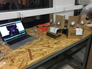
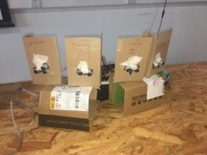
The fabrication and production process was split apart between my partner and I. He was in charge of the audio assets, Arduino code, and physical component, while I was in charge of the visuals, extracting frequencies from the audio, and connecting his components to my Processing code. For my production process, I first waited until he had finished all the audio assets which he made on GarageBand. He made the entire soundscape and made sure each audio asset could be split and synced with the tempo. Once airdropping the audio files, I, with some demo code, incorporated his audio files into Processing. I spent a couple days crafting the code and creating 2 different demo visuals until I was satisfied with the results. Because the visuals were a big component of what the users would see, we needed to create visuals that were relatively easy and obvious to manipulate with color and size, yet also appealing to the eye. At first the visuals changed in many ways with certain combinations of distances, until I decided to have each separate sound asset have its own shape it would manipulate so one could tell that the visuals were changing with clear intention, rather that appearing as if random. During the user testing session, we had our sensors faced toward the user because we wanted users to move by standing. However, after user testing, we discovered many issues with our fabricated prototype. Many people when approaching our project most of the time used hands, not walking, and did not know that there were several audio assets when you changed the distance of where you were. Another issue was how fast people moved their hands near the sensor and didn’t know what was changing on the screen. Overall, the design wasn’t very clear in connecting what the visuals and audio do.
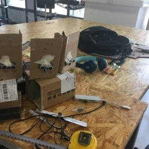
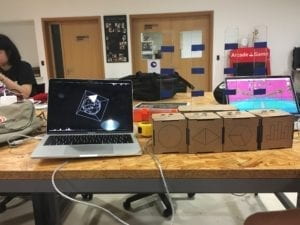
Kyle and I spent the Friday after user testing by fixing our fabricated prototype. We separated the boxes to encourage multiple people to interact with the device and contained our Arduino and wires. We also added an acrylic panel in the back which had markings which signified areas of where to put your hand. Additionally, we thought to change the interaction with hands rather than through standing due to the manner users were interacting with it. We also added labels to each box which showed what users were changing on the screen to help understand what was happening with each distance sensor. With the Processing, I also changed the rate the program detected the changes in hand position for every 5 frames. This is because the original code detected it for every 20 frames which was too slow, and if I removed this portion of the code, the drawings generated would glitch up and slow down due to how many times the “update” function was being called — which was an issue I ran into. 
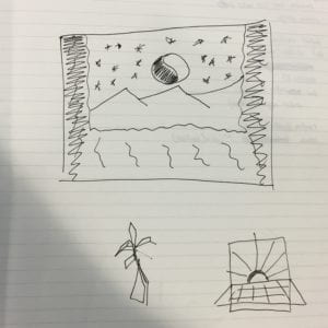
  

We used the cardboard material for our physical component because we wanted to draw the shapes onto the boxes. We also glued the acrylic on the back of the component instead of apart of it because we wanted to have the marks changeable in case they were printed wrong and we wanted a lighter material because we were afraid that the box would fall over. With these changes, we hoped that our intention for our design would be self-explanatory; however, I do think there are issues with our physical component which I considered when redesigning the component — everyone’s hand size is different. The top of the hand would bump into the acrylic marker. We decided it was fine since the users could move the box. Looking back on that decision, I think it still would have been better to move the acrylic stick to the side of the box. 

The goal of my final project was to create a collaborative experience where people can create music and visuals in an easy way. My project results aligns with my definition of interaction because you can visibly see the interaction between two entities/actors. When you change the distance of your hands to the sensor, the visuals and audio react to the changes. But the audience was still somewhat hesitant approaching the project and there was some collaboration and the design was slightly faulty. If I had time, I would have made the boxes more approachable and spread out (LEDs?) and wrote instructions for the user to understand our intention to our design. I would also change the acrylic back and move it to the side of the box. I learned a lot with what I accomplished and from my setbacks and failures. With coding, I learned how to use the minim library, Processing in 3D, and animating with processing. With design, I learned that designing with purpose, functionality, and friendliness (if I could say) takes in account a lot of considerations. Designing for functionality and purpose makes you think about the audience and how they would feel and interact with your device. Although our physical component was not very inviting, it made me think about how do designers create objects that make people want to use it? How can you use design to communicate what you want it to do? How do you bring an invention or foreign object to the world and make it inviting? As for the visuals I created, it makes me think about how do I make visuals that people would want to look at and would notice? Despite the fact we were only allowed a Mac screen for the IMA show, it made me consider if we had made it into a projection or on the TV would people look at it more? 

With this final project, I learned a lot about how to create an interactive experience without touching. Often, interactive involves pressing a button, moving a joystick, or using force or torque. How can we make audiences interact with objects that don’t really involve using one’s strength but mere movements with an object. Usually an object represents something to hold and be tactile with, not to hover over. 

Ultimately, we decided to create a project which allowed users to not touch much of anything at all because we wanted to create an experience that was pretty seamless and effortless. We wanted to encourage collaboration with art and music as well as create an improvised moment between people much like how communication is — unplanned but natural. I think because of this intention, our project gave way to create meaningful interactions with people through music and art and gave people a new way to interact with objects without touching them. Why are we compelled to approach certain objects of design more than other? What do we decipher from them when we look at it? Is it comfort? Is it beauty? And why, at least for this project, are used to tactile interactions? These questions make me think about how we are used to certain ways of navigating through the world and how it bleeds through our approaches to different experiences. When we live our lives, we are approaching a certain way of design — design of a lifestyle, a design to how we approach life. With this class, we are allowed an opportunity to break those boundaries, inventing how we approach, design, and interact with technology. We are able to propose: what if? 
Final Project Reflection – Robin Luo

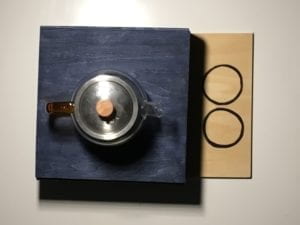
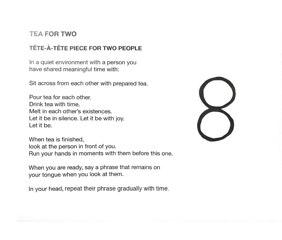
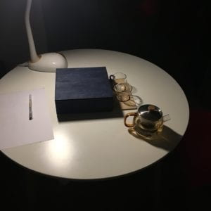
For my final project, Gabe and I designed two person performance art piece called Tea for Two which utilized a tea set and an event score.

Our intention was to allow individuals to feel power with words that deserve time to be heard with people they care about. We wanted to tackle this because words when said often pass us so briefly and instantaneously that sometimes they are not digested thoroughly. Sometimes due to this lack of time or because they can be easily said, they can be used cheaply and their power becomes dulled. I wanted to focus on verbalizing these words in person rather than through text because it lets two individuals be in a moment together and hear these words manifest naturally in the present rather than on paper or screen and see these words that were written in the past before the moment they are read. This also allows one to create time for an experience in their lives and bring people together to say a phrase that deserve time to be heard for a person they think deserves to know it. 


I really wanted to utilize this Final Project to design something experimental, and stray away from technology and design that is functional and useful for the masses and the everyday. Throughout this class, I noticed that the idea of a thing’s functionality and usefulness more often than not is attributed to it’s degree of value and worth. I do think keeping this idea in mind is good for designing with purpose — when it’s necessary. You should question why aspects of your design are there. However, I frequently find this mindset difficult to tackle with the arts — which is why I inserted in the last slide of the presentation: Why design? This question lingered in my mind throughout this entire project — why? Why this project?

Frankly, I had a lot of doubts about the value and validity of my project despite the fact my intention was clear. Why should people care? Why should I care? When looking at or creating art, writing, etc., the more the answer to this question gets muddled and faded. It makes me think about Susan Sontag’s Against Interpretation which suggests when you interpret art or find its reason for its existence (like its form or style), you begin to reduce it for what it is — you make it digestible and palatable. 

Thinking about this question, the reason why I think people should care is because I strongly believe my project — and art, design, writing, really anything that interests anyone — allows a window for an experience that enriches one’s life. With my project, I create a window for an intimate experience between two people who mean a lot to each other an opportunity where they can digest words that mean something to an individual for another individual after they share a conversation over tea. It allows individuals to hear what should be heard and it allows you to take time to appreciate that individual in your life, not over a card or a letter but in a face-to-face conversation and with a single meaningful phrase. I chose this piece as the vehicle which drives this belief.  Despite this reason, whether you believe in what I design or create isn’t a decision I make — I only persuade you and its up to you to believe in what I believe.  

In regards to the design process, Gabe and I thought creating an event score + tea ceremony was the best way to approach this project after we shared each other’s inspirations and ideas while we expressed our wishes to make a tea set. Then we thought instead of creating an interactive and tactile piece, why not incorporate our inspirations at the moment into our intention by designing an experience like Tom Sachs’s tea ceremony and Yoko Ono’s suggestive Grapefruit event scores? I think by approaching this project in this manner, we have the opportunity to touch a more intimate, sensitive experience with art and share the experience of our intention — not only do we allow two people feel power in words, but we allow two people to be present for these words meant for you. I think this approach makes the experience with this art piece more powerful.

Because of this intimate experience, I wanted to integrate this experience subtly and naturally as possible. I didn’t want to create something artificial. This consideration for the natural permeated through the entire project. As I wrote the event score, I didn’t want to have them do a specific action as Yoko Ono does in some of her pieces like to “Scream at …” or “Eat a tunafish sandwich.” Drinking and making tea seemed like already a very natural and nature-like experience, and while the event score had less specific requests, it was done on purpose. “Melt”, “Let it be,” “remains,”  and “gradually with time” were phrases I thought and felt were ones that are out of our control. I wanted words you said to the other person to emerge and settle. I wanted the individuals to appreciate the time spent together. You could say I wanted the words and experiences to be like how tea leaves are when they are sprinkled in a hot cup of water and then sink, saturating the water over time.

Final thing I want to add to this reflection is the symbol we used. Gabe incorporated the two circles just for design for our tea tray, but I found a lot of meaning we could incorporate in it. I liked how they were just touching like how we often graze by others in our every experiences, how it looked like a figure-8 or a sign of infinity like how all of our experiences are embedded in the past forever, and how it looked like two tea cups touching. I also think by drawing in the symbol, it again emphasized the natural aspect. I thought it was a nice touch! 

Ultimately, I really enjoyed this project despite my insecurities about it in the end because it made me think more about why I design, what is design, and why design at all — an approach which I tried to hold when taking this class.

Final Project Workshop Reflection – Robin Luo

For this Final Project workshop, we did several mini workshops: empathy workshop and Final Project ideation.

The Empathy Workshop was fascinating — I was particularly excited by seeing whether or not I managed to have my partner build what I described. I thought it was essentially about effective and clear communication as well so your partner could clearly understand what to build. As for empathy, I can see how it is to help share an identical connection and build connection. Usually, I associate empathy with being able to understand someone else’s emotions rather than to a physical object. 

The Final Project ideation definitely helped break through the pressure of crafting your own final project with a new set of eyes. I definitely considered the new ideas my partner brought to the table and what Gabe’s partner suggested. It is definitely going to shape how we approach the project. I also helped clarify my plan of action. I think having someone else look at your project simply helps one to break away what they want to envision.

Group Project Individual Reflection – Robin Luo

For my group project, we designed a product called “Connect” which allows social event organizers to have a new way to connect and get people to socialize through a LED bracelet which light they can control and symbolize. 

Overall, this project definitely helped me to understand and approach the design process. Often when I come up with a project to tackle, I tend to have a lot of ideas which tend to be scattered and lack coherence. Designing a product which has a certain purpose or goal felt like an exercise to help me narrow down a focus and isolate and mold ideas into a way that made sense. When we discussed about our product, it was difficult to find focus; but after talking to Leon about our design, one piece of advice that heavily stood out to me that he gave (which has completely reoriented me to how I approach design) was contextualizing your product. Narrowing your product into a very particular scenario really helps form the product you want to design and reinforce why you pick certain design choices. 

With this context in mind, designing the bracelet was really balancing out the feasibility and the design frameworks we had to work with. The original idea was to 3D print the prototype, but I ran into so many problems with the 3D printer (7 attempts) that I ended up using the 3D printer in the Fabrication Lab which took 2+ hours of waiting. Not only that, just wearing the test print was too uncomfortable and the fact I couldn’t choose the color of the filament for 3D printing already defeated the intention of the sleek black design, so I opt out by using fabric that matched the aesthetic choices we wanted and was also comfortable. It also made it easier to create 2 bracelets without having to wait unnecessary amount of time. It also helped orient the LED light into focus and be the centerpiece of the product — as well as easily incorporate the LED and 3V battery to the bracelet! 

This assignment really helped reorganize the way I approach conceptualizing projects and how to design with purpose. It also reinforced the idea that design can bridge the boundaries of our regular way of navigating through the world and allow us to explore experiences we otherwise wouldn’t have experienced if we didn’t design a certain product, building, city, etc. in a certain way. It was definitely a learning experience yet also interesting to see how we can design new products by mixing up different frameworks that don’t necessarily fit with one another. 

Recitation 11: Documentation by Robin Luo

Lab Date:  May 3, 2019
Instructor: Marcela

Aim of Today’s Lab: Pick a workshop to attend: Media Manipulation, Serial Communication, Object Oriented Programming 

For this workshop, we practiced media manipulation with Processing. We looked at how to change videos’ and images’ styling, video speed, and how to incorporate video and image manipulation step by step.

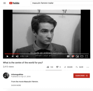
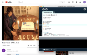
I created random scraps of videos I liked and random photos I found online. I used clips I found on Youtube of two films: Masculin Feminin by Jean Luc-Godard and Close-up by Abbas Kiarostami. The images I found were from searching on Google images “super8 stills.” I also used the sound library to manipulate the tint of the video. The song I used was “D.A.R.L.I.N.G.” by Beach House.

I ran into some issues loading the videos until I realized that the videos must be saved into a folder called “data”. Other than that, I just had fun with the exercise!