Recitation 7: Functions and Arrays

Introduction

In this weeks recitation, we learned how to use functions and arrays.

Part 1

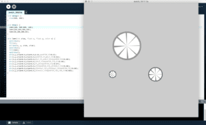
For this part, we had to create our own design and use it as a function in order to reproduce the same design 3 different times with different variables.
Part 2

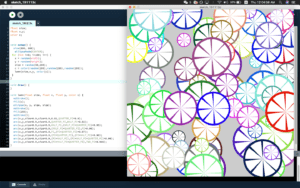
In this part, we created a for loop in order to recreate different versions of the image 100 times. The loop I created was placed both into void setup() and void draw().
Part 3 and 4

For these part, I created arrays for the x, y, size, color data, as well as speed for each of the individual drawings. I set up and filled all the arrays in the void setup() section, and then used loop in void draw() to display the function I had made 100 times with movement.

[Video cannot be processed at the moment]

part 4

Code

int lemn = 100;
float[] x = new float[lemn];
float[] y = new float[lemn];
color[] c = new color[lemn];
float[] size = new float[lemn];
float[] xD = new float[lemn];
float[] yD = new float[lemn];

void setup() {
size(800, 800);
ellipseMode(CENTER);
for (int i = 0; i<lemn; i++) {
x[i] = random(width);
y[i] = random(height);
size[i] = random(50,200);
c[i] = color(random(255),random(255),random(255));
xD[i] = random(-10,10);
yD[i] = random(-10,10);
}
}

void draw() {
ellipseMode(CENTER);
background(120);
for (int i = 0; i<100; i++) {
lemn(size[i],x[i],y[i],color(c[i]));
x[i]= x[i] + xD[i];
y[i]= y[i] + yD[i];
if (x[i] > width || x[i]< 0) {
xD[i] = -xD[i];}
if (y[i] > height || y[i]< 0) {
yD[i] = -yD[i];
}
}
}


void lemn(float size, float x, float y, color c) {
noStroke();
fill(c);
ellipse(x, y, size, size);
noStroke();
fill(255);
noStroke();
arc(x,y,size*0.9,size*0.9,0.01,QUARTER_PI*0.9);
arc(x,y,size*0.9,size*0.9,QUARTER_PI,HALF_PI*0.92);
arc(x,y,size*0.9,size*0.9,HALF_PI,(HALF_PI+QUARTER_PI)*0.95);
arc(x,y,size*0.9,size*0.9,(HALF_PI+QUARTER_PI),PI*0.96);
arc(x,y,size*0.9,size*0.9,PI,(PI+QUARTER_PI)*0.97);
arc(x,y,size*0.9,size*0.9,(PI+QUARTER_PI),(PI+HALF_PI)*0.98);
arc(x,y,size*0.9,size*0.9,(PI+HALF_PI),(PI+HALF_PI+QUARTER_PI)*0.99);
arc(x,y,size*0.9,size*0.9,(PI+HALF_PI+QUARTER_PI),TWO_PI*0.995);
}

Questions

  1. Setup makes the code run only once, whereas void draw() makes the function loops, similar to how void loop() in arduino loops the code.
  2. Arrays can help when working with a large number of separate elements and entities within an animation. In this case, I had 100 different objects with their own unique properties, and all these properties were controlled with the arrays that were created. In a future project, If I were to need to control many different elements with individual variables, I would now be able to simplify the code using arrays.
Recitation 6: Processing Animation

Part 1

For this recitation I tweaked the bouncing ball code and made it so that a box would appear if the mouse were to be clicked, and then the ball would then bounce inside of that box instead of around the whole screen.

CODE

float x = 100;
float y = 100;

float xsp = 7;
float ysp = 12;

void setup() {
size(800,800);
background(0);
}

void draw() {
noStroke();
background(0);

fill(255);
ellipse(x,y,100,100);

if(x > width-50 || x < 50){
xsp = -xsp;
}
if(y > height-50 || y < 50){
ysp = -ysp;
}
x = x+xsp;
y = y+ysp;

if (mousePressed) {
rectMode(CENTER);
fill(255,0);
stroke(255);
rect(400,400,400,400);

if(x > width-250 || x < 250){
xsp = -xsp;
}
if(y > height-250 || y < 250){
ysp = -ysp;
}
x = x+xsp;
y = y+ysp;
}
}

Part 2

For the homework, I had to create a circle that expanded and contracted while changing colors, as well as a square that I could move using the arrow keys.

The functions I used in this code include millis() in conjunction with frameRate() in order to create smooth movement, as well as the sin() function to make the circle expand and contract. Since trigonometric functions go from 1 to -1, I used the abs() function in order to make it go from 0 to 1.

CODE

float x = 300;
float y = 300;

void setup() {
size(600,600);
frameRate(60);
}

void draw() {
background(255);
ellipseMode(CENTER);
strokeWeight(10);
stroke(abs(255*cos(millis()*0.004)),abs(255*sin(millis()*0.003)),abs(255*cos(millis()*0.002)));
fill(0,0);
ellipse(300,300,250*cos(millis()*0.001), 250*cos(millis()*0.001));

rectMode(CENTER);
rect(x,y, 50, 50);
}

void keyPressed() {
if (key == CODED) {
if (keyCode == UP) {
y = y – 10;
}
else if (keyCode == DOWN) {
y = y + 10;
}
else if (keyCode == LEFT) {
x = x – 10;
}
else if (keyCode == RIGHT) {
x = x + 10;
}
}
}

PREPARATORY RESEARCH AND ANALYSIS

Chronus Exhibition

During my time at the Chronus exhibition, one thing that struck me as different from other art exhibitions is that all of the instalments had some kind of dynamic movement. All the pieces were moving in a certain way that seemed choreographed and had some kind of purpose. It seemed that a task was trying to be completed, although sometimes the task being completed was not clear. For the obvious examples, one exhibits seemed to be watering electronic components as one would water plants. This instalment used Arduino components. As for other instalments, I was unclear as to what its purpose was. The largest art piece in the room was a wooden frame with moving string attached to weights and pulleys covering the wooden frame. One thing that all the pieces shared in common though was that all of them were dynamic in some sense. One thing that this exhibition made me realise is the power of movement when trying to draw in attention. Even though we were not directly interacting with the art pieces, they still caught our attention and drew us in just by using movement. This made me realise the power of visual spectacle a dynamic movement in order to get someone’s attention. Drawing from this, I concluded that the combination of interacting with a piece in order to create a certain result would be the best way to completely catch a person’s attention. 

As for interaction, I had previously defined interaction simply as humans being able to utilise a mechanical tool in order to complete a certain purpose, whatever that purpose may be. As for a more direct definition of interaction, I drew inspiration from my midterm project, as well as some examples I’ve seen from interactive projects that I saw as good examples of interaction, and bad.

Piano stairs

https://www.youtube.com/watch?v=SByymar3bds

The piano stairs first struck me as sort of mundane and useless, but thinking about it more, this turns out to be a great example of human machine interaction. Each of the stairs is programmed to play a certain note, just like the scale on a piano, thus creating the piano stairs. Although it seems very novel, the stairs help achieve the goal of encouraging people to take the stairs rather than to take the escalator. The stairs draw in a person through their curiosity and amazement. Stairs are often thought of as the less ideal option when having to move between floors, as escalators and elevators have become more and more common. In order to solve the problem of people not taking the stairs, this project made taking the stairs a more fun experience. Not only did the percentage of people taking the stairs increase, but the people taking the stairs were probably unaware that they were even doing something that they previously would have not wanted to do, that being walking up the stairs. From this example, I concluded that in order for my final project to be useful, I would have to use interaction in order to encourage people to do something that is beneficial to them. In this case, the piano stairs encouraged more and more people to walk up the stairs which is better for their health.

Centurylink Piano

Similar to the piano stairs, I see this art installation as a good example of user interaction. While walking through Centurylink mall trying to find a place to eat dinner, I notice on the outside a piano inside of a glass room. Right next to the piano was a large arrangement of LED lights arranged into a type of sculpture. Inside the room was a little kid banging on the keys of the piano while the LED lights on the outside were forming different patterns and giving the illusion of movement. What I quickly realised was that the piano was controlling the lights through some sort of algorithm. The boy, while banging on the keys of the piano, was amazed by the spectacle that he was creating. What I see in this art installation is a new and cool way for people to be drawn in and interested in piano, and music in general. I would deem this to be good user interaction as it uses interaction in order to encourage a person to do something to better themselves.

Back to Chronus

Although cool, the wooden framework with weighted strings and pulleys is what I would deem “bad interaction”. I would do so since the purpose of the piece was not clear, not just because there was no direct interaction between the observer and the piece. In my opinion, interaction does not only mean literal interaction between user and machine. Interaction also consists of a clear or easily learnable purpose of a machine. For the piano stairs and piano lights that I explained before, it was clear what the purpose of those pieces were. For the piano stairs, you step on a stair and you hear a note. This is further made clear since the stairs are already painted like a piano. Just from first glance or first step, the purpose of the stairs are clear. As for the piano in Centurylink, a piano inside of a glass room stand in the middle of a garden, clearly asking for people to come in and play the piano. Once a person plays the piano, then it is clear to them that the piano controls the light instalments just outside of the glass room. It is easily understood how the human can affect the machine. Even for the non literal “interactive” pieces in the Chronus exhibition, the purpose of some of the instalments was still clear. One piece was a motorized watering mechanism that watered pieces of hardware just as one would water plants. Although seemingly useless, the intention was clear and easily understood– watering electronics. In this sense, the audience still interacts with the piece by clearly understanding its purpose, and then wondering why that purpose exists. For the wooden frame, however, I did not know why it existed.

Conclusion

As stated previously, I initially defined user interaction as interacting with a machine in order to fulfil some kind of goal or purpose. I then learned that interaction, for me at least, does not require literal interaction. Interaction can mean that something is easily understood, or something that encourages someone to do something, whether that be through direct or indirect interaction.

Recitation 5: Processing Basics

Introduction

For today’s recitation, we were tasked with choosing an image, and then to either recreate the image, or use the image as a motif and create a piece of art as an interpretation of the piece in Processing. The purpose of this exercise was to get introduced to the basic drawing functions available to us in Processing, as well as seeing the similarities between the processing program and that of Arduino.

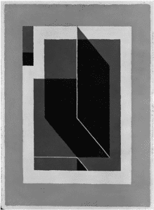
Bent Dark Grey – Josef Albers

I chose this image because of its use of different lines and shapes, as well as how those lines and shapes interact with each other through transparency and symmetry. I was thinking that the best way to reproduce this image would be to split it up into sections, foreground, and background, as well as the different shapes that make it up. 

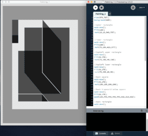
I wanted to recreate the piece in Processing as faithfully as I could. In order to do this in the most efficient and organized way possible, I split my code up accordingly to each of the shapes that I saw as I inspected the painting, and then worked from there in order to piece the shape together to create the coherent piece. Other than the shapes, I also had to work with the transparency of each of the shapes in order to make the blending effect seen in the original painting– how the shapes overlap with each other and create darker regions. Another thing that pops out of the painting was the white line in the center of the image that almost separates the painting into two. The hardest part about recreating this piece faithfully was getting the proportions of each of the shapes to look correct. This required me to fine tune the pixel values through trial and error, as well as some math calculations in order to find the exact pixel values that I needed. 

In order to make this piece different from the original, I used the keyPressed() function to make the piece interactive. If a key was not pressed, the details of the painting would be covered by a slightly transparent dark rectangle– although, this was not the original plan. Originally, I wanted to create a negative version of the original painting through reversing the colors when a key is pressed, however the values I inputted weren’t correct. Instead, they made the whole middle section a dark grey when a button is pressed. So I just went with this version in order to make the audience of my piece “work” to see the piece by pressing a button.

Code

void setup() {
size(575,787);
background(220);
}

void draw() {
if (keyPressed == false) {
//outer rectangle
noStroke();
fill(150);
rect(15,15,545,757);

//inner rectangle
noStroke();
fill(25);
rect(75,105,425,577);

//topleft upper rectangle
noStroke();
fill(0,85);
rect(75,105,40,150);

//topleft lower rectangle
noStroke();
fill(0,85);
rect(75,205,40,50);

//back square
noStroke();
fill(0,85);
rect(155,155,290,290);

//back trapezoid below square
noStroke();
fill(0,85);
quad(155,445,445,445,445,632,310,632);

//back rectangle
noStroke();
fill(0,85);
rect(115,305,155,277);

//triangle beside back rectangle
noStroke();
fill(0,85);
triangle(270,443,390,582,270,582);

//back rectangle lowest
noStroke();
fill(0,85);
rect(115,585,153,47);

//low traingle x2
noStroke();
fill(0,85);
triangle(268,585,307,632,268,632);
noStroke();
fill(0,85);
triangle(268,585,307,632,268,632);

//top parallelogram
noStroke();
fill(0,85);
quad(272,105,392,244,392,582,272,445);

//top line
stroke(25);
strokeWeight(3);
line(270,110,270,445);

//bottom line
stroke(25);
strokeWeight(3);
line(270,445,388,580);
}
else {
//outer rectangle
noStroke();
fill(150);
rect(15,15,545,757);

//inner rectangle
noStroke();
fill(230);
rect(75,105,425,577);

//topleft upper rectangle
noStroke();
fill(0,170);
rect(75,105,40,150);

//topleft lower rectangle
noStroke();
fill(0,170);
rect(75,205,40,50);

//back square
noStroke();
fill(0,170);
rect(155,155,290,290);

//back trapezoid below square
noStroke();
fill(0,170);
quad(155,445,445,445,445,632,310,632);

//back rectangle
noStroke();
fill(0,170);
rect(115,305,155,277);

//triangle beside back rectangle
noStroke();
fill(0,170);
triangle(270,443,390,582,270,582);

//back rectangle lowest
noStroke();
fill(0,170);
rect(115,585,153,47);

//low traingle x2
noStroke();
fill(0,170);
triangle(268,585,307,632,268,632);
noStroke();
fill(0,170);
triangle(268,585,307,632,268,632);

//top parallelogram
noStroke();
fill(0,170);
quad(272,105,392,244,392,582,272,445);

//top line
stroke(230);
strokeWeight(3);
line(270,110,270,445);

//bottom line
stroke(230);
strokeWeight(3);
line(270,445,388,580);
}
}

“Come Here!” – Russel Sy – Rodolfo Cossovich

Our device is a box with some kind of product for sale on top of it, as well as shining LED lights below it. When a person passes by it, a recording will start to play prompting the person to walk closer, and as they walk closer, the LED lights shine brighter.

When my partner and I were brainstorming about ideas, the use of some kind of sensor was always present in all of our ideas. Sensors are one of the cornerstones of human and machine interaction, as sensors translate human input into machine understanding. In one recitation, we worked on different kinds of sensors, including proximity sensors, and how human movement can trigger devices to do different things. From my previous research with the group project, we focused solely on how the human can interact with the machine, and how the machine can do anything that the human wants. For this project, however, we reversed the roles and made it so that the machine, in a way, was interacting with the human, and vice versa. The significance of this view on interaction does not have to do with seamless integration. The goal for us was not to create a machine that can act as an extension of human capability, but rather to create something that can be as familiar as another human— a machine that interacts with you.

For the conception of the idea, we thought of sensors and sound. One of the most human aspects of ourselves is our voice, and we wanted to integrate that into our project. We decided to create a new way of advertising products in malls. Instead of having signs and posters advertising products, we would create a device that calls out to customers, and talks to them about the product. In order to do this, we used a proximity sensor to detect when a human walks by the device, as well as an MP3 player to play premade voice recordings that cater towards the product. The whole idea of the device is to attract customers to walk towards the product. So in order to do so, we also added and LED light strip that got brighter as the customer would walk closer to the device. As for the aesthetics, our original design idea was to create a large rectangular box with a stand above it in order to showcase a product, as well as LED lights below it. Unfortunately, with limited resources and time, the final prototype was a much smaller wooden box without a stand above it. The wooden box was not the best way to present the project, as it was not aesthetically pleasing and incomplete without the stand on top, however, the device still functioned the way it was supposed to.

In user testing, our product was not complete, so I will be talking about the feedback from the final showcase. The first thing about our design was the lack of it. The product is meant to attract customers, and in order to do so, an aesthetically pleasing design was needed. For the next iteration, we could enlarge the box, and make it out of acrylic instead of wood. On top of that, we could work on the product holder on the top of the box to make it look like we’re really trying to sell the product. As for the design of the one complaint was the direction of the sensor. Our idea was to place the sensor right in front of the box, so that it can detect someone walking right in front of it. Only then will the LED lights react and the MP3 start playing the prerecorded voice callouts. The downside of this is that once the MP3 recording starts playing, the person walking by might by too far away to hear it, as the box would also be behind them. One way to fix this would be to have two sensors angled slightly at opposite sides from the front of the box, so that the device would detect the person walking by and play the recording while the person is still in the device’s vicinity, increasing the chance that the person would stop and look at the product.

Again, the goal of this device was to reinvent the way people advertise products by creating a two way interaction between human and machine. Even with its design flaws, a person who would walk by the device would turn around once the MP3 recording calls them out, and then walk towards the product and listen to the recordings, as if they were listening to a salesman. Although interaction is not as explicit, the way the human interacts with our device would surely fall under the definition of interaction as it draws in human attention through detecting the human, and then the human is drawn into the device due to the recordings and LED lights. If given more time, we would implement the angled proximity sensors, as well as improving on the outwards design. Through creating this device, I learned about the importance of really know every single lin of code’s importance, as well as the importance of user feedback in order to improve the device, and cater it more towards its goal. In my opinion, the world is moving more towards two way interaction between man and machine, and this simple device can show how this two way interaction can work as an effective tool for marketing and selling products.