Week2 – CSS excercise – Daisy Chen

link: https://imanas.shanghai.nyu.edu/~qc532/week02/

screenshot of the webpage:
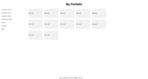
Firstly I started working on the styling of the content boxes using the flexible box. I spent some time figuring out the difference between different flex-direction and finally, I chose “flex-flow” to set the style as row&wrap.

I encountered some problems when I tried to modify the style of the hyperlinks. At first I didn’t see any changes in the color of the pages then it turned out to be that it’s because I didn’t write a:link first. (lesson: a:hover must comes after a:link and a:visited)

When trying to style the footer, I firstly used justify-content and align-content but neither of them work and I can’t make the footer on the bottom of the page. My final solution is to use the absolute position and the distance from the bottom. To make it lie in the middle I used left:40%. (Maybe there is other better solution)

The most difficult part is to set the navigation and content at the same horizontal level. (The size of the browser will also affect the view) At first I tried justify-content and align but none of these style functions works. After several tries, the method I found is to change the width of the navigation and content box and use the float. 

Week 3 – Photoshop Collage – Daisy Chen

Final version

Preparation

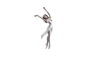
For this week’s assignment, my initial idea was to create an image of a woman dancing with the ice. The style will be mysterious and I choose blue as the theme color to present cold tone.

Here are the images used for this work:

Process
Figure 1
Figure 2

I started with deleting the background using the pen tool to select the outline of the dance and create a new selection (see Figure 1). And then I put this dancer in a new document with a white background and dragged other background images.

Figure 3
Figure 4

To better combine the background, I added a picture of smoke above the forest. I also used the mask and desaturate function to erase the edge of the picture. (Figure 3 & 4)

Figure 5
Figure 6

Next I added the highlight image and the image of ice using different blend modes and did some distortion with the ice to let it fit with the gesture of the dancer better.

Figure 7
Figure 8

A few more editing to the image – add the reflection of the dance, edit attributes like photo filter, contrast, hue/saturation, etc.

Figure 9

Works DONE!

Screenshot of the layers:

Several steps to improve in the future: refine the shadow and the ice image, refine the light-shade relation between character(dancer) and the background

Week 2 – ux Project idea & storyboard – Daisy Chen

Group member

Daisy & Milly

Project Idea/Concept

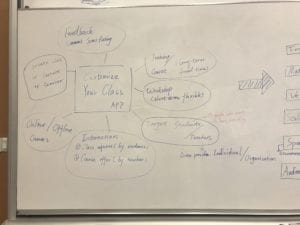
For this project, we aim to design an APP that helps people customize their class according to their own needs. It’s like a courses version of “DZDP(大众点评)+Didi”. On one hand, it enables people who want to learn something new to contact the teacher(s) directly. On the other hand, it enables people who want to teach to reach out to their potential students.

In our product, the users will be able to find online courses as well as offline courses and workshop info. Our platform will be a mobile phone (APP) as well as PC (web). Generally speaking, everyone who has the will to learn or teach could be our audience. According to the situation in real life, the potential users may lie in the age of 20-40.

We design this project to address the demand for people to learn and teach. Nowadays there is an increasing demand for people to learn more things in order to either enrich their skill sets or just for fun. But they have limited time and can’t go to traditional extra curriculum school to learn. There is also a group of people who have a good command of something (language, music instrument, drawing, etc) and are willing to teach. But they don’t have the channel to reach out to the potential students. 

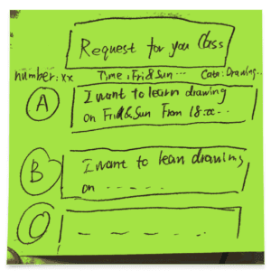
This APP aims to address this problem by connecting these two parts – students can find the teacher through class request and teachers can find students through these request or by offering classes.

Story Board

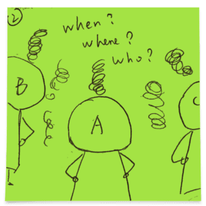
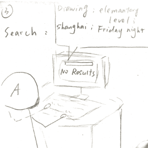
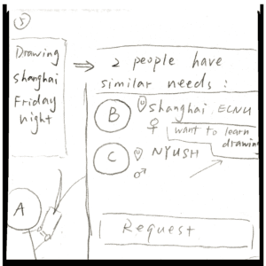
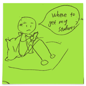
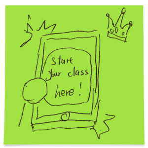
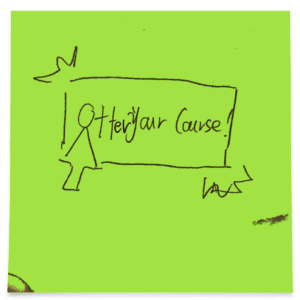
Our storyboard approaches the same “happy ending” from two sides – the students and the teacher(s). 

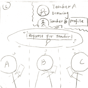
Storyboard from the students’ side

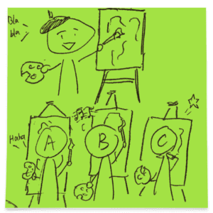
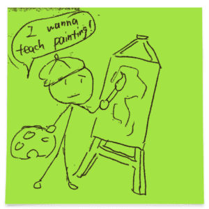
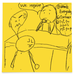
Storyboard from the teachers’ side

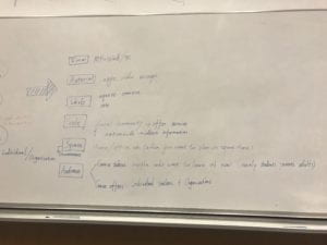
This APP serves as the bridge between teachers and students. Instead of simply listing out all the choices, we adopt a similar form of Didi – students can “request” a course with their expectations (like sending an order for a taxi) and teachers who satisfy these requirements and willing to teach will respond to this request. Unlike Didi in which the first-comer takes the order, here it’s up to the person who sends the request to decide the teacher. The students can also find people who have similar class interest to them and they could be classmates if they want. Or they can also invite their friends to join and send a class request as a group.

Further improvements on functions and UX design will be made in the following week when the user research goes further.

Week 2 – Response to “The Medium is the Message” by Mcluhan – Daisy Chen

“The medium is the message”, as Mcluhan argues in his book, emphasize the effect of medium itself rather than the “content” it carries. Mcluhan provides a new way to look at the relationship between “medium” and “content” (or “message”). Instead of the traditional dichotomy view, from Mcluhan’s perspective, the medium is not only a container and the content is not just something carried by the medium. As Mcluhan explains, “the ‘content’ of any medium is always another medium”. The medium is the message, and the users are the message of the medium. For example, today every web user is producing content for the internet and in return, this content consists of the internet itself. According to Mcluhan, what matters more is not “what is the content” but “how does the way it is conveyed affect ourselves”. Mcluhan’s argument provokes us to observe the development of human history in terms of the development of the medium. People used to perceive the world with five senses. But the medium alters the sense ratio, resulting in the imbalance of using different senses. The invention of printing with the emphasis on vision turned our way of thinking into a linear form. As writing becomes the main method of communication, logic, and rationality original from the independent and linear way of thinking. Besides, it also contributed to the rise of nationalism and individualism. While the invention of television engages more listening and touching and brings up the level of human interaction.

In the macro level, the medium has such a huge impact on the sensation structure of human beings and influence the whole society. The appearance of a new media even marks a new stage of human civilization. In that sense, the content carried by the media becomes less important. In the micro level or the individual level, we can also feel the power of the medium. For example, we are now living in the Internet era. The so-called “Internet thinking” is related to the characteristics of the internet such as “connection”, “interaction” and “network”. We are also becoming more and more dependent on the media — we turn to Google when we have questions, we look at the map on mobile phone when going to some places… The Internet has largely changed our way of thinking and behaviors but we are not aware of that. Only when we realize the existence of the medium can we recognize the changes brought by the medium.
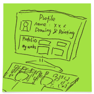
Week 1 – HTML Portfolio Page – Daisy Chen

http://imanas.shanghai.nyu.edu/~qc532/week01/hw1.html

Reflection: I wrote this portfolio page with the basic html tags I learned this week. The first welcome page contains two links to my self-introduction and contact info. In the “about me” page I use the summary tag to hide the details like photo and comments to make the page look more organized. And in the “contact” page I use the list tag to showcase my social media account and contact information. Since I haven’t learned CSS yet, the style remains quite simple but I can improve them in the future.