Update for Final Project Reflection (Winny)

During our presentation for final project on Thursday, we have received some feedback from fellows and peers, here I will add these feedback to my reflection of my final project:

  1. Video quality: our general idea for the video is interesting, but as for the quality, we should have paid attention to the lighting and also steadiness. To have better quality, we can learn about how to adjust the lighting before shooting, and also have more testing before official shooting.
  2. Website design: our website lacks clear instructions for interaction, our users feel confused about what to do or where to look. For this problem , we could first adjust the style of our website, adding clear signals to show the video section or the text section; second we could give clear instruction on ways of interacting, like scrolling, clicking; third we also need to rethink: what kind of style matches our theme and video style? What interaction does not confuse our users?
  3. Audio quality: our project lacks an organized audio system: sometimes the volume is too low/high, sometimes the audio quality isn’t consistent. Many of these problems attribute to our limited time, we could be more careful and test more before set up the final volume for each video. 
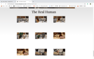
  4. Introduction of characters: we receive feedback that the three profile pictures of the characters can be more specific about their roles. Also we could add more introduction about these characters. 

Final Project Reflection Post (Winny)

Project Reflection

LINK

Design

Our project presents a recreation of The Perfect Humanbased on the university life here in NYUSH. The Perfect Human is a short film in the 60s; its style is very simple and abstract, showing the “perfect” side of a human. We draw the concept of “perfection” from this short, and we shoot a new version trying to convey the idea that “perfect is impossible”.

Our project contains two parts, one is a reflection back on the original film and the other one is our videos. By clicking on buttons, users can check a series of videos depicting three “perfect” NYUSH students. Through this series of videos, users can have a sense that the image of a “perfect student” doesn’t exist; a real human’s life contains both positive and negative parts.

Process

Sebastian and I first write our script and prepare what scenes we want to shoot. For this part, we first find three volunteers who would like to be filmed, then based on their personality and interests, we create three characters of “perfect human” and develop the script too.

Then we start shooting. Since the characters are designed based on the real student, our actors don’t really need to “act” and our job is to capture the scenes we need. Unfortunately, we are not professional enough to produce high quality film, some of our films are not so stable and some of them have lighting problems. If we can start over, I would first learn about how to adjust the light input to avoid such problem.

Afterwards, we distribute our work into two parts: website setting and video editing, and I’m responsible for video editing. The process of editing goes well, generally we have all the scenes that we plan to have. One problem in this process is the narration. When we first record narration I use a Tascam but there is echoing in the background. So later I record again outside in the air. But due to limited time, we record the second time using our phone. So some of the audio also have problem. If we start over, this time I learn that we can borrow a microphone from IT that works better than Tascam in this situation.

Last, we put all the elements together and set up our website. We have some confusion on the style of the website. If we start over, we would first be more specific on the style that both of us like.

Future

In the future, I would like to reshoot some parts of the video/audio, using better equipment. This project is video-based; I think it would be much better if the video quality becomes much better. I also want to spend more time design the website. I want to implement a clear, artist layout of the website.

Another part that I want to explore more is the music. This time, I tried with traditional Chinese Erhu. I want to mimic the original sounds a little but also has our own style. If I have more time for research and another try, I think music will give our project a big upgrade.

Week 11: Response to Rachel Greene (Winny)

It is vert interesting to see Rachel Greene talks about how internet offers a space of freedom to a certain degree: “…the Internet allowed net.artists to work and talk independently of any bureaucracy or art-world institution without being marginalized or deprived of community” (163). I’m going to Prague for study away next semester and they offered a class on “post-Communist media” (but not for next semester so sad..) which interests me a lot. I think it is very meaningful to connect the Internet, as well as artists for the net to a social view. The Internet offers a new world beyond the old world mechanism with its advantages of immediacy and mobility. From here, the advantage of “creating vacuum” is also something we should pay more attention and make good use of. 

Week 11: Internet Art Project Post: Low Level All-Stars(Winny)

I went through many projects in the link, and Low Level All-Stars surprises me at the moment I see it. The whole page is in the style of old-school video game; the detailed animation at the title makes me feel like someone has just typed out the words. At the bottom, it says “‘Low Level All-Stars’ is presented by Radical Software Group and Beige Records”, the style of “Beige Records” seems like Childs drawing, which makes it more interesting, nostalgic.

“Video game culture has long relied on ‘crackers,’ the fearless geeks who remove a game’s copy protection through brute trade…” the beginning takes me into the setting of a legendary video game story. And al the crackers shown in this page are formatted in rows, like the title indicates, they are the members for the All-Stars show. 

When I click one project, it pops out a new window, where the background color stays coherent. And when I watch the video of the same project, the screen of old video games jump out, the electronic beeps starts. This webpage is like a museum of old video games.

This project inspires me in terms of artistic style, a coherent theme, and the idea of preserving old video games. 

Week 11: Video Project Documentation (Winny & Ploy & Matt)

Link: click here

Description of project and how the project works

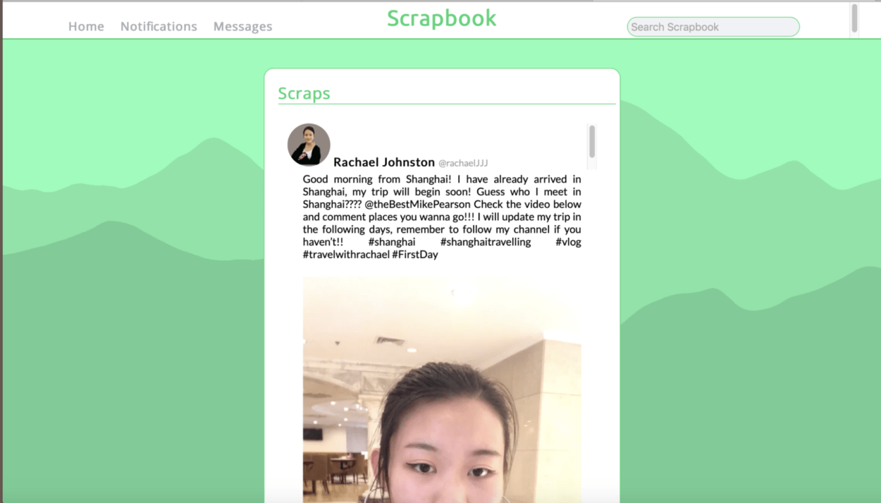
Our project aims at telling a story to our users by letting them explores our website, video posts; through the process of watching all the videos from two characters, the users will discover the story of a missing girl.

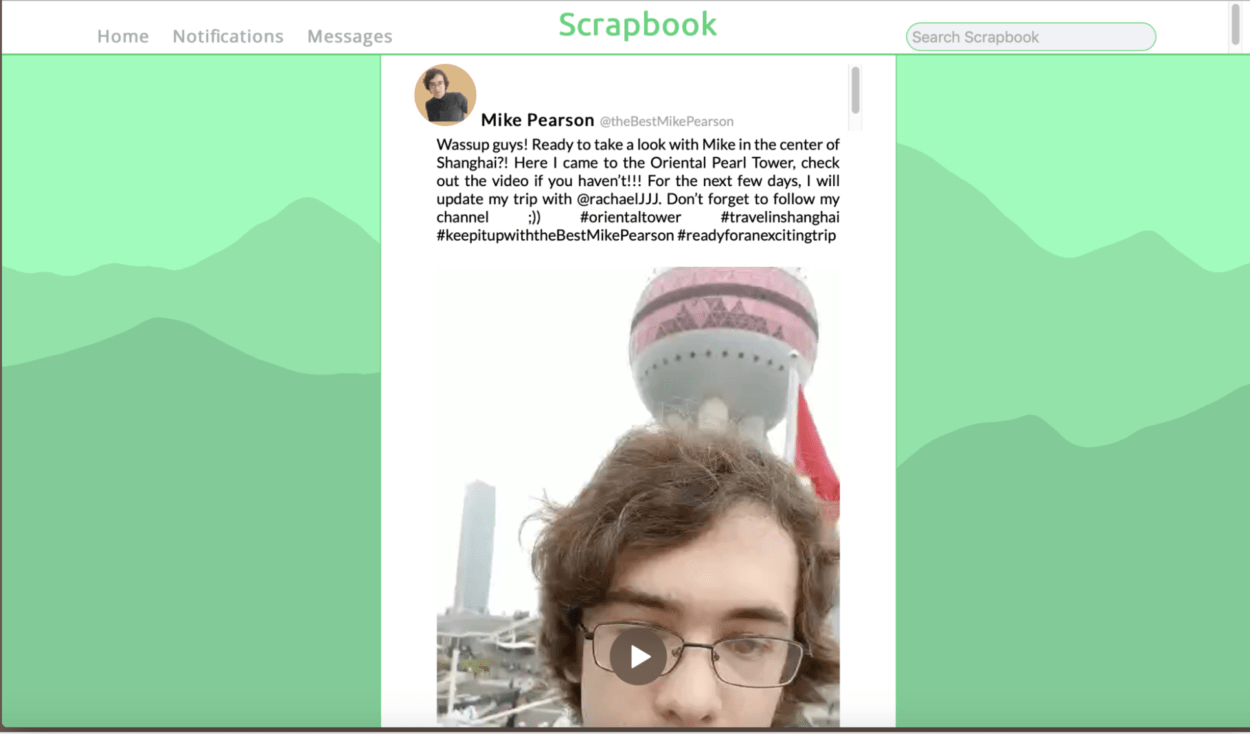
Our website works as a function social media page where people can post videos. We created two characters who travel and post videos of Shanghai. In different videos they post, there is a stalker following them but they didn’t notice at that time. Before they even start their trip, the girl character is missing and the guy is worried about her. At this point, some of the guy’s fans found out about the stalker in their previous videos, and the guy starts to get suspicious. Later on, users can find a news post, in which they can hear from people who met the missing girl talk about this event. At the end, the guy realizes the girl’s missing must have something to do with the stalker, he runs away in worry; but the girl is still missing, and the policy and the press are working on discovering what has really happened…

Our users can interact with our project by discovering the story on themselves without any instructions, playing with the fake social media page, watching the videos, like and comment below the posts, etc. The whole idea of interaction is inviting our users to get engaged with this story in reality.

Discussion of your process

We have me, Ploy and Matt in our team, and Ploy and I are mainly in charge of filming and script writing while Matt is responsible for website designing and functioning. We first build up the whole story line and come up with a storyboard, where we can refer to the scenes that we need to shoot and the posts which develop the story. After that, we film the scenes according to the storyboard both by phones and by cameras. We also invite two of our friends to act in one of the videos. From then on, we individually work on our distributed work: Ploy and I *fake* the content needed on the website (posts and usernames etc..) and edited the videos; Matt put everything on the page and set up some interactive function such as commenting, playing videos.  

Post-mortem on whether or not the project met your goals

Generally speaking, this project didn’t meet my goal. I like our idea very much and I come up with most of the story plotting. We notice many questions like details on the website for interaction from the beginning of our planning, but at last we didn’t finish it. And during our user testing, Ann gave us some suggestions on website designing, I think we fail to finish it too. I think it has something to do with our team dynamics, but I’m going about it here. However, if we have more time or if we all finish our work as we agreed, we could improve our website to a great degree, in details. And we first agree to add a pop-up page, which it’s not achieved at this point, but it will be a good point for future adjusting.

Screen shots of project
Reference: 

https://www.youtube.com/watch?v=sU0ZWicyypM