Week 2: Enchanted Objects Reflection- Gabriel Chi

In David Rose’s Lecture, “Enchanted Objects”, Rose expands on his ideal design/ technological future. This proposed future makes use of what Rose calls “Enchanted Objects”, seemingly normal and everyday items that are imbued with some sort of special skill. For example, Rose’s own design of an umbrella, functions and looks like a normal umbrella; however, it begins to glow if it detects any forecast of rain. Rose even mentions the relevance of fictional items from fairytales and legends, such as the flying carpet or Dorothy’s red shoes, all containing magical properties under the guise of normal items. These enchanted objects are what Rose hopes our society moves towards, creating a simple yet thoughtful lifestyle. 

I found Rose’s design process and thinking extremely intriguing after watching the video. His mention of wanting technology and design to become more simple, and rudimentary to an extent, but effectively be able to complete their tasks. The phrase “Pervasive is Persuasive” embodies such thinking, with Rose explaining that when tasks and information are easily accessed through visual cues, humans are more likely to respond to them. Without having to go through a lengthy process of checking an app, simple colors or lights (that might even be in your periphery) do an equally, if not better job at notifying someone. 

However, I feel that Rose’s idea of enchanted objects have several flaws, realistically speaking. For example, the introduction of enchanted objects seem to be mainly focused around consumers, related to their everyday tasks. In this context, enchanted objects are indeed an effective method for implementation. However, if we consider applying this method to a larger scope, where information might be too complex to convey in a simple manner, the idea of enchanted objects might not be as effective. Therefore, although this technology is very effective and seems promising, I fear it might only be relegated to a very rudimental level. 

Week 2 Reading Response: Thoughtless Acts + Affordances & Constraints – Gabriel Chi

For Week 2’s readings, both Jane Fulton Suri and Don Norman discuss the intricate relationships of individual, environment and design. In Suri’s “Thoughtless Acts”, Suri observes the subconscious interactions with our environment and surrounding objects. As Suri states, “These are actions, prompted by our relationship with the world, that seem automatic
or intuitive.” These automatic responses to daily objects or tasks are considered “thoughtless acts”. For example, some thoughtless acts I commonly encounter is whenever I use my AirPods, instead of putting them back into my case, where it can charge and be safely stored, I hang them on the top of my ear like a pencil. I do this so I have easy access to listening to music, and so I can avoid constantly taking/ putting them back into my case. This can be considered a thoughtless act, as I stray from the intended use or design of the object I interact with. 

In Norman’s paper, the topic of affordances, constraints and “perceived” affordances explores the way we understand and perceive certain functions. In his paper, Norman describes affordances to be “the actionable properties between the world and an actor”; While, constraints are the limitations of these actions. However, Norman touches upon “perceived” affordances, which unlike standard affordances, are learned and not naturally formed. Similar to thoughtless acts, after reading this paper, I also began to identify certain affordances and “perceived” affordances within my daily life. For example, the iPhone touch screen is a perfect example of a perceived affordance. Although, we take for granted the easy touch technology of an iPhone screen and assume it is easily accessible, it is a perceived affordance. If you were to hand an iPhone to, for example, someone from 30 years ago, they would have no idea how to access the technology. This is because the concept and design of the touch screen is not an innate function that all humans understand, it is constrained by the timeframe it was created within. 

Week 2: Thoughtless Acts- Gabriel Chi

My Thoughtless Acts:

Observing my interactions with my everyday environment and objects, I began to realize the different thoughtless acts I encounter on a daily basis.

iPhone & Computer Screen

Whenever I use my iPhone and computer, I always try to multi task with the different assignments I have. To do this, I usually place my phone on my computer screen, for easily switching between both tools. However, by placing my phone on my computer screen,  I am using it for a completely different purpose than intended. This can be considered as a thoughtless act. 

Hanging Clothing

Whenever I take off a jacket, I tend to hang them onto the side of my bed. This is mainly due to the easily accessible nature of this location, as when I wake up, I can easily pickup a jacket and get ready for school. However, this is different from the bed’s intended design, and as a result, becomes a thoughtless act. 

Folding Book Pages

When I’m reading a book, I always fold the edge of page in order to keep track of where I left off. However, after thinking about this habit, I’ve realised that it’s actually a thoughtless act. The pages have page numbers as a tool for readers to use, however, sheerly out of convenience, I fold the edges of my pages to quickly get back to where I stopped. By not adhering to the intended use of the book pages, I believe this is a thoughtless act. 

Week 2: Unconventional Design Reading Response Gabriel Chi

Reading through the three readings this week, I’ve begun to understand the complex and expansive nature of design thinking and the research that goes into it. In Jasper Liu’s article, Liu expands upon the different versions and iterations of the design thinking processes. With different visual interpretation from organizations such as IBM and Stanford, I realised there is never a single definition for what design thinking can be. Similarly, Liz Sanders introduces the visual representations or maps of design research. In her paper, Sanders presents the four key components of design research, Research Led, Design Led, Expert Mindset and Participatory Mindset. Both readings provide a helpful visual interpretation of the intricate field of design, as Sanders states, “Maps can be useful for showing complexity and change.” I really agree with this statement as, both Liu’s and Sanders’ visual aids helped me understand the different processes and research that go into both design thinking and research. 

The final reading, Wicked Problems by Richard Buchanan, discusses the issue of “Wicked Problems”, which are defined as a “class of social system problems which are ill-formulated, where the information is confusing, where
there are many clients and decision makers with conflicting values,
and where the ramifications in the whole system are thoroughly
confusing.” To confront such conundrums, Buchanan suggests that designers must push the scope of what is considered the norm, and identify issues of specific circumstances, in order to create something previously though of as impossible. Buchanan’s description of design being “potentially universal in scope” especially intrigued me, as design truly is an endless subject, with an immeasurable amount of solutions to create. All of the readings showed me how important the design process is in creating a product. I feel that many consumers merely look at the final product, without considering the countless iterations it goes through to reach its goal, which is a shame considering the amount of work that gets put into it. 

Quick & Dirty Design Cycle: Group 1 Gabriel Chi

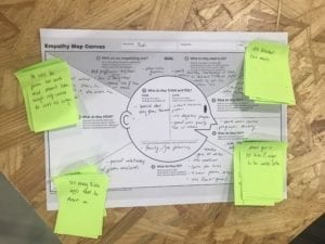
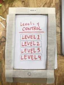
For our “Dirty Design Cycle”, Group 1 was assigned to identify and potentially provide solutions for an individual using the design cycle. Our assigned subject was Rudi, an IMA professor who wanted to decrease his phone usage, especially riding the metro on the way to school. Rudi uses his phone around 4 hours a day, mainly focusing on apps such as WeChat. After identifying Rudi’s objective to decrease phone usage, we brainstormed using the empathy map and created a prototype app that would make it increasingly harder to use his phone the longer it was used.

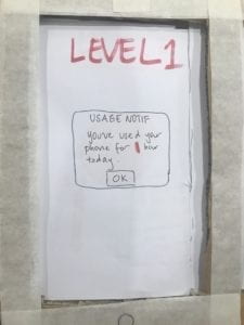
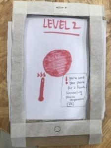
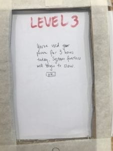
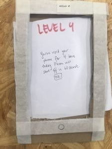
This prototype would include 4 levels, each level making phone usage  progressively harder. The first level would not be a total blockage, only notifying the user with a message, informing them how long they have used the phone. However, when reaching the second level, the phone would physically begin to rise in temperature, creating uncomfortability and encouraging the user to stop usage immediately. The third level will begin to slow down phone functions, making app usage and typing harder, to the point of frustration. Finally, the fourth level would completely shut off the device, rendering the phone completely unusable. 

When presenting the prototype to the class, we received positive feedback, but also very important critique. Firstly, if the phone began to rise in temperature, especially in a location such as the metro, there would be no place to allow the phone to cool down/ continue to heat up. Taking into consideration the location, the second level proved to be a slight hazard to the user. Secondly, the final level, which shuts off all function, also proved to be an issue. If there were a possibly accident or emergency, the phone would be unable to respond or send out any messages, proving again to be a detriment. To improve upon the prototype, we could remove the heating function and change the final stage to allow emergency apps/ phone and texting.