Week06 – Soundscape – LEON – Moon

For our soundscape project, we try to recreate a crime scene. The idea just popped up in my head at first. I thought the crime scene could be a really unique space to present the collection of sounds. On the other hand, these different pieces of audios can reflect emotion activities from different people on the spot. The podcast Homecoming inspired me in some way. I found that how characters express themselves by audio can convey rich emotions which helps to enhance the general atmosphere for listeners. The theme of a crime scene could also be attractive for listeners because it is not normal or common to see in real life. I believe it will bring more shock and surprise to listeners.

At first, we wanted to build our project based on one main crime scene image with buttons to trigger different audios. However, we found it a bit inappropriate because there is an order for the emergence of audios in every specific crime scene. For instance, the cause, like the sound of the explosion in our project should be the first before the sound of the police and everything else. With the template offered by Professor Moon, we decided to make our project with the scrolling function so that one fixed order can be set by us first. My partner, Christy suggested that we could design the scene under one specific story background so that we chose the movie Leon, the Professional in which the famous hitman Leon was killed in one explosion in order to keep the little girl Mathilda safe. After having the basic stricture of our project, we started data collecting. We collected the audios both by recording on our own and searching online. For the parts with characters talking, I found one of my friends in the theatre club who’s good at acting to help recording the Mathilda part. By this way, I hope listeners could feel the message we are trying to convey in the audio. I also used Audacity to add sound effects when editing the beginning sound and making the sound of the crowd as the background when the policeman is talking, etc. In order to make the project more dramatic, I edited both the beginning and ending audios with Audacity. I hope listeners would have the “whoa” feeling when listening. For the visual part, we didn’t spend much time. we found images online and photoshopped them.

For this project, I did all the coding and didn’t encounter any major problem because we were offered the coding template which helped us a lot. The only thing that troubled me during the process is that the audio started to play every time it detected that the “scrollPercentage” was larger than the threshold value while I only wanted it to play once the first time the percentage is larger than the threshold value. I talked to Professor Moon about it. He simply added one boolean function in js code and it worked. I remember using it last semester for interaction lab but didn’t think of utilizing it here. By defining true and false, the audio could only play once. Another small thing is that I was afraid that if the listeners scroll too fast so that different audios mix together so that I added an alert to ask them to scroll after finishing listening to each piece. For the recording part, it took some time but I was quite satisfied with the pieces. The Tascam and Audacity are not hard to use.

I think our project turned out to be similar to what we expected but the content is not that rich because we didn’t have much time and it is a bit difficult to gather relative audios for our project. I had one idea that didn’t achieve in the project, but I made an attempt in the project. I wanted to break every piece of audio down with every according visual element and pile them up to build a whole image of the crime scene, just like building puzzles. We utilized different elements and had the whole image but didn’t design it as I expected because it might take more time to design the visual elements and code. So we just focused on the audio part and kept others simple. If I have more time, I’ll add more audio to the page and probably work on the visual part.
On The Way-Ning Zhou-Rudi

CONCEPTION AND DESIGN:

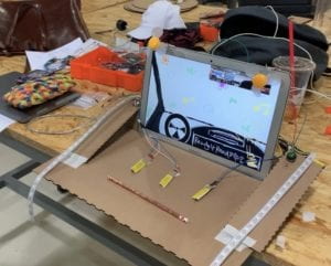
We thought a lot about how to build and promote the interaction between the users and our project. Due to our initial goal of the project which mainly focuses on the experience, the forms of interaction could be a bit limited by other projects. So, we chose to offer different options for users and push them to make decisions under different circumstances, which leads to various results in the end. In order to make the process more engaging, we chose to make an accelerator just like the real one in car as a main element in our project. It can bring a realer feeling for the users and more willing to interact with the project. What’s more, I think the motors with fans and strip led lights added by us also contribute to a better interaction process by offering feedback. We simply used components from Arduino kits to build circuits for the motors and led strips because they weren’t hard and we have done similar tasks before. While for the accelerator, we used cardboard. I got suggestion from Rudi to use the conductive tapes so that every time the user steps on it, the circuit would be connected. I considered whether the materials and the function suit the users as the top thing. However, one thing that could be a bit strange is the match part because users might expect something like steering wheels for their hands when experiencing. But the steering wheels might be hard to control and be applied in the project so that we rejected it. And for the matches part, it belongs to our story line and the symbol of imagination of our project, which means a lot just some people may be confused about it. So, here I think that we need more time to consider about what can be better applied for this part.

FABRICATION AND PRODUCTION:

For the production of our project, we more focus on the coding part, comparing to the midterm project. Also, because our project is largely based on media manipulation so that we worked a lot with Processing. When we were at the stage of coding, we met a huge problem. That is, we added a lot of movies, sound files and images, which made the beginning of loading the project really a long time and the framework of the movies were really low. I felt like I knew the problem of this but just had no idea how to fix it. so that later we reached out to Rudi. Luckily, Rudi suggested a new structure for our code which would allow only one case happening at one time so that the code can run smoothly. For this user testing session, we received a lot of useful feedback. One thing we noticed that users didn’t really like to read the instructions. They just wanted to do what they want, such as just pressing the keys and stepping on the accelerator randomly. So that we decided to change the form of using keys into using accelerator. And at the same time, make the instructions bigger enough on the screen to make everyone be aware of what they are doing and what they are supposed to do. I found the adjustment of using accelerator really a good idea because this is one way that make users more immersive and engaging in the project. We also replace the function of the keys with buttons and matches with cables so that the interaction could be more fun and not so boring.

CONCLUSIONS:

The goal of our project is to let people have a new driving which they may not have the chance to do in real life and enjoy the various pieces and beauty of life from multiple perspectives. my project aligns with my definition of interaction by offering options for users and allow them to make decisions to create their own stories. I wanted the users can feel the emotional change inside which is not simply shown on the surface, but something inside. However, on the other hand, the project’s purpose may be a bit unsure for certain users because they don’t have a clear idea about what the project is about and have the assumption that it is just a game. But it turned out that it is not a game. While it would be easy for them to lose patience and interest for this, especially kids. So that I think that the project can be more focused on certain groups of people or be made cleared about what it is about. After the showcase I found that most people were attracted by the fans, led strips and the cover (beginning image) of the project, or the accelerator. Some of them later just realized that it is not what they thought it was. I have foreseen this because I thought about the situation that people, especially kids would prefer games. Remember the talk we had with Rudi, we mentioned that what we were creating was not a game. And I actually don’t want it to be game. Though it is a bit vague to classify it as an interactive movie or just an experience, I think the final version of my project reached the goal that I wanted to realize at the very first stage. What I really appreciate is that some mentioned on the show that the songs were really good and I loved how they moved their body along with the beat. This is one of the interactions that impressed me most during the show. So, if I have time, I’ll build a box to create space for users to make them feel like that they’re really in the car. More decoration is needed for sure. And I’ll use sound box to play music, add steering wheels, even just for decoration. If possible, I would like to use projector and reflect the vision on a bigger screen. I feel like the whole process of my project brought me a lot of things. There was a period that I was really confused and depressed because what I wanted to make is too huge and what can I actually make is so small. And I felt that all my brain cells stopped working. But anyways, I always believe that I’ll figure it out. There are always so many people around me that can offer help, my partner, my professor, all the faculty in IMA.

I remember that in my former proposal of my final project, I talked about how people ignore the details, beauty in their normal life. Now I can feel this even stronger. Sometimes it is not that they don’t don’t care, it is that they do not have the patience to see what is going to happen next so that they would lose the chance to see something beautiful takes place. At least this is something I get after observing the users during the IMA show. We’re now living in “the age of entertainment”. People just want fun. I mean, everyone needs fun, for sure and I also love fun a lot. But we need time to slow down on the way. Stay calm, peace to feel, and think. This is what we need.

Recitation 11: Workshops by Ning Zhou

For this recitation, I went to Leon’ session, media manipulation workshop. The main reason was that for our final project, we need to apply a lot media, such as videos, audios and images. Some interesting things I found on class was many other functions that I’ve never used before, like the time(); function which is also used later in my exercise and further in my final project. 

For the in-class exercise, I used the material I may use for the final project and created a short video. Here’s a clip for the project:

Here’s the code:

import processing.video.*;

import processing.sound.*;

SoundFile location;

FFT fft;
int bands = 64;
float smoothingFactor = 0.2;
float[] sum = new float[bands];
int scale = 1;
float barWidth;

PImage car;

Movie nyc;
Movie spd;

boolean stop = false;
boolean spdover = false;

void setup() {
size(1440, 855);
location = new SoundFile(this, “location.mp3”);
location.play();

barWidth = 250/float(bands);
fft = new FFT(this, bands);
fft.input(location);

car = loadImage(“3.png”);

nyc = new Movie(this, “nyc.mp4”);
spd = new Movie(this, “spd.mp4”);

}

void draw() {

nyc.play();
image(nyc, 0, 0, width, height);
filter(POSTERIZE, 10);
image(car, 630, 600);
if (time2 > 5) {
textSize(32);
fill(255);
text(“WANT A FAST RIDE:) ?”, 1020, 810);
}
}
if (stop == true) {
spd.play();
image(spd, 0, 0, width, height);
image(car, 630, 600);
}

if (time3 > 10) {
spdover = true;
}
}

void keyPressed() {
if (key == ‘y’) {
nyc.stop();
stop = true;
}
}

void movieEvent(Movie m) {
m.read();
}

Recitation 9: Final Project Process-Ning Zhou

Step 1

 â€œSpacetime Symphony”:

The project is an audio and visual soundscape. The vision would change according to the movements of the participates and show on the screen by projector. We suggested using proper sensors to make sure that the message sending process would be efficient. Also, the choice for music could also be varied to meet different audiences’ needs. I found this project quite interesting and has shared concept with my project, the visualization. When doing my research, I saw several projects similar to this, but one thing that “Spacetime Symphony” particularly impressed me is the big stage for the audience, which could create a strong and engaging interaction. The project synthesizes physical movements, sounds and visions together and creates the interaction from multiple dimensions. This kind of interaction is quite aligned to my definition of it because it emphasizes the change of one actor in the communication, the audiences, and to start chain reactions as response to the change from multiple perspectives.

“Magic Brush”:

The project specifically aims at those audiences with disabilities who cannot draw as normal people do. With the exterior device with buttons and other switches, these people can draw with different functions on the computer screen more easily. We thought that this interaction might be a bit too simple. And also, what if there’s people without hands want to use the device? So, we added some advice like enabling users to use their heads or feet to draw. I thought it would be really cool to make a helmet and draw with infrared ray. The concept of interaction in this project is a bit different from mine. In this one, I feel that it is more like the audience telling the machine what to do but not interacting with it in a fairer position. But I can see where Guangbo wanted to reach. It could be a great design if more fresh elements can be added to it.

“Do You Know You Have Magic?”:

The project is for audience to draw on the sands without actually touching the sands and the vision would also reflect on the computer screen at the same time. We all found this quite interesting but could be hard to achieve. We offered our opinions specifically on the step of drawing. Since the user would not actually touch the sand, it is possible to get help from magnets and irons. Also, what is drawn on the computer screen doesn’t necessarily be exactly the same as the sand, there can be some interesting transition. I think that the concept of interaction in this project is a bit similar to the one in “Magic Brush”. But for this one, the two actors are in a fairer stage because the audience don’t tell the computer what to do exactly. There’s space for the computer itself to “freestyle” which I think could be interesting.

Step 2

For my projects, I got really useful feedback. Firstly, for the tile of my project “Driving into Imagination”, it could be a bit misleading and not easy for audience to understand. Because at the first part of my project, it is still a reality simulation, the imagination part happens later. Another thing is that when talking about the functions of the car and hoe do audiences interact with the project, I mentioned that I wanted to build the car according to the reality though it could be hard. Robin then suggested that there’s tilt sensor in our Arduino kit which can work as the stick in the car that control the speed, light and other things. They thought the idea could be interesting that give people a driving experience that may differ from the one they used to know. However, they may be a bit unsure about the interaction part more engaging. I agree with them because we used buttons to build interaction in midterm project so that it’ll be better if other ways can be applied in final project to make the interaction more efficient and interesting. I think I’ll try to figure out another name for the project and look for other method to build the connection between audience and the project to make the project more appealing to them.

Recitation 10: Media Controller-Ning Zhou

For Sunday’s recitation, I tried to use potentiometer to control the size of the circles, in other word, pixels of the webcam. So, firstly, I built the circuit and used the monitor to test if it worked. I used the code from the slides and added one sentence “Serial.println(sensorValue);”. It turned out that the values were correct but there were weird signs before the values. For example, “?455”, “#710”. Then I asked Nick for help. He pointed out that in the code, there appeared to be “Serial.write(sensorValue);” before the code I just added in. I remember the difference of “serial.write();” and “serial.println();” because I have made this mistake on class exercise before. They speak two different languages! And that’s why there were actually two type of values on the monitor – they were actually sending the same messages, but in different languages. Hence, I deleted the code I added.

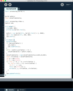
     For the Processing part, I used the code of example 11 from the “Pixel Manipulation” class. I mapped the value from 0-1023 to 0-480 to fit the cam size and changed the circle size to the value from Arduino. However, when I tested the code, it didn’t work well when the value from Arduino became smaller. Later I found that it is not appropriate to map the smallest value as 0. The pixel can’t be zero. Thus, I changed it to 10. And it worked as I expected.

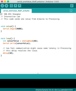
CODE:

processing code
Arduino code

Reflection:

In the article “Computer Vision for Artists and Designers: Pedagogic Tools and Techniques for Novice Programmers“, visualization could be defined as one of the key concepts. Similarly, visualization is also a key concept in my final project. In the article, it is mentioned that the computer vision is now widespread in different fields like interactive arts and design. In my own point of view, vision is the most direct way for interaction. What we see is objective, but what everyone receives is subjective. So, here is one thing I find quite interesting about because there’s always different meanings, thoughts behind single view for every individual. Also, I think that vision can be easily mixed and connected with other type of expressions, such as music. Just as the project mentioned in the article, “Messa di Voce”, the usage of “whole­-body vision-based interactions combines visions with speech analysis and situates them within a kind of projection-­based augmented reality.” This kind of combination maximizes the interactive elements in the project and brings the audiences huge satisfaction.