Week 2: Photoshop Exercise (Due 3/4) – Murray Lu

So for this assignment, even though I had Photoshop downloaded on my laptop, I barely had any experience with it. And despite being a photographer, I always used Lightroom and VSCO to edit my photos and even though a lot of photographers highly recommended that I learn how to use Photoshop, I never really bothered to fully venture into it. However with Commlab, I now have the motivation to learn Photoshop since it’s related to my assignments. At first, I had some trouble brainstorming ideas for what I’d like to Photoshop so I decided to think about film and shows that I liked. When I was younger I watched a film called “Treasure Planet” which I really enjoyed so I decided that I’d like to make an image that was inspired by the film. So I decided for the image that I wanted it to be a wooden ship that flew through outer space like in a fairy tale or fantasy world. So for my outer space background, I decided to use this image which I found:

Then for my wooden boat, I thought about wooden boats and it led me to think of using the “Going Merry” from the manga “One Piece”. One Piece is definitely one of my favorite manga’s and I loved the Going Merry boat so I decided to use this image:
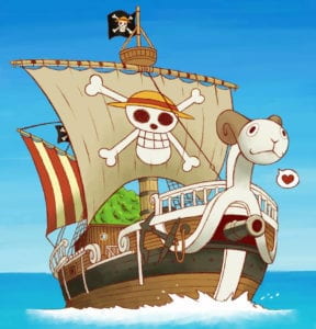
I felt that it would be interesting to add wings to the boat to show that it flew and I also thought that if the boat had wings, it would appear more magical and magnificent so I used this image:
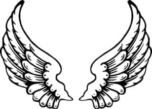
Finally, even though the picture is taking place in outer space, I felt that if there was a moon in the background, it would look really nice and I also happen to like the moon a lot as well. Originally I was going to use a crescent moon cause that’s my favorite kind but then I thought about the moon from one of my favorite video games “Kingdom Hearts” and decided to use their moon instead:

In the end, by separating the other images from their initial background and inserting them into the outer space background that I had chosen, this was the final result:
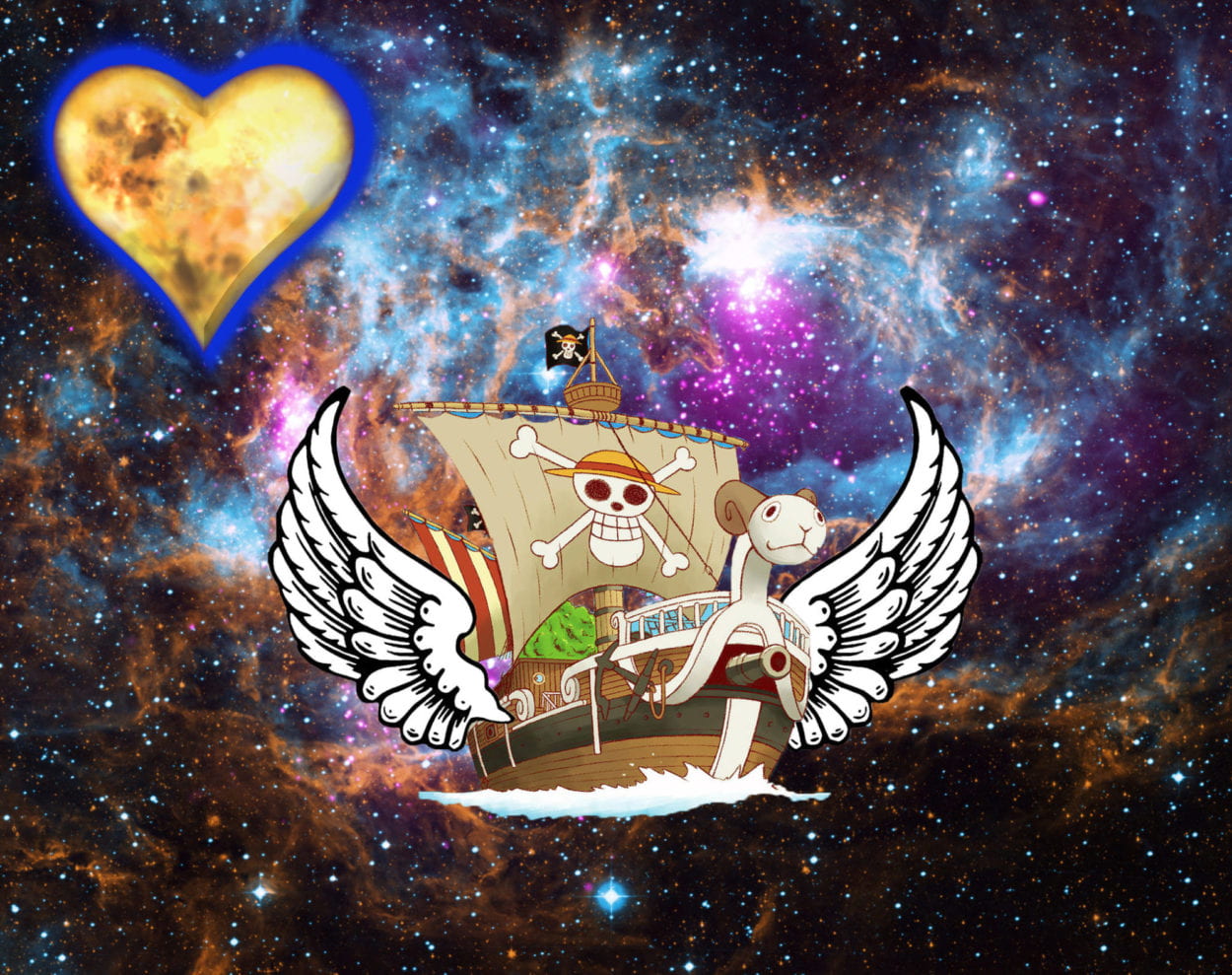
In the end, I had a lot of fun with this assignment and hope that there will be more class activities in the future where we will have the opportunities to utilize Photoshop!

Week 3: Comic Idea – Murray & Hannah

For our comic project, we’re planning a narrative of two NYU freshman– one at Abu Dhabi and one at Shanghai– and their process of adjusting over the course of the year. We will juxtapose their experiences of the culture and their conversations to their friends there and at home. The story will show their growth over time side-by-side, although the characters never meet. Their lives are very similar and we explore this by highlighting the parallels between their lives as expats in a new environment. By the end of the comic, they return home and realize the place they struggled to adjust to in the beginning now feels like home. If practically possible, we would create this as a sequence of animated cartoons that the user could click through.

Week 3 – Basic HTML/CSS website – Murray Lu

http://imanas.shanghai.nyu.edu/~mwl323/week3/

This was definitely one of the most challenging assignments I’ve done before. While it was challenging, I felt that it was a necessary challenge since because of this, I was able to  properly have a better grasp at understanding CSS as well as having a hands-on experience with it. Since my HTML portfolio page that I made last time was focused on my photography, I wanted to make this one more focused on my traveling experience. At first, I was already struggling since I was still pretty used to using HTML to code and I still wasn’t as used to using CSS. However, by using resources such as w3schools and the Learning Assistants for Comm Lab, I was able to have a much better understanding of the assignment. One part that I was a bit confused with at first was making a separate spreadsheet for CSS instead of adding CSS to the HTML itself. For instance, originally I would center my images by using HTML but this time I had to do it differently by CSS. I at first had trouble changing the color and some of the fonts for my page but after some trail and error, I figured out how to do it and it was a lot easier than I thought. Not only that, but this time I had some trouble uploading my assignment into Cyberduck but after a lot of trial and error, it finally worked. In the end though, this assignment definitely taught me the difference between HTML and CSS and just how much better CSS can make your website look nice and stylish.

Week 2: CSS Exercise – Murray Lu

http://imanas.shanghai.nyu.edu/~mwl323/week2/

So in the beginning, I struggled with this assignment a lot more than the last one. However, as I did more research on it and used the given resources to experiment with the code (primarily w3schools and YouTube), I realized that I was overthinking the assignment and it was a lot simpler than I had imagined. I decided to make a few differences to “My Portfolio” than the given example. For mine, I decided the change the color of the boxes into maroon instead of grey like the given example since maroon is one of my favorite colors. Furthermore, I wanted to experiment with the font so I used “Questrial” since one of my favorite music albums uses that font for the album title (The Drums – Portamento). Lastly, I personally didn’t like how for the example that was given, “Photo Title” in the boxes was on the left side. So instead, for “.content”, I made the “text-align: center” and that made the “Photo Title” be in the center of the boxes instead of being on the left side.

Week 2: Response to “Understanding Comics” by Scott McCloud – Murray Lu

At first, prior to reading “Understanding Comics” by Scott McCloud, I had some trouble understanding how this would relate to communications lab. However after reading the first four chapters, it totally made sense to me. Comics I feel tend to have a negative connotation in society since they’re viewed as not “real” readings and are very quite visual. However, McCloud goes in to describe how comics in reality, have always been a part of our life subconsciously and how the “medium” that’s involved within comics is quite different from other literary texts. Comics as McCloud describes, play out like a small film, and with the texts and how the scenes are drawn, the reader is able to fully understand the context and setting of the story within the graphic novel. I personally have read comics that have no bubble texts in them and even with just pictures and the visuals, I could still have a deep understanding and appreciation of the story and what was going on.

In current society, there are now 2 popular mediums of comics out there. One is American comics such as Marvel and DC (although the comics have significantly died in popularity but the films have generated a lot of profit) and Japanese manga which is very popular all around the world. Many manga readers will even prefer the manga over the animated version of that manga or even avoid the light novel. I think a main reason why is that the manga will usually have the rawest and truest story and with the visuals in it, it will be easier to trace the actions and the detailed art amongst the texts. 

I also found it very interesting to how when McCloud said that comics were everywhere, he even used ancient examples such as the Egyptian hieroglyphs and how they followed a linear path the way comics do. Not only that, but he also described how people will use their features in creating things and how comic art is often simplified so much that practically anything could be associated with a human face of feature.