The main premise behind our interactive comic is a ‘choose your own destiny’ kind of game. Ideally, we would have at least four distinct endings (ranging from ‘good’ to ‘bad’) that create four separate story lines. We’re playing with the idea of how to choose your options, and we will likely either use scrolling or buttons using JavaScript to do so. We want to make it from a first-person perspective to immerse the user in our project.
Week 3: About Page With CSS (Matthew Fertig)
http://imanas.shanghai.nyu.edu/~msf432/commlab/week1/
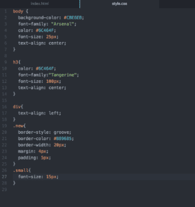
My first initiative in beautifying my website was to figure out how to center my text and choose pleasant-looking fonts/colors. I figured the best way to center my text would just be to “text-align: center” in my body and create a div for any parts that I want to justify left. Achieving these steps were quite simple, and my code reflects that.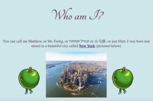
I then experimented with coolors.com to find a nice color palette and landed on one that I was ultimately happy with.

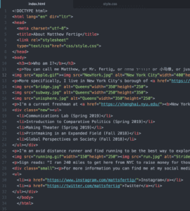
I then realized that gifs can be added in the same way images are and thought that might spruce my website up a bit. Also, seeking inspiration from our CSS exercise, I added a div class for the box around my list of classes to separate the information.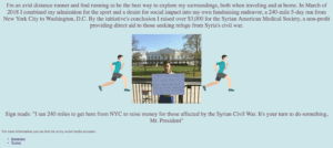
I then created another class to change the font of my social media handles because I thought that information was secondary to the format of my website.
Week 2: Photoshop – Matthew Fertig
For my photoshop project I decided to combine the luxuries of New York’s Fifth Avenue today to a familiar scene of the past. I was initially confused about which crop tool to use when, but online photoshop tutorials were able to answer my questions.
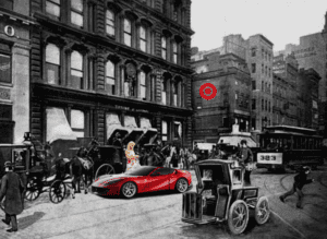
I created this image by combining the old New York image as my background, and then layering first the woman on her cell phone, then the Ferrari in front of her, and lastly the Target logo on the building. 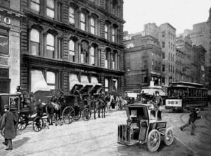


I chose to darken the background to create an even starker contrast between the new and old in the picture. I had the option of turning my added images black-and-white to blend in but I wanted there to be no discrepancies in my meaning. Instead, we’re presented with the reality of New York today: increasingly gentrified neighborhoods that bare no resemblance to the past.
Week 2: Response to McCloud- Matthew Fertig
I’ve never really been one to appreciate comics, but I still enjoyed learning from McCloud about its rich history. I found it interesting how he was able to relate to the reader by opening up the use of comics to a broader scale. He writes that when observing the definition of comics as a sequential art, we can then see anything from diagrams to photo booth pictures as branches of comics (McCloud 20). He also goes into detail differentiating the distinctive comic style of art from the actual comic strip. Whereas one “is an approach to picture making,” the latter “employs that approach” (21). His desire to meticulously go into details in defining what a comic is forced me to question his rationality for doing so. I came to the conclusion that his unique way of defining the medium serves to introduce the content of the following chapters, as his definition of comics is simply one of many.
I also found his comments on the simplicity of comics in chapter 2 to be particularly interesting. Without thinking, our minds link certain images to greater concepts, that we label as ‘icons.’ The more familiar the image is, the more likely we are able to recognize the simplified version of the image. While, as McCloud depicts, levels of simplicity can vary, we are often times able to define images based on little content. This, in essence, is what comics seek to achieve: the way to convey information in a simplified form.
Week 2: CSS Exercise (Matthew Fertig)
http://imanas.shanghai.nyu.edu/~msf432/commlab/week2/css-exercise
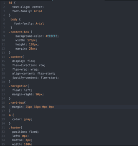
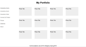
There were many obstacles in my attempts to create this webpage. After several attempts at making changes to the CSS page I realized I linked the page incorrectly. Instead of putting the “styles.css” page in the week 2 folder, I kept it in week 1, so that’s why I wasn’t able to see the changes on my page. It also took some experimenting to find the right sizes for the boxes and margins. These problems were easy to fix (for the most part), it was mainly overcoming the flaws in my code that made the exercise difficult to complete.