Final Project Research by Megan Rhoades

Interaction is a process in which two or more actors use a shared language (or method of input) to recognize and react to each other.

This is the definition of interaction I proposed in my research for the initial group project. In this research, I decided that Crawford’s “What Exactly is Interactivity?”1 and Igoe and O’Sullivan’s “Introduction to Physical Computing” 2 were important influences to this definition. Crawford’s idea of interactivity involves a spectrum, with some things feeling more interactive than others. Igoe and O’Sullivan, meanwhile, note the importance of developing how a computer “sees” us.

After my midterm project, I learned that an important factor in creating an interactive project is creating a piece which uses the user’s language. As I progress in the class, the idea of communication has become more and more prominent in my mind. For this reason, I would like to adopt my definition of interaction moving forward in the class:

a cycle of communication between two or more actors which involves “listening,” processing, and responding.

To test and develop this new definition, I will examine two popular examples of interactive projects.

  1. (BANTAM BOOKS, various authors) CHOOSE YOUR OWN ADVENTURE

The first project I would like to discuss was revolutionary in its use of “interactivity,” but I feel that it falls short of my proposed definition of interaction.

To be short, the books cannot engage a reader. Rather, the reader engages the book. The formula of the books involves text which prompts the reader to make a choice, but (as many readers of Choose Your Own Adventures may remember!) the books at points felt as if they lacked real agency and creative thought on the part of the reader. I chose to analyze this project because it is one of the spiritual predecessors of my next choice:

  1. (NETFLIX, director DAVID SLADE) BLACK MIRROR: “BANDERSNATCH”

This project fits the definition of interaction I propose above, but I believe it could be made more interactive.

When Netflix released this episode of Black Mirror in December 2018, everyone was curious about its interactive features. The episode rips on the classic idea of interactive fiction by bringing text to video format. While the episode was a hit, I found myself somewhat bored about halfway through the project. This feeling is subjective, of course, but upon further thought I believe I had adjusted too quickly to the formula of the episode: Scene pauses, user picks one of two choices. The story lines were beautifully developed and depicted, yet the formula offered no surprises. I love this concept, so I would like to add onto it for my final project by tweaking the part of the episode I found weak (the choice system).

After reviewing these two related interactive projects (“Bandersnatch,” Choose Your Own Adventure), it seems that one of the concepts which should be added to a definition of interaction is creation or engagement. Although actors may communicate with each other, if every iteration is completely predictable the feeling of interactivity is lost. The user should have curiosity towards the functions of the project. This factor is one which I will consider moving forward in the class — a project should not only respond to a user, it should delight and surprise the user in some way.

End Notes

  1. Crawford, Chris. The Art of Interactive Design: A Euphonious and Illuminating Guide to Building Successful Software. San Francisco: No Starch Press, 2003.
    Chapter 1: “What Exactly is Interactivity”
  2. O’Sullivan, Dan, and Tom Igoe. Physical Computing: Sensing and Controlling the Physical World with Computers. Mason, OH: Course Technology, 2010.
    Introduction
Recitation 7: Processing Animation (By Megan Rhoades)

Part 1: Interactive Animation

This animation was originally something I created in class when we were learning for loops. The original sketch had only two circles which bounced after reaching the edge of the screen. For this recitation, I added an interactive element in the fact that pressing the mouse (or, since my laptop is also touchscreen, touching the screen) in a certain spot would generate another circle. Further, every mouse click changed the size of the circles randomly. I also added a function which would clear the screen of the small circles with a keyboard press, so that the user could continue drawing if the screen became full. 

Finally, I added a colored background (which also changed with each click), some simply instructions for use, and a title. 

The video is inserted here, and the code can be found at the end of this post:

Part 2: Expanding/Contracting Circle Exercise

I had a lot of trouble with this exercise. Creating the ellipse itself was no problem, and neither was making the ellipse contract/expand by setting boolean parameters that change the size of the radius. The problems began when I attempted to color the outline. As the circle contracted, it left behind a distorted background in the shape of the fully expanded ellipse. I also had trouble getting the colors to change at a more slow pace, so I ultimately left the color change at a default (very rapid) setting. 

The flickering of the circle in the video is from a function I added which clears the program every few frames in order to get rid of the distorted background. 

The final sketch:

And this video shows the distortion mentioned above.

Code:

The code for the animation sketch (circle_rave):

float CIRCLE_DIAM = 30; //20 pixel diameter for circles
final int ARRAY_MAX = 1000; //size of array

int[] pointX = new int[ARRAY_MAX]; //x coordinate of point
int[] pointY = new int[ARRAY_MAX]; //y coordinate of point
int numPoints; //current number of points on the screen

int value = 0;

//for the text
PFont f;

//for the circles
int x = 100;
int y = 400;
color c = color(random(255), random(255), random(255));
int spdx = 3;
int spdy = 4;
float d = 100;
float D = 100;

int X = 150;
int Y = 300;
int spdX = 17;
int spdY = 11;

void setup() {
size(600, 600);
f = createFont(“Georgia”, 16, true);
ellipseMode(CENTER);
numPoints = 0; //sets array
}

void draw() {
background (value);
textFont(f, 70);
fill(0);
text(“c i r c l e r a v e”, width/5, height/4);
fill(255, 255, 255);
text(“tap me”, width/2, 300);
textFont(f, 20);
fill(0);
text(“press key to reset”, width/2, 340);

int red = int(random(255));
int green = int(random(255));
int blue = int(random(255));
color clr = color(red, green, blue);
for (int p=0; p<numPoints; p++)
{
fill(clr);
ellipse(pointX[p], pointY[p], CIRCLE_DIAM, CIRCLE_DIAM);
}

ellipse(x, y, d, d);
x = x + spdX;
if ( (x < d/2) || ( x > width-d/2)) {
spdx = -spdx;
fill(color(random(255)));
}
y = y + spdy;
if ( (y < d/2) || ( y > width-d/2)) {
spdy = -spdy;
fill(color(random(225), random(100, 200), random(100, 200)));
}

ellipse(X, Y, D, D);
X = X + spdX;
if ( (X < D/2) || ( X > width-D/2)) {
spdX = -spdX;
fill(color(random(50, 150), random(50, 150), random(50, 150)));
}
Y = Y + spdY;
if ( (Y < d/2) || ( Y > width-d/2)) {
spdY = -spdY;
fill(color(random(225), random(225), random(225)));
}

if (keyPressed == true) {
numPoints = 0 ;
}
}

void mousePressed() {
if (value == (color(155, 100, 100))) {
value = (color(random(0, 255), random(0, 255), random(0, 255)));
} else {
value = (color(155, 100, 100));
}
if (d == 100) {
float circledi = random(10, 250);
d = circledi;
} else {
d = 100;
}
if (D == 100) {
float circleDi = random(10, 250);
D = circleDi;
} else {
D = 100;
}
if (CIRCLE_DIAM == 30) {
CIRCLE_DIAM = random(5, 80);
} else {
CIRCLE_DIAM = 30;
}
}

void mouseClicked()
{
pointX[numPoints] = mouseX;
pointY[numPoints] = mouseY;
numPoints++;
}

The code for the expanding/contracting ellipse:

int rad = 50;

boolean ellipseIsShrinking = false;

void setup() {
size(600, 600);
//background(255, 255, 255);
frameRate(40);
}

void draw() {
int red = int(random(155, 255));
int green = int(random(155, 255));
int blue = int(random(155, 255));
color clr = color(red, green, blue);

// Make smaller if shrinking, bigger otherwise
if (ellipseIsShrinking) {
rad–;
} else {
rad++;
}
// Test if instructions should be reversed
if (rad == 50 || rad == 150) {
ellipseIsShrinking = !ellipseIsShrinking;
}

ellipseMode(RADIUS);
stroke(clr);
strokeWeight(20);
fill(255, 255, 255);
ellipse(width/2, height/2, rad, rad);

if (rad%4 == 0) {
clear();
}
}

Recitation 6: Processing Basics – By Megan Rhoades

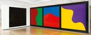
I took inspiration from the artist Sol LeWitt. In particular, I took inspiration from the colors used in this piece: 

colors inspo

However, I also noticed that he used lots of stars and repeating patterns in his work. For example, this piece:

lewitt star

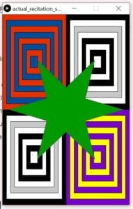
For my project, I wanted to create something that incorported these three elements: First, the star. Second, the repeated stripes of color. And finally, the actual colors used in my first selection of LeWitt’s. For this reason, I decided to create one star as the main focus with different rectangles, each with their own color scheme.  This was the final product:

recitation 6 result _ rhoades

I felt good about the result, but had I been given more time I would have liked to find a way to re-create the layered star piece with the colors of the first piece. Originally I wanted to layer the star over tiles each with a curve on them, but I could not find a good way to create neat curves given the time I had. I do think Processing was great for the creative use of color, but creating natural curves is difficult. 

Below is the code I created. I would like to note that the star I created was tweaked from code by user Jan Vantomme on Openprocessing. His code can be found here: https://www.openprocessing.org/sketch/28207/

The code:

float innerRadius = 70;
float outerRadius = 180;

int numSpikes = 6;

PVector[] points = new PVector[ numSpikes * 2 ];

void setup()
{
size( 400, 600 );
float angle = TWO_PI / points.length;
for ( int i = 0; i < points.length; i++ ) {
float x, y;
if ( i % 2 == 0 ) {
x = cos( angle * i ) * outerRadius;
y = sin( angle * i ) * outerRadius;
} else {
x = cos( angle * i ) * innerRadius;
y = sin( angle * i ) * innerRadius;
}
points[i] = new PVector( x, y );
}
noLoop();
}

void draw()
{
rectMode(CORNERS);

fill(230, 46, 0); //base
rect(0,0,200,300);
fill(0,0,0);
rect(200,0,400,300);
fill(0,0,0);
rect(0,300,200,600);
fill(122, 0, 204);
rect(200,300,400,600);

fill(0, 77, 153); //layer 1
rect(12.5,18.75,187.5,281.25);
fill(255,255,255);
rect(212.5,18.75,387.5,281.25);
fill(255,255,255);
rect(12.5,318.75,187.5,581.25);
fill(255, 255, 0);
rect(212.5,318.75,387.5,581.25);

fill(230, 46, 0); //layer 2
rect(25,37.5,175,262.5);
fill(200,200,200);
rect(225,37.5,375,262.5);
fill(200,200,200);
rect(25,337.5,175,562.5);
fill(122, 0, 204);
rect(225,337.5,375,562.5);

fill(0, 77, 153); //layer 3
rect(37.5,56.25, 162.5, 243.75);
fill(255,255,255);
rect(237.5,56.25,362.5, 243.75);
fill(255,255,255);
rect(37.5,356.25,162.5, 543.75);
fill(255, 255, 0);
rect(237.5,356.25,362.5, 543.75);

fill(230, 46, 0); //layer 4
rect(50, 75, 150, 225);
fill(0,0,0);
rect(250, 75, 350, 225);
fill(0,0,0);
rect(50, 375, 150, 525);
fill(122, 0, 204);
rect(250, 375, 350, 525);

fill(0, 77, 153); //layer 5
rect(62.5, 93.75, 137.5, 206.25);
fill(255,255,255);
rect(262.5, 93.75, 337.5, 206.25);
fill(255,255,255);
rect(62.5 ,393.75 , 137.5, 506.25);
fill(255, 255, 0);
rect(262.5, 393.75, 337.5, 506.25);

fill(230, 46, 0); //layer 6
rect(75, 112.5, 125, 187.5);
fill(0,0,0);
rect(275, 112.5, 325, 187.5);
fill(0,0,0);
rect(75, 412.5, 125, 487.5);
fill(122, 0, 204);
rect(275, 412.5, 325, 487.5);

fill(0, 77, 153); //layer 7
rect(87.5, 131.25, 110, 168.75);
fill(255,255,255);
rect(287.5, 131.25, 310, 168.75);
fill(255,255,255);
rect(87.5, 431.25, 110, 468.75);
fill(255, 255, 0);
rect(287.5, 431.25, 310, 468.75);

translate( width/2, height/2 );  // the star
smooth();

fill(0, 153, 0);
stroke(80);

beginShape();
for (int i = 0; i < points.length; i++) {
vertex( points[i].x, points[i].y );
}
endShape(CLOSE);
}

The Mystical Aunt Margot – Megan Rhoades – Rudi

  • Context and Conception

My experience with the group project led me to conclude two things about interaction: first, some things “feel” more interactive than others. Second, an important factor in creating this interactive “feel” is having a piece that can speak the user’s language. The definition of interaction I used in that project was focused on the idea of communication. In this case, such thoughts inspired me to create a project that would “talk” to its user in some way. I took inspiration from the idea of the Magic 8 Ball. The Magic 8 Ball was an ideal place to start because, although the mechanism for the Magic 8 Ball is quite simple, the user experience has an interactive feeling. The user asks the ball a question, and in return are given an answer. Of course, my partner and I wanted to do something more than just a Magic 8 Ball. I find myself getting bored with the Magic 8 Ball after a few uses, mostly because the answers are simply too predictable. My partner (Alison Frank) and I decided to create a project which would give a set of answers which had more of an engaging, human character to them.

  • Design

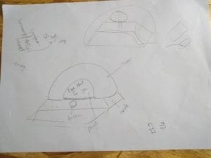
My partner and I began the design process by drafting a long set of answers which we could use in the project. These answers were originally quite long and some were quite mean – based on this, we decided that we wanted to create something stereotypically cute and innocent-looking to contrast the sarcastic answers. Like the Magic 8 Ball, we wanted it to be round with a small window for the answers to appear. Ours, however, would have some features to create a character, which we felt would be more engaging and create more of an interactive “feel.” We decided we wanted to use cardboard to create a base which would hide the circuitry and host a button: this was done mostly for convenience sake, as we knew the upper piece which would conceal the answers would take more care to create. A lot of this first draft influenced our final project: the “two-box” structure, the button, and the concept of a stepper-motor were all integral to our final design.

Our initial sketches:

The very first sketch we did. We changed the shape and placement of the button/window, but kept the idea of a stepper motor and two boxes to cover the wiring/motor.

Original Sketch

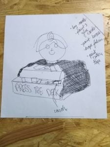
Our initial design for the “cute character” element which would go on the cover. 

Original Sketch

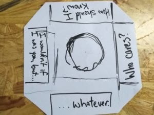
A slip of paper we used as a placeholder for the final thing. We ended up adding many more answers and printing the final one.

Original Sketch

  • Fabrication and Evolution of Design

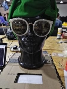
Despite this first sketch’s influence, we immediately realized we would have trouble with it. The stepper motor which we had used in recitation was a decent choice but creating a circular object to go on top of it was giving us trouble. For this reason, we changed the circular top to another box. We fabricated the top box to have a window for the answers to appear in. Although this design worked decently, we had lost much of the character that we originally wanted. Users could press a button and get an answer from the project, but there was no real sense of interaction. At this point, we received advice from Professor Rudi about creating a theme which would mimic fortune-telling carnival booths. By adding a mannequin head and concealing the button with a deck of cards, the aesthetic of the project (and subsequently the experience of using it) was changed completely. It was at this point that we found a title for the project: “The Mystical Aunt Margot.” Rather than a “mean” Magic 8 Ball, we had created a fortune-telling machine which replaced the genie figure with a (somewhat incompetent) aunt.

Some photos of this process:

The placement of the head (with shirt as a wrap and my sunglasses to cover the face) and the sketch that I made to estimate what a final product might look like incorporating it. 

updated concept the head 

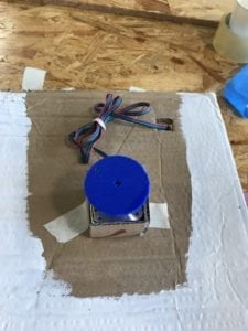
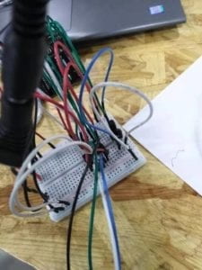
The bottom box — the backside, which shows how the wiring fits into it, and then the top with the motor placed in its place. 

Bottom box/wiring bottom box/stepper 

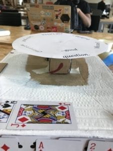
The motor with the slip of answers placed on top (sans cover).

stepper with paper

The working of the final product. Notice the way it lands incorrectly between answers before correcting itself.

The final steps of the project were all taken in response to the user testing. Some feedback was easily implemented: the window which revealed the answers, for example, was too small. This was fixed by simply cutting the window to be wider. Another issue was that some users simply had no idea how they were to use the project. My partner and I had assumed that everyone would be familiar with the Magic 8 Ball concept: while some users immediately knew what to do with the project, some were completely lost. This led us to include a speech bubble with instructions on how to use the project. Although we were given some easy fixes, there were some tougher issues we had to face. In terms of the user experience, some felt that the button was too arbitrary. One piece of advice was to create a mechanism which would make the project give an answer based on picking up a card. Due to time constraints, my partner and I decided we could not realistically implement such a mechanism. Our struggles based on time were due to the last issue we encountered during user testing: our answers would often not spin evenly, leaving every few button spins landing in-between answers rather than revealing only one. At first we considered that this might be a hardware issue: we replaced the foam disk we had used to support our answers with a lighter cardboard one. This helped a bit, but still did not fix the issue. My partner was busy most of the weekend but gave some advice over messaging about fixing the problem by mapping our array values onto the number of steps in the stepper motor. With some help from a fellow we got closer to fixing the problem, mostly by adjusting the delay between spins and adjusting the values within the arrays which would determine the steps the motor would move. Still, our final project occasionally got off. Given more time, I would hope to sit down with my partner and finally figure out why this problem persisted.

  • Conclusions

My partner and I intended to create a project which would create an interactive, fun experience for the user. In the end I do believe we came very close to fulfilling that goal with our “Mystical Aunt,” in that our project has its own clear aesthetic which invites the user to, in short, play with it. I could see this project existing in a shopping mall or diner as a small toy, a gadget that users could put a coin into to get a fortune. Given more time, I think it would be very fun to add some decorative flairs, perhaps some lights that flash when the disk spins or some kind of voice recording that tells a user how to play when they step up to the device. It might even be fun to get rid of the disk altogether and just have a random voice message play after the button is pressed. Going ahead, I will keep these possibilities in mind for the final project.

I learned two major things from this project experience: First, when designing I should try to consider how people of different backgrounds would approach the project. My partner and I were both very familiar with the Magic 8 Ball and similar devices, but while user testing we found that this was not true for everyone. Second, I personally learned that it is okay to have to change things. I was very set on our initial idea, so when those things did not work out I did not know where to go. However, after talking with Professor Rudi I realized that I could very easily make something cool out of what I had already built. Next time I hope that when I have to abandon plans I can use the opportunity to improve and make something cool instead of feeling that I have to build towards my original concept. Moving into the final project, I have a better concept in mind of how to build something with an interactive “feel” that can entice people of all backgrounds, and more strategies for working with setbacks to turn them into opportunities for new development.

Recitation 4 (Drawing Machines): By Megan Rhoades

Diagram

H-bridge circuit diagram

Final Product

drawing machine circuit_rhoades

Components

  • 1 * 42STH33-0404AC stepper motor: Spins in calculated movements with application of current, provides movement for “drawing machine” when combined with gear
  • 1 * SN754410NE ic chip: controls flow of current
  • 1 * power jack: connects power supply to circuit
  • 1 * 12 VDC power supply: acts as source of current
  • 1 * Arduino kit and its contents
    • arduino, usb connector
    • jumper cables
    • potentiometer: measures electrical flow, helps user manipulate arduino to control circuit (in this case, to control the load)
    • breadboard
  • Tools for construction drawing machine:
    • 2 * Laser-cut short arms
    • 2 * Laser-cut long arms
    • 1* Laser-cut motor holder
    • 2 * 3D printed motor coupling
    • 5 * Paper Fasteners
  • Tools for drawing with drawing machine:
    • 1 * Pen that fits the laser-cut mechanisms
    • Paper

Process:

  1. Circuit: The process of building the circuit is always enjoyable to me. I had little trouble following the diagram, although next time I would like to challenge myself to use the least amount of jumper cables possible. Checking if the circuit was wired correctly was a bit nerve-wracking, but I had no trouble with the process. After testing the motor I moved the usb cable from the protector to my own computer. I did notice towards the end of the recitation that my potentiometer was not fully pressed into the board, resulting in some lag in the control of my motor. After noticing the issue I quickly fixed it. 
  2. Coding: Having never coded before, this aspect of the process is always the most difficult to me. I pulled up the correct example to work the motor, but quickly realized that I did not really understand how to handle this kind of coding. Having the different functions of each element of code (the mapping function, for example) explained to me took some time, but afterwards I felt much more confident. I helped some peers with their code for practice, and I now feel that I definitely know how to use the mapping function and define variables. I think with a few more circuits I will be confident in my ability to tweak example codes. My goal now is to be able to tackle the code on my own as soon as possible.

Questions

  1. I would be very interested in building a machine that involves the human senses somehow — I think that scent is a highly underrated sense when considering art, especially interactive art, so I could see myself building a machine that plays with this element. The role of hardware and incorporating actuators in this kind of project seems to be the most difficult. In general, I find actuators and “movement” to be incredibly important in creating art that feels like it has its own existence beyond human control. In essence, I would like to play with the hardware element of modern art rather than the software element, although both are important in creating a final product. While software is abstract, hardware takes real material to create and interact with. It interacts on our plane — it can touch our senses and get our attention. 
  2. The project I would like to discuss is Daniel Palacios JimĂ©nez’s Waves. What interests me about this project is the simple motors that would be required to create increasingly complex forms. Our project in this recitation used only two motors and a series of cut materials, but was able to draw a variety of different shapes and curves (as seen by the diversity of the drawings left on the wall!). I believe this project has a similar element in that it uses simple motion to create a beautiful result. I personally find the shapes created with rotation to be fascinating, reflecting what we find in nature while also having abstract possibilities — this artist likely felt the same.