JS Conditional Exercise – Mingyue Deng

Project: JS Conditional Exercise

Documented By: Mingyue Deng

Link: http://imanas.shanghai.nyu.edu/~md3606/commlab/week4/exercise.html

For this exercise, I had a lot of trouble setting up the flex-container and making it become a row. Then, I realized it was because I set the relation wrong, I set it up as exercise but it should be stylesheet.

I still could not get the JS to work, but I got everything else to work.

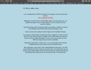
Here is a screenshot of my JS page.

Comic Project Outline – Mingyue Deng, Shirley Liu

Outline of the Comic Story:

  1. The girl goes home and sees her parents fighting/arguing in the living room
    1. depictions of some parts of the argument
  2. She is used to it and goes to her room and locks the door
    1. she puts on her headphone and starts to daydream
  3. Daydream
    1. She got her favorite camera and flies all over the world to cities she has always wanted to go to
    2. depictions of cities and pictures she takes when she is there
  4. Wake up
    1. she wakes up from the daydream
    2. she finds herself not in the house but actually traveling
    3. her parents are not fighting but traveling with her to places
  5. the daydream is actually real and the fighting in the house is the dream

Shirley and I are going to draw for some parts and photoshop for the harder parts.

The users would be using the girl as the main character and interface with the website, and follow her journey in the cities and back.

Basic HTML+CSS Website – Mingyue Deng

Project: HTML+CSS Final Website

Documented By:  Mingyue Deng

Link: http://imanas.shanghai.nyu.edu/~md3606/commlab/week3/

I had several troubles when I was making this website. At first, I was unable to align all the items in a row like this instead of in a column. 

Then, I decided that I would make several pages so I could really put texts in their place. So, when people click on the bar like “About Me”, they would see my profile page.

After I made those pages, I ran into trouble making the column of pictures into the rows as I did with the bars.

However, I fixed the problem later after I put each part into their corresponding bars.

Then I ran into trouble when I try to upload the website to IMA NAS, and I still could not figure out what the problem is. I tried several ways to write the link, and I tried to copy the link through Cyberduck, all did not work. I always opened it to a 404 error page. Now the link works to open the website page, but the CSS files I uploaded were not appearing to decorate my website. So I decided to screenshot all my pages as they should be looking like and post them here.

Final Website:

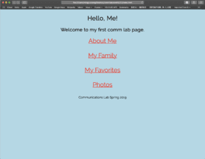
Index: the red text becomes larger in size when the mouse hovers on it.
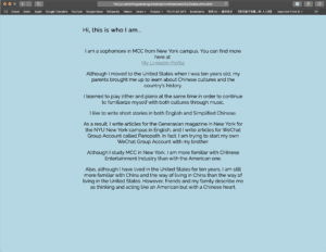
About Me: The light gray linked text becomes red when the mouse hovers on it.
My Family:
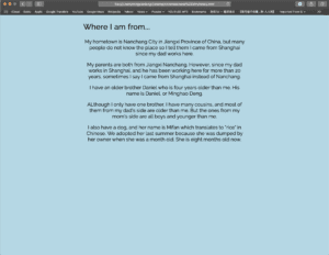
My Favorites:
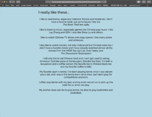
Photos: All photos are in rows instead of in columns now on this page.


  

This is the effect of how I want the website to look like, but I don’t know if it’s going to be shown like this when you click the link.

Response to Scott McCloud – Mingyue Deng

In Scott McCloud’s Understanding Comics Chapters 1-4, he described his understandings of comics and cartoons. Many people read comics, some read them when they were little, but some continued to read them when they are still older and others would decide to choose it as their career. However, readers almost never consider these elements which McCloud is explaining if they are only reading comics and not studying it deeper. The method McCloud used to make this piece is quite interesting and different from others too.

There are many concepts and theories which McCloud explained would be useful in real life. For example, the way people’s minds understand the concept of a face in simplified form of a drawing instead of a realistic face. It is very interesting that he thought of the plugs and how it resembles a face. Also, the way people always think about how they look when they meet someone else. If a person does not look in a mirror for a long time, he or she would only have a vague idea of how he or she looks in detail. The gutter between the drawings is very interesting too. I have never considered the gutter to be useful until I read this piece. Then I realized that it is actually very effective when the gutter becomes smaller or the drawing boxes become longer when reading comics. I think that ice could use these concepts n media environments too, such as the color theory to pop out something. Playing with our minds and studying how people perceive different media forms is fascinating.