Final Project: Step 2- Project Proposal – Lillie Yao

  1. Image Changer

For this project, my partner and I researched on this pre-existing art piece called the Aurora Organ. This was part of my last weeks research as well and we used this project as inspiration for our project idea. We liked this idea because it was really pretty to look at but at the same time, the user could control the colors and the way it looks. We used certain aspects of Utterback’s project to create our own project.

Here is the link to The Aurora Organ : http://camilleutterback.com/projects/aurora-organ/

For the Image Changer, we wanted to implement a temperature and pressure sensor. The temperature sensor would sense the temperature of someone/something and then change colors according to the temperature. The pressure sensor would just sense the pressure of the user touching the “button” and represent how long the light would hold out. The output would then be shown through Processing and Arduino.

We were thinking that this project would be displayed somewhere just like the Aurora Organ, inside a mall or something that a lot of people would go to. The reason we would want it to be in a mall is so that when people are there waiting for someone or just bored, they have something else to do instead of being on their phones. In other words, people would be able to interact with this project and other people instead of just being on their phones.

2. Chemistry Coach

For this idea, we researched this teaching device that helped people learn trigonometry called TAMI. We liked this project because it is intended to help people learn in a fun and interactive way, which was our motive for Chemistry Coach.

https://www.creativeapplications.net/openframeworks/tami-an-intuitive-approach-to-the-learning-of-trigonometry/

For Chemistry Coach, we were thinking of having the periodic table coded into Processing so that if the user would click a certain element, it would show them what the element was called and  the properties of that element as well. At the same time, we would have Arduino set up with LED lights to show the electron configuration of that specific element (with the different energy levels). 

Here is a picture for reference: on Electron Configuration: Image result for electron configuration

For this project, we wanted to make learning basic chemistry easy, interactive, and fun. This project is mainly designed for students who are trying to build a solid foundation in learning basic chemistry. This is also designed to help more visual learners grasp chemistry, because we all know it is SO hard to learn. We hope that this project will also motivate students to learn chemistry and master it, even though it sounds hard.

3.Motion Painting

This idea was influenced by my interest in interactive art exhibits. We found this interactive art exhibit called Leap Motion in Tampa, Florida. This piece was especially interesting because it showed people interacting with the piece just by moving their hands/body and the output on the screen was just random shapes in random colors moving symmetrically to them. This reminded me of the activities we did in recitation, just without the motion.

For Motion Painting, we wanted to implement a motion sensor so that it could sense the different movements a user would make. Then using Processing, we would display different shapes and colors according to whatever motions the user made. Of course, we would need to put the motion sensor somewhere so that the user would know where to move, so we were thinking about having a “controller” that would be covered by some sort of dome that we would 3D print or fabricate.

We wanted to make this project for everyone to be able to use and have fun with, kind of like our first idea. At the same time, we wanted to make this project for people that are especially interested in interactive media art and would come just to see this art piece. The meaning we wanted to interpret into this project was that you don’t need a pen/pencil and paper in order to create art. Art comes in many different forms and “motions.”
Recitation 7: Functions and Arrays – Lillie Yao

Recitation Exercise:

For this documentation, we were asked to use Processing and create 3 shapes and create arrays, for loops, and animations with the code. In this exercise, I got to practice with color changing, x and y values, and movements around the screen. Throughout the steps, I did run into some obstacles but soon figured them out just by playing with the code.

Step 1: 

For this step, we had to display 3 different shapes on the screen. I made 3 different circles, all the same size, and made them random colors every time the user would run the code.

Step 2:

For this step, I had to use a for loop to tell the code to make 100 different circles. I had trouble with this because I didn’t make another integer “i” so I wasn’t giving the for loop a command to keep making circles until it reached 100 circles. It was also hard because I didn’t know whether or not to put the color command in the setup() or the draw() function. In the end, I figured it out and declared an integer “i” and put the color function in the setup() function.

Step 3:

For this step, it was basically the same thing as the previous step except I used an array. This was hard for me because I was really confused as to how many different arrays I needed to make. At the same time, I was also confused as to where I needed to put my arrays. Turns out, I declare the arrays outside of everything and then fill them in the setup() and draw() functions.

Step 4:

In this step, all I had to do is make the circles move a certain way and then I used an if statement to ensure that if the circles hit the sides of the screen, that it would bounce. This was really simple for me to do since I already had the basics down so all I needed to do was to add an if statement.

Question 1:

The difference between having my for loop in setup() and draw() is that in setup() I would only be telling it to run once and then it would stop. But when I put the for loop in draw(), it constantly repeats itself. I’m not sure if this is exactly why but I found that it worked when I was testing my code out and figuring out where to put the for loop.

Question 2:

Using arrays is beneficial when you have to store multiple values at once in an array. I find that using arrays will be make coding a lot simpler especially if you are using a lot of numbers and have to store them. I might use arrays in a project when I have to assign different values to certain shapes, or make them move without having to declare each variable.

Code:

int circle = 100;
float[] x = new float[circle];
float[] y = new float[circle];
float[] speedX = new float[circle];
float[] speedY = new float[circle];
float[] size = new float[circle];
color[] c = new color[circle];

void setup() {
  size(600,500);
  background(255);
  
  for (int i=0; i < 100; i++) {
    x[i] = random(width);
    y[i] = random(height);
    speedX[i] = random(-2, 2 );
    speedY[i] = random( -2, 2 );
    size[i] = random(10,500);
    c[i] = color(random(255),random(255),random(255));
      drawCircle(50,50,color((255),color(255),color(255)));
    

    print("y["+i+"] = ");
    println(y[i]);
  }
  
}

//void display(float x, float y, color c) {
//}

void draw() {
  background(255);
  for (int i=0; i< 100; i++){
   drawCircle(x[i], y[i], c[i]);
  
   x[i] = x[i] + speedX[i];
   y[i] = y[i] + speedY[i];
   
   if (x[i] > width || x[i]< 0) {
      speedX[i] = -speedX[i];
    }
    if (y[i] > height || y[i]< 0) {
      speedY[i] = -speedY[i];
    }
  }
  
}

  //drawCircle(150, width*0.25, height*0.25, color(91,246,250));
  //drawCircle(50, width*0.45, height*0.45, color(255));
  //drawCircle(200, width*0.75, height*0.75, color(0,0,255));


void drawCircle(float u, float v, color c) {
  noStroke();
  fill(c);
  ellipse(u,v,50,50);
}

Final Project: Step 1- Preparatory Research and Analysis – Lillie Yao

When I went to the Chronus exhibition, not only did I think it was different from the non-technology based artwork, but I felt like it was different from the technology based art work I’ve visited before as well. The exhibit itself I felt was pretty hard to understand, even with the descriptions and explanations, I felt like it was just there and I was often confused by what the art pieces were trying to convey. At the same time, I did find it very interesting that they used components that I’ve used before but yet made them into such complicated pieces of art. There is a lot of difference between this exhibit and non-technology based art work. The non-technology based art work that I’ve been to usually have a meaning or deep story behind it. Although the pieces at the Chronus exhibit had a story behind it, I felt like it wasn’t as deep as I would’ve expected it to be. On the other hand, I felt like there was so much thought and creativity put into each and every one of the projects and I find that to be similar in non-technology based art work as well.

FLUTTER- LA, CA

Flutter is an interactive art exhibit in Los Angeles that features 6,000+ square feet of art that is meant to be touched. They have different types of exhibits that range from digital, to hands on art. The reason I found this exhibit is from this video: https://www.youtube.com/watch?v=rtRscfX8O44 

I love the type of interactive art that has to do with animation that reacts with motion of people. I think this is successful because museums and exhibits like these lure more people in because it either looks very cool, unlike other things before, or people want to experience it for themselves. 

Their website: https://flutterexperience.com/

AURORA ORGAN – Camille Utterback

Camille Utterback is a very well-known interactive media artist. This piece specifically drew me into her artwork. The Aurora Organ is currently displayed in St. Louis Park, Minnesota in a shopping mall. This piece is designed for customers and people within the mall to interact with it. The organs are basically just hanging pipes and they change/add colors once someone touches it. The amount of color that adds on differs by each motion, whether you are tapping or holding the railing. From their website:

“The colors in each column animate in various ways – moving faster or slower, up or down, depending on how people tap or touch the railing. Holding the railing sensor creates a long streak of color, while tapping creates shorter bursts. New colors overlay and blend with previous patterns, visually merging past and present activity at the railings. If all six sensors are touched simultaneously, general properties of the system, like gravity, are reversed – causing a major change in the behavior of all the colored elements. Each column of Aurora Organ becomes a temporal history and amplified visual trace of people’s presence and activity in the atrium.” 

I feel like although the Flutter exhibit seems more fun and people would pay just to go and experience it, The Aurora Organ seems like a more successful interactive experience to me. They both represent interaction very well but in my opinion, The Aurora Organ is more personalized and you can basically make it do whatever you choose. Whereas the Flutter exhibits are more general and one of those things you just walk through and watch, not as much as hands-on interaction like The Aurora Organ.

Camille Utterback’s website: http://camilleutterback.com/

The Aurora Organ: http://camilleutterback.com/projects/aurora-organ/

During the group project, our definition of interaction was:

“Interaction is a continuous conversation between two or more corresponding elements.” 

Basically meaning whether or not there was an input or output, the machine would still keep running on it’s own and the only way it would be considered interactive is if it responds to an action given by the user. After the midterm project, I would still agree that in order for an interactive project to be successful, there must be an input and output for the project as well as it keeps on running on its own if there is no input. For example, my midterm project was a game called “Simon” where it would only start if the user presses a button. At the same tie, the game would keep running and/or restarting on its own even if there was no user pressing the button.

With that being said, I did not feel like the Chronus exhibit was a good representation of interaction because not all of them had to do with a user giving input and it reacting to it. The exhibit was very interesting as I’ve never been to an exhibit much like that one, but it did not fit my definition of a successful form of interaction. As for both the Flutter Art Gallery (https://flutterexperience.com/) and The Aurora Organ by Camille Utterback,(http://camilleutterback.com/projects/aurora-organ/) I would consider to be successful for many reasons. First, both exhibits require human/user interaction in order for it to fully function. Second, if there isn’t human/user interaction, the exhibit is still fun or nice to look at and at the same time, still operates. The Flutter exhibit will have the animations still keep going and the Aurora Organ will still have the lights changing colors.

Recitation 6: Processing Animation – Lillie Yao

Recitation Exercise: For this weeks recitation, we had to work individually to add some sort of animation into a project that involved interaction. I chose to add onto the project that I created during last weeks recitation.

I coded so that the background would change colors every time I pressed the mouse button on my computer. At first, I couldn’t get the mousePressed() command to work because I just added it to the bottom of my code that I previously had. I realized that I needed to put all of my previous code into void draw() in order for the mousePressed to command to run and put size(600,600) inside void setup(). After I did that, my code ran and worked perfectly.

My code:

void setup(){
size(600,600);
}

void draw() {
fill(255,0,0,220); // big red circle
noStroke();
ellipse(350,100,65,65);

fill(0,0,0,220); //big black rectangle
noStroke();
quad(20,100,440,100,470,170,50,170);

fill(255,255,0,130); // big yellow rectangle
noStroke();
quad(270,30,320,30,410,210,360,210);

fill(255,255,255,180); // big white rectangle
noStroke();
quad(280,120,410,120,330,270,200,270);

fill(0,0,0,150); //small black rec
noStroke();
quad(160,230,280,230,290,250,170,250);

fill(255,0,0,130); // small red circle
noStroke();
ellipse(240,230,20,20);

fill(255,255,0,100); // small yellow rectangle
noStroke();
quad(195,190,215,190,255,260,235,260);

fill(0,0,0,100); // small black trap rectangle
noStroke();
quad(230,235,260,235,235,280,205,280);
}

void mousePressed() {
int r = int(random(0,255));
int g = int(random(0,255));
int b = int(random(0,255));
background(r,g,b);
}

Additional homework:

Step 1/2:

In this step, we had to code a circle shape that increased and decreased in size. I coded it so that the circle would get bigger and smaller when I pressed the “Up” and “Down” key. I don’t have the exact code as I kept adding to the original to create up to Step 3.

Step 3:

In this step of the assignment, I had to make the circle change multiple colors smoothly. I had the most trouble doing this because I couldn’t figure out where to put the code and what commands to use. I experimented with float and colorMode. I had problems because the circle would not change rainbow colors (instead grayscale) and it wasn’t moving smoothly either. In the end, I ended up only using colorMode and just declaring a color outside of the void setup() function. It was very interesting to use colorMode, float, and declaring the color function because I have never used that before. Although colorMode was hard to figure out, it definitely made my code much simpler than before.

My code:

int y = 0;
color c = color(0,150,255);
void setup(){
size(600,600);
colorMode(RGB);
}

void draw(){
background(255);
noFill();
// float c = random(0,255);

ellipse(width/2, height/2,y,y);
strokeWeight(18);
if (key == CODED) {
if (keyCode == UP) {
y–;
stroke(c–);
} else if (keyCode == DOWN) {
y++;
stroke(c++);
}
}
}

Simon : Midterm Project – Lillie Yao

CONTEXT AND SIGNIFICANCE:

For my midterm project, my partner and I decided to do a fun interactive game. Although this game and the concept of this game already exists, my partner and I still tried to challenge ourselves and re-create our own version of it. We brainstormed some ideas before actually deciding on our project, “Simon.” We chose this because it incorporated buttons, speakers, and LED lights that we could use all together and create one machine. Although this is sounds like a simple project, it was certainly challenging to accomplish. My previous group project didn’t really have that much inspiration for my midterm project but our basic understanding of interaction did carry through.

My definition of interaction is where there is a constant loop between the user and the machine. Likewise, when there is an input, there must be an output; if there isn’t an input, we programmed the game to keep running. “Simon” is obviously a recreation of the “Simon” game where it plays certain lights in a random order and it is up to the user to remember the order. We changed some aspects of the game as in when the user accidentally puts the wrong order, the game will replay the sequence that just went wrong; basically giving the user another chance.

Our project is intended for all ages. Originally I thought it would be more geared towards younger children since it would be a good game that gives them something to do. But I realized after we created this game, that many different students my age, around 18-20 also really enjoyed playing this game and it attracted their attention. I feel like this game is suitable for anyone no matter how old they are.

CONCEPTION AND DESIGN:

During User testing, my partner and I realized a lot of issues with our project when other students gave us input. For example, a lot of people felt that we should make our buttons so that they didn’t have to hold them each time it was being pressed since it was hard to switch around. I would agree because in the beginning, our game looked like a bunch of wires jumbled up together and the user couldn’t tell what they were supposed to do unless they were told to.

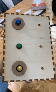
With that being said, we decided to laser print a box so that our buttons and LED lights could sit on top and the cables and everything else was hidden underneath. We selected laser printing because it would be more logical to create a box that way than to 3D print. We chose the wooden design just because we thought it would look more simple and clean that way. 

Another option for us was to 3D print a box but we were told that it was not suggested to since we wanted a hollow box and it would most likely not come out the way we wanted to. To play it safe, we just went with the laser cutting because it was fast and better for our design.

  • FABRICATION AND PRODUCTION:

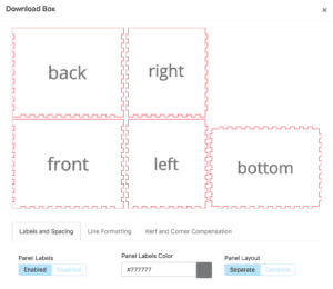
During the fabrication process, we had to make a pdf version of what we hoped to be laser printed. This was challenging because both my partner and i have never done this before. At the same time, it was hard for us to measure the diameter of the buttons and LED lights to fit in the top of our box. After piecing it all together, we realized that the measurements were wrong so we had to improvise and cut out cardboard to place on top of the holes and hot glue around the LED lights.

  • CONCLUSIONS:

 The goal of our project was to create an interactive game that required an input in order to have an output. The result of our project basically sums up my definition of interaction because the game continues to play by itself unless there is an input and therefore an output will be played. Our audience reacted as expected, they were first trying to test out our game and it ultimately took a few tries. My partner and I made the mistake of not putting an explanation to the surface of our game so that our audience would at least know how to start the game. If we had more time, we would have made instructions or some type of recording that would give the user a queue to start and finish as well as directions.

After creating this game. I realized that there are so many different ways to show interaction. Overall, I am really happy with the outcome of our project because this is the most challenging machine that I have built/programmed. I have also learned that your first product will never be perfect and that there is always room to improve, even when you think that you’ve done your best.