Louis Veazey – Kinetic Light Final Project – The Light of Hypnosis

Project Description

For this project, I really wanted to move away from what many of my classmates used, such as the LED strips, and work on a piece that uses light and shadows. From the beginning stages of my ideation, I wanted to work with the DMX lights to create interesting patterns of color, light, and shadows. Additionally, as we had to incorporate some form of movement into our projects, for example by using a servo motor, I really wanted to implement circular motion into my project, by either using a stepper motor or a DC motor. 

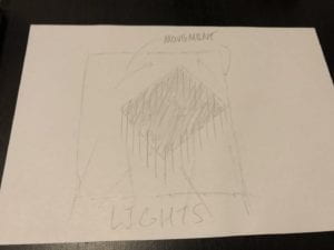
To start I conducted a bit of research into past works by world renown modern and kinetic artists, and I found my original inspiration Olafur Eliasson’s and Willem Van Weegel’s usage of circular motion and how what the audience sees changes as the artwork moves,  presenting ‘new’ pieces of art each time the artwork moves or shifts one way or another. Thus for my first proposal, I wanted to create a piece that had a rotating canvas in the middle, painted completely black, along with several black strips hanging loosely along the outer edge of the canvas free to rotate and move as the canvas rotates.
Perspective and Context

As I mentioned in the last section, I was heavily influenced by Eliasson and Van Weegel’s kinetic artworks. The circular rotation and the free moving strips were both inspired by some of their previous works, and as I was researching many different kinetic artists, what they had created was what really gave me my Eureka moment. Both Van Weegel and Eliasson’s usage of movement, and particularly Eliasson’s usage of light contributed a lot as well. These two artists inspired more of the tangible parts of my project, the rotating canvas and the free moving strips.

For the more intangible parts – the lights, shadows, and colors – I wanted to make use of the DMX lights and really use what we learned at the beginning of the semester about color theory. By having 3 different DMX lights shining at the canvas from different angles, and as each light’s brightness changes, there would be different sets of shadows and color shadows appearing either on the canvas itself or behind the canvas onto what the canvas would be set on (in earlier stages I was hoping for a wall, at the end we placed the canvas on a wood board). I was hoping this would create many different interesting patterns, especially in the background behind the canvas.

Development and Technical Implementation

Stage 1: At the beginning, I planned to have a canvas painted completely black with black strips along the outer edge. Thus I got to work on coding for the DMX lights and spent a few hours working on different patterns of light and colors and fading them in and out to see what kind of resulting color combinations I would get. I ended up with a few combinations such as yellow, blue, green, the classic red, green, blue, and a couple of others.

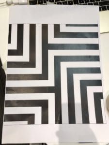
Stage 2: After receiving my canvas in the mail, the first one I received was broken, so I had to re-order a second one. However, I still made use of the first canvas and painted one half of the canvas black to see what it would look like when painted black. I did like this design at first, but upon seeing it multiple times, I thought that a completely black canvas would be a bit boring, almost as if there was something missing that could be there with a different design. So I asked the professor for his opinion on changing the design to something else, something similar to François Morellet’s artworks. I thought that this design would be much more interesting, particularly as different colors change the white areas of the painting, and the color shadows would show other colored lines on the canvas as well. I ended up deciding to use something similar to the far-left painting of Morellet’s, and changing it a bit to fit more with the kind of design that I would like to have.

Stage 3: So I went into Adobe Illustrator and created a mock-up of what I would like to create, and this is what I came up with. I thought that this fit perfectly with what I was trying to do and quickly got to work on painting the newly arrived, unbroken canvas. I used tape to cover up the areas that I would like to leave as white and left the areas to be black uncovered. I used regular black spray paint in the garden area outside the canvas and ended up with exactly what I imagined.
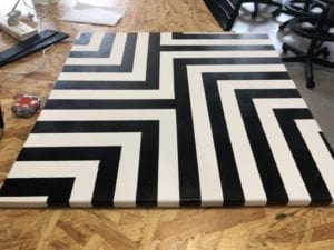
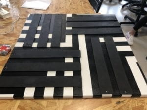
Stage 4: Then I got to work on implementing the strips that would be along the outside edge of the canvas. I decided that I would laser cut the strips using a 3mm MDF board, and then paint each of these with the same black spray paint to maintain the white and black aesthetic. After laser cutting, and painting, the strips looked like this on top of the canvas. I used a screw to hold each of the strips in the place where you see them in the picture and kept it loose enough so the strips can move about on its own as the canvas rotates. 
Stage 5: Afterwards, I got to work on connecting the canvas to the stepper motor itself, and how to keep the motor in place when setting the entire piece on the wall. For this, I also used 3mm MDF and laser cut multiple different pieces to put it all together.
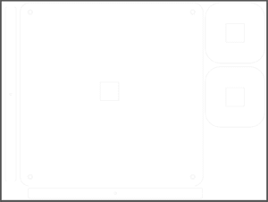
In this picture, though it is hard to see, the two strips on the far left and bottom of the picture are part of what the held the shaft of the stepper motor to the canvas. I drilled a hole into the center of the back of the canvas (the beam that runs along the middle of the frame of the canvas) and used the two strips with holes in the middle to provide additional support by hot gluing the strips onto the beam so the holes lined up perfectly to hold the shaft. The two square pieces on the right with a square hole in the middle, along with the identical pieces below were what I used to hold part of the stepper motor. Plus the large piece in the center of the picture above, which held part of the stepper motor and was to hold the entire piece on the wall. The smaller squares were hot glued together and onto the large piece and the stepper motor went into the smaller center square.
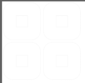
After putting it all together and attaching the canvas onto the shaft, I moved onto implementing the artwork onto the wall with the help of my professor.

Stage 6: We learned that we couldn’t drill into the wall on campus, and since it would be hard to install it to the wall without screws, professor and I decided that we would use a large wooden board to install the piece, and then place the large board onto an easel, which would be much easier to move around and install for the final IMA show. However, since I needed the canvas to lean slightly forward to keep the outer strips from hitting one another too much, I had to fabricate something to hold the wooden board forward without letting it fall over. I decided to laser cut this: From the right edge of the middle square in the left to the right edge is approximately 48 cm which allowed the large wooden board to lean forward enough to keep the strips from hitting one another. The small square on the left was installed onto the back beam of the easel and the right side of the laser cut ‘board holder’ was screwed into the top of the large wooden board. After placing it all together onto the canvas, and letting the motor run its code, it looked like this.

The stepper motor’s wire ran over the top of the large wooden board, as we weren’t allowed to drill through the board itself, and I had my breadboard and Arduino set up on the easel behind the board, out of sight.

At this point the set up was complete.  The canvas was falling off of the stepper motor a bit, so I used some hot glue to attach it a bit better and left it for the night for the final presentation.

Github Link for DMX and Stepper Code: https://gist.github.com/veazeylt/ecfda6ce8b3290b7390e7130b95b312d

Presentation

For the classroom presentation, I used the same set up as in the previous picture and used the 3 DMX lights to project from different heights and angles towards the canvas. Unfortunately, I don’t have any photos or videos from the in-class presentation. The audience liked the spinning canvas and the strips along the outside – at one point one of the strips got caught on a screw and flung around violently and that got a reaction out of the audience. However, the different colored lights didn’t work out as well as I had hoped, and upon suggestion by the professor, for the IMA show I decided that I would use one light to illuminate the canvas, kind of like a spotlight, making even more use of the white and black aesthetic through single color shadows. The stepper motor’s wire was also a point of criticism, and the professor explained that since we can’t drill through the wooden board we can’t exactly hide it entirely, but one of the fellows suggested that I use tape to hide it as much as possible. One point that was really liked was that there was almost no wires or any kind of breadboard or technological piece visible to the audience and that was really pleasing to see.

So for the IMA show, I set it up to have one light shining onto the canvas and let the canvas rotate just as I had planned. The result was very beautiful and felt like a great culmination of my efforts. However, something went wrong, as they unfortunately always do for these kinds of projects. The hot glue didn’t hold the stepper motor’s shaft to the canvas well, and the canvas fell a bit multiple times throughout the show. After the first time, I changed the steppers code to just keep rotating one way, but the canvas still fell again, so I had to resort to just leaving the canvas hanging by itself without rotating. This was unfortunate, but the only way I can display it.
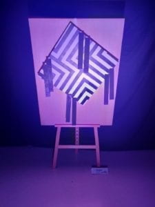
Other than that hiccup in the IMA presentation, the project went the way I had hoped, and I was very happy with the resulting piece of art that I had created.

Conclusion

Overall, I believe that my final creation was almost exactly how I had originally planned. Although I did make a change in the design choice for the canvas, and I had the error at the final showing of the artwork, all in all, I was satisfied with how I executed my original design. I hope that in the future I would be better prepared from this experience, and think of what possible errors could occur as things move around. I should have 3d printed or laser cut an additional piece to hold the canvas to the shaft, and I regret that I wasn’t able to just let the canvas rotate back and forth continuously like how I had intended. 

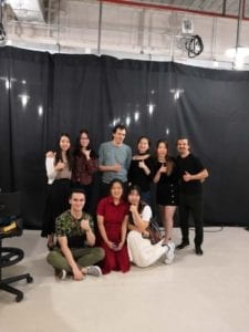
This was one of the most fun projects that I had gotten to work with so far in my college career, and I hope I will have as much fun in further projects to come! I have always liked working with my hands and building and putting things together, so this project was practically a dream come true for me. To be able to piece together what I learn with what I like has inspired me to create more pieces like this, and this summer I plan to work with what I had learned this semester to create some side projects back home. Lastly, I would like to thank Professor Eric Parren, the IMA Fellows, and my classmates for helping me not only on this project but other projects and assignments throughout the semester. Thank you!
Kinetic Light Final Project Proposal

Perspective and Context

Two artists who I think create excellent artwork and inspired my final project are Olafur Eliasson and Willem van Weegel. Eliasson’s usage of lights and shadows, combined with van Weegel’s style of using lines and boxes inspired my proposal that I will write further below.

For Olafur Eliasson, some of his work is a bit related to the concept of Mechanics and Optics, discussed from page 48 in Guy Brett’s book, The Century of Kinesthesia. In recent years, Eliasson has made countless works that make usage of motors and liquids to evoke the feeling of movement for the audience. Furthermore, he often uses circles or spheres in his works, much like Julio LeParc’s famous work, Continuous-Light-Cylinder. I believe that Eliasson makes excellent use of “the marriage of light, optics, and machine [to show] …avantgarde in its wildest form.” (47)

Eliasson’s work is also related to the concept of The Space of Abstraction. While Eliasson does tend to use circles and standard shapes in much of his works, he also uses the style of randomness with curved lines and shapes in some of his works which have a similar style to Georges Vantongerloo’s works. Eliasson incorporates the “free-form, random-seeming, and coloristically subtle and ambiguous approach to lines” (18). Vantongerloo’s Des elements is also somewhat similar to Eliasson’s Pistoletto compass and they both make use of curved lines and soft edges.

Willem van Weegel’s works are somewhat related to the Linear and Cyclical section of the reading. van Weegel’s kinetic pieces tend to move at a very slow pace, and at each step revealing new and different shapes that weren’t there before as the shapes rotate around and with each other. This way, his work “reveals to us a field of ‘actions’ in which the eye is no longer able to track the object’s journeys… only the quality of slowness allows [the object] to obliterate its own tracks” (35). This slowness is fully displayed in van Weegel’s work.

Furthermore,  another way van Weegel’s works are related to Linear and Cyclical concepts are as follows. van Weegel’s works are not of the kinesthetic style in which movement and change move in a linear timeline, from point A to point B. van Weegel’s pieces instead move in a cyclical timeline, one which has no beginning or end, and continues endlessly.

For my project, I would like to use both of van Weegel’s and Eliasson’s styles into one piece that makes use of both, movement through physical movement, and the perception of movement through lights and shadows. van Weegel’s slow-moving works are a perfect inspiration for the way my work will move and change. Additionally, Eliasson’s usage of using motors, and combining the usage of light, optics, and machine is another inspiration for my project.

Another artist that inspired me is Robert Irwin, and one of the artists that inspired him, Kazimir Malevich. Malevich’s usage of abstractionism, minimalism, and basic shapes, combined with Irwin’s usage of near-blank canvases that leave the interpretation to the audience are what really gave me a clear image of what I would like my project to look like. I’d like to make a piece that complements what they have created before, and to make it my own through the addition of lights and movement.

Project Description

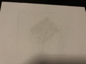
For the non-light related aspects of my project, I would like to make use of one of the classic abstractionist styles of using basic shapes. For me, I will use the square. As my ‘canvas’ I would like to have a basic background of a large white square (preferably fairly large), and within this canvas, a bit offset to either the right or left, I would have a second smaller square that is completely black in order to keep it from reflecting any color from the lights. This black square would have either thin strips of long black paper or black sticks that would always droop down (would have to be attached loosely). The black square would be attached to a motor (not sure which type yet) and rotate around different ways in different sequences.

For the light related aspect, I would like to use DMX lights and project them onto my ‘canvas’ As the DMX projects in different patterns and colors, there would not only be regular shadows appearing behind the box and lines (strips/sticks) but also some beautiful colored shadows. This can make it seem like there are more than just one set of box and lines, but multiple appearing as the DMX projects onto the canvas. 

So in all, I want to make use of a large white square canvas, a slightly smaller square canvas which would be black, and black strips/sticks always going downwards that I would have along the outside edge of the black, inside canvas. DMX lights would then project towards these objects in different colors, patterns, and sequences. I would like the audience to experience not only the addition and subtraction of the ‘phantom objects’ through shadows and colored shadows, but the sense of movement through the rotating box and dangling lines.


Production Schedule

4/25 research, find, and buy items necessary
4/26 start thinking of, and begin coding sequence for DMX lights
4/27 continue coding DMX
4/28
4/29 items should start arriving, start piecing them together + coding
4/30 items should start arriving, start piecing them together + coding
5/1 items should start arriving, start piecing them together + coding
5/2 continue putting physical items together
5/3 buy any additional items necessary
5/4 continue coding sequence
5/5 think if there can be anything added + coding
5/6 finish up putting together the physical pieces
5/7 if any additional items arrive, place them onto the work
5/8 continue coding
5/9 ” + measuring distances between lights and physical pieces
5/10 start placing physical items into the display area
5/11 add any additional coding
5/12 clean up any bugs
5/13 complete placing physical items and DMX lights into the display area
5/14 listen to any critiques, tips, etc. from class and implement what can be implemented

Kinetic Light Midterm Documentation

A DAY IN SHANGHAI

Description

For this project, I was inspired by the city that I have seen every day throughout my first two years of my college career, the city of Shanghai and the gorgeous skyline that can be seen throughout the different times of the day. Throughout my time here, I have seen countless photos of the Pudong skyline from the perspective from The Bund across the Huang Pu River, either on Instagram, Facebook, or other social media websites.

 My original intention was to have a large 3D printed box with the skyline of Shanghai in the front. This box would display different weather patterns and the sky during different times of day (sunrise, sunset, etc.) of Shanghai by using Adafruit Neopixel LED Strips. These strips would then project the light onto a screen either within the box structure, or somewhere outside of the structure.

Perspective & Context

For perspective, I wanted to place this project in the sense of seeing the city that we, in our class, see all the time but seeing it in a ‘different light’ Instead of seeing the sky light up the buildings and bringing light to the entire city, I wanted to show a new view of Pudong, one without the bright lights of the riverside buildings. Thus this would introduce to the audience a new way of seeing Shanghai, in a situation where the iconic skyline lighting up the Huang Pu River is completely dark.

I additionally wanted to use the concept of how our minds would relate different patterns of light to different weather patterns, for example how the audience would relate flashing white lights to rain or lightning, and the darkening and brightening of the sky to clouds, etc.

I also borrowed inspiration from some DIY projects that I saw online, which they used basic RGB LEDs to have a glowing effect behind different city skylines. Shown below:

Image result for city skyline light artImage result for city skyline light art

Development & Technical Implementation

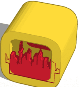
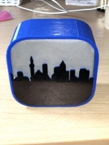
My initial creation process was to have a box with rounded edges with a Length, Width, and Height of 15 cm, with the front having a flat Shanghai skyline, and the back panel having the ancient characters for Shanghai protruding out.

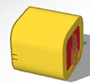
Front (unfortunately this is the only picture I have of the original design)Back (extremely blurry but there are two characters in the middle of the red square)

However, upon uploading this design to the 3D printing software, I was told that this print would take over 35 hours! So naturally, I altered the design.

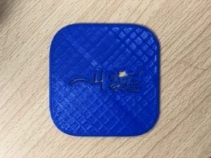
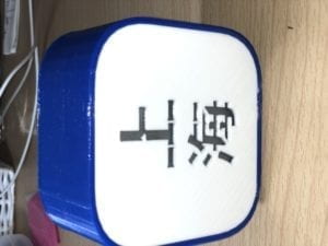
At this point, I tried to minimize the design as much as possible, with a much thinner outer structure, a thinner front panel, and a thinner back lid with “carved out” ancient Chinese characters. Fortunately, this time printing took much less time, around 4 hours for the outer structure + front and 2 hours for the back lid. However, due to the style of the ancient character, some of the 3D printed areas in the middle parts of the second character had no connecting support and fell out when taking the lid off of the 3D printer.

Back Lid (hole in the middle of the second character)

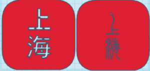
So in my third design, I changed the characters to modern Chinese characters, and added a bit of support in some spots to make sure that there would be no ‘floating’ 3D printed parts with no support. I added support to the top right, bottom right, and middle area of the 母 inside the 海 character.

New Design on left, Original on right

For the final outer structure + front, I chose this design:

Front and Outer Structure (from Back)

I planned on having the led strip at the bottom of the structure (in the picture above, the bottom is where the strip would be), and that would light up the entire structure, with the addition of tracing paper behind the Shanghai skyline (inside the outer structure) and behind the Chinese characters. However, upon implementing this, the light did not look very bright from the front and did not have the effect of a sun rising from behind the buildings.

Front with tracing paper

Back with tracing paper (wouldn’t rotate vertically in Documentation after trying for almost 10 minutes)
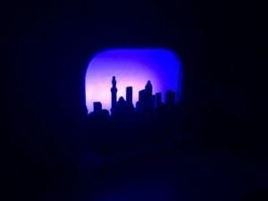
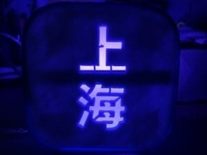
Since the original placement of the led lights did not work very well, I tinkered around a bit with the placement of the lights and decided that having them on the back lid was the best spot, this way it would seem that the sun was rising and setting behind the skyline.

For the code, I wanted to have a sunrise, bad weather, sunset, and the night lights coming on. I was able to code each of these successfully but when I tried to put them all into one long script, it got a bit buggy so I had to keep each section separated. The link to the code is below:

https://github.com/veazeylt/KL-Midterm-Shanghai-Skyline-

Presentation

The presentation went a bit better than I had originally expected, the audience seemed to like the 3D structure that I printed and the addition of the Chinese characters for Shanghai on the back lid. The sunrise and sunset were a bit too fast, and one of the members of the audience pointed out that the color choices may have been a bit too strong, particularly starting with red for sunrise. I agreed with this criticism and also think that I should have used a softer color for the sunrise. Another point given by the audience was for the nighttime sequence, the lights should flicker a bit as that is the way in the real world. This point is also valid and I believe that I should have implemented that into my code. The way I hid my Arduino and the wires could have been improved as well, a structure underneath would have been a better option for hiding them. I also think that the structure overall was a bit too thin, and if it wasn’t for adding black paper to the areas that weren’t covered with the tracing paper, the light would have seeped through the blue structure and white lid.

Below is the video and photos:

 Front Back (some light still seeps through)

Conclusion

Throughout this project, I learned how difficult it is to 3D print the structure the way that you originally intend and that working with light can have many different ways to display this light. While I enjoyed using the tracing paper as the ‘screen’ for the light, I was also inspired by my classmates light structures to use the light to show the skyline and characters light up a dark room’s walls. While I personally think that the 3D printing was successful even if I couldn’t use my original dimensions and design, I didn’t do as well as I had hoped with coding the composition and the overall display of the structure wasn’t as good as it could have been. I believe that I could have done much more with the Neopixel lights, and with more time I would like to show a ‘week’ in Shanghai, perhaps on a much bigger structure. I enjoyed working with 3D printers for the first time in almost a whole year, and have gotten some good inspiration for my final project.

LED Strips Documentation – Louis Veazey

Analog LED Strip

For this project we were told to create an approximately 1-minute long composition using the Analog LED Strip, and I was almost immediately inspired to use music, and sync up the Analog Strip to the music to create a beautiful sound-sight relationship. I was not sure what piece of music I would use at first, but after watching Captain Marvel over the weekend, I decided to use the Avengers theme song, and match the LED Strip with the song. It took a very long time to synchronize the light effects and the music, and it took hundreds of lines and delay()s to match it up perfectly. Furthermore, since Arduino doesn’t allow us to upload music, the music sometimes didn’t match up exactly as I would press PLAY too early or too late. Fortunately, during the presentation it went perfectly, but for some reason the LED wouldn’t turn off and would stay green. In the video below, the LED turned off properly when I wanted.

Digital LED Strip

For this project, I worked with Skye and Candy on another LED Strip synchronized with music, and for this we used a traditional Chinese piece which is about the battle between the Chu and Han armies, set in 202 BC. The musical piece is called “Ambush from Ten Sides” Our work consists of the final eight chapters of the original composition, and we synchronized the lights to the climax of the musical piece.

Kinetic Light Project 1 Documentation – Louis Veazey

Pinhole Binoculars

Description

My creation, Pinhole Binoculars, is a simple creation to alter one of our most depended on senses – vision. I drew my inspiration from the concept of light and how when it travels into our eyes the image is actually upside down and then ‘flipped’ in our brains. Therefore, I wanted to create something that would either reverse and/or flip what the user will see. After going through several different models of vision-altering pinhole devices, my final device allowed the user to see the image in front of them upside down and blurred.

VIDEO

Perspective & Context

On page 75 of the work we read The World of Perception by Maurice Merleau-Ponty, he talks about how “the world is not made up of space and things” but also includes “[our] own vision of things.” And this vision and how we see ourselves in relation to other beings and how we relate to them with our senses is what made me want to alter vision. By altering our perception through the changing of what is normal, we can SEE ourselves in a whole new world in a whole different way. Without our normal ways of perception and perceiving the world around us, we are placed in a situation where we must rethink and reprocess the images, sounds, smells, and others that we are receiving.

Development Process

I was first inspired to create something using pinholes that would not only flip what you see but will display it on the opposite side of where it ‘should’ be visible.  My first idea was to create an enlarged VR glasses shaped box with a pinhole on the left and right side of the box. This would then allow the light from either side of the user to travel through the two pinholes, projecting an upside down image of the outer world on the opposite side of the respective pinhole. However, once I created my device the image wouldn’t travel through and reflect on the other side as well as I had hoped, most likely due to the physics properties of light (which I spent a few hours researching and calculating and measuring) and the distance it travels from the pinhole to the opposing side of the box.

Therefore I was forced to scrap that idea and when I searched what else I could do with a pinhole, I came across a YouTube video that was showing how to create a pinhole camera. This led me to my final product’s idea which was the Pinhole Binoculars.

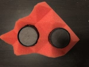
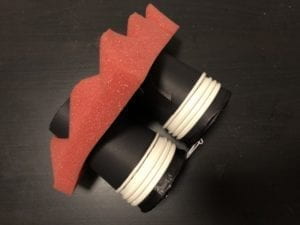
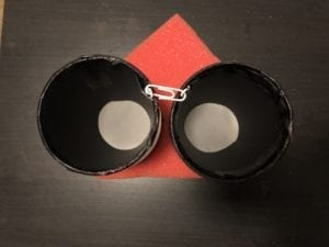
  • The Pinhole Binoculars consist of two ‘lenses’ which consist of 5 paper cups on each side (3 are removable to adjust clarity/size of the image).
  • On each cup furthest outward, there is a small pinhole in the middle of the cup, from which the image from the outside travels through.
  • On each innermost cup, there is a sheet of sketching paper attached to the bottom of the cup which is where the image/light traveling through the pinhole will be displayed – upside down.
  • The 3 white cups which can be seen in the third image are removable and can be used to adjust the clarity/size of the image projected on the sketching paper.

 Front Back Top

Presentation

The presentation went better than I had expected. During the days leading up to the presentation, it was mostly cloudy/rainy and dark outside which worried me a bit on how well my Pinhole Binoculars worked. However, the presentation and user testing went extremely well as the day of the test was very sunny, and the image projected was relatively clear and enjoyable. I was surprised at how many people wanted to try my creation and how much they were enjoying the experience. I believe I can improve my preparation for presenting as moving down the hall to the windows looking outside was a last minute idea, and I wasn’t one-hundred percent sure if that would work.


Conclusion

In this project, I learned that in order to change our perceptions or senses, a high-tech solution isn’t necessarily required, but through the use of a few scientific properties and tricks, we can relatively easily create something that can alter our ‘normal’ senses. I failed at creating what I had originally set out to create, mostly due to the lack of the adequate resources, materials, and knowledge, but I feel that my final solution worked out just as well as I had hoped and I am happy with the results. To further improve on my final creation, I would like to add either straps or glasses-type arms that would free up the user’s hands, and I would like to also add additional foam that would block out any other light that could enter through the sides of the user’s vision. Although my final product was not my first idea, the project really taught me how much we rely on our senses without even thinking of it, as I struggled to walk through my apartment when I wore the Pinhole Binoculars inside.