Final Project Documentation – Kevin Xu – Virtuo

Documentation and Reflection: Kevin Xu

http://imanas.shanghai.nyu.edu/~kx421/flp/trueintro.html

Project Proposal:

A virtual midi board including drums, piano, and a guitar, which also represents how a computer recognizes sounds. Using the assumption that computers can only read binary, the computer reads the notes using binary as well.

Project Description

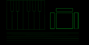
The main goal of my project was to emulate the simple layout of a MIDI board, allowing users to easily access three separate instruments on the same page. However, the second version of this website, which is the “dark” version is meant to represent how a computer recognizes notes of music. Binary is shown which can be translated into the notes which the user played, allowing the user to keep track of the notes he or she played during the experience.

Process:

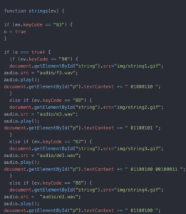
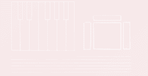
In order to complete my project, I set out two main goals. One was to solve the javascript and functions of the project, while the other was to create a visual that was simple and relaxing to look at while not interfering with the user. I settled with a subtle gradient background which slowly changes color behind a clean white interface. This way, the visuals or not overwhelming or distracting but instead allow the user to focus on the music. In contrast, I made the “dark” version of the website clearly meant to symbolize a computer with the bright neon green on top of black similar to the color scheme of movies like The Matrix. I used the keydown and keyup functions in order to get the instruments to work.

Issues: 

The main issue that came up with was getting the guitar to work. In order to simulate a real guitar, I wanted users to hold one key on the keyboard while strumming the guitar with 6 other keys, like the strings on a guitar. At first, I couldn’t get two keypresses to work at once, but with the help of the IMA fellows I was able to allow the strings to work with a two keypresses.

Project Reflection: 

The final product i created was just like how I imagined it to be. I wanted to create a simple layout with a focus on the instruments at hand and music which could be played on them. In the future, I would like to be able to actually learn how to code a binary to text translator to put into the dark version of the website which would allow users to translate their binary into text right in the website.

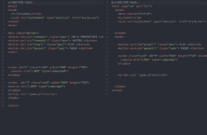
The following are screenshots of how I got my keypresses to work as well as the two contrasting layouts for the virtual midi board.
Final Project Proposal Documentation – Kevin Xu

Kevin Xu

Kx421

Final Project Concept

The concept of my final project will involve expressing to the human eye how I believe computers perceive music. This idea first came from a thought about how computers perceive everything differently from humans. After researching how coding works and how computers can only truly read binary, I decided to base my project on not how computers read data but on how computers read music. My project will be a website which presents three instruments playable by key presses on the keyboard. However, those key presses will also generate visible binary which appears on the side of the instruments. If the binary is then converted back into text, it will read the exact notes played by the user. This way, people can exchange music played through this website not through audio but through binary. I chose this topic because I wanted to explore the concept of conversion. The more I learn about all areas of study, the more I realize that most things can be converted into other things, and that most units of measurement or symbols can be traced back to a completely different area of study. Therefore, I wanted to make an experience that urges users to think more about conversion, and how even music can be converted to a language computers speak and vice versa. In addition, I will include a sort of easter egg where people who understand the basics of code can access a special part of the website which has a few extra features. This easter egg will serve as a sort of reward for discovery and deeper thinking on the part of the user.

One inspiration I had for this project is not a single artist, but rather is rather a method of music production. Autotune is describes what is essentially modifying a person’s vocals using a computer. This method of AI and computer aided music is one of the major things that made me think about how computers can read music. In addition, the MIDI board is another method of music production which inspired my project. The MIDI board is a tool for producers and musicians which allows them to emulate other instruments using a computer. Most MIDI boards include a number of pressure sensitive buttons as well as a keyboard. I wanted to match that experience using a computer’s pre-existing keyboard, which inspired how my project looked and felt.

My project will focus on audio and making the act of playing notes as simple as possible for the user. I will use the “keydown” and “keyup” function to create instruments playable through keypresses, and include visuals to help the user better understand the notes they are playing. The user will mainly use the keyboard to create notes through the instruments, but in addition to that, the user is encouraged to open a binary converter to convert the notes they played into actual notes rather than binary. Then, they can look at the notes in a separate window while looking at my website, creating a sort of virtual sheet music which can be followed by humans.

Week 11 Web Work Documentation – Kevin Xu

Web Work is a work written by  Rachel Greene which explains the history of art on the internet and the term net.art. It explores the illustrious history of the many pieces which affected art on the internet today.  Rachel gives many examples of important pieces of net art such as Buy One Get One and Jodi.Org. This piece inspired me to look into older pieces of internet artwork which gave me ideas for my own project. Just like looking at older paintings can help modern artists develop their own art style, I believe that reliving older pieces of internet art can help me develop my own web art style as well. 

Week 11 Interactive Art Example Kevin Xu – Windows 93

http://www.windows93.net/

Windows 93 is a sort of simulation of what an older version of windows looked and worked like. Using retro images, the website creates a nostalgic feeling meant to take the user back to when the internet and computers were much less developed. I like this website because it allows the user to explore freely without much instruction, creating  a sense of wonder and discovery. It has also inspired to look to the past for ideas about visuals. 

Interactive Video Project Documentation – Kevin Xu

http://imanas.shanghai.nyu.edu/~cec717/video%20project/video.html

Documentation and Reflection: Kevin Xu

Project Proposal:

A parody of an interview for a job meant to show that people shouldn’t judge others purely based off appearance. We wanted to achieve this through the ability to switch videos.

Project Description

The story of our film involves a regular candidate for a job interview being interviewed by a somewhat delusional boss. The boss immediately judges her by what she looks like, and decides that she is the stereotypical LA girl. During the interview the viewer can switch from a third person perspective to see what’s actually going on, and a first person perspective where the viewer is able to see what the delusional boss is saying.

Process:

We split our project into three main parts: video editing, web layout, and javascript. I mainly worked on javascript and helped a little with web layout. We all finished our parts and put them together, creating a visually appealing yet working interface for the viewer to interact with the video. I used two videos stacked on top of each other simultaneously playing so changing videos would not force the viewer to rewatch the parts they’ve already watched.

Issues: 

The main issue that came up formatting the video so that it fit inside of the television. We wanted to emulate a TV show, so we found it important to frame the video inside the television, with the buttons being similar to buttons on an old TV.

Project Reflection: 

The final product Cara, Evan, and I came up with was similar to our starting idea in code, but not in story. Our story changed dramatically since our original idea involved a restaurant setting but it eventually changed into an office setting. However I believe we created a product we were all proud of.

Below is a screenshot of the way I stacked videos on top of each other.