Week 3: JavaScript exercise (Kat Valachova)

Doing this exercise, I have struggled a bit with the syntax of css in JS, the solution turned out to be the use of camelCase instead of the dash in the property (e.g. instead of “font-size” use “fontSize”).

Also for some to me uknown reason, the third button doesn’t want to stay in line with the others. I have spent quite a long time on it, without finding a solution.  If anybody has an idea what happened there, please let me know!

~Thanks.

Here is the link:

http://imanas.shanghai.nyu.edu/~kv795/week3/

Week 2: Photoshop (Kat Valachova)


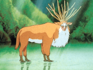
I chose to collage together a a picture of forest and a road, replace it by river and then add the Forest King from Princess Mononoke. With the quick selection tool I cut and pasted river and the king to the forest image. To help the banks of the river and the Kings legs better blend with the background image, I changed opacity for those spots.

Week 3: Interactive Comics Project – Introduciton (Winny Wang, Kat Valachova)

In the process of searching for our project idea as well as getting to know each other, Winny and I have discovered we both have in common passion for coffee. So we decided to make it our topic and dedicate the story-line of our online comics to this heavenly and intriguing drink.

Because we want more people to explore the long journey that beans have to undergo and appreciate the cups of black liquid that we can all hold in hand, we plan to create a short educative skit about how coffee is made.

The story is set in a cafe, where two friends meet for a chat. The boy has never drunk coffee before, so he plans to order tea, as usual. The girl, who is a devoted coffee lover sees it as a pity that he doesn’t know anything about the beauty of coffee. Therefore, she takes upon herself to introduce the art of coffee to him, explaining how it’s taken care of from the plant, to the roasted beans we know. Through appealing and interesting storytelling, the boy is intrigued about this magical drink and it strikes him how much he has missed over the years because of his undervaluation on coffee. The boy decides to stop taking things for granted and giving new experiences a try. Both surprisingly and not, he falls in love…

For now we have created the profiles of our two characters and we plan to work on the details of the coffee processing.

Week 3: My Portfolio (Kat Valachova)

With this homework, I mainly focused on practicing laying out the content through <div>, in order to create a grid that would later on allow me easier manipulation, smaller ajustments and adding of content, links and photos to my portfolio. What helped me a lot was outlining the wireframe on paper first, instead of directly writing it as a code. It proved to be especially useful once the code got longer and thus harder to navigate around.

I also tried to play around with positioning in order to get a knack of when it is better to use the absolute, or relative one. The absolute p. proved to be useful when it came to my strategy of ‘containers’ building, as it always refers to the top left corner of its parent element and one then doesn’t have to calculate the parameters from the top of the page.

I encountered an unexpected problem with a footer containing my contact information, that I wanted to add. No matter what I did (I created its own <div> with only the <body> as its parent element, positioning: absolute; bottom: 0px), it didn’t want to stick to the bottom of the page. So for now, it has been inactivated in the html code.

The link:

http://imanas.shanghai.nyu.edu/~kv795/week1/

Week 2: Understanding Comics (Kat Valachova)

Reading McCloud’s comics, I could really agree with how, I believe, the comics are being underrated. Many times, the content is judged by the form. And the form is in a stereotypical way attributed to a level of children’s amusement, imperatively creating a halo of inferiority, which is not necessarily true, as comics offer a very specific form of transmission of information, targeting our senses on multiple levels.

Projecting ourselves, a written book leaves all of the imagination on the reader under the author’s guidance. Comics books allow the reader, on the other hand, projecting themselves onto the characters through the lens of the artist. I found it fascinating, how one is able to see faces everywhere, as this is something we take for granted, not realizing how obscure and interesting it is. Just from a constellation of a curve and two dots, we are able to read the mood. Imitating basic features in combination with our imagination leads to understanding of simplified objects, enhancing the understanding of this visual language. Of course, even with visual language there is a certain initial stage of learning, but as most of the understanding is left to our imagination anyways, this boils to only a short session of interpretation of widely used basic signs and symbols. This language is globally understood. The simplification then allows wider interpretation and stimulates creativity.