Link to our comic
Our initial idea at the start of the project was a life journey of two siblings from the start of their lives, until the very end. We really wanted to incorporate a ‘full cycle’ storyline, however, when we started planning out our comic, we struggled with the storyline when the siblings would’ve been older than 30 years old — possibly because we didn’t have any personal experience to draw on from.


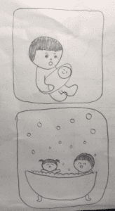
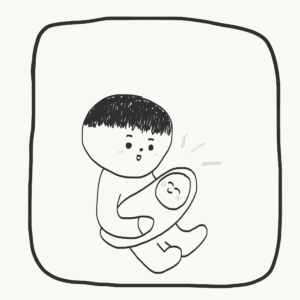
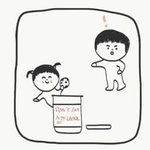
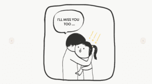
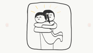
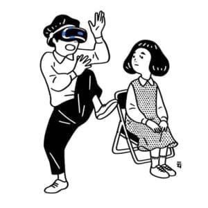
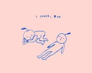
Instead, we decided to focus on the sibling relationship that we’re familiar with, from birth to around age 18, before one of the siblings leave for college. From the start, we imagined our comic to be completely hand-drawn with simple illustrations with light colours as an accent. Almost all of our visuals are hand-drawn first on paper then traced on Adobe Illustrator for a cleaner look and uniform quality.
As our characters are going through their childhood memories together through flipping through a comic book, so we only placed one frame per page to emulate a photo album feel as well. Our initial idea was to also incorporate a ‘flip’ page effect between page, however, we found this quite hard to code and search up a tutorial for. Instead, we opted for straightforward ‘next’ and ‘previous’ buttons for users to flick through.
When we first started coding, we placed our code in separate HTML pages. However, we quickly realised we couldn’t continue doing this as we wanted to include music that played throughout the whole comic. Due to this, we had to place all of our frames in one HTML file and use javascript to show and hide all of our frames, which was perhaps the hardest coding we had to do for our comic project.
To do this, we initially individually used “block” and “hidden” for the “style.display” elements which took up many lines and lines of code. However, after (greatly appreciated) help from Dave, he was able to cut down all these lines to 3 lines of looping code. Through this, I learned the complexity of coding, like how a hundred lines of code versus three lines of code could execute the exact same function.


Throughout through making of the comic, we were worried that we wouldn’t have enough user interaction, as we didn’t have “choices” for our storyline like many other groups used; thus, for our visuals we made many of GIFs and mouse-over effects to make them more like a digital, interactive comic than just a normal comic. With the help of Konrad, one of the most interactive frames we were able to create are frames 3 “bubbles” and frame 5 “block” in which the user can add elements to the frame wherever they clicked on the mouse (using the mouse’s x and y positions).

Near the end of the project, we realised that our comic didn’t have instructions on what to click and where to click which meant that sometimes users weren’t aware of some of our interactive elements. Whilst we tried incorporating some instructions last minute, we didn’t have enough time to find a place where the instructions wouldn’t compromise or ‘ruin’ the overall look/feel as we wanted this to emulate a photo album as much as possible. Hence, this is also something to improve in for next time.
Overall, we think that we achieved most of our goals for this project. We weren’t able to do some of the “extra details” such as a drawing page or a page flip transition. If we had extra time or if we had to improve our project, this would definitely be something to work on, along with extending the storyline further into the sibling’s older lives. However, in terms of functionality, our project works and is visually stimulating enough, even without these extra aspects.
