Final Project Reflection – Kimmy and Helen (Kimmy Tanchay)

http://imanas.shanghai.nyu.edu/~kd2130/final_project/index.html

Inspiration

Whilst I was scrolling through my Pinterest board feed as per usual, I stumbled on a post on reimagined modern websites such as google and facebook in the style of the very old of Windows computer in the 2000s. I was really inspired by this that I started wonder what Instagram would look like in the 90s.

I’ve always had this fascination with the 90s because it was this great period of time in which the Internet has only started to become popular and widespread. At the time, simply starting up the internet took up so much time, graphics were really pixelated and computers were the size of TVs. Despite how much progress the internet has made since, people still look back on the “good old days” of the 90s with happy nostalgia, hence integrating Instagram into the 90s was an attempt to bring back that feeling.

Furthermore, as my favourite social media, I felt Instagram was the most fitting choice of social media to integrate as most people of generation use Instagram to share their personal experiences and their lives. Living in Shanghai now is a totally out-of-my-comfort-zone experience that’s it’s both extremely new but amazingly exciting. Hence, I thought of combining these two ideas in which we use a 90s Instagram look as a medium to show our experiences in living in Shanghai.

Visual Design

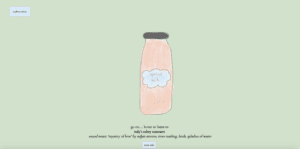
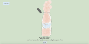
A lot of my focus on this project were the visuals. For the actual Instagram page and desktop, I tried to replicate the original Windows 85 to the best of my ability and the Instagram page the same layout and format as the current Instagram desktop format, I’m happy with how it came out. My immediate vision for the individual posts were the colours. I wanted bright, bold colours that also mirrored how the 90s used colours at the time and to also give each post a distinct look of their own. Hence, each post/picture had a different colour in which I tried to cohesively matched together as an instagram feed.


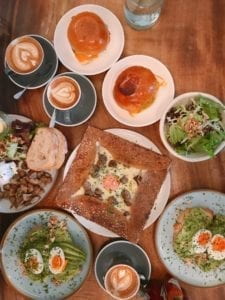
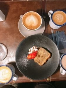
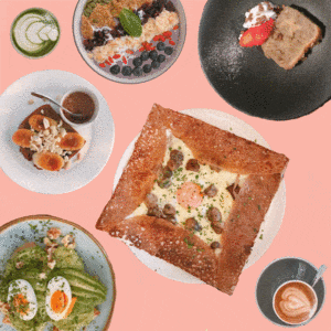
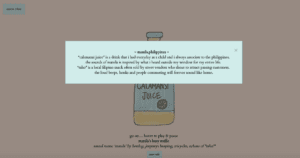
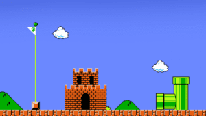
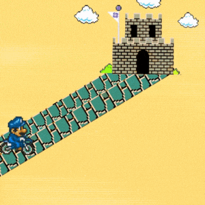
I then decided that the best way to present our visuals would be through photoshopped images in order to blend photographs we took ourselves into assets that we could use. For example, for our brunch post, all of the food that is shown in the photo was taken (and eaten) ourselves. Moreover, to incorporate some aspects of the 90s, photoshopping was the more obvious choice instead of hand-drawing EG we were able to incorporate Mario as an ele.me driver and make the iconic castle representing NYU Shanghai.


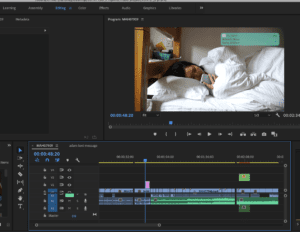
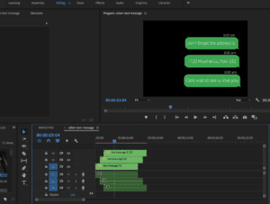
For the videos, all of the footage were also all taken and edited by us. I had an especially fun time making the “Friends” video, incorporating the popular 90s TV show. We were lucky that one of our friends often makes videos for Youtube and so we had readily available footage of us from the first and second semester. For both videos, filters were used to also replicate a VHS camera.

The visual assets alone took around 2 weeks to fully complete but out of the whole project, this was the most tedious yet most fun part to create.

Coding Process

Whilst I did some, Helen handled a large part of the coding process and putting all the visuals elements together which is quite a feat since we had over 30-40 images, videos and buttons that had to be put together. Much of the coding we used for this was straightforward as we incorporated a lot of the skills we learned from previous projects such as hover, counters, block/display/none.

The most difficult aspect we encountered with this project was the coding for the ele.me driver to move around the page. It was originally meant to be a draggable element in which the user can drag the driver to its destination, but for some reason it wasn’t working when placed onto the div window. Instead, with the help of Dave and our friend Robin, we opted for a ‘click’ then leading the driver which served a similar purpose.

Overall

I had a lot of fun making this project. Most of it turned out exactly as I had imagined. There were some things that could have been improved such as interactivity in the videos or perhaps a better foundation for the conceptualisation. If we had more time, we would have definitely created more posts of what we loved about Shanghai and included some p5 elements which would have enhanced our project even further. Moreover, we could have even added more button function to make it even more like an actual desktop besides just the close button and follow button. Despite some limitations of our project, I’m extremely proud of our project as it is a homage to everything we learned in comm lab.

Thanks to all of the IMA fellows who has ever helped me with any of my projects. I couldn’t have done any of it without them, especially Dave !! 

Lastly, shoutout to Helen for being an amazing amazing partner <3

Week 11 Interactive Art – Kimmy Tanchay

https://anthology.rhizome.org/epithelia

I fell in love with this project almost instantly. What caught my eye about it initially was that it was made back in 1999; meaning all of it is against an old Windows software. This brought back a very nostalgic feel as if I was transcending back in time. 

Besides this, what really struck me was how the artist’s concept was focused entirely on the human body in which the user can explore the different body parts. However, this was presented through beautiful collages that were distinctly different for each body part. It was chaotic, weird and sometimes even haunting — in the best way possible. 

Video Project Documentation – Kimmy Tanchay

Link to video project 

Inspiration / Idea

The inspiration from this project came from a very personal experience of noticing and seeing a very contrasting difference between the routines of me and my friends. I tend to be very early riser, early sleeper whilst one of my other friends don’t even get up until past noon and end near the early hours of the morning. Hence, I found this quite fascinating how we are all living in the same time and space; yet, our days can be very different to one another.

To transform this idea into a video, we decided to have it focused on 3 main characters with different lifestyles: the early waker, the late waker and the one who never even wakes at all. With this, we also added a storyline of the early waker having a very important show on the day whilst the one who never wakes is his significant other who doesn’t show up – leaving the early waker completed dejected. With this, we really wanted to capture that feeling of that total heart-wrenching disappointment when the only person that really matters to you, doesn’t show up.

Process:

Film shooting/editing

We had some complications and difficulties shooting our video. Firstly, since not all of us lived in the same dorms, we had to commute to film our morning routines. After some complications of who wanted to which characters, we were able to do get some good footage. It wasn’t exactly as I had imagined, however we worked with what we got. Although it was visually fine, some of our clips only had white noise and didn’t pick up any of the background noises which was quite essential to what we imagined our video to be like. However, due to time constraints, we weren’t able to reshoot these scenes and just decided to have each character have their own soundtrack to mirror their routines.

Me and Adam both edited all of our footage on Adobe Premiere whilst Kai opted for iMovie. Both of us learned a great deal and realised how powerful Premiere really is. For me, I learned keyframes and that’s how I was able to animate the text message. For each perspective, we wanted to make their perspectives totally different to one another hence, we tried to have them distinctly different from one another especially in terms of editing. Whilst Adam had much longer shots of him getting ready — mirroring his normal routine of getting up early, I had very quick fast pace scenes that mostly only lasted a few seconds to capture how my character was in a rush as I was already late. Kai’s scenes were generally very slow and dark as she does never wake up.


For interactivity, I made hand drawn animated buttons for users to switch between perspectives through the symbolism of time (alarm clock, wall clock or phone clock, depending on each character). We also included interactivity on the metro scene which was a hover effect in which the user can hover on and off to hear the different sounds of different people commuting.

Coding

Perhaps one of our greatest mistakes in this project was underestimating how much coding we needed to do. As this was 3 different videos due to 3 different perspectives, our code became complicated, messy and very long very quickly. Adam did almost all of the coding, and he did a phenomenal job with trying to put it together. However, since our project’s code turned out to be quite complex and long, that meant we had to try to help him. Whilst I attempted to help with the CSS, hovering and buttons, another problem we realised was how much time it also took to piece 2 codes, done by separate people, together. Even when it worked on one person’s laptop, it somehow didn’t work on another person’s which was overall, very frustrating and time-consuming having to fix.

Moreover, the fact that we were dealing with not just still images, but videos this time, made editing and styling a lot more difficult. Also, as we had many different videos, images, gifs, audio and buttons to code together, we encountered many bugs and things that didn’t work.

Final Thoughts

Overall, despite it not being finished, I’m still proud of this project as a lot of work for filming, editing and coding went into it. It was definitely out of my comfort zone; I learned how to edit on Adobe Premiere, animate objects (such as the text messages on our video) and how to make film. Despite not having much knowledge or experience in filmmaking in the past, we really tried to tell a story through our project and giving users the experience of interacting with these characters as the narrative unfolds.

If we had more time, I’m sure we would have made this project work and flow well between different perspectives to show the contrast between routines of 3 different people whilst also telling the narrative of being disappointed by a person who you really care about.

From this project, we really learned the importance of starting early, dividing workload and making sure to not just focus on the idea and assets of the project, but also if its able to be realistically done within the time frame we were given. 

Week 8 Response: “Danger of a Single Story”  – Kimmy Tanchay

In the “Danger of a Single Story”, Chimamanda Ngozi conveys her story of how being only aware of one narrative or perspective is damaging as it allows bias and some sort of prejudice, whether it is intentional or not. Just like many others, this story resonated with  me. Even though I was born and raised in the Philippines, I was lucky enough to have less ‘traditional’ parents as my dad is Chinese-Filipino whilst my mom is Thai-Vietnamese. They worked hard to ensure I kept an open mind and to be accepting of any culture, religions or beliefs of other people. This was a complete contrast to my actual environment as Chinese-Filipinos tend to be very conservative and traditional in their beliefs, often frowning upon others who are different from them.

Moreover,  moving into an international school, I realised how my life in the Philippines is extremely distinct compared to the rest of the world. As I grew older, my curiosity for other cultures and perspectives only swelled. As such, this is probably why NYU Shanghai’s branding of being a very international, diverse school gained my attention.

Looking back on it all now, if I would have stayed in the Philippines for university, I would have been stuck in constantly meeting the same kind of people with the same exact beliefs and perspectives. Hence, I’m extremely glad I got this opportunity to gain different insights outside from what I’ve always grown up with. Although these beliefs within cultures and nations are only natural as it has been practiced and taught for generations. Despite this, as Ngozi stresses, it’s important to do as much as we can to educate ourselves to look beyond our cultural societal norms, especially in our increasingly globalised world.

Audio Project Documentation (Helen & Kimmy) – Kimmy Tanchay

Audio Project Link 

Inspiration

For this audio project, I had a pretty clear idea of what I wanted it to look and sound like. The inspiration for this came from one of the chapters from a book called “The Night Circus” in which the character finds bottles that allow him to experience different sensations despite not actually being there. I wanted to replicate that for our project – except with a focus on sound.

Visuals

For the visuals of this project, I wanted to make sure that the bottles were very distinctly different from one another; whether it was through different bottle sizes, colours and labels, I wanted every bottle to stand out and have its own ‘personality’ in a way that also reflected the place it was from. For example, for Mexico, it was a “Bohemia” bottle as this is a favourite of many of our Latino friends. Furthermore, we chose the homepage bookshelf to be very muted in terms of colour in order to emphasise the bottles to the users.

Once the user hovers over the bottles, they do a bit of shaking through an animation transform on CSS. This is done to not only communicate to the users that they should click/interact with it but also, it brings that ‘magical’ element as they aren’t just ordinary bottles. When a bottle is selected, that is a zoomed in version of the bottle and is a lot more colourful. This was done in order to reflect a dream-like atmosphere. When the user hovers over the bottles, the bottle opens and the audio starts playing.

Audio

Similar to how the appearance of the bottles are distinctly different, we wanted to make the audios very different from each other as well. When the user hovers in and out, we made sure the music plays, pauses then continues, instead of it playing and starting over again from the beginning for a smoother listen.

The five different sounds we chose to focus on were: Manila’s busy traffic, Ulaanbaatar’s countryside, Shanghai’s streets, a Mexican bar and Italy’s summer. Whether it was living in those places or experiencing the place first hand, we have a personal connection with each of the audios, which meant we often looked for those specific sounds to include. Each bottle For example, for Manila, I wanted to include someone shouting “taho!” as it was something I heard every day when I was back home. Whilst for Helen, she wanted nomads singing as this was what was usually heard in the countrysides of Mongolia. We wanted to not just have our audios to be ‘soundscapes’ which was why we placed all of these sounds together with music from that specific country/place.

To ensure our audio noises sounded as authentic as possible, we went out to various places such as West Nanjing, metro and even a bar. The ones we couldn’t record were found on YouTube and credited in our ‘about’ page. Helen did an amazing job combining all of the audios together that I was really happy how some of the audios, such as loud Shanghai streets, became surprisingly, very soothing to listen to.

Inspired by “tasting notes” seen on chocolate bars, we decided to include “sound notes” to inform users what were the different sounds they should be able to hear. In order to give further context to the user of our choices for our audio, we included a “more info” section, just in case there are some specific cultural aspects that some users are not aware of and our inspiration behind each bottle.

Lastly, we included a homepage audio in which we mixed “Blue in Green” with the sounds of typing and working in order to mirror how many people often listen to soft classical music whilst studying and also, provide a chill atmosphere for the users before the contrast of the louder sounds from the bottles.

Overall

If we were to do this again or improve it, we could perhaps include more javascript animation to enhance user experience. Moreover, I would have also liked to include more of our own self-recorded audio and rely less on youtube; however, due to our bottles being in very different places around the world, this would be hard to do so.

Despite all this, I’m really happy with the way our project turned out. I think it may have even turned out better than what I imagined it to just because we included a lot of personal and intricate details to our project. As such, we hope we were able to successfully communicate not only what these different places sound like but also, the different culture and traditions that exceed the abilities of audio.