With the season one Serial podcast, “The Alibi,” I was intrigued by the storytelling and audio elements of the recording. As soon as I was listening, I was able to be immersed in the story but it’s frequent use of sound effects and audio choices. For example, one small subtle sound effect was the creaking of the door, in a situation when this occurrence was called for. I also realized that the music had to be timed exactly so that it flowed with the rest of the storytelling, which in this case, was completely real and nonfiction. Right after the narrator spoke the words, “figure out who”, the music cascaded into the audio track and helped transition the story into another segment. This way, it made the audio more dramatic, more abrasive to the listener, and allowed the listener to become continuously submerged into the story. The effect is very lovely, and should be a technique employed for our own audio projects.
Week 5: Interactive Comic Project- Kai & Kevin
Link to our interactive comic project
Reflection by Kai
Description:
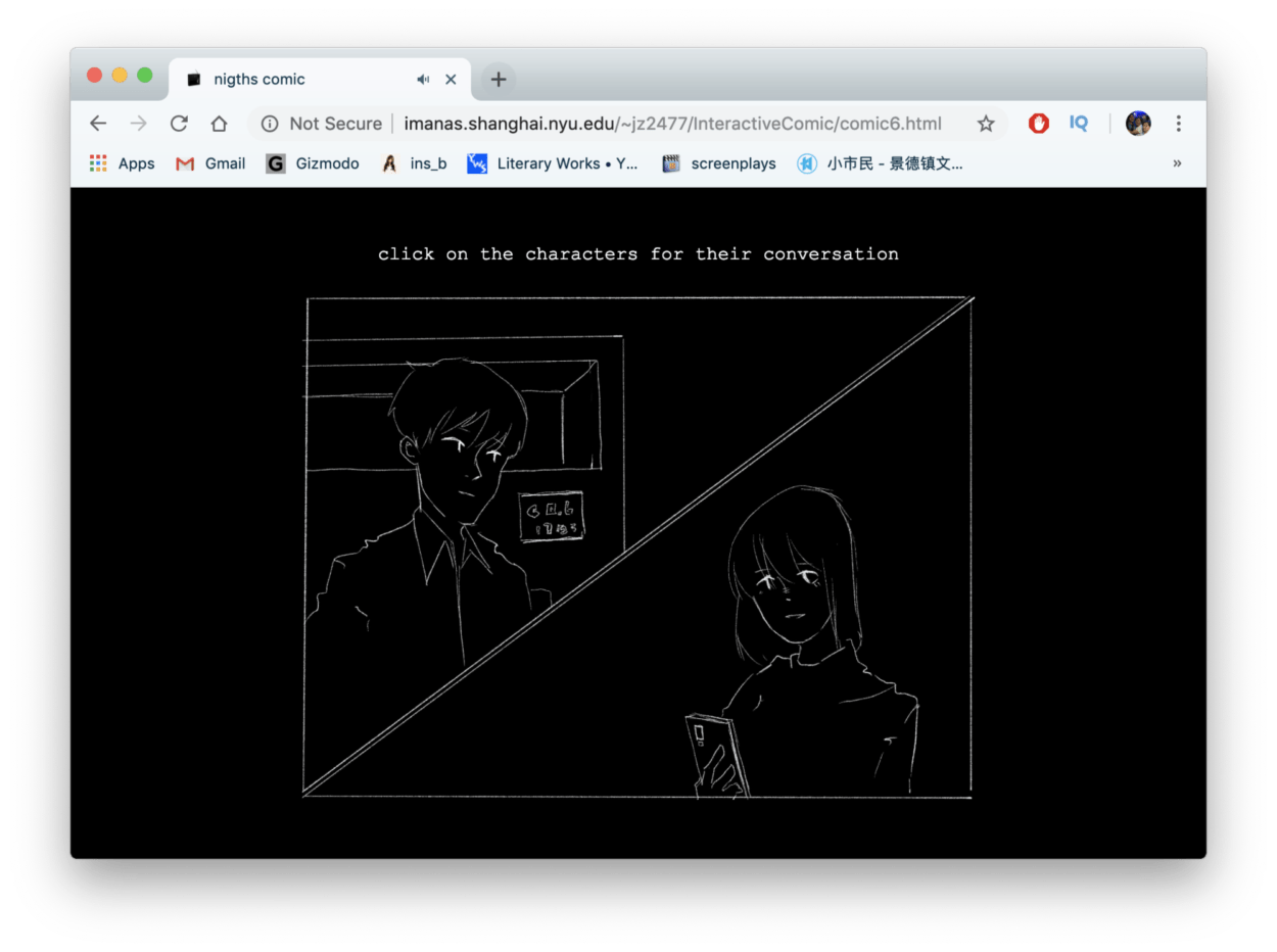
The comic we designed is focused on telling a straightforward, linear story that allows the audience to browse, listen, and immerse themselves in the story of “nights”.
Process:
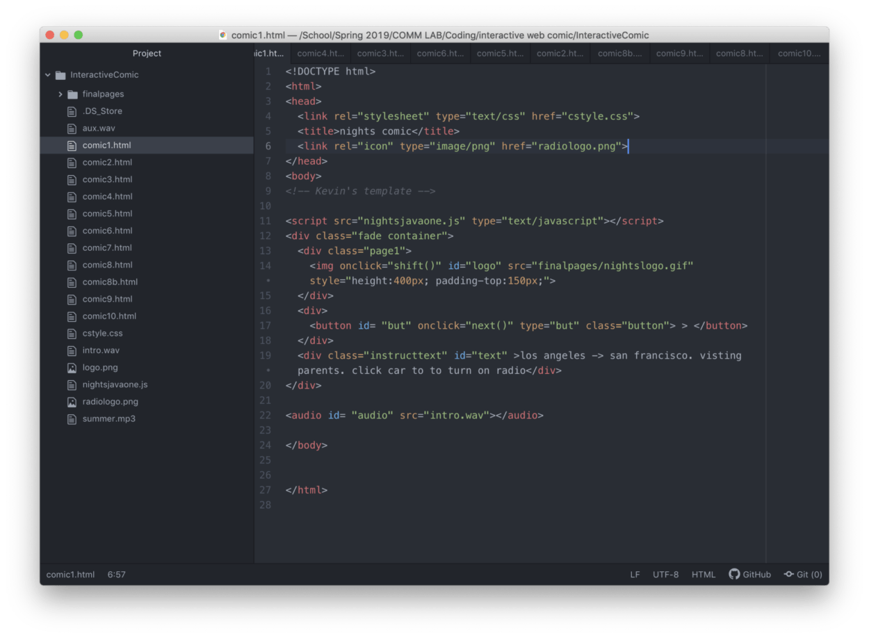
The process began with Kevin and I planning out the plot of the story, which involved drawings on his side, and the dialogue script on mine. His visuals are complied .jpgs that make up into .gifs, so they have this animated effect that look aesthetically pleasing. Kevin also created the html, javascript, css templates, which I later had to remodel for the subsequent pages after comic3.html.
Kevin was also able to make original audio for the pages, which were very streamlined because they loop on each of the pages, so we didn’t have to time them. Working along with his streamline process, I furthered the project with matching each of the dialogue to whatever page it was supposed to be on. I also added the icon in the head of the html so that we would have a unique difference compared to normal html pages.
Issues:
We ran into a few issues involving the template at first, which he figured out after a few trials. After he created the first three pages and I got ahold of his code, I saw that there were needed alterations on the css and javascript, one: to make the organization better in the grammar of code, two: the in-text style needs to be removed for the text, and three: subsequent pages had their own new issues which I have to tweak for everything to flow. I also had to think of more ways to make the comic interactive than simply pressing the same button, and we were able to enhance a couple page’s places of clickablity. I think this strengthened the flexibility of the originally rigid-in-concept comic.
Post Mortem:
The result Kevin and I made exceeded my expectations. There were many times where I wasn’t sure if the code we were writing could exactly pan out the way we wanted. However, in the end, with the help of so many fellows and lab assistants (Tristian, Cindy, Dave, and Konrad), I think we really go the product we wanted. I also learned a lot about javascript coding, the one computer language I wasn’t at all familiar with in the beginning of the class.
Week 4: Javascript Walk -Jikai Zheng
This time, we worked on javascript conditional exercises. There wasn’t as much troubles with the code as the organization aspect with the folders. Overall, I think javascript it becoming clearer and clearer in my head.
Week 4: Interactive Comic Progress Update – Kai & Kevin
This website Link is our work in progress, and we will incorporate the script into the comic once the drawings get completed.
Below is the stylized version of our script in sublime text. 
Week 3: Javascript Dancing Cat- Jikai Zheng
This week, we learned to use javascript to add some buttons and make our webpages respond to clicks. This is my reproduction of the dancing cat. What I think would be even cooler though, would be to make the webpage respond to arrow keys, left and right for the boogie left and rights. But, that’s for another time!


