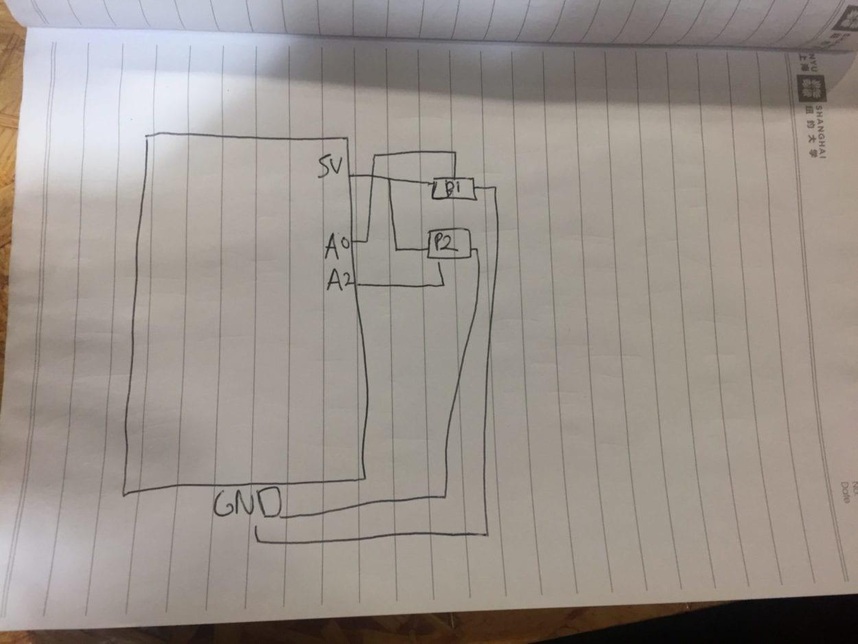
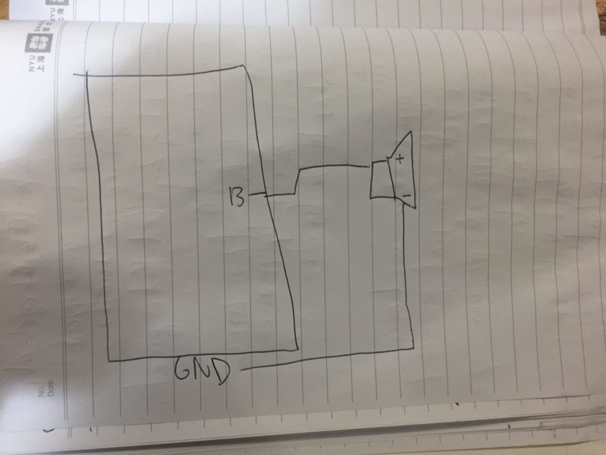
The three projects I critiqued were Jackson’s Bongo with Bongo Cat, Sarah’s Tap the World Over, and Justin’s Tip Tap Snap.
Bongo with Bongo Cat:
The project is a musical media interface in which the user can experiment with the possibilities using the instrumentals of many popular songs such as “We Will Rock You” by Queen, “DJ’s Got Us Falling In Love,” etc. By tapping the five buttons on each cat paw, the user can interact with “BongoCat,” a reference to a popular internet cat meme that also could play music. Put together the user can either complete the song, or play with the song’s features to create something entirely unique.
Jackson defined interaction as two or more actors affect one another through a cyclical process, and I believe this project fulfills this definition of interaction because the two paws attached to the digital cats not only allows for multiple players, but also allows for continual interaction with the machine. I always thought of interaction as a conversation personal and individual to one user, so factoring in potentially more people is one avenue I could consider.
Some feedback I and other group members gave him were that he could:
- add a more obvious objective for the user to follow along, as it might not seem immediately obvious what he wants the user to do by just looking at the setup.
- put on headphones so it is more personal to the user and so the music can still be heard over all the other projects during user testing.
Tap the World Over:
This project wants to incentivize users to recycle plastic bottle caps more by making it into a game: Sarah envisions that there would be cardboard globe attached to a recycling bin, and anytime a user successfully “tosses” a bottle cap in any one of the different holes (each with different point values) on the globe. When the user successfully throws the bottle cap, the point value will correspond to the degrees in which the globe on the screen will turn.
Sarah defined interaction as a process that incorporates users and provides responses promptly to a particular action placed by the user. I believe this project does follow her definition of interaction because the user sees a direct result of their action, and it molds to each different action the user decides to take. It corresponds to my definition of interaction because I too want an immediate response to when the user “talks” to the machine, and I want the response to be tailored to their individual action.
Some feedback I and other group members gave were:
- Add a counter to the top of the screen, because like those refillable water stations people feel like they are contributing to something larger, and it shows a more immediate effect of reward
- make the reward more obvious to incentivize users more to participate in the game, because they might just think it is a cooler trash can and not actively try to throw the bottle caps into the bin
- Increase degrees so the reward is more immediate.
Tip Tap Snap:
Justin’s project takes inspiration from popular 2010 music app games such as Tap Tap Revolution, but he emphasizes the competition aspect of it more to make interaction feel more like a communal experience. Using pressure sensors the users compete to correctly “tap” to the beat of the music. At the end there is a photo taken to capture the user’s experience while playing the game.
Justin defines interaction as two parties bouncing ideas off of each other while creating 1+1>2 effect with creativity. This means that with two players, their interactions have to be greater than a simple cause-effect relationship, and the interaction has to be more meaningful beyond the simple call and response. I believe this project corresponds to his definition of interaction, because there are two players, and the multiplayer competition aspect of it greatly affects the experience of the game. I agree with this definition of interaction, and try to incorporate it into my project because I want the interaction to be greater and more personally impactful than just a simple cause (the user’s interaction) and effect (how that interaction shows up on the machine).
Some feedback I and other group members gave:
- Incorporate the photo aspect more fluidly into the game: maybe have a “winner” and a “loser” filter at the very end with each user’s photo
- Split the screen vertically instead of horizontally so the game is at eye level with both users
Feedback and Critique Reflection for my project:
Feedback I received for my project:
- All group members wanted to know how I would decide to make my monsters “ugly.” Going forward, I will base them on what users have been “taught” to fear through depictions of monsters in movies, books, etc. And will make this research clear upon further presentations of my project.
- Justin suggested I make the twist of the game more obvious by showing the user what the pet will end up looking like, and asking if the user still wants to take care of the pet
- My group members also suggested I reverse the process and shorten the game, so they will grow to appreciate the monsters from the get go.
- Make it more obvious what you want the user to do: whether it be add meters for whether or not they are hungry or making it clearer what the order of the buttons need to be pressed.
- How will the design go? My group members suggested I use more realistic depictions because pixel art allows the user to separate themselves from the pet.
Reflection on the feedback:
Most successful part of my presentation was the idea of a “pet” that ends up turning monstrous, because it subverts the usual expectations people have of virtual pet games. The least successful part was how I presented the how I will illustrate the “monstrous” design, as stated above my group members believe I need more research/justification for how I will design the monsters to look more “monstrous.”
For my project, going forward I plan to incorporate more research into how I decide to design the monsters. I will also make the pet’s needs look more obvious, such as adding a “feed me!” reaction, or making each reaction to each of the physical interactions unique so the user knows that each interaction does something different. While I do not think it is necessary to show the user what the monster will end up like, because I feel that would be too obvious, I do like the idea of making the user question in the design whether or not they still want to take care of the monster.


