Week 3: Response to Scaturro – Tiger (Syed)

Date: 02-26-2019

Response to Sarah Scaturro’s “Eco-tech Fashion: Rationalizing Technology in Sustainable Fashion”

In this article, Sarah Scaturro explores the possibilities of technology being helpful for boosting sustainable fashion, and I find my opinion coinciding with hers, that technology could be of key significance to a more environmentally friendly fashion industry. The debate over biological fibers and technical fibers that Scaturro mentions is interesting, as either of them possesses advantages over the other, which is why companies are still striving to create better materials for garment manufacture. And what Scaturro means by “technology” refers to not only the physical, but also it enhances the recycle model by providing a platform like the Internet, where people get to recycle and purchase second-hand clothes; most significantly, it’s an good place for people to actually learn about sustainability in fashion and get an idea of how they themselves are interacting with it through their fashion behaviors.

Personally, I am pretty interested in how the Internet could play a vital role in sustainable fashion. Given its great influence on the society nowadays and the fact that it is where most socializing takes place, chances are that people’s values towards fashion could evolve through the Internet. Aforementioned second-hand garment trading is one way in which clothes may last as long as possible, but there remain problems, though, because unlike other second-hand products, clothes directly and constantly touch people’s skin, and germs could be transited along. Fashion brands can actually try utilizing sustainability as a way of advertising and brand value conveyance on social media and start promoting more opportunities for green fashion, such as holding green fashion shows or design competitions. As Maslow’s hierarchy of needs suggests, the more well-off consumers are, the more likely they are to pursue value actualization of higher levels, and fashion industry could actually take advantage of that by reinforcing the idea that sustainability is sexy, and that through supporting sustainable products, consumers are indeed doing good to some part of the world.
Week 2: Assignment 1-5 – Tiger

Date: 02-24-2019

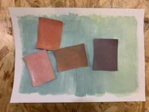
Assignment 1

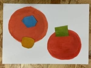
For this grey scale exercise, now I do realize I could have made the rectangles into more interesting shapes, and if I knew then I would… Anyway, what I learnt from this exercise is that grey can refer to a pretty wide range of colors, all of which may have different hues but what they share is comparatively low saturation, which required a lot of white paint in the process of creating this.

Assignment 2

If only I had more time… I think I would have made the colors differ more in terms of brightness and saturation, now that it seems that the only difference between them is the hues. The shapes are more diverse than those in the first assignment, though. Also, since we used water based paint, it was kind of hard to keep the colors pure, as they kept mingling.

Assignment 3

For this assignment, the requirement is for us to modify the background colors so that the one in the middle could look like two.

The first one features three different shades of grey. With the lightest and darkest ones as background, the two squares with the neutral grey get contrasted differently, which makes them look different.

The goal for the one below is to make the two squares look like they have different hues but the same saturation and brightness, which is very tricky. I tried many colors, and this combination is what I decide ultimately to be the best one that matches the requirement. Because purple is the combination of blue and red, the purple on the left kind of contrasts its blue background and “resonates” with the orange (which also contains red) on the right, so I think it looks warmer than the one on the right.

This one is the hardest one for me, for which the requirement was for one color to display two shades of saturation. Different combinations have been tried, and even though I’m still not sure if this is good enough, I do think that the yellow on the left is a little more saturated with the pink background.

Then, make all three values (HSB) look different.With the knowledge involved in the previous three exercises combined, I used pink, purple and orange in this exercise. The pink on the right seems lighter, more toned-down, and less purplish.

Finally, this one below is kind of the easiest one to do – to make two different colors look like one. I used two different yellows with the same hue and similar saturation but different brightness, and gave the light one a lighter background, the dark one a darker background.

Assignment 4

For the first color sequence, I chose a bluish hue and adjusted the saturation and brightness so that it shades from dark to light; for the second one, I adjusted the hue and lightness so the colors share the same saturation value but display a kind of toned-down rainbow effect. Then I combined the two sequences.

Assignment 5

It is the first time I have ever used Illustrator to create something, thanks to the help from IMA fellow Cindy! I drew my inspiration from the subway train – just imagine standing in the middle of a subway train carriage and looking towards one end of the train, and when the train turns and trembles, the carriages form a tunnel like this that twists and turns. The yellowish stripes symbolize the speed and the parallelism between subway trains in two directions. The colors actually did not turn out the way I expected because they seem far away from subway colors. I was also inspired by Antonio Asis’ works, where he uses a lot of shapes that cross each other, which produces a lot of little spaces, and Asis fills them with different colors.

Week 2: Response to Payne – Tiger (Syed)

Date: 02-24-2019

Response to Alice Payne’s “The life-cycle of the fashion garment and the role of Australian mass market designers.”

Payne employs a surprisingly organized structure and easily understandable phrasings in this article, elaborating briefly yet clearly about a life-cycle perspective to look at sustainability in fashion. Thanks to the subtitles, which help a lot to organize the article, I get to have some idea about the life-cycle of a piece of clothing, from the day it’s made to the day it’s thrown away, and also that each and every stage of the process has a lot to do with sustainability.

It gets me thinking about how garments, as products on the market, should be treated. According to Payne, “Fast fashion clothing is inexpensive to purchase and hence perceived by consumers as disposable.” I very much agree with her that the price of a product hugely affects how much we think of it. Things that cost more get treated with more respect and care; on the other hand, the shocking inexpensiveness of clothing, which mostly results from mass-production, leads people to overlooking all the effort and resources that one piece of clothing actually takes. Because they are cheap, we think less before throwing them away, hence its shorter life. So, what I’m trying to say here, is that maybe, clothes deserve to be a little bit pricier – now that you’re not just buying a T-shirt, but also paying for everything that it takes for it to go from across the globe to the retail store that you’re at. Actually there is much in a T-shirt that could have cost more – think about a possible new technology that could be implemented to make its fabrics more durable, or better working conditions for workers at the factory – all of these can, and should, result in a reasonable rise of clothing prices. As long as brands are taking the whole life-cycle thing into consideration and thinking further about the life of their products, I believe consumers will gradually understand and accept higher prices as the consumption model changes for the better.

NOC – Week 2: Petals in Flames – Tiger Tian

Date: 02-24-2019

Click here to visit on p5 Web Editor

Before starting with this assignment, I thought a little bit about what “Nature of Code” could mean, and it occurred to me, why not begin with something that is most commonly deemed beautiful in nature – flower?

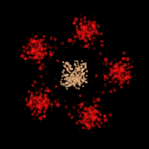
So the flower looks like this, with five red petals around a yellowish center. Each petal is made up of 200 squares randomly generated from a class, wandering in all directions and forming a flame-like shape. Interestingly, fire is also a production of nature! translate( ) and rotate( ) function allows me to duplicate one petal and make five. I initially wanted to make the petals spin around the center, but it would make it a lot messier since the “burning flames” are already visually striking. The center comprises 200 shivering little circles. The shiver effect is realized through giving the circles a constantly changing random speed between -1 and 1. So the two classes here are Petal and Flower (the center).

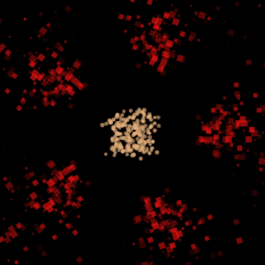
The first method I gave Petal is called wind( ). What it does is to “blow away” the squarish pieces in the petals – by giving them a faster speed towards outside the screen, as shown below. This method is triggered when the mouse is pressed.

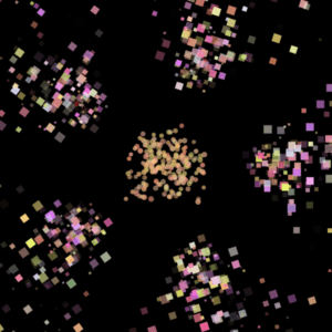
The second method color( ) changes the color of petals from red into blinking pinkish colors, as shown below. It happens when the mouse touches the center of the flower.

And thanks to rotate( ) function, it’s very easy to modify the number of petals. A new petal appears upon every mouse click, until it reaches the maximum I set of nine petals, after which the number decreases.

Week 2: Response to Pink and Morgan – Tiger (Syed)

Date: 02-19-2019

Response to Sarah Pink and Jennie Morgan’s “Short-Term Ethnography: Intense Routes to Knowing”

Never did I encounter the word “ethnography” until a few months ago, when a friend introduced it to me as a way of doing social research. Nevertheless, I’m not a stranger to short-term ethnography, because less than a year ago I was with some classmates in Anhui (安徽) Province doing a service program with some rural kids infected with AIDS/HIV. We spent a few days there interacting with the kids. Although a service program is undoubtedly different from a social research, there are similarities between the two that make what Pink and Jennie say related to my experiences. Now that I’ve read about Pink and Morgan’s idea on short-term ethnography, not only have I realized the things that we could have done better in the program, but I’ve also learned how short-term ethnography could be effective as well, despite more people’s belief in long-term ethnography. What inspires me the most is the “intensity of the ethnographic-theoretical dialog” as Pink and Morgan addresses. It is required of ethnographers that they are ready to raise more theory-oriented questions that cut to the chase, which makes prior study extremely significant. For the service program, we were asked to learn a lot of materials about the kids’ living conditions and the situation of AIDS/HIV in China. What kind of confuses me is that Pink and Morgan suggest that details are crucial in short-term ethnographic studies: wouldn’t focusing on details make ethnographers more easily biased because the larger picture is forgotten? Besides, I don’t quite understand what they mean by Morgan drawing from her museum curating experience, which, according to them, “enabled [Morgan] to recognize and ask participants to reflect on practices that were unspoken and would have been otherwise invisible”. Though, their paper does inspire me in a lot of ways in terms of the short-term ethnographic trip that we are about to go on.