Week 14: Kinetic Light Final Project – Tiger Tian

Title   Disco Fever

Presentation Date   05/17/2019

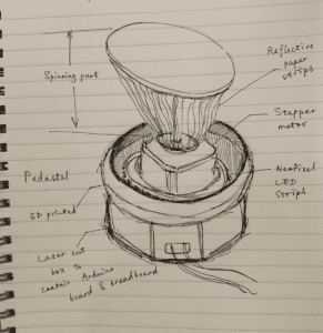
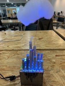
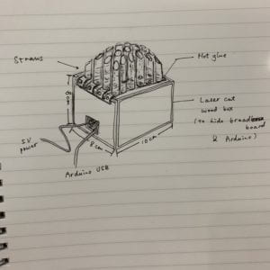
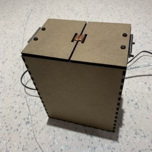
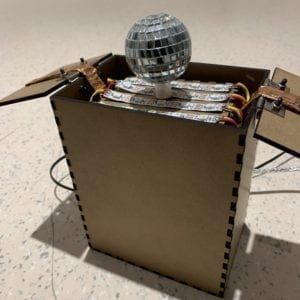
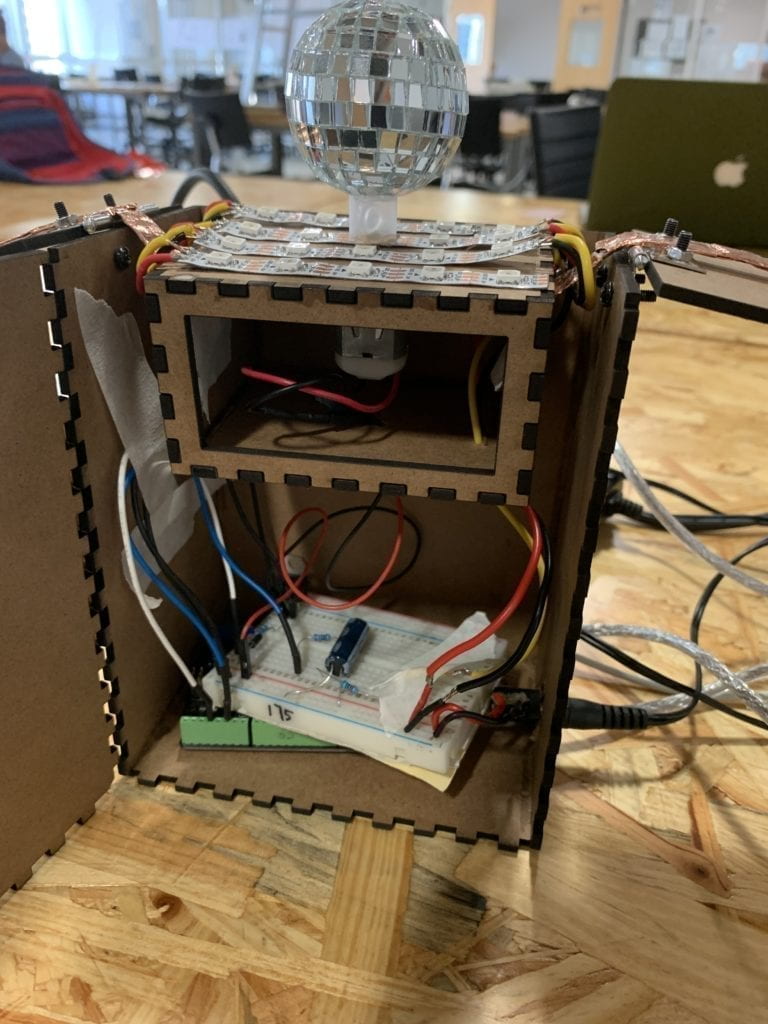
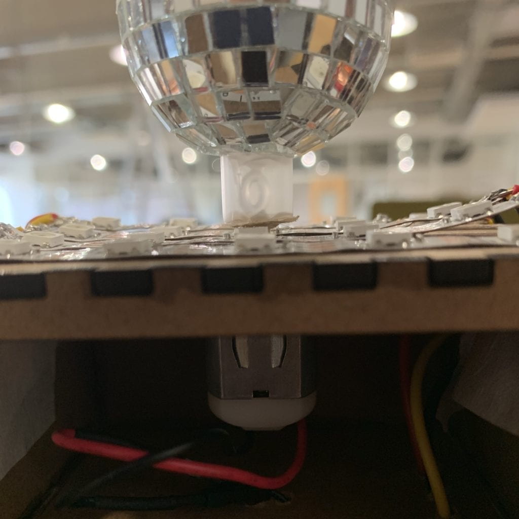
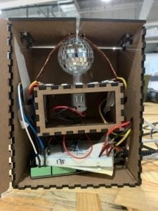
Project Description   Intended to pay homage to the 1977 film Saturday Night Fever, “Disco Fever” comprises a DC motor and a NeoPixel LED strip. As the light composition goes, the spinning disco ball reflects the light and casts it throughout the room, creating dynamic patterns all around. The box containing the motor and circuit was made using laser cutting, in which there is a hidden layer that will lower to hide the disco ball when the lids of the box close.

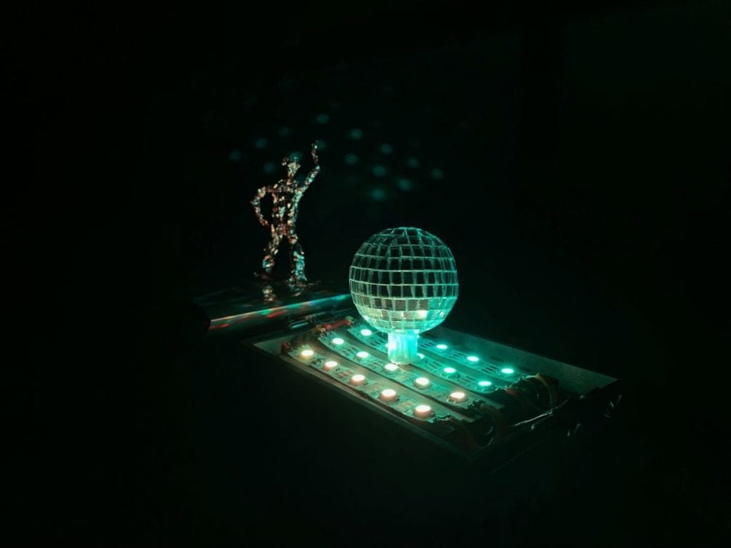
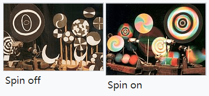
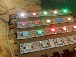
Perspective and Context   As a fan of pop music, I found dance music to be the most engaging and inspiring genre. From 70’s disco to 10’s electronic dance music, dance music has evolved a lot; what remains unchanged is its liberating essence. Dancing symbolizes the liberation of the soul from the mind, and thus dance music acts as the medium that enables the revealing of one’s true self to happen. Greatly inspired by that, I wanted to make a disco box that embodied the retro disco spirit. The intention of my project was to revive the atmosphere of 70’s disco dance floor using a small-scaled device but within space as big as a room. I simulated the famous light matrix dance floor from Saturday Night Fever with four strips that are connected together in a series circuit. The disco ball, on the other hand, softened the light and shattered it into various shapes, producing a sparkling effect.

Saturday Night Fever, 1977

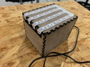
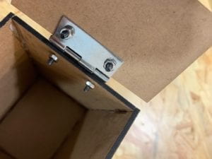
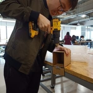
Development & Technical Implementation   The creation process started with making the box. With the help of fellow Leon, I laser cut the two boxes needed for this project. To make the lids, I bought hinges online, drilled holes in the box, and screwed the hinges to the box. I glued the sides of the box together with super glue and left one out for the convenience of building the inner structure of the box.

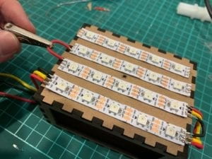
The purpose of making a box was to hide everything inside when it’s closed, and have the disco ball automatically lifted up when the lids open. The inner box is the key to the trick, and also where the LED strip would be. I glued the four strips zigzagged on the lid of the inner box, and then soldered them together. This process happened twice because the first time the product didn’t work, and I couldn’t decide what the problem was. So for the second time I did it, I tested the strip as soon as I finished soldering each part, in order to make sure every joint was well done.

The lids work like this:

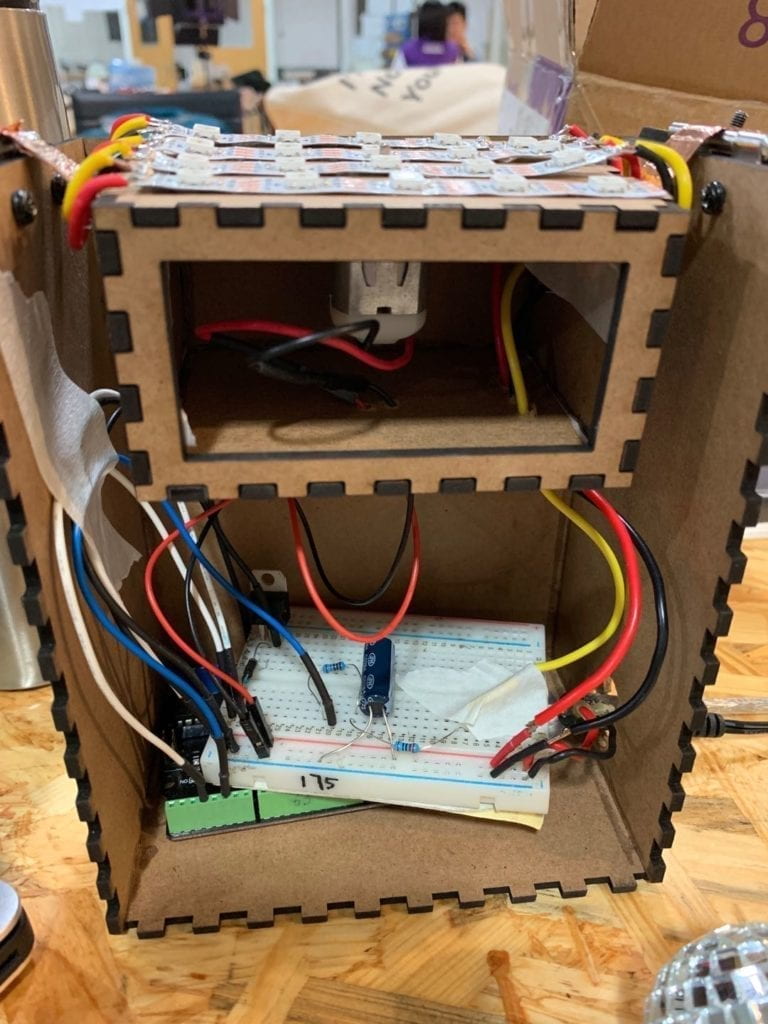
After assembling the box, the challenge was to hide the circuit, which contained a strip and a motor, within such small space, and to keep the circuit stable with the inner box moving up and down. I used a lot of tape to make sure the wires stick to one side of the box and don’t interfere with the inner box. Some extended wires were needed to connect the motor as well. To fix the disco ball, I used hot glue. Since the box would be moving up and down, the wires of the strip needed to be flexible, so I soldered a strand wire at the end of each wire of the LED strip, which are softer and easier to bend than solid wires.

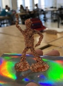
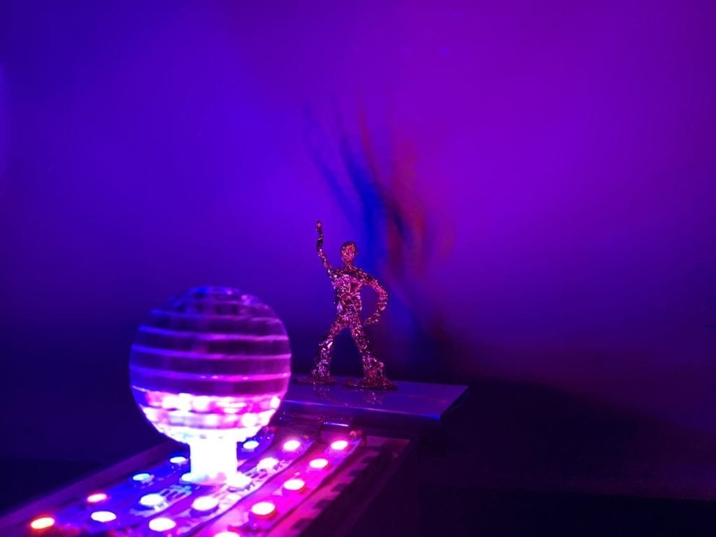
The last part but also the best part is the little statue I hand-made with conductive tape. I gave it the iconic gesture in Saturday Night Fever to make it look like it’s dancing. This little statue is not part of the box but stands beside the disco ball. Because the tape is reflective, it looks extremely shiny with dynamic light casting on it.

Presentation   During the in-class presentation, thanks to some advice I got from my classmates, this project was made a whole lot better through just a simple change. I changed the position of the little statue and put the box against the wall, and the shadow of the disco man statue cast on the wall produced some unexpectedly amazing effects. Because the light from the LED strip constantly changes, the shadow on the wall moves as if the man is actually dancing. I also played the “Stayin’ Alive” song to reinforce the disco theme and build the dance club atmosphere. The feedback was mostly positive, saying that it did produce some “disco vibe” as I expected.

On the final show, this project attracted a lot of attention, which I hadn’t expected at all. Many took photos and videos, and told me that they were impressed at the dynamic movement of the shadow. Some also said that it would look better if made in a larger scale. There were even two little kids who saw my project and started dancing instantly, and thanks to them, I think I have achieved my goal of motivating people to dance to this project.

Conclusion   The making of this project did equip me with a lot of skills that I wasn’t so familiar with or hadn’t even touched before. I had to use the drill a lot to make holes in the box and screw screws into them. Soldering the LED strip really made me better at soldering as I spent about three hours in total doing it.

What I would have definitely done to do it better is to integrate music into it, rather than using an external player. Or better still, I would time the light composition to the music so that the shadow would dance on beat. I would also make the lids into a switch that turns the circuit on when opened.

NOC – Final Project: Interactive Immune System – Tiger Tian

Date   05/18/2019

Title   Interactive Immune System

Introduction   By making this project, I expect it to simulate how human immune system works. User can click to add pathogens, and see how different kinds of cells cooperate to eliminate them from the system. As the color and size of the pathogens created change, the cells show different behaviors to cope with the situation.

Concepts Involved   The major concept I utilized in this project was autonomous agent. All the objects that are able to seek other objects are autonomous agents with a seek method. Collision happens between cells and between pathogens. Sine function was also used a lot in this project to produce an organic growing – shrinking effect of the cells. Except the phagocyte and the T cell, all other objects have a lifespan, and when their lifespan is done they are removed from the system.

Principle   Just to be clear, compared to what actually happens in human body, I simplified the process in my project. Once a pathogen (in this case, the virus that you create) appears in the canvas, the phagocyte (the yellow/orange-ish cell) comes to “eat” it. If the pathogen is larger in size than the phagocyte, then the latter requests assistance from its fellow cell – T lymphocyte (aka T cell, the purple one), by sending it the antigen (the little round thing that has the same color as the pathogen) of the pathogen. This way, the T cell receives information about the virus and accordingly generates a B cell (the green one), which subsequently produces a lot of antibodies that are targeted at the pathogen.

What’s very interesting is that, all antibodies are specially produced to kill only the type of pathogens that it is assigned. In biology, this process is called “adaptive” or “specific” immune reaction. I implemented this by giving antibodies the same color as their target pathogens, so if you pay attention you can see that a pathogen does not get killed by an antibody if their colors don’t match.

Aesthetics   I picked this red/pink-ish color to be the background as it gives me a sense of what it feels like inside human body. As the “war” between pathogens and your immune cells gets more intense, the color darkens. For the cells, I specifically picked colors with less saturation so that they wouldn’t clash with their different hues. Also, I really enjoy watching the T cell and B cells grow and shrink as if they are live objects inhaling and exhaling. I added shadows to all objects by drawing a black ellipse beneath each of them. To make the process more understandable, I added an “Annotation” boolean that enables user to see information of the objects.

Presentation   The comment that I heard the most on this project is that it is very educative. That was not my intention, but it was nice hearing so. A big thank you to professor Moon for making me present this project on the IMA show! I was hesitating at first as I thought I wouldn’t have time for it, but I was so glad that I eventually did because it felt good hearing people’s compliments 🙂

Resources   It took some reviewing before working on this project because I barely remembered anything I learned in high school about immune system. Below are two materials that I referred to during the production of the project.

Immunomodulatory (in Chinese)

High school Biology textbook (in Chinese)

Week 11: Kinetic Light Final Project Proposal – Tiger Tian

Perspective and Context   Paul Friedlander started out as a physicist. His career as a kinetic artist began when he was 36, before which he had worked as lighting and stage designer as well.  Since childhood he has been interested in kinetic art involving the use of colors. His early works were mostly small scale sculptures – taking the ones shown below as an example, they are a bunch of black and white colored wheels, which display various colors when spun.

Just like the one above, many of his works utilize persistence of vision, which is a kind of physical phenomenon that has everything to do with the perception of light. Simply put, human visions are not exactly updated with time, and what one sees at this moment is going to remain in his vision for about 0.1 sec. This phenomenon enables us to perceive television as consistent images rather than discrete ones. Friedlander created these 3D light sculptures (shown below) making use of persistence of vision.

蔡文颖 (Wenying Cai) was a Chinese-born kinetic artist. He was most famous for his “cybernetic sculpture works” that incorporated stroboscopic light. In the pictures below is his best-known work “Upward-Falling Fountain”. It is said that depending on the frequency of the strobe light, the falling drips of water present different visual effects, either going upwards, downwards, or floating in the air.

“Upward-Falling Fountain”的图片搜索结果

相关图片

相关图片

Both artists had or have a physics background that allowed them to integrate relevant knowledge into their works. The two light sculpture projects that I briefly introduced above both produced visual illusions to distort viewers’ perception of light, and that is essentially how both artists are closely related to the concept of perceptions. Physics is a way that humans invented to understand the world as it is, but technically we are never going to see it for what it is, because there is and will always be a gap between the reality and our perception. Nevertheless, using physics principles, Friedlander and Tsai found places within this gap of illusion to base their art on.

Project Description

Above is a tentative design draft of the light sculpture project that I plan to build. It mainly consists of two parts – a pedestal containing one or multiple NeoPixel LED strips (source of light) and the circuit, and an upper part that spins with a stepper motor, reflects the light coming from below and produces dynamic shades of colors on the table. The audience would be able to see kinetic patterns produced by the reflective materials as they spin.

Production Schedule

4/30 Physical design finalized

5/02 Physical parts (3D printed ones and laser cut ones) all ready for assembling

5/07 Arduino coding done

5/09 Feedback session

NOC – Week 10: Balanced System – Tiger Tian

Date: 04-23-2019

Click here to visit on p5 Web Editor

To interact, simply click anywhere on the canvas to create a ball object, which will attract and be attracted to all the existing ball objects. Nonetheless, the attraction between them does not simply pull one ball towards another; when their distance decreases to a certain point, the attraction changes to repulsion to prevent them from getting any closer, so that both balls remain at a balanced position. When there are more than two balls, they shake and move constantly until they reach the balanced point. Every time a new object is added, it takes the objects some time to find that new balanced point.

I added sine value in the movement, giving a constant shrinking and growing effect to the bigger circular shape that all the ball objects form.

Week 9: Kinetic Light Midterm Project – Tiger Tian

Title   Concrete Jungle

Presentation Date   04/14/2019

Project Description   As the title suggests, I drew my inspiration for “Concrete Jungle” from the image of a modern city: groups of skyscrapers with reflective surfaces made of glass, steel and concrete. I laser cut an 8 cm * 8 cm * 10 cm box as its pedestal, and simulated skyscrapers with straws. Under each straw was a LED light – in total I used four digital LED strips, and a FadeCandy to control them. I hid the circuit inside the box, only the strips coming out through a pre-designed hole on the box. A large proportion of the surface is covered with silver-colored reflective materials – I picked silver because to me it is the color of modern cities. To create contrast and reinforce the cold and stiff feeling brought by the silver color, a piece of cloud made of cotton is hung above the straw city.

Growing up in Shenzhen, I was never afraid to identify myself as a city kid. I love how during the daytime in the city, all buildings look the same with similar glassy surfaces but when the evening comes, they all light up with distinct patterns and dynamic colors. That’s when it occurs to me that the buildings are not lifeless, and that actually in this jungle of concrete, the constantly changing lighting is a way in which we can feel the life of a city. With this project, I wanted to express my love for big cities and remind people of how beautiful and lively they are.

Perspective and Context  More than just an abstract model of city buildings, “Concrete Jungle” is intended to help its audience recreate, reimagine, and for them to appreciate the beauty of the city lights. An extra takeaway that I wanted the audience to get from the project (putting aside the actual result :D) was the inclusiveness of the city. A kinetic light art project, “Concrete Jungle” is open up to all kinds of interpretations, and I would not want my explanation to interfere with them. But to be honest about what happened during the creation process, all the elements – the colors, the different heights of the straws, and the patterns on the straws, are my ways of embodying diversity. One significant reason why I love big cities is that, the bigger it is, the more inclusive it tends to be. When creating the project, I was thinking about how urban people can seem so similar in terms of their daily routine – nine-to-five jobs, working five days a week – but each of them has a different story underneath. Different opinions collide and blend, different values converge and diverge, and the variety of them blows my mind. I wanted to symbolize that in this project, hence all the different elements I utilized. Specifically, the patterns on the straws are a product of me inspired by the famous pop artist Keith Haring. He was famous for the repetitive patterns and bright colors in his works, and a major object that he drew was man. I drew repetitive but distinct patterns on the straws wanting to symbolize city people – all alike, yet completely different.

The constant changing of the lights is a key factor of the project, because without them it would be a completely different thing. You may think that the physical setting already looks complete and self-explanatory, but as I said before, a city is not complete without the lights. The lights are the colors of the city, bringing life to it and symbolizing its “ever-changing-ness”. They are the humanity of the city. Each May when NYU seniors are graduating, the Empire State Building lights up in purple to celebrate that. Ever since NYU Shanghai, the Oriental Pearl Tower has been doing the same. I was lucky enough to see it last year, and I felt instantly connected to the city that I’d lived in for one year.

From Internet

Development & Technical Implementation   Before finalizing the idea, I drew this draft to generally determine what materials to use and how big the scale would be. You can see on the draft that the straws were not how they turned out to be, but other than that, the draft basically reflected what the physical setting of the project would be like.

Draft
Laser cutting the box

Test pic running before the straws glued on the box

After I had the box cut out using laser cut, I assembled the circuit and hid it all within the box, only letting out the four strips. I got a piece of reflective paper and cut holes on it, putting it over the top surface of the box. I bought the straws online, only to find that they were a little too transparent for my project. I was expecting that they would reflect more than letting the light go right through, so that each straw would just be a column filled with light of one color only. I cut some straws into different sizes and hot glued one over each LED. Before gluing them, I drew different shapes and patterns on some of the straws, for decoration and also to kind of make the straws a little more opaque.

Still, it was not so ideal, because the straws let too much light out. Thus, I cut out a piece of reflective paper for each straw, rolled it and plugged it in. This made it look so much better not only because the brightness was toned down, but also because of the dynamic colors that the paper reflected. The straws looked more like skyscrapers, thanks to the silver color.

On one side of the box I drew a city skyline, and the root of a tree on another, to echo the name of the project. The city skyline was based on an image I found online of my hometown Shenzhen, and in the middle is the fourth tallest building in the world – Ping An Finance Center. The light of the LEDs is cast through the straws onto the cotton cloud above the city, while also shining through the gaps between the straws and the box.

The coding part was not so much effort as the physical part. Because FadeCandy had an example code that enables an LED strip to show the colors in an image while it scrolls up, I only needed to come up with an image to implement the generative composition. Since this method does not require high resolution at all, I decided to use the most “primal” software ever – Microsoft Paint, also to make it more natural by drawing the whole thing manually with the spray paint tool.

Initially, I thought about giving it a theme color, but not before long, I changed my mind and decided to go through all hues in the image. Starting from the white color, I manually adjusted the HSB values each time I finished with a new color, to give it a subtle and intentional transition. In the middle part, I divided the image into two parts, making them start to differ at the purple section and converge again at orange. During the separation, the two parts go to opposite directions on the hue spectrum, and they meet again because the hue spectrum is actually a closed circle. The colors mostly hover around high/mid-saturation, but to connect the bottom of the image to its top, (in the example code it scrolls up forever in a loop) I gradually toned down the saturation towards the end so that it went back to white.

Presentation   The presentation in class was generally successful and went as I had expected. The project was set up on a table, while the audience all stood around it. I wanted them to be able to look at it from any direction, so I asked them to kind of move in a circle to watch from different angles. When I first ran the program, the color remained white, because I closed my laptop, and the program could not run with the laptop closed. I restarted it with the laptop slightly open, since I did not want the light from the screen to interfere with the experience as well. Most of the audience complimented the project for the atmosphere it produced. Some suggested me remaking it into a larger scale, which I think would enable a better visual experience. Some suggested I use more diverse colors and make them vary more. Another thing to mention was that in the dark, the audience could not see what I drew on the sides of the box at all, and only after I noted did they realize there was something there, so that is definitely something that I could improve.

Picture credited to Candy Bi
Picture credited to Yang Gao

Conclusion   I think the good thing about this project is, as soon as everybody saw it, they knew that I was trying to make a model of a city. Though it’s called “Concrete Jungle,” it was a somewhat abstract simulation of city, and I intended to make it abstract. The problem is, how do I take the audience one step further than just knowing that it’s a city? What do skyscrapers mean to them? How can I convey to them what a city means to me? In this sense, the project is not yet complete, and there is a lot to consider. I never expected to take the audience where I came from making the project, but at least I had to take them somewhere outside of that classroom.