Interactive Comics Progression I – Nan & Val

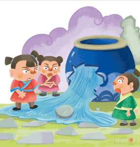
We decided to focus on a story in the Song Dynasty in China, “Sima Guang breaks the vat” to make it into interactive comics.

Sima Guang breaks the vat: A famous anecdote relates how the young Sima Guang once saved a playmate who had fallen into an enormous vat full of water. As other children scattered in panic, Sima Guang calmly picked up a rock and smashed a hole in the base of the pot. Water leaked out, and his friend was saved from drowning. (Wikipedia)

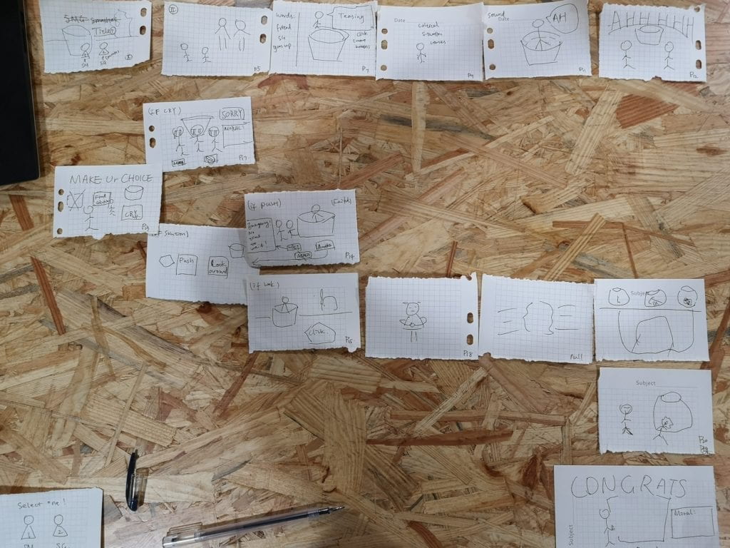
Regarding the plot, we have decided that we could set two storylines. At the beginning of the story, the user can choose which character he or she would be – Sima Guang or the children to jump into the vat, and let the user make decisions. The result, according to different decisions that the user may make, would be implications of morals like “be careful about the unknow vat” and “don’t be panic when facing an emergency.”

Update (March 7 2019):  We have decided to only make one storyline, but more interactive. This is the storyboard that we have made:storyboard
Currently, we want to modify the comics with reference to this website, and photoshop all the characters individually to plot our new storyline. The sample pictures are as followed:

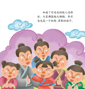
Shangguan-is-out-of-the-vat everyone-praised-sima Sima-throwed-the-stone

Meanwhile, Val is taking Chinese Art course where she is learning to draw in a traditional Chinese style. We have got inspiration from this website, and thought that we can also make some scene of the story in a style like this:
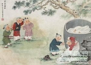
Traditional-style-of-vat

We will keep updating.

Update (March 7 2019): We decided not to use the traditional style but a modern one because we want to make it a light-hearted story.

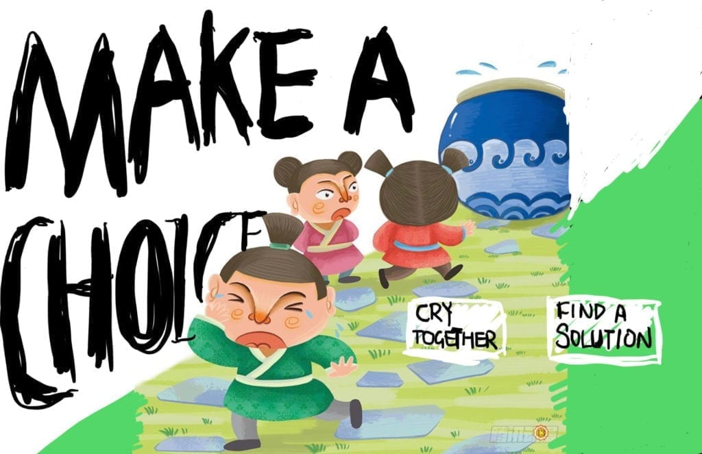
We are now photoshopping the images that we can get from the internet, and draw some comic effects referencing Understanding Comics to exaggerate some scenes. 

Examples:
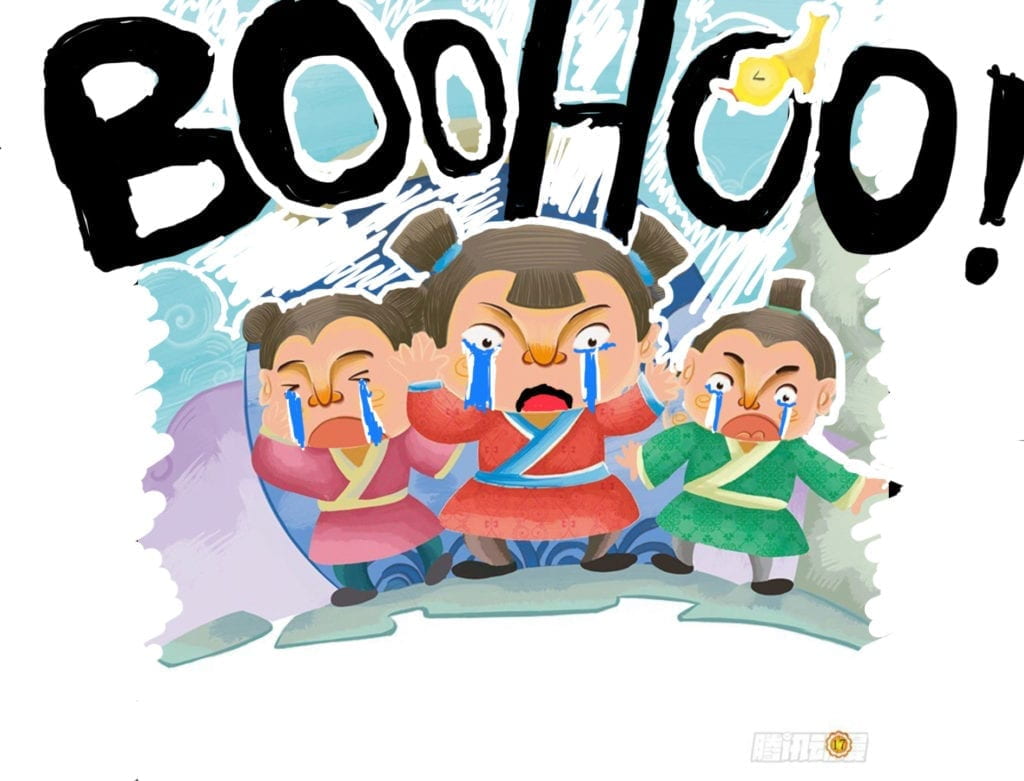
BooHoo

Make-A-Choice

Week 3 – JavaScript Excercise (with BONUS) – Jiannan Shi

Link: https://imanas.shanghai.nyu.edu/~js9686/ExcerciseFeb28/

Description:

Inspired by Leon, I modified the syntax “-webkit-transform” in CSS into “webkitTransform” in JavaScript, and it set the “scaleX” to be (1) if I want it to keep it original, and (-1) to make it flipped. The cat is amazingly flipped without me changing the source of the image!

Difficulty and solution:

I want to play with the caption by adding multiple styles into the font. However, I realized that if I do the “document.getElementById(“xxx”).style.*******” in my self-defined function, it would only display the top first style. Referencing this link, I used the syntax .style.cssText = “*****”, and filled the **** part with CSS syntax. My caption is amazingly displaying multiple styles at the same time! 

Week 3 – Fix the HTML Website and Add CSS – Jiannan Shi

Project: Fix the Project – HTML portfolio + CSS

Documented by Jiannan Shi

Webpage link:  http://imanas.shanghai.nyu.edu/~js9686/week_1/index.html

Date: Feb. 26, 2019

Description:

Problems I encountered:

  1. navigation bar: I want to make a horizontal bar, and center it. But what I see is either horizontal but always on the left or they cannot be horizontal. The way I did the navigation bar was to change the way of displaying the <ul>list.cannot-center To solve the “center” problem, I figured out that I need to set “display:inline-block;” in the CSS ul{} section. (reference: link).  To solve the problem that the purple bar cannot fit into the whole green line, I set margin:0; and padding:0; in the ul{} section. Final work:final-navigation-bar
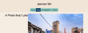
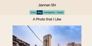
  2. the wrong position of the picture.No matter how I change the “text-align: center” of the title “a photo that I like,” or try to make the picture centered, I failed. Solution: I added another <div> dedicated for the title. And it finally looks like this:right-position
Response to Understanding Comics by McCloud – Jiannan Shi

Understanding Comics is a comic book that McCloud composed all about comics, and opens a brand new angle for me to look at comics as a medium rather than an amusement genre. McCloud argues that comics are set in the world of abstract icons, and introduces us to different comic styles, vocabulary, the use of closure effect, and time frame, based on psychological foundations.

The “cartooning” of objects makes the audience able to focus more on the sequential theme of work instead of paying too much attention to the special details; but meanwhile, to add some realistic scenes between the cartooning images creates a sense of distant, which is a technique that some artists use. In Chapter 2, McCloud introduces a triangle, in which the three vertices stand for reality, abstractness, and meaning respectively. All the comic works, no matter how realistic or abstract they are, can all find their place in this triangle. The comics, like other media such as literature and film, is deeply rooted in the artists’ culture. For example, Japanese comics utilizes aspect-to-aspect perspective to arrange the panels far more frequent than the western ones because the Eastern culture treasures the tradition of “cyclical and labyrinthine” art while the west does not.

The most impressive description of comics that McCloud introduced is the foundation of why we could understand comics: our high closure effect. We can simply complete some dissociated scenes together, and form a holistic view. In this process, some special stimuli like “the sound of chopping cucumbers in the kitchen” can keep existing from the first panel to the last one unless the author suggests that we should move our eyes off the kitchen. If the artist wants to control the sense of time in the work, it is a good way to utilize such closure effect by drawing a clock with two different times marked on it, by setting another silent panel, or to extend the length of the silent panel.

Week 2: CSS Exercise (Jiannan Shi)

Project: CSS Excercise – My portfolio

Documented by Jiannan Shi

Webpage link:  http://imanas.shanghai.nyu.edu/~js9686/portfolio/

Date: Feb. 21, 2019

Description:

I arranged this webpage according to the prompt, and I find it helpful to draw a borderline on each column I want to make in advance to make myself clear about where they are. 

To personalize my page, I set the headers and texts to good-looking fonts from Google Font, using the method we learn from the last lecture. To make the hyperlinks look good, I also changed the color of them using the “a:” syntax.