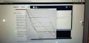
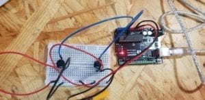
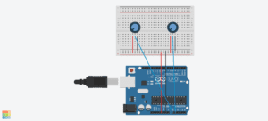
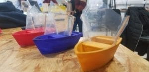
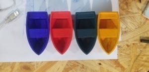
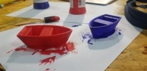
Having developed an adaptation of our midterm assignment, we had the benefit of hindsight when it came to designing our final project. In fact, our main source of motivation to continue developing the Pirate Chase game was to further realize our original concept with a better design. One of the first aspects we knew needed to be changed was that the game needed to be bigger and more dynamic. An initial challenge was finding an adequately sized base for which could fill enough water for the game to function properly while also not becoming too much of an impediment. The decision to use a small inflatable pool only came to mind once we decided that in fact having a circular base would allow for the game to be more dynamic as players would be inclined to move around the entire structure in order to blow the boats towards the sensor. Secondly, we knew that the boats needed to be secure enough so as not to break, fall apart, or immediately sink after several uses. For this, we made sure to leave ample time to 3-D print four boats of the same size, attaching plastic sails afterward. The boats were then painted a different color to distinguish each individual player’s boat. Thirdly, my partner and I decided to add an additional component to the design that would serve to make the game-play more challenging. Keeping in line with the theme of the game, we felt it would be most suitable to design a machine that creates waves for the boats as this would make blowing the boats across the body of water less consistently achievable. Lastly, with the infrared sensor, we felt the component didn’t require much alteration as we felt a light sensor would be less responsive and infrared allowed us to ensure that one user would account for the ending of the game.
Project design during user testing:
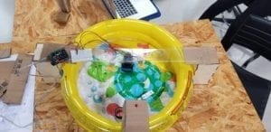
Users interacting with the project during user testing:
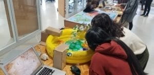
Testing out 3-D printed wave-making component:
Painted 3-D printed boats:
I’d say that the most challenging part of the production process came from the Processing portion of our final project. I felt that, although we had a clear idea of how the design should be laid out and a basic understanding of serial communication, there was a steep learning curve required to finalize the coding to ensure the project would work every time. With enough time dedicated, however, we were able to fulfill this component to our satisfaction. Interestingly, during our user testing, we received very little critic in terms of functionality or concept. Most users enjoyed the concept and thought it was well-realized without much explanation. Additionally, there were few reservations with how users interacted with the game. That being said, we found that a lot of users wished the project had more of a pleasing aesthetic to make the game more inviting. Also, many users recommended we simply set up our project differently so that it would be easier for future users to go around the table and to interact with the computer screen without taking attention away from the physical structure. For the final presentation, we made sure to add several design components to make the game look more appealing. Additionally, we arranged the computer monitor to face users while they were playing in front of it. The results proved to be rather effective, especially during our showcase, as users were more intrigued with a better aesthetic design to our project. The shift in the layout also helped users to follow the narrative in which the game is played.
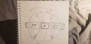
First sketch of project layout and design:
The purpose of this project was to develop a game in which users would challenge one another in order to reach a commonly desired end-goal, which in turn would demonstrate this sort of “tragedy of the commons” scenario seeing how individuals act independently against the common good of others. Through layers of challenges, both physically and to some extent emotionally, users would take part in a conversation with the game is the input/output system was apparent. The idea of having a boat being moved to reach a sensor, highlighting the end of the game, served as the main portrayal of this conversation. Although my definition of interaction being a form of conversation has not necessarily changed, the completion of this project taught me the scope in which interaction finds itself. Even though my intention was to create a series of functions resulting in a form of communication of a human-machine level, the interaction continued throughout the process. Users began communicating with each other, with us, to themselves, all based on one form of interaction. I’ve now understood that interaction is just a one-time event but rather links itself perpetually to a chain of communications that may take place in all different forms.
I think if given more time and more resources, I would like to make this project bigger. The effectiveness of adding challenging components to the design worked so well at creating tension and furthering this form of interaction that I would really enjoy seeing this project at its largest state. For example, having more than just two users competing for the end-goal and as well as having stationary obstacles that would require users to maneuver through this course. In summary, I think this project has shown me the value of proper communication in the modern environment. With so many people putting others down to achieve seemingly one target or goal, the realization that life’s journey along the way is just as important becomes lost.
