A. Design
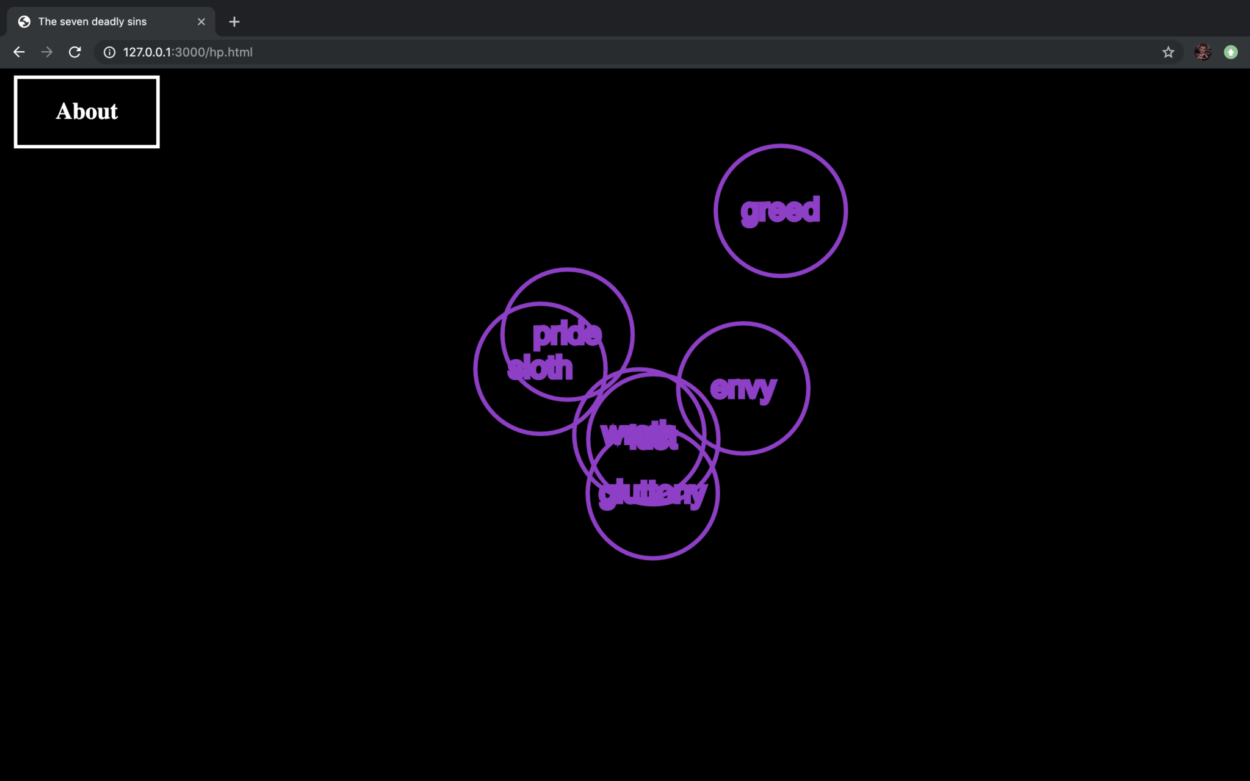
The inspiration of our project comes from the seven deadly sins. In our project, we try to depict how the seven deadly sins are shown in our every-day life.
The home page is made up of seven circles moving randomly on the page. Each circle represents one sin and can link to the corresponding page.
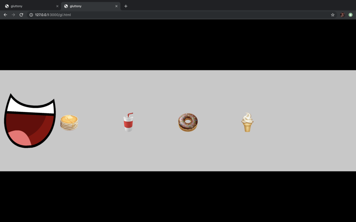
For gluttony, we use the concept of “stress eating”, which is a common phenomenon that the more stress we have the more we eat and the more we eat the happier we get. In this section, player can control the mouth on the screen using “left” and “right” button on the keyboard. The mouth will then eat the food on the screen.
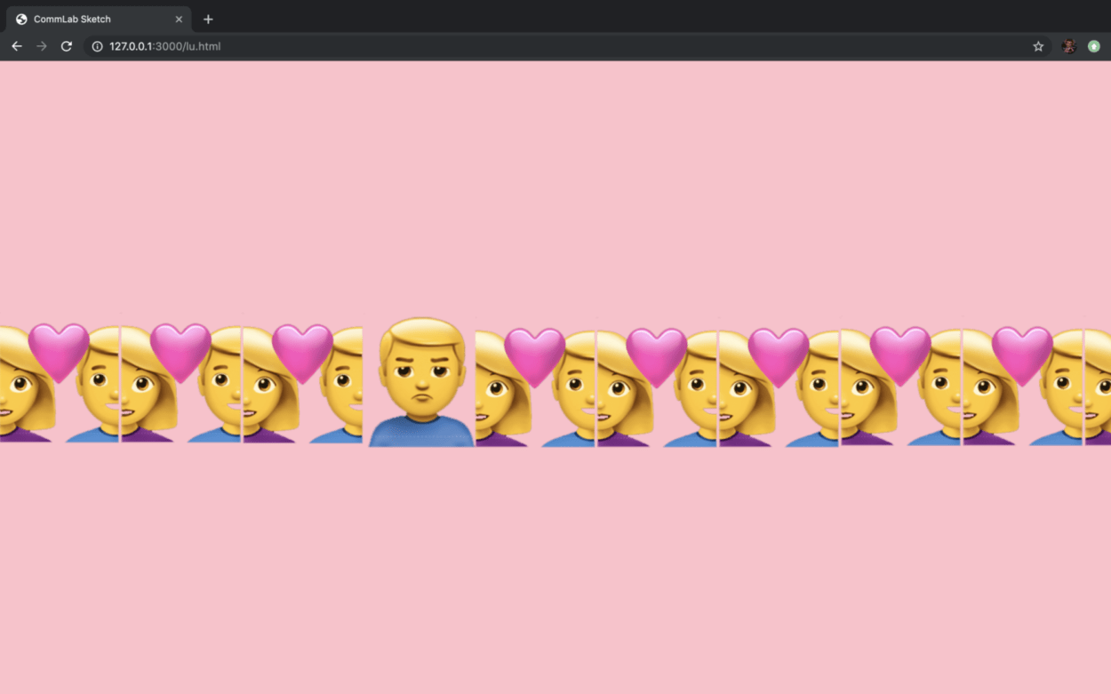
For lust, we use the concept of “single dog (单身狗)” which is used to say someone who is single and longing for love. On the page, there are many couples and among them, there is a single man who looks quite unhappy. The player can drag the long picture either using their mouse or the “left” and “right” button on the keyboard.
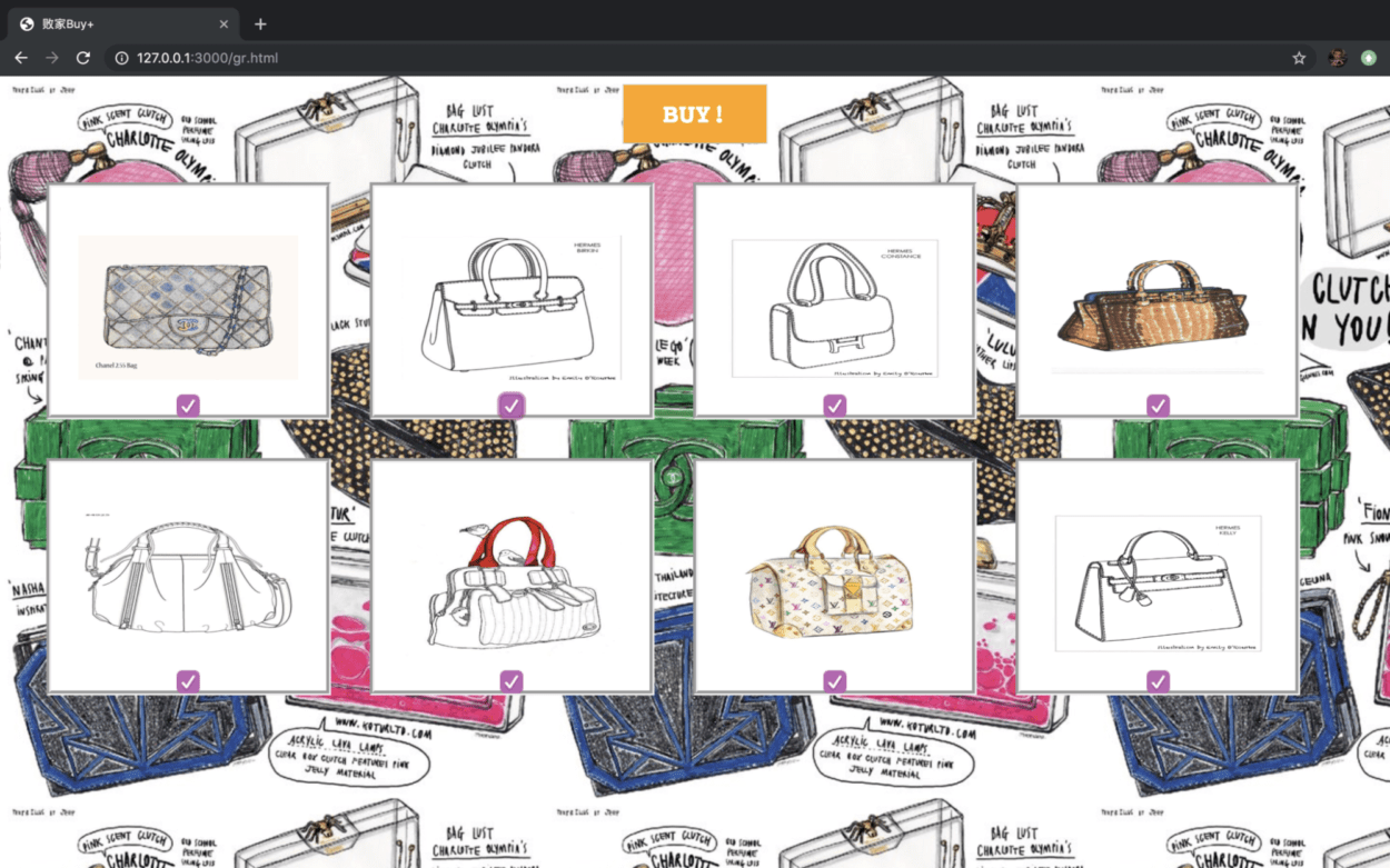
For greed, we made a shopping page where if the user check one box all the boxes will be checked. And when they click “Buy”, there will be alert popping out saying “Out of Balance”. This shows the phenomenon that people who are into online shopping couldn’t resist the desire to buy more even if they may not have that much money.
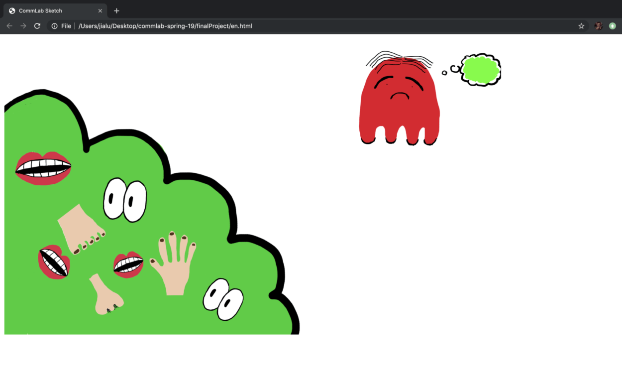
For envy, we use the saying “green with envy”. There is a crowd at the left of the page and a lonely man at the right of the page. Each time the user hover their mouse on the crowd, there will be sounds of people chatting and laughing and the man on the right will shrink a little. We want to show the phenomenon that someone who is shy and afraid of socializing may sometimes envy those who can fit in.
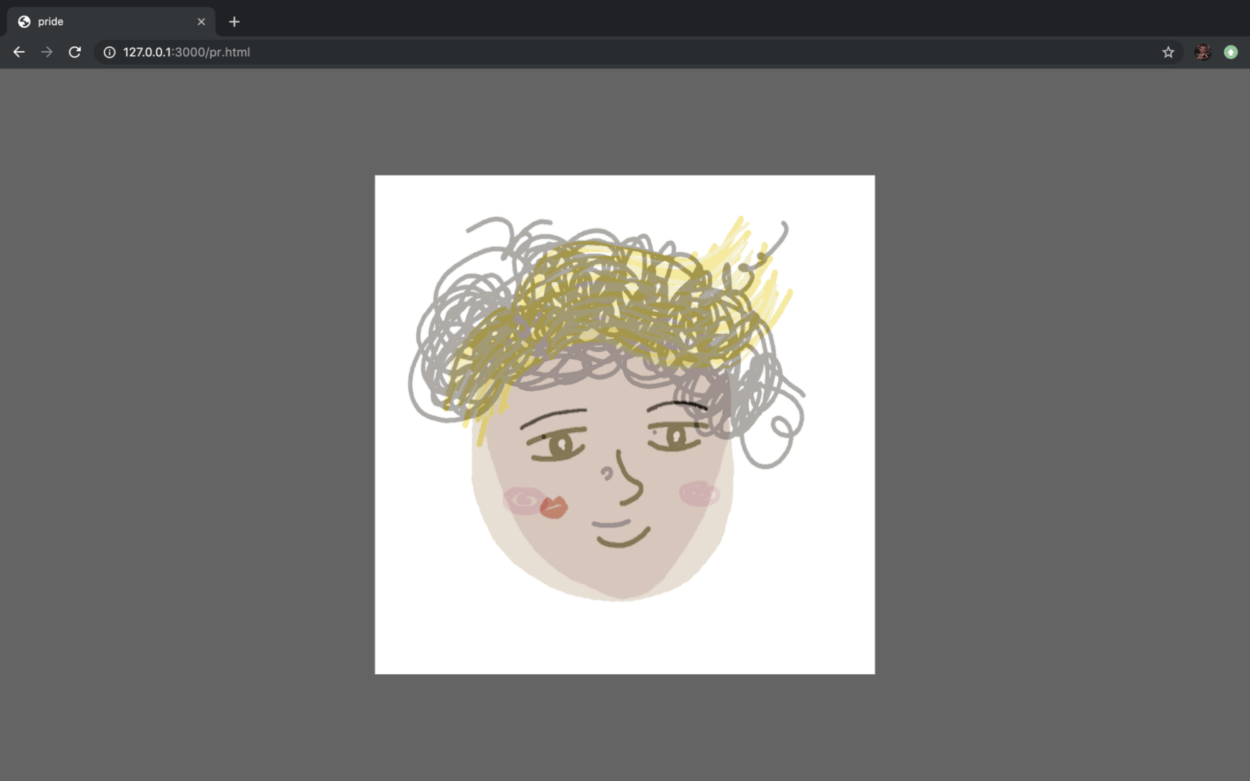
For pride, we use the phenomenon that people like to photoshop their selfies before putting them on the social media in order to leave a good impression on others. When the user moves their mouse from the left side of the page to the right, the picture on the page will change from “before ps” to “after ps”.
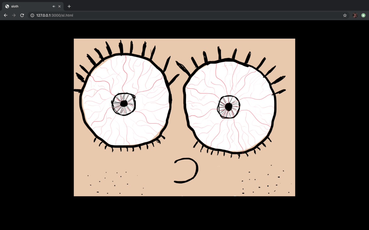
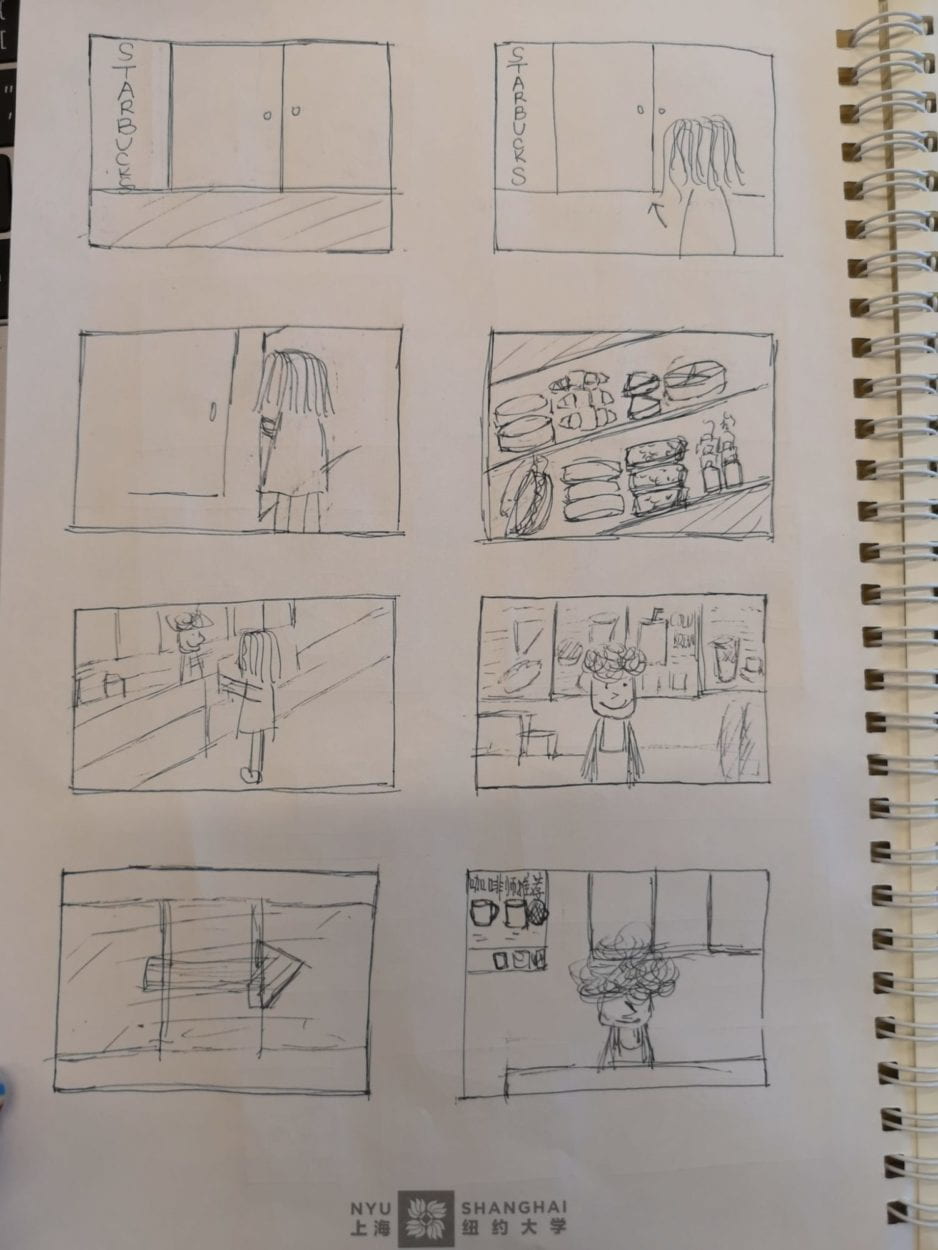
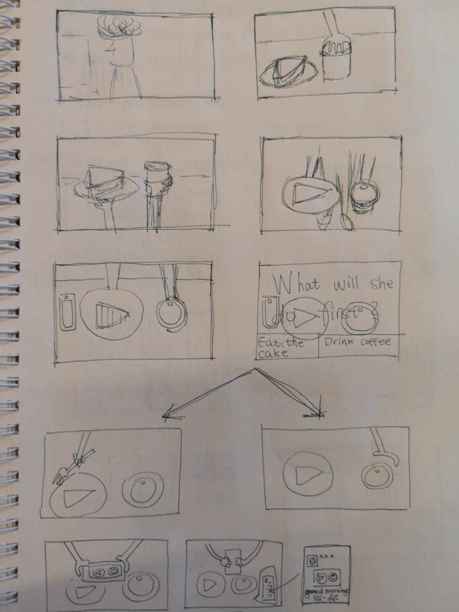
For sloth, we use the idea that people having trouble waking up in the morning. This page is kind of like a comic where people can go to the next page by clicking on the webpage.
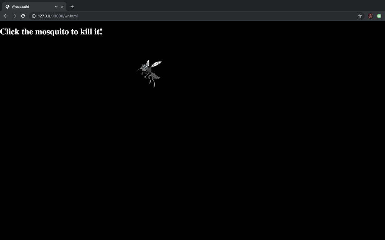
For wrath, we made a mosquito which flies to a random place on the page as soon as the user hover their mouse on it. There is also the annoying sound of the mosquito which only stops when the user manages to “kill” the mosquito by clicking on it.
B. Process
I think “the seven deadly sins” is a very interesting theme and we can explore a lot based on this idea. We did great in working as a team—we came up with the idea of our project together. And after we set out to doing our project, Steve was in charge of coding using P5 and I drew all the assets and helped Steve with some simple coding as well. However, we were a little over ambitious. We underestimated the time needed to finish a project that is composed of seven mini projects. Therefore, we had to simplify our ideas when we realized that we were running out of time. I think it will be better if we had made a plan before start doing the project. We should plan at what time which part of our project should be down ahead of time.
C. Future
If we were given more time, we can make each part of our project more like a little game. For example, for gluttony, we can add more food and also many add a “stress bar” which decreases as the mouth eats more food on the screen; and for sloth, we can make the format of the page less liner and make it more interactive. Also, we need to think more deeply about the meaning of our project. Whether or not we are using the most proper way to depict the seven deadly sins in modern society? Is there any better way to show the seven deadly sins? These questions are the foundation of our whole project.
