Week 2: Photoshop – The Adventure Begins | Jonathon Haley

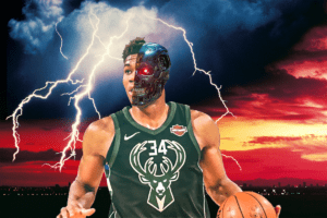
I decided, for this week’s Photoshop assignment, to take NBA star Giannis Antetokounmpo (popularly known as the Greek Freak) and merge him with a Terminator’s face, serving the dual purpose of looking really cool and giving a scientific explanation for why he’s so good at basketball. I put Terminator Giannis (pronounced YAH-niss) against a dramatic backdrop complete with storm clouds and lightning.

The Final Product.

While I do think it looks great, it’s also pretty obvious that it was made by a beginner to Photoshop…but that’ll change in the future.

First, I took an image of Giannis and removed the background. The image isn’t a pure photograph – it appears to have been put through some kind of filter, making it look slightly less than real, with more emphasis on Giannis making him stand out from the background more. After a few minutes of Google searching I did find the source photo and can confirm that it’s a real picture of Giannis that had been slightly processed – so it’s already been Photoshopped most likely. I then removed the background through a combination of the Magic Eraser and regular Eraser tools.

The image of Giannis I used.
The slightly-photoshopped image of Giannis that I used.
The source photo, which I didn't use.
The source photo for the image I used. Notice that compared to the processed image, this one is darker in the foreground which may have made it more difficult for me to use.

Next, I went looking for a Terminator image that could be photoshopped onto half of Giannis’ face – the half that’s slightly closer to us. This meant that the Terminator would need to, like Giannis, be facing slightly away from the viewer. After a bit of searching, I found exactly what I needed.

The Terminator whose face could be Photoshopped onto Giannis'
The Terminator in all its glory. He’s conveniently looking away from the viewer at roughly the same angle as Giannis, only in the opposite direction.

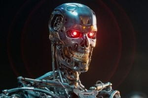
I flipped the Terminator around to look in the right direction, and then removed his (his? its?) body and neck, leaving only the head.

Terminator's head
The head of the Terminator (before removing the neck and cleaning up the outline of the head)

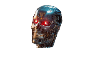
After that, I copy-pasted the Terminator’s head into the same project file that Giannis was in. I put the Terminator and Giannis side by side, and rotated and resized the Terminator’s head (as well as moving it over Giannis’ head) until it was the correct size and rotation. I then used the regular Eraser tool to remove the far half of the Terminator’s face, leaving us with a half-face mask. I placed this onto Giannis, and then zoomed way in to erase the bits of ear, neck, and hair that were sticking out from behind the mask. The hair especially was a bit of a problem, as I wasn’t sure at first exactly how to cut it at the point where the mask begins. Eventually, I chose something that looks pretty convincing, I think.

Giannis/Terminator (although that may already be redundant)
Harvey Dent, anyone?

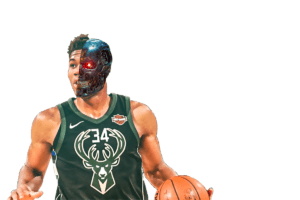
With that, the transformation was complete. The last, easiest step was to paste our new human cyborg onto one of the carefully selected backgrounds. I actually chose two different backgrounds, and I do like both of them. This one is “beauty in simplicity” exemplified:

Giannis and the Purple Lightning
Terrifying.

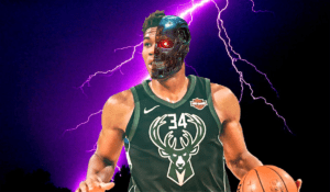
But I went with this instead, as my final creation.

The Final Product.
Watch out, NBA. The takeover has begun.

Week 3: Personal Website using CSS | Jonathon Haley

Here’s the link: https://shanghai.nyu.edu/

With this week’s assignment, I focused on laying the foundation for my personal website, so that I can easily add more styling, backgrounds, and other interesting stuff later. I built a very simple website, with very little styling, that contains links at the top to various parts of my portfolio, a link to my About page, and links to the Chinese- and Japanese-language versions of my page. The links to my portfolio are currently empty (set to “#”), but will be implemented once I actually have something to show (i.e. after completing some projects for ComLab). The English Index page contains no actual content except the text “Nothing yet”; the Chinese one displays a similar message in Chinese, while the Japanese one displays an error message about not being able to reach the server, but in all three languages (just to mix things up). The About page has been set up and the link to it works, although the actual About section is still very basic, having been mostly copied from the week 1 assignment using only basic HTML. The About page looks very similar to the Index page, and contains the same set of links at the top (including the language links), something I plan to do with all the other pages once they’ve been added (although plans change…). I haven’t made my about page in Chinese and Japanese yet, so the About page link only works on the English page so far. The Chinese and Japanese pages look identical to the English version, except I added separate CSS files for each language (including English) allowing me to manipulate the fonts and anything else I desire for each language. These CSS files (en.css, zh.css, ja.css) are mostly empty for now, but can be expanded later as needed, and as a result each language’s page can contain a different font, different font colors, and other styling, which still retaining the same layout and (aside from the text of course) content.

That’s what the “finished” product, although I’d call it more of a framework at this point, looks like at this time. So how’d I actually build it? Well, I used the html page that we were given for Monday’s CSS assignment, with a few modifications. I had the idea of different language-specific versions of my site very early on, and to allow for this I added a specific div tag for each language: english, chinese, and japanese. I placed the appropriate tag (depending on the page’s language) just inside the body of each html page, to encompass all the text that would be actually displayed on the page, not including the page’s title and meta fields since these don’t need styling. I also added two two div classes, called language and lang-box, to serve a similar function to navigation and navi-box, or content and content-box. These boxes hold the links to the page in other languages, and a dead link to the page’s current language. I also added the other languages’ styling around those specific links, so that i.e. on the English-language page, the button that says “中文” to switch to the Chinese page will display in the font being used for the Chinese page, not the English one.

I also added two other div classes: current-navi and current-navi-box. They’re similar to the other ones but display only the name of the page you’re currently at, on the row below the links to other pages, to make it clear what page you’re on. I made the current-navi-box box and font sizes larger than the others to make this abundantly clear; if that doesn’t make sense, it will once you’ve seen the page. Each page has its own name in a current-navi-box, and the links to the other pages in navi-boxes. Therefore, each page only has one current-navi-box.

Another thing was that since I haven’t added any content to my page (aside from text in the About section), I commented out most of the content-boxes that were included in the html pages. I kept one for each page, to contain the “Nothing yet” message in the Index and the About section’s image and text. I modified the content-box class in the css layout file – since I only need one (at least for the time being), I made it span the width of the screen to allow the text it contains to reach across the whole screen, and made its height such that it goes nearly all the way down to the bottom, but allows you to see the footer without having to scroll (at least on my computer anyway). This way, the location of the header stays consistent no matter how much text or content you add – at least until you add more than the screen can handle and need to scroll, and at that point I’ll need to find a better solution.

One more thing: I’ve put a hidden link somewhere on the website. It’s embedded in an item of text, but doesn’t go to one of the other pages on my site. Hint: What part of the website stays constant, no matter where you go…and is right at the top?

That’s about it so far! I’ve got a solid framework in place to add content, style and interactivity in the near future. All I’ve got to do now is make sure I don’t botch the upload to the IMA server…

Screenshots below, of the four semi-completed pages so far:

Index-English

Week 3: Understanding Comics by Scott McCloud | Jonathon Haley

Understanding Comics by Scott McCloud brings up some very interesting points not just regarding comics, but also about media in general and the ways we perceive information. He notes that after making a character’s face less detailed and more abstract, we (the viewers) can relate to the character more. This is because the less detailed the character’s features (especially facial features), the easier it becomes for us to project our own ego image onto the character and assume the character’s role as our own. I think this likely applies not just to visual media such as comics and cartoons, but to storytelling in general: the less you specify about a main character (especially when telling a story from a first-person perspective), the more likely an audience will “become” the character, and relate to the events and relationships in the story much more deeply. Since the goal of all storytelling is to engage an audience’s attention, this seems like a very effective means of accomplishing that. As a side note, I’ve been thinking about writing a story of my own, but don’t know where to start; perhaps first creating a character who is not so much a person as an idea, a generality whose shoes you can fill and whose life you can experience firsthand, while still incorporating a few key specifics to drive the story forward – perhaps this would be as good a starting point as any.

Week 2: Flexin’ with CSS | Jonathon Haley

Finally got that CSS page done. The assignment, as you know, was to apply CSS styling to an HTML page that we were given, in order to look something like this:

 The sample given for the CSS exercise, which I did my best to replicate.

I decided to make an exact replica of this page. As in, down to the precise RGB values used for the text and boxes. The first thing I did was to set all the fonts to Helvetica – guessing, correctly I think, that this was the font used in the example, as our professor has often used it during our class sessions.

Next, I took the suggested action of adding a temporary background color to each div, in order to see the areas encompassed by each of these div’s more clearly. I then used imagecolorpicker.com to determine the colors used for the text and boxes, and applied these in my code. However, the hyperlinks in the navi-box on the left still displayed blue or purple (default colors for hyperlinks, before and after being pressed). I found the solution after some googling. By changing .navi-box a:link and .navi-box a:visited, I was able to change the hyperlinks into the color I wanted, rather than having them revert to the default hyperlink colors.

After that I had to convert the content and content-box div’s into flex areas. I followed the guidelines laid out in the slides, but encountered an issue where all the boxes’ colors would take up the same space (effectively creating just a single box), while the boxes’ text were lined up in rows and columns as I had intended, but below the navigation section (on the left, with the links) instead of next to it. After some trial and error, I found that my mistake had been placing most of the flex information in the .content-box sub-div, rather than in the overarching .content div. Once I moved the code detailing flex information (such as flex-direction, flex-wrap, and justify-content) into .content, the boxes displayed normally.

From there, it was just a matter of fine-tuning, to get the specifics just right to look as close to the original page as possible. I removed the temporary background colors from the different div’s, as they were no longer needed since everything was already roughly in place. I added margin to the right of the navigation and content sections (in the case of content, this was to generate a “line-break” for the content boxes, as too many were being displayed on one line), margin above and below the header, a large margin above the footer, and padding around the navi-boxes. I also included a small margin and even smaller padding for the content boxes – the margin for separation between boxes, and padding for separation of the content box’s text from its border (without padding, the text would be right up against the border, which was not the case in the sample website).

The one problem I could not find a solution to was to justify the content box’s text against its upper-left corner. With the boxes I created, the text is left-justified, with a very small space (produced by padding) between the box’s left edge and the left side of the text, but a significantly larger space between the box’s top edge and the top of the text. In the sample website, the space at the top is also very small (as you can see in the screenshot at the beginning). After a good deal of time spent googling the issue, I couldn’t find any way to resolve it, or at least none that worked, so I left it there. It’s the only major discrepancy I can find between the original sample website and the copy I’ve created. Below is the sample website again, and below it a screenshot of my created website. See for yourself: how close did I get to the original? Click HERE to visit the page itself.

.

.

.

.

.

.

.

.

Side note: The screenshot on top (the original sample website), taken on a professor’s computer, apparently has different screen dimensions from my own computer, which took the screenshot on the bottom (my copy website). So for example, the position of the boxes relative to the “My Portfolio” header is the same for both websites, but the margin between the boxes and the hyperlinks on the left (the .navigation section) is a little larger in order to preserve the boxes’ position relative to the header and to the center of the screen.

Week 2: “The Medium is the Message” by Marshall McLuhan | Jonathon Haley

Quoting Bernard Lam in The Art of Speaking (1696): “A Discourse cannot be pleasant to the Hearer that is not easie to the Speaker; nor can it be easily pronounced unless it be heard with delight.” What’s interesting about this phrase is that it counters a fundamental assumption we seem to make: that what I say isn’t exactly what you hear. What I perceive as good, might not be what you perceive as good. It comes down to how subjective you think reality is. Lam is saying that a sentence that’s good, that you feel good about, will also be felt the same way by whoever you’re talking with. While you may understand the message of my words differently than how I intended them, the quality of the actual words and sentence is never lost in translation. The medium (the words and, at an even lower level, the sounds and articulation) stays the same, while the information assumes a different form. The medium is truth, the information more of a gray area.

This may be why we find body language to be the strongest indicator of how somebody really feels about something: while they may manipulate their words to mask their true state of being (i.e. what mood they’re in, or how they feel about something that’s happened), the means they’re using to communicate these ideas express the bigger picture. That’s how I interpreted the words “the medium is the message:” to really understand a piece of information, not just at face value but also its context and the deeper implications behind it, it’s necessary to look at the means by which it was delivered to you. That’s why reading something via text or email and being told in person are two completely different things: the information is the same, but the medium is different.

I didn’t understand the meaning of the title too well, until I read the quote by Lam, near the end of the text. This helped me put things into context, and I think I understand it better now.